The work we show first
Real estate, e-commerce, branding, interfaces and manufacturing. Pick a direction to see the projects.
A website concept for a UK co-living and build-to-rent developer: real people instead of renders, serif type and an investor layer that shows its figures.
View case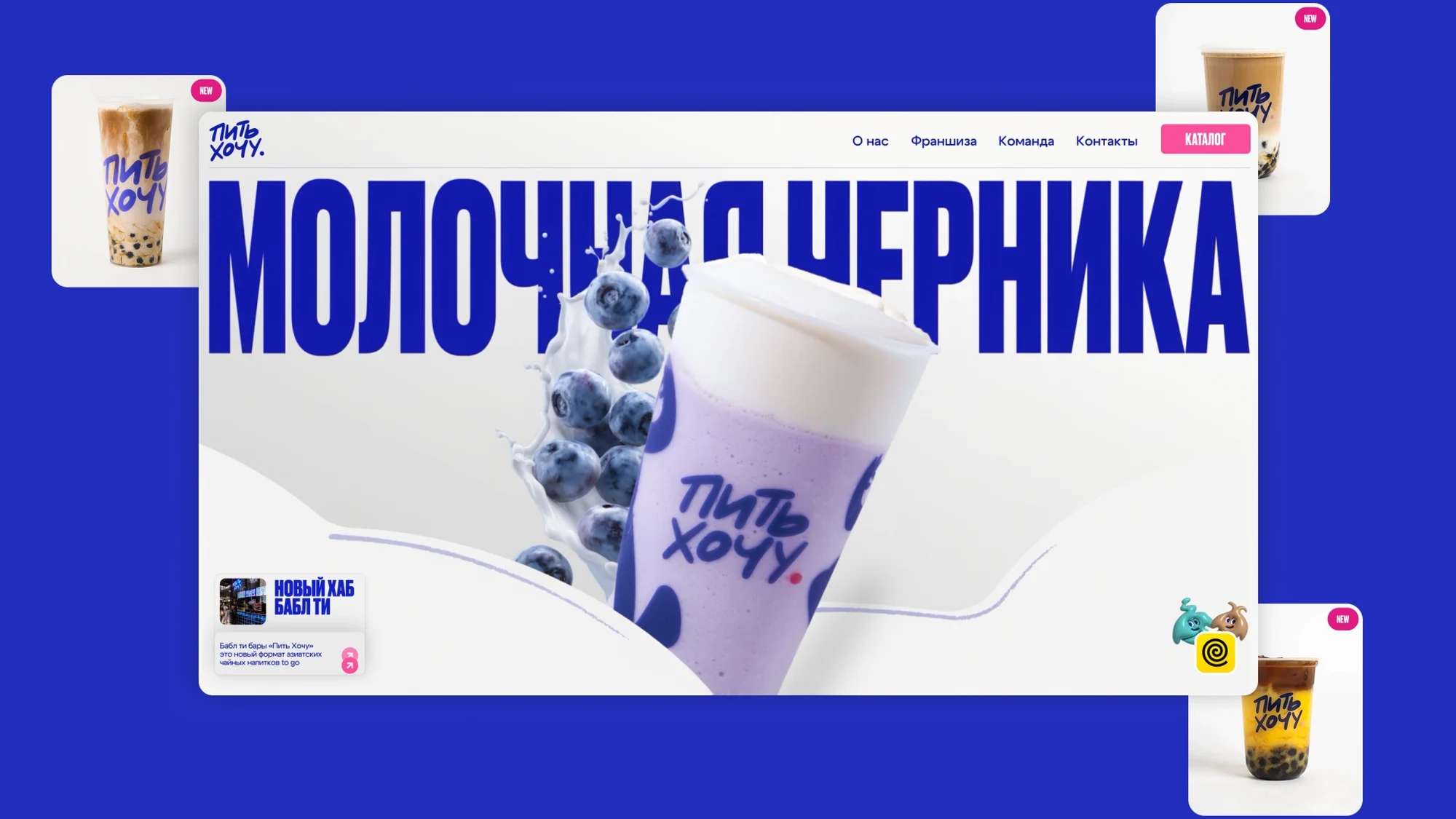
A bubble tea chain: rebranding and a website — oversized type, product photography and 3D mascots as interface characters.
View case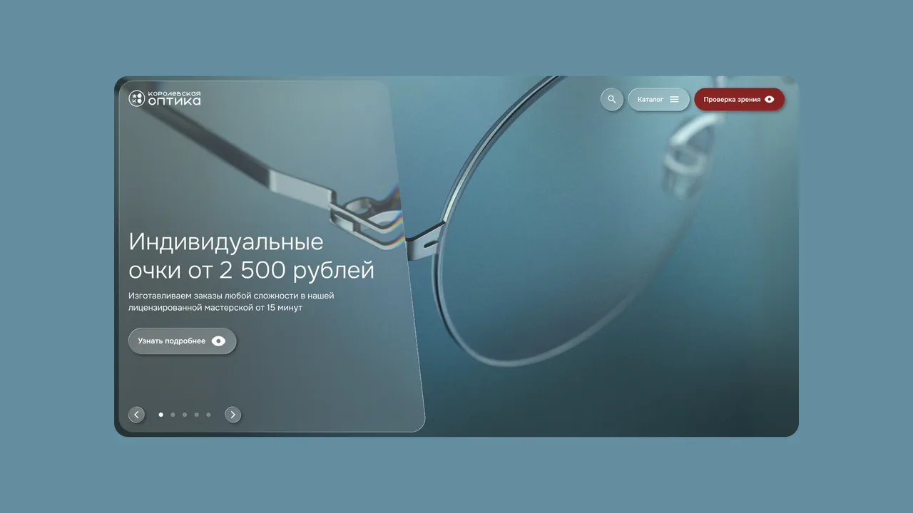
A chain of 26 optics stores in Kaliningrad: a homepage concept with an interactive lens, Bitrix support and a redesign in progress.
View case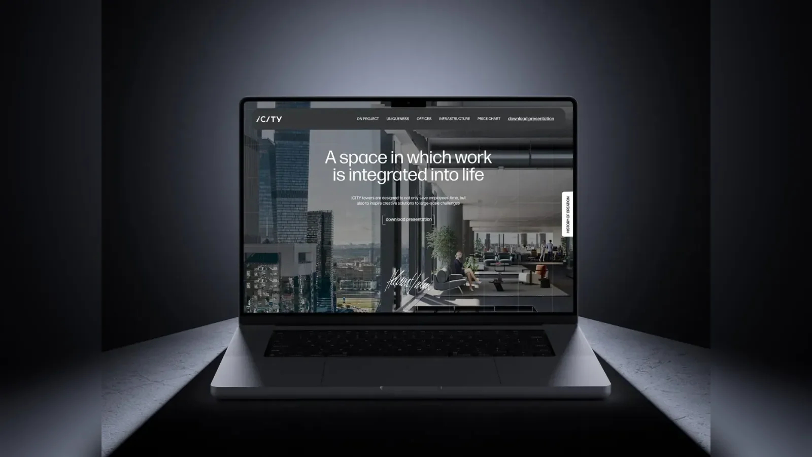
A website for a business centre in the Moscow business district. Two metaphors brought together in one project.
View case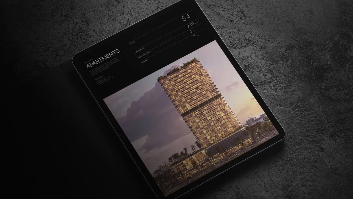
A family residential complex in a prime Dubai district. A space concept built around the film Interstellar.
View caseDesign support for an Israeli developer: brand carriers, 50+ project presentations, brochures and posts for US buyers — for two and a half years now.
View case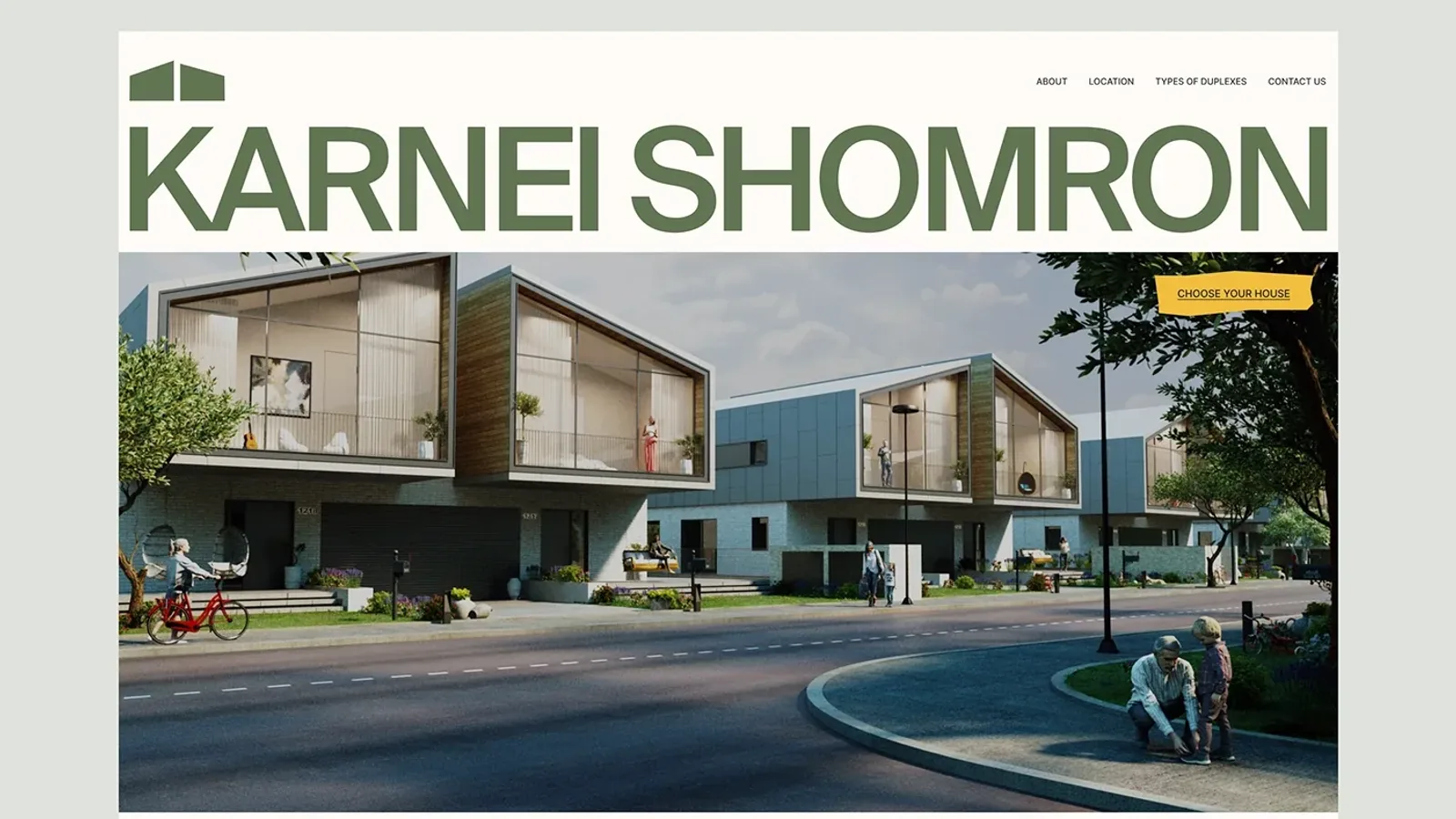
The Harey Zahav village website for American buyers: a portrait of the community, a map of the surroundings and a plan of 26 duplexes.
View case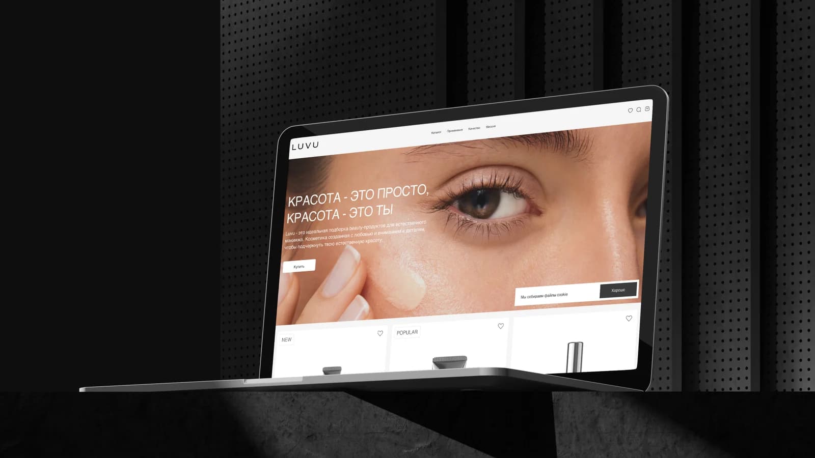
An online store for a new cosmetics brand on 1C-Bitrix. Payments and delivery, eight automation options, a funnel and email marketing materials.
View case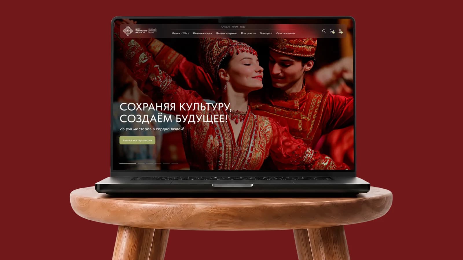
A platform for a craft centre in Kazan: residents and workshops, activity sign-ups, three user roles, accounts and an admin panel.
View case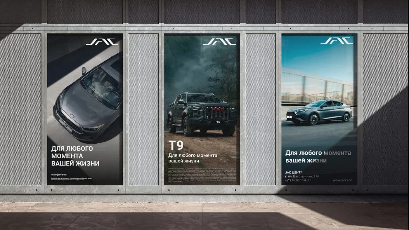
A refreshed identity adapted across more than 30 applications.
View case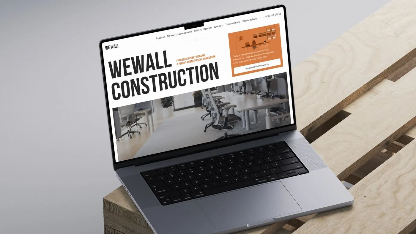
A design system for a commercial property company and 17+ pages built on it: four business lines from finding space to fitting it out, on Bitrix24.
View case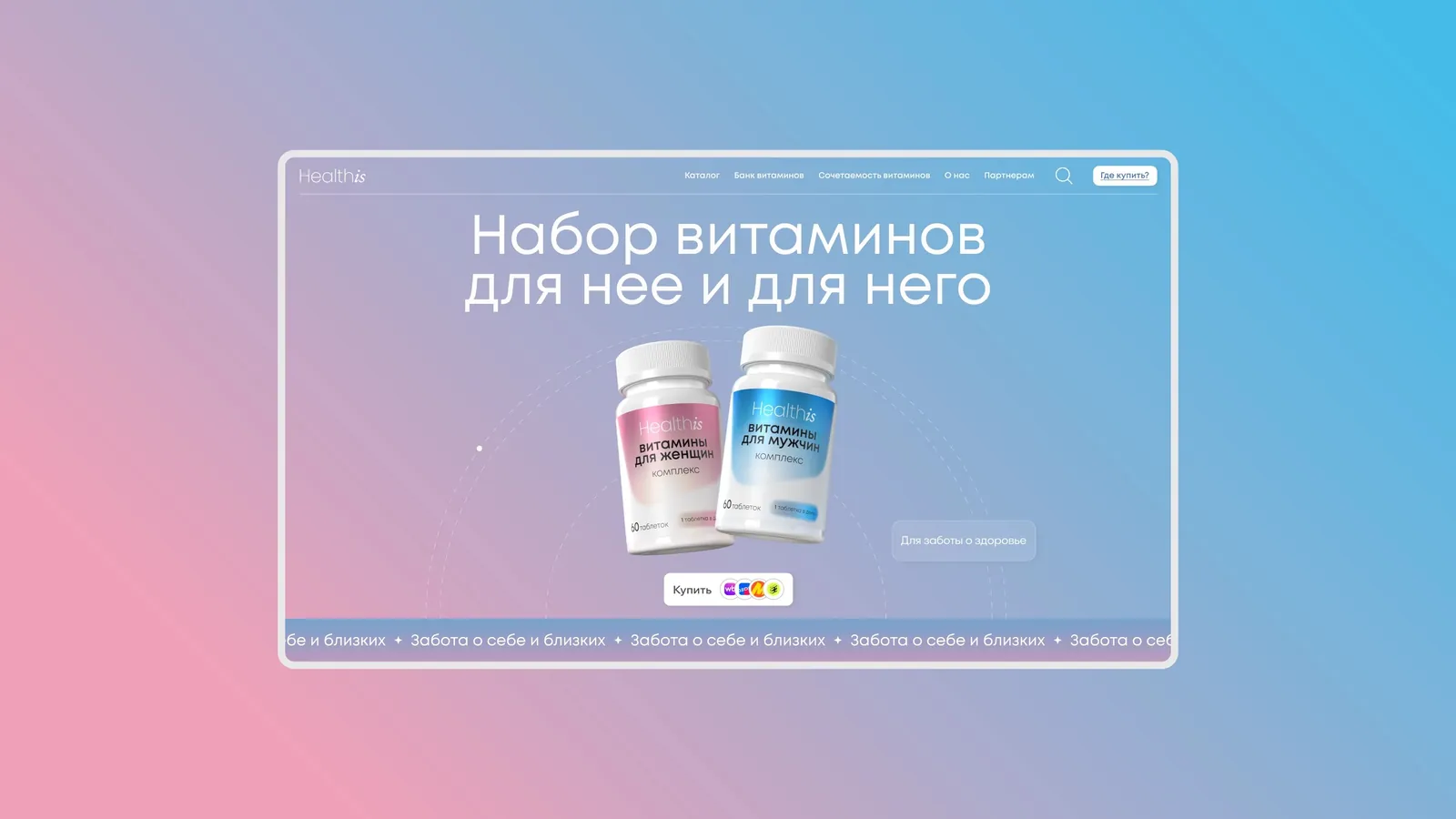
A project for a supplements manufacturer: a new design system and a refreshed site — visual style, palette, type and a cleaner interface.
View case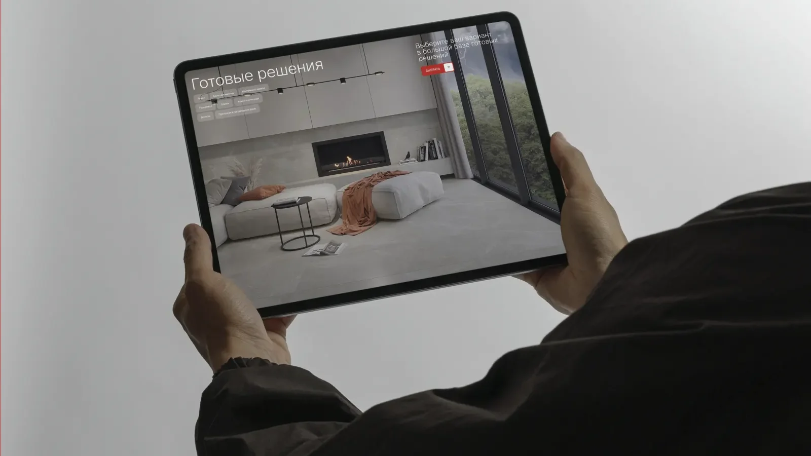
A refreshed visual approach for a ceramics brand and a design system for web, marketplaces and offline: landing pages, a new home page, a collection catalogue and a partner conference.
View caseDashboards tracking operations across a group of companies: finance, HR, plan versus actual by division. Under NDA.
View case
A website for a private residence in Tiberias on the Sea of Galilee: three versions — Russian, English and Hebrew — on a shared structure, with native RTL.
View case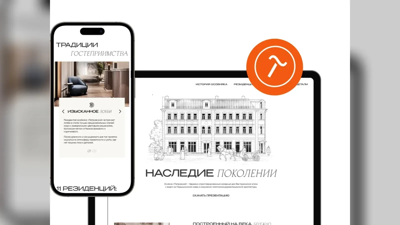
A concept for a private residence in historic central Moscow: the merchant-era metaphor runs through the whole site.
View case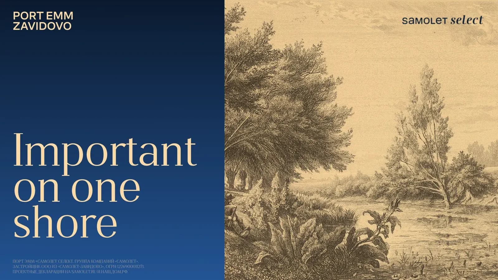
Brand communication for the developer Samolet: the visual and verbal language of the project — from the first words to the first screens.
View caseA platform for a functional sports nutrition brand: a direct sales channel instead of marketplaces, a delivery subscription and its own community.
View case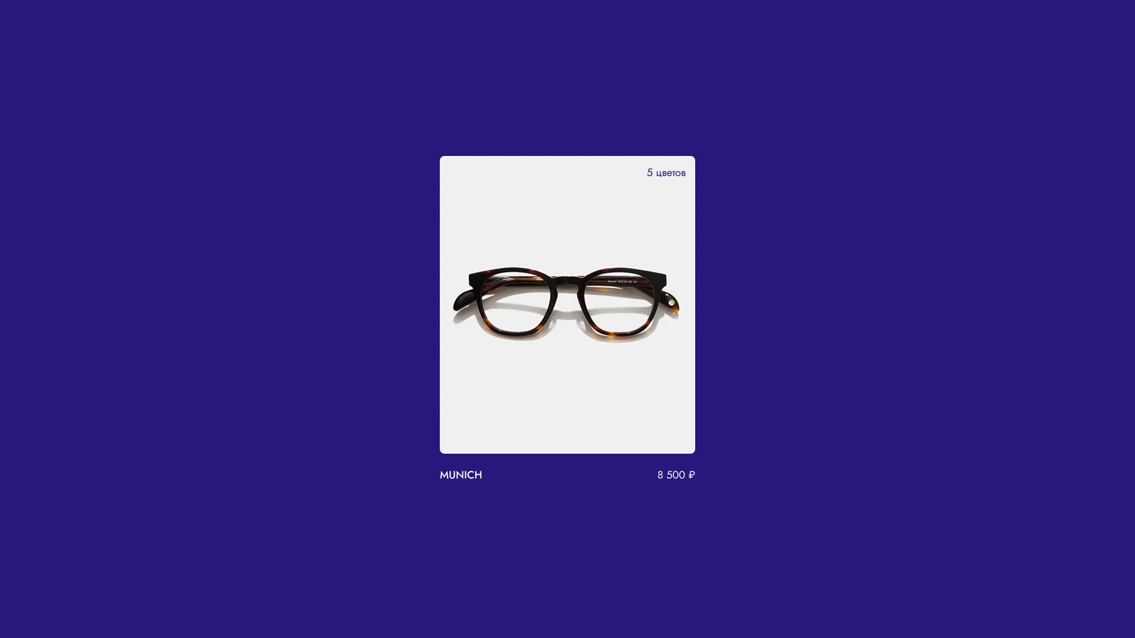
An online store for eyewear and accessories: we grow the technical architecture, ship new interfaces and keep the support running.
View case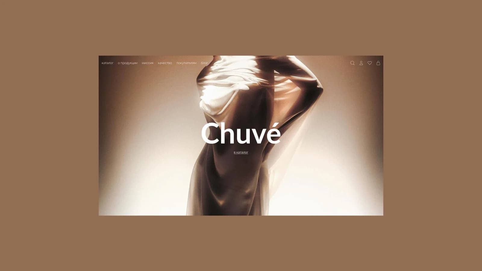
E-commerce built from zero: platform structure, the key interaction points and the design of every page — a base for launching online sales.
View case Bronze, G8 2026
A skincare brand: a brand platform, an identity and packaging for a younger generation.
View case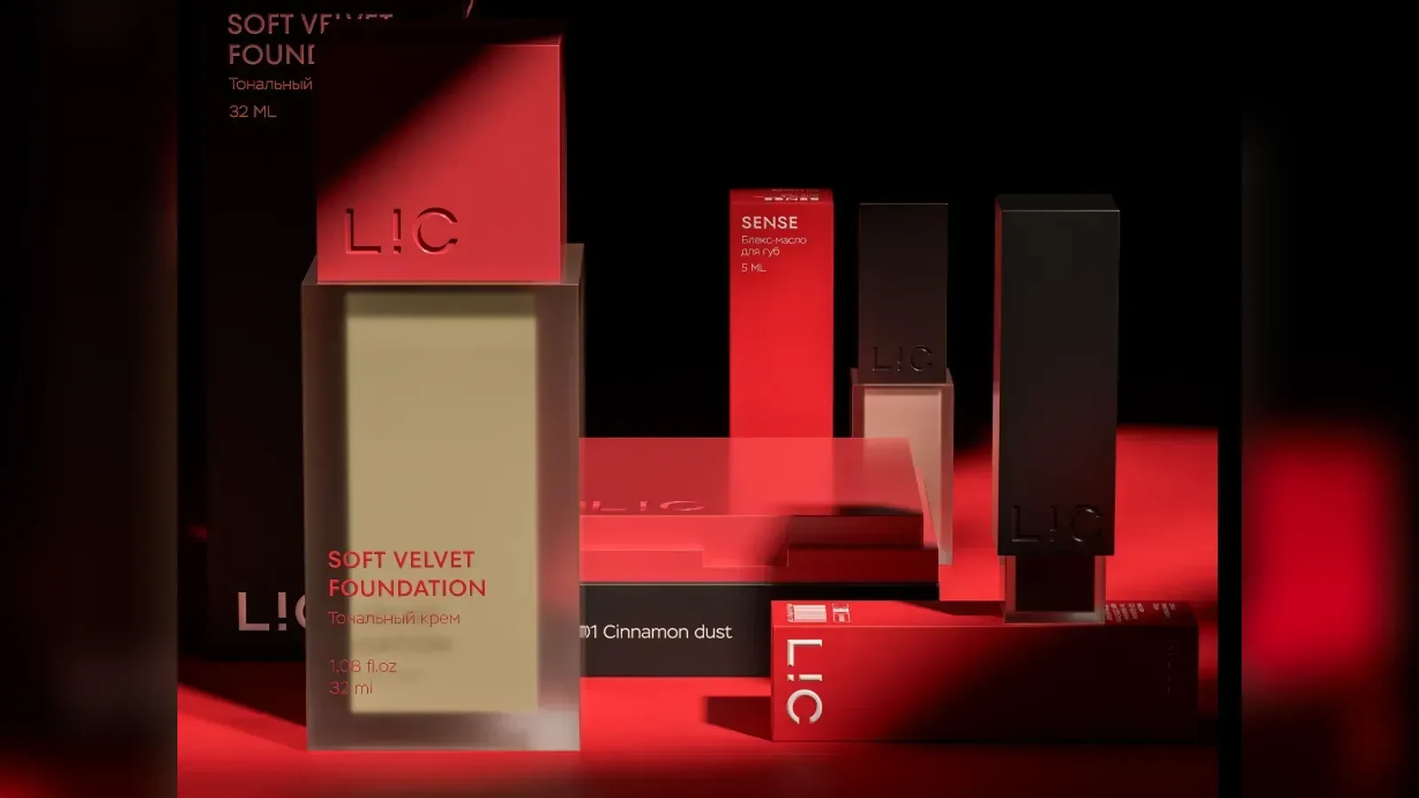
A new line for a professional cosmetics brand: audience and trend research, a brand platform, identity, packaging and an online store.
View case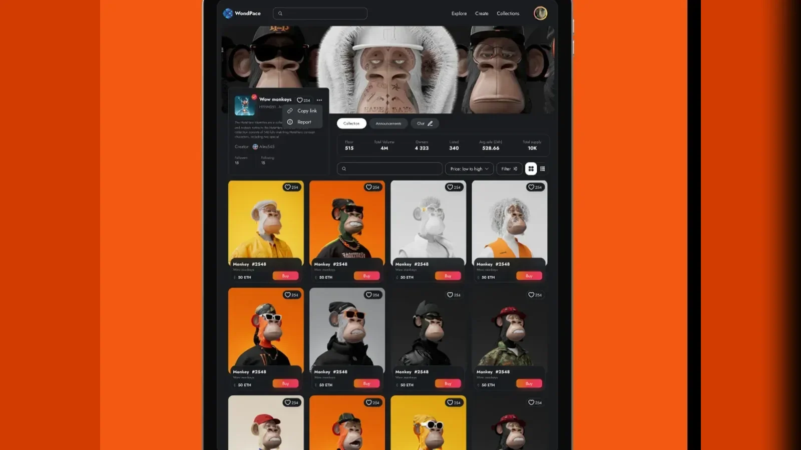
A concept for an NFT collection marketplace: buying and selling tokens, gamification and rewards, a personal account and chats.
View case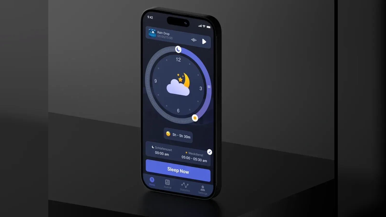
Research and user interviews, a reworked journey and 60+ screens designed.
View case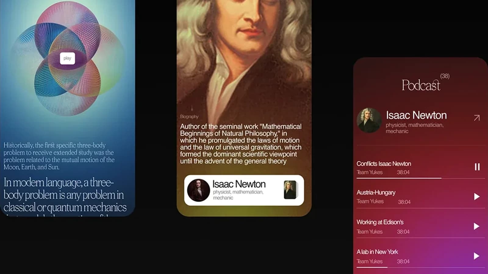
An EdTech app concept that teaches history through people rather than facts: bold type, contrast and colour instead of the usual classroom look.
View case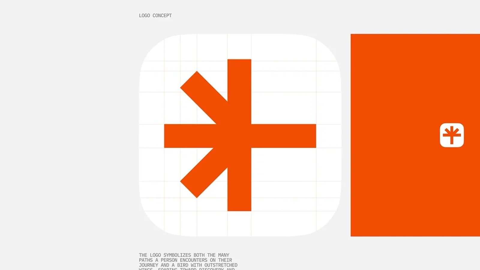
A concept for a traveller’s navigator app: selections by interest, an AI assistant, secret destinations and a profile with statistics.
View case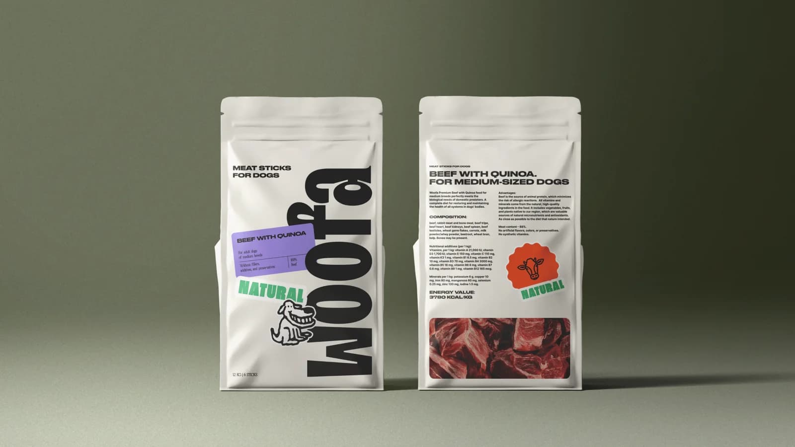
Full identity and packaging for a Georgian eco dog food brand: a sticker-style logo, a playful visual language and the packaging range.
View case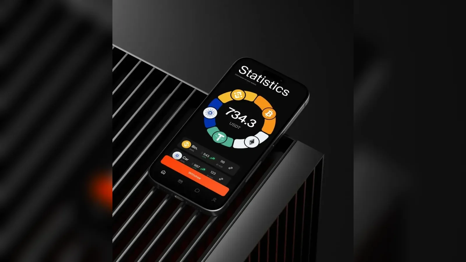
App design for mining. Gamification built into the design system: rewards, chats, friends and a personal account.
View case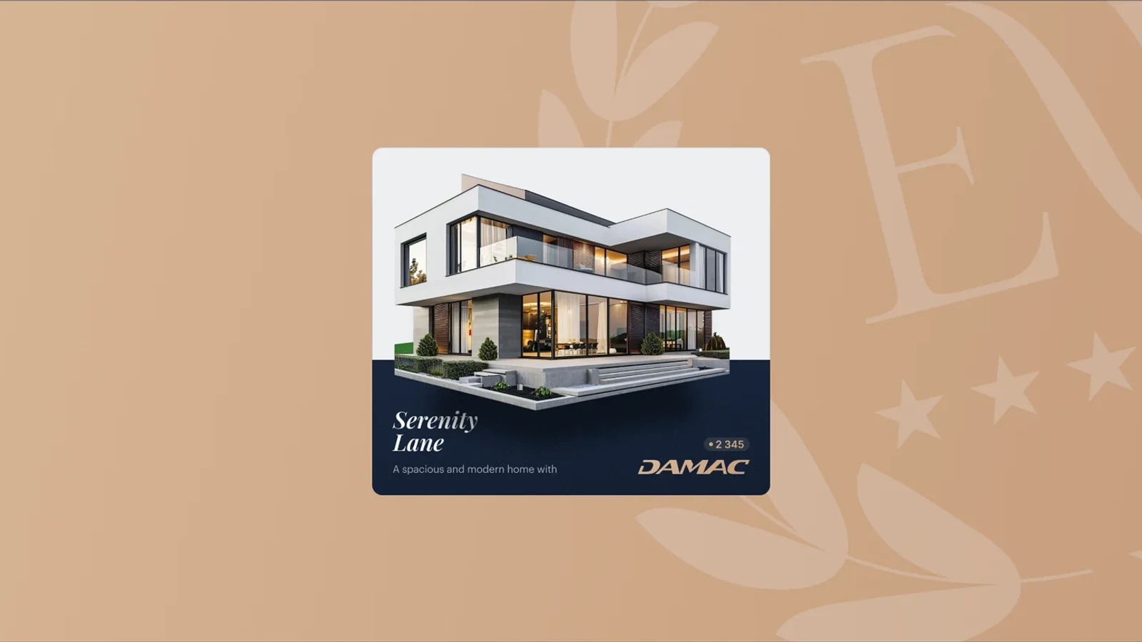
A redesign for a premium real-estate agency in Dubai: a design system, curated collections, smart filters and a map.
View case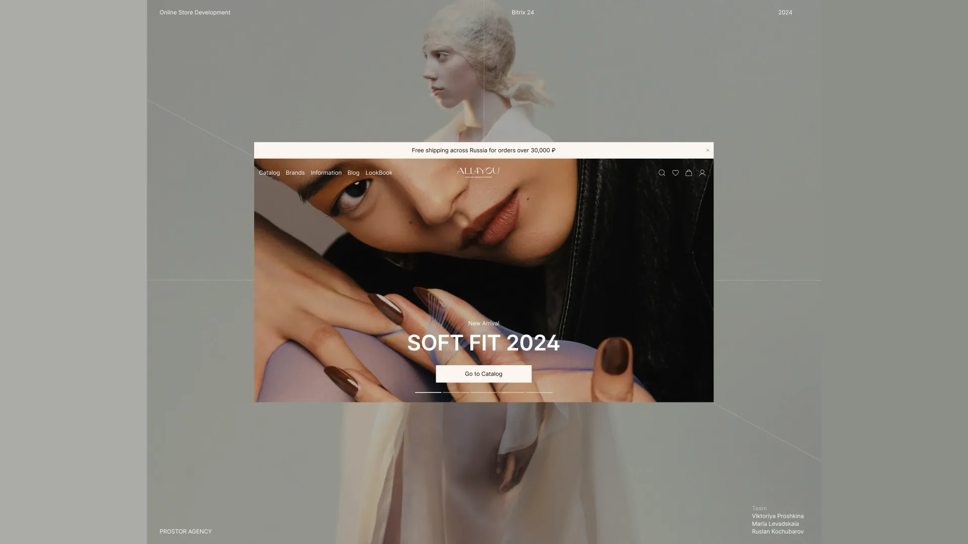
An online store for an Italian luxury boutique: an editorial catalogue, buying a whole look from the card, logistics and 1C integrations.
View case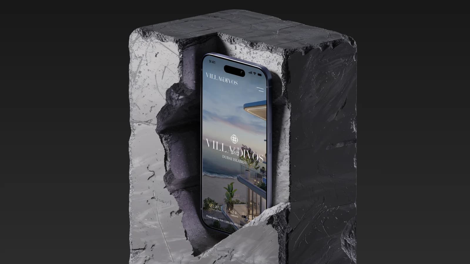
A website for a Dubai Islands residence: completion date, apartment formats and starting price on the first screen.
View case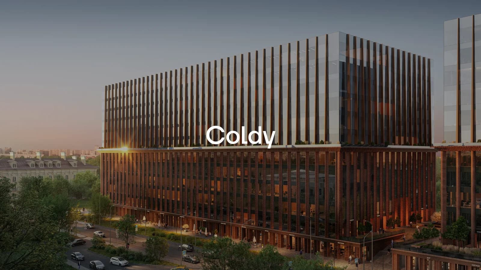
A UX/UI audit of a private residential club developer’s website and the team’s internal materials.
View case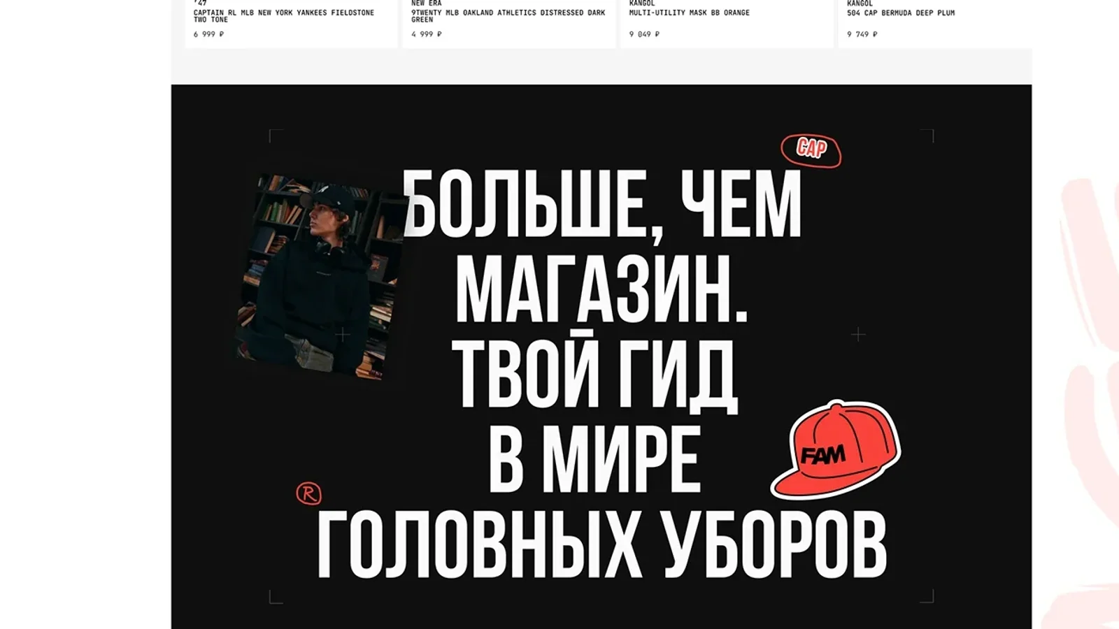
Rebuilt a headwear store on its existing product database: a new catalogue structure and the brand’s character on the storefront.
View case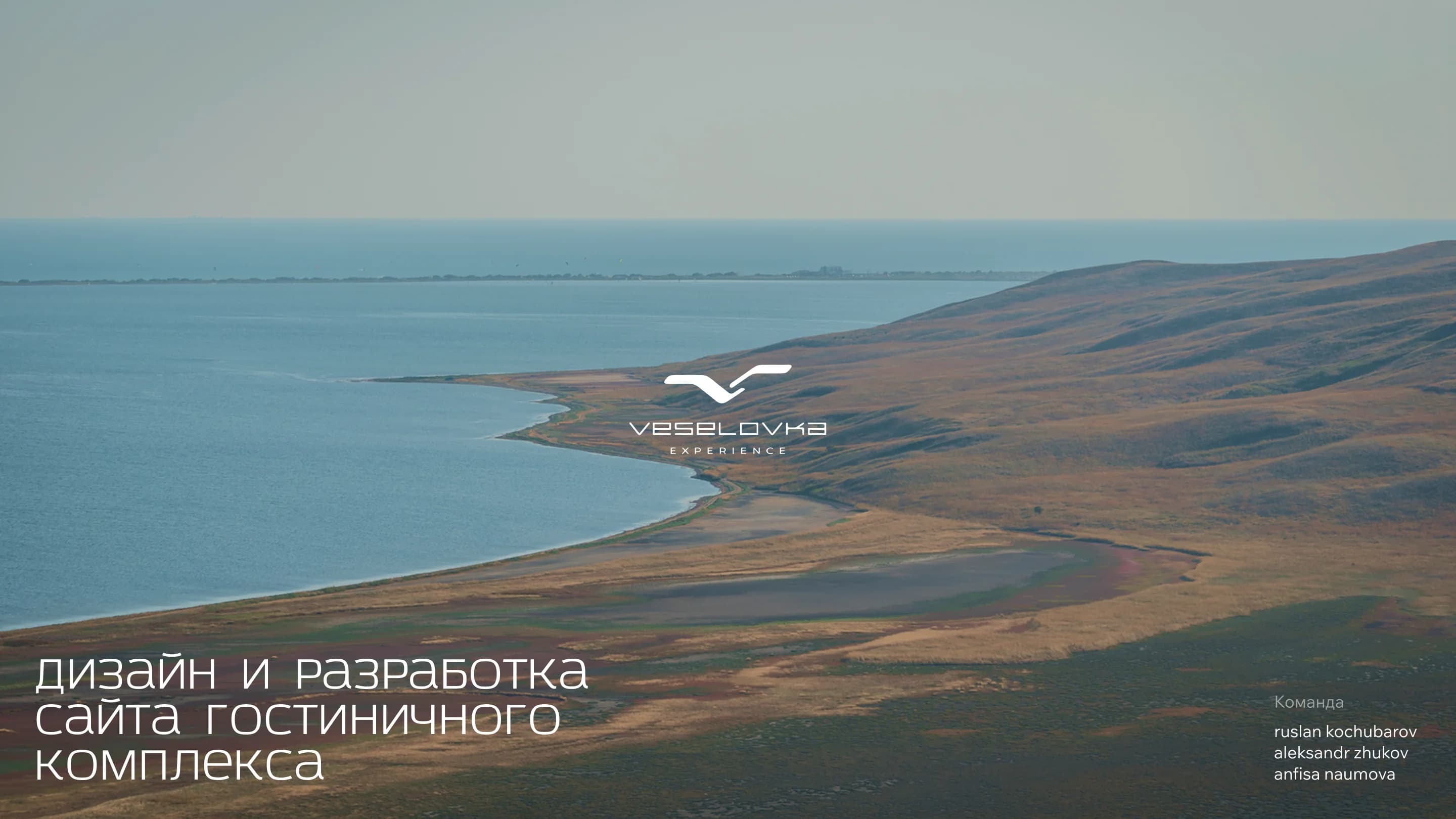
A website for a Black Sea hotel complex, with room booking and a section on the resort’s active-leisure grounds.
View case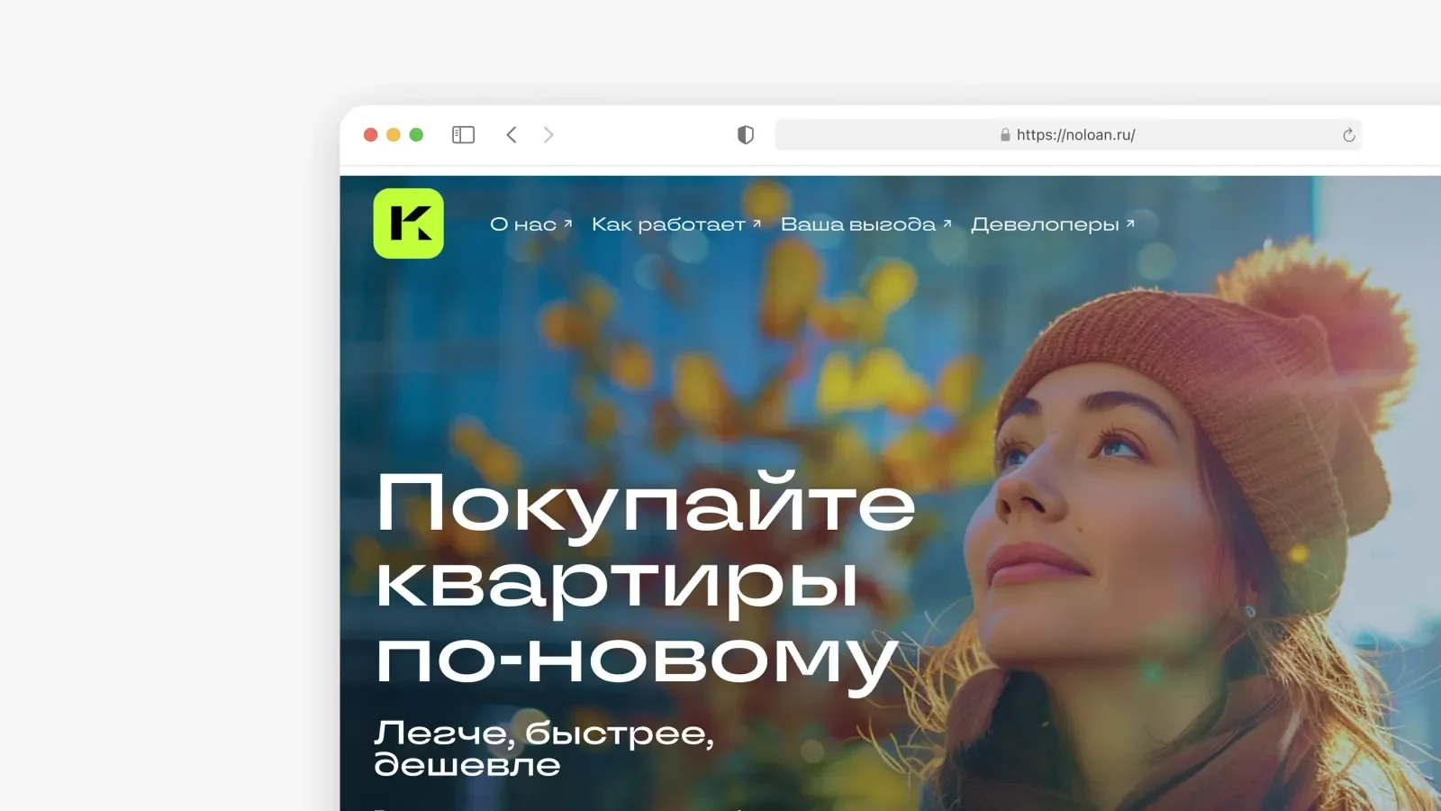
A website and personal account for buying property by the square meter, without a mortgage, via digital financial assets.
View case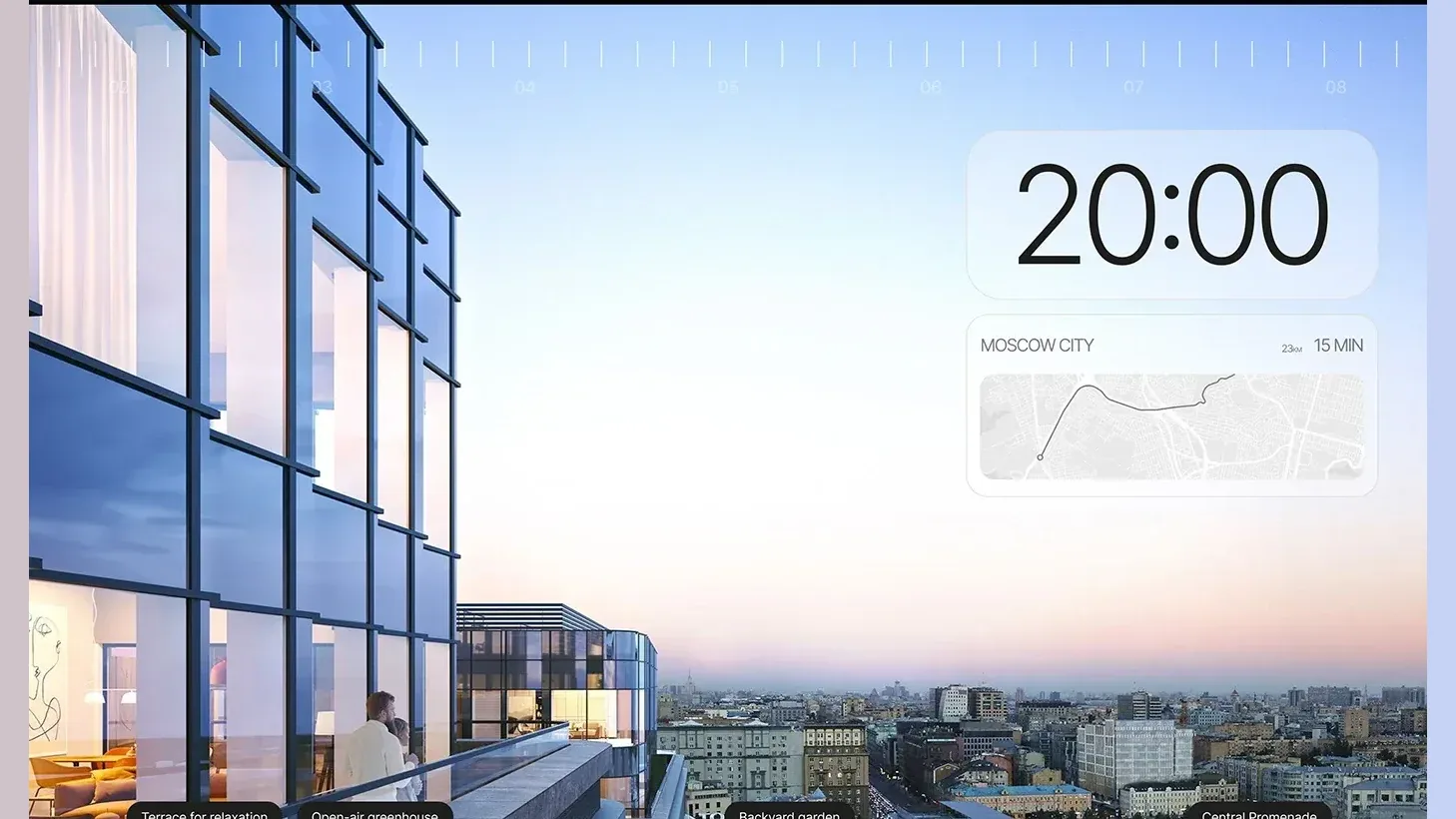
A premium-class multifunctional business centre in central Moscow: a metaphor, interfaces and a website on Tilda, delivered in 25 days.
View case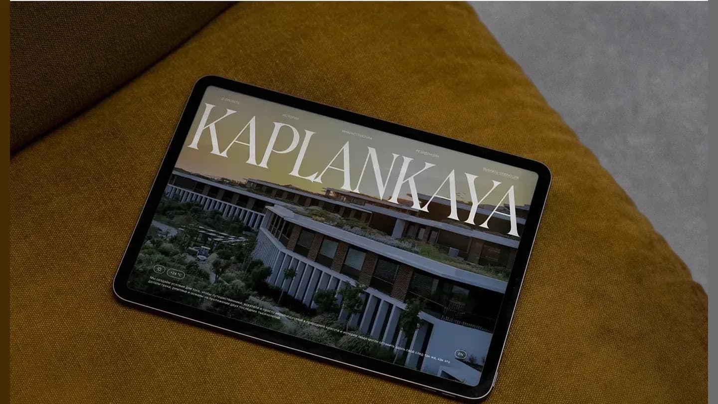
A multilingual landing page for a premium resort on the Turkish coast, built around the history of the place.
View case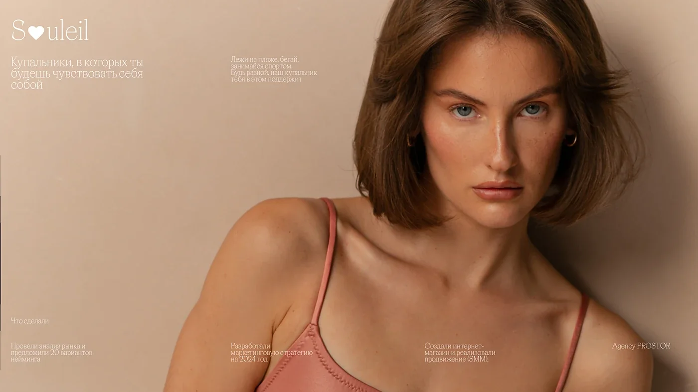
Swimwear store design on Tilda, naming and a social media launch for the brand.
View case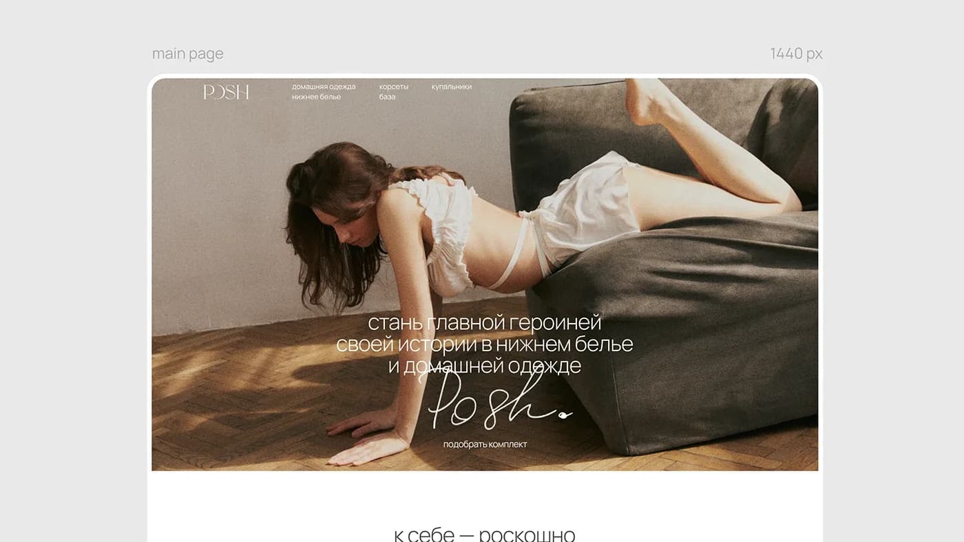
Brand language and a Tilda store for handmade lingerie: a handwritten mark and custom illustrations.
View case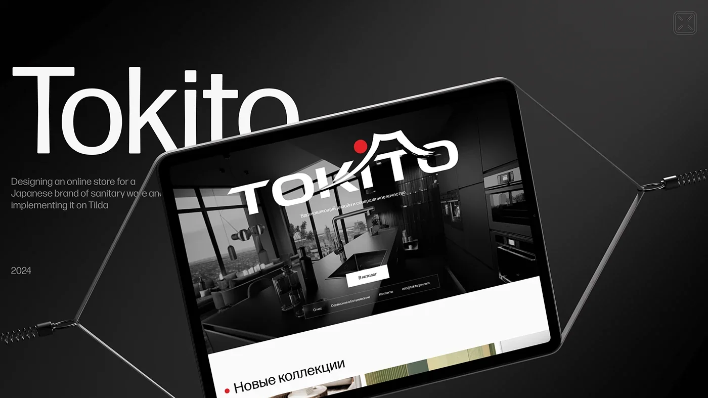
A sales catalogue site for a Japanese sanitary ware brand, with a collection filter built for distributors.
View case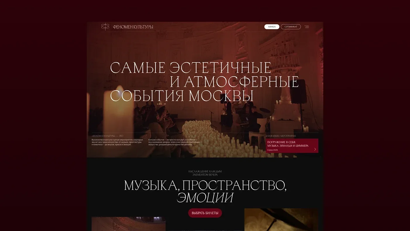
A website for a premium Moscow cultural events listing: the atmosphere of the evenings built into the interface, a flexible events system and a custom admin panel.
View case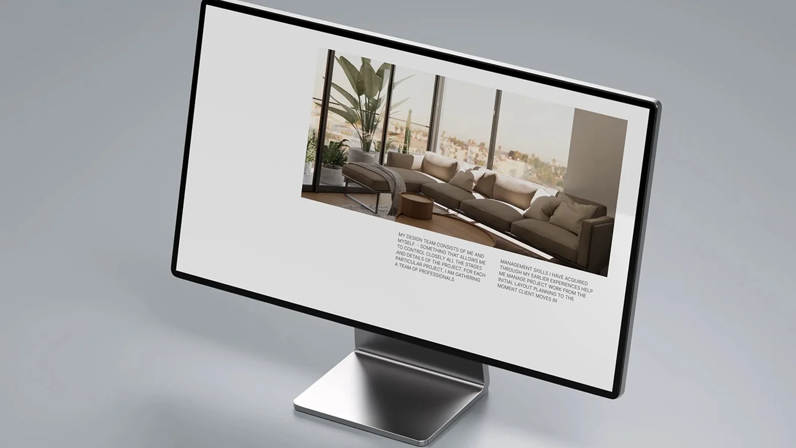
A website redesign for a Tel Aviv interior design studio: the portfolio as the visual centerpiece and an unconventional grid.
View case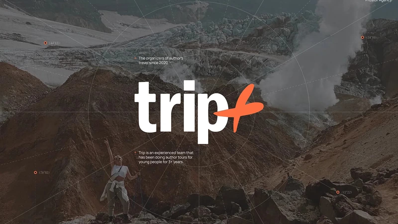
A website for a curated-travel club: a discovery metaphor carried through the whole structure, from the homepage to tour cards.
View case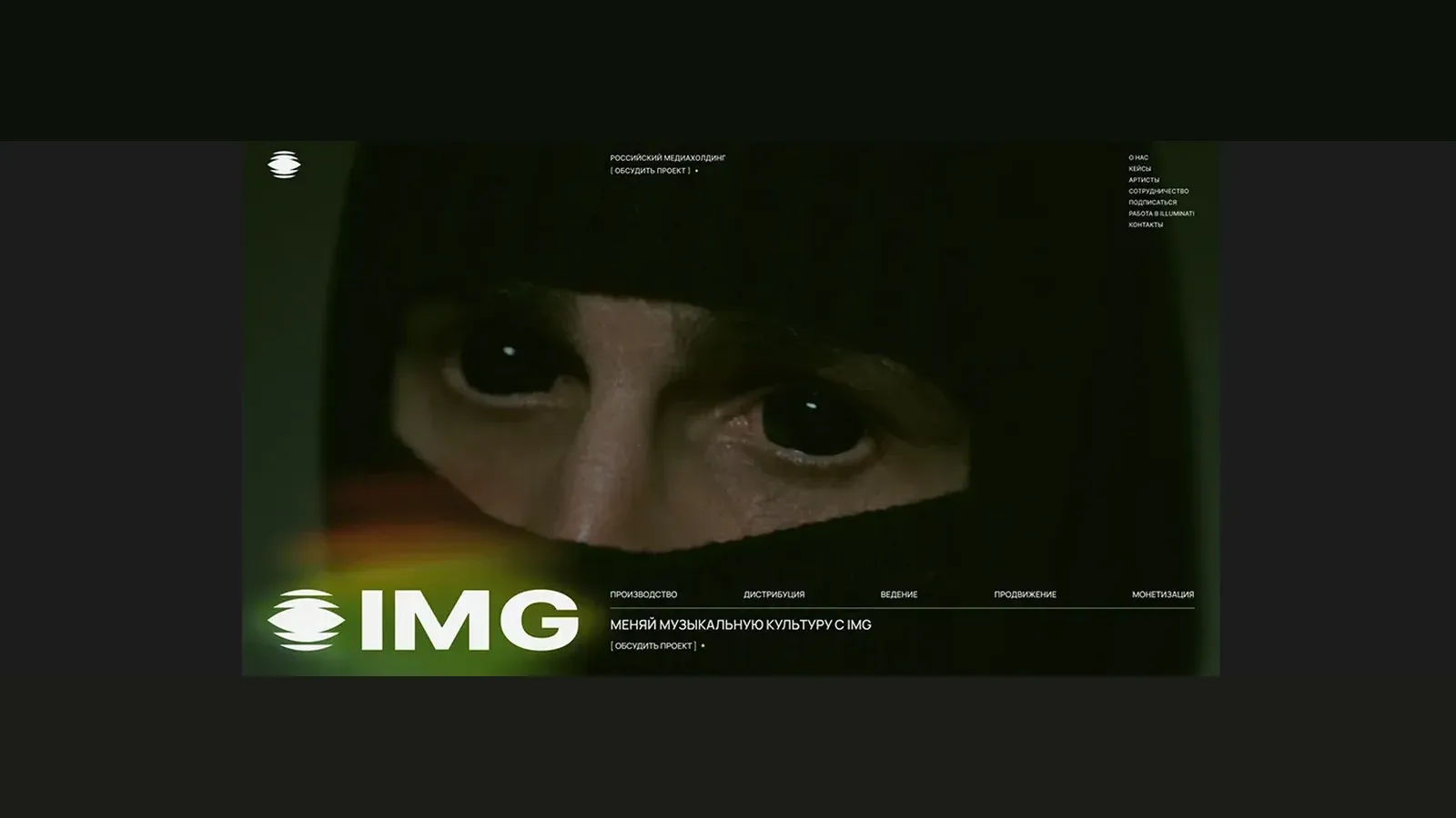
A website redesign for a music media holding: bold accent style and structure showing the full service cycle.
View case
Redesign of an endowment-fund platform: three concepts and a new visual language.
View case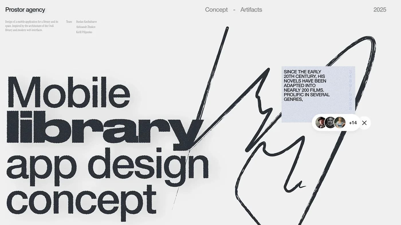
A concept mobile app for a library: screens and artifacts inspired by the architecture of Oodi.
View case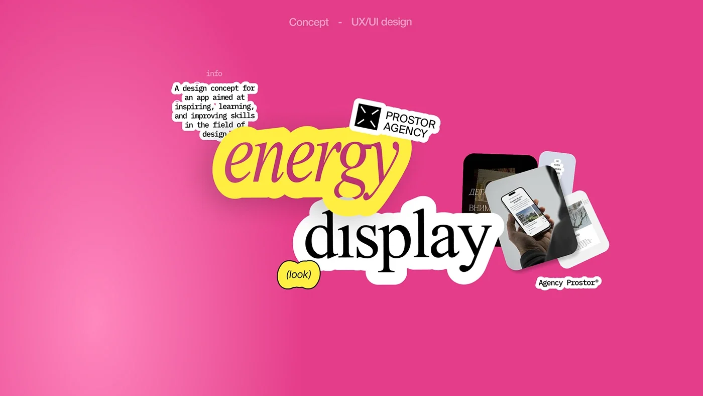
A concept app about inspiration and growth in design — the studio’s own initiative.
View case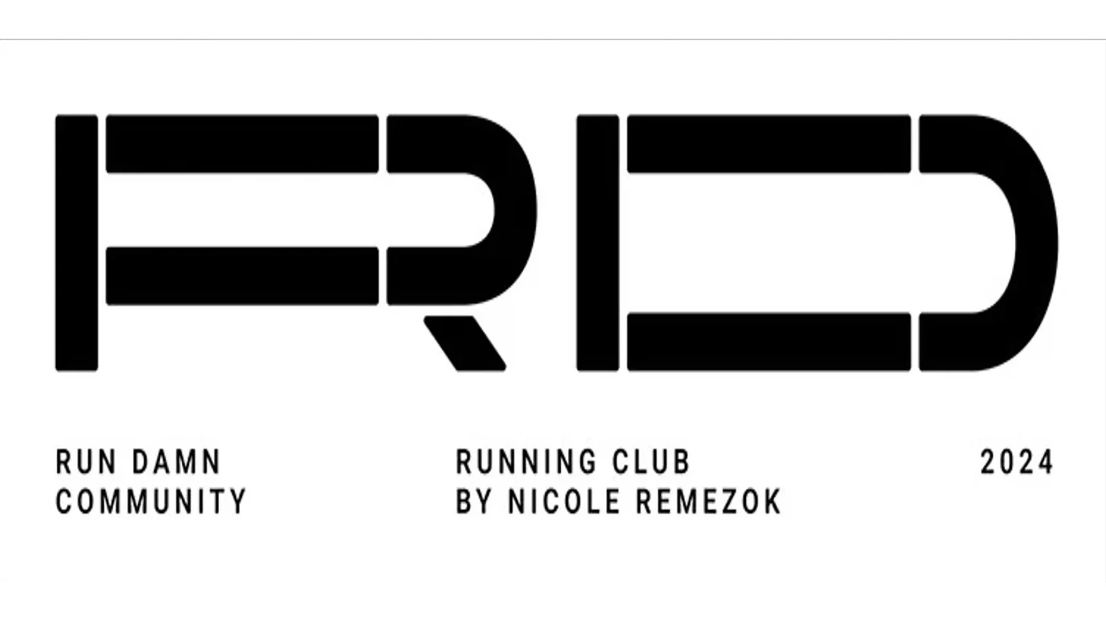
A logo and identity for a Moscow running community: a counterform stencil mark and a type system built on Patrona Plain.
View case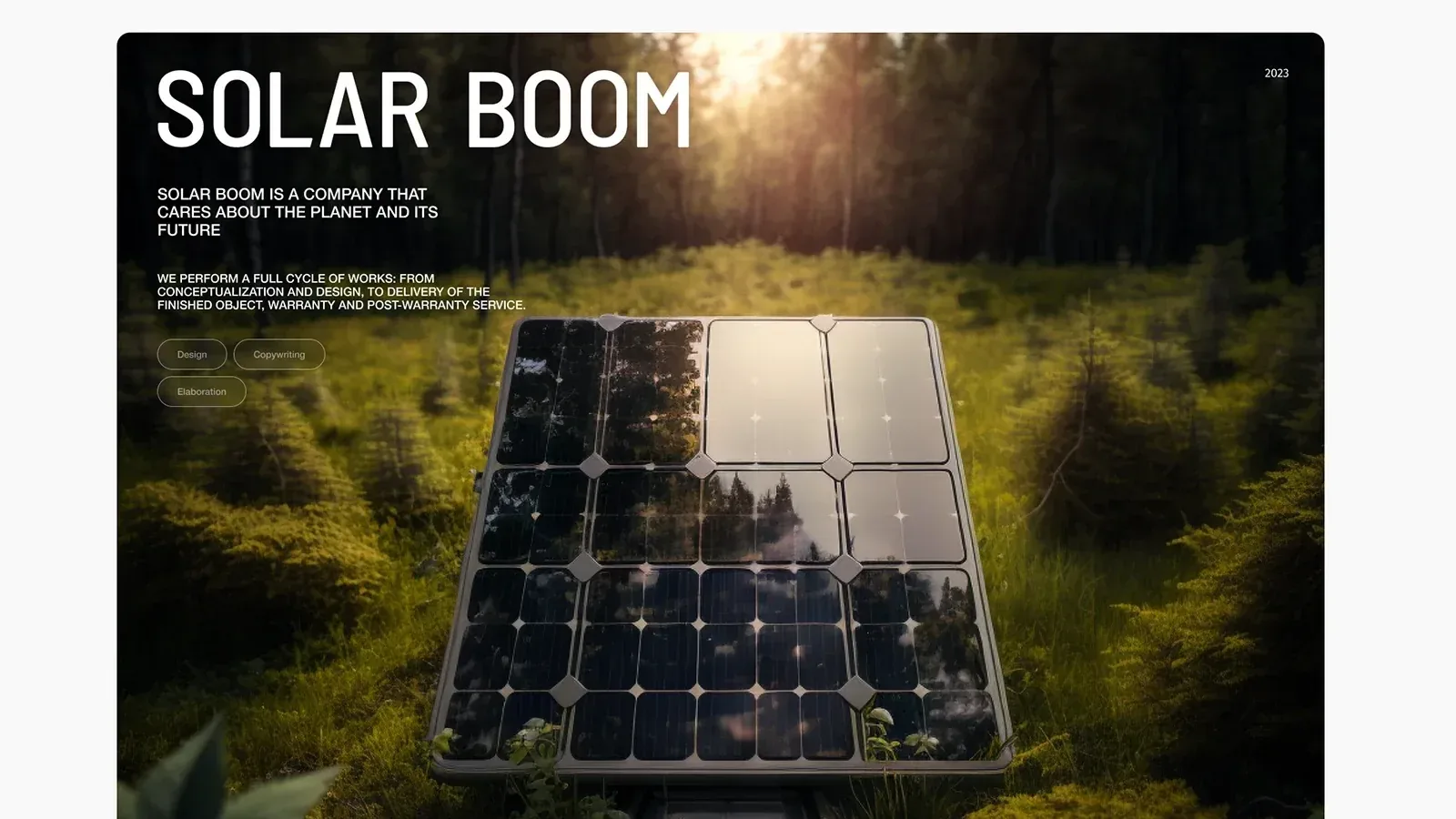
An online store for renewable energy equipment: an idea built on the shape of a solar cell, a calculator, copy and illustrations.
View case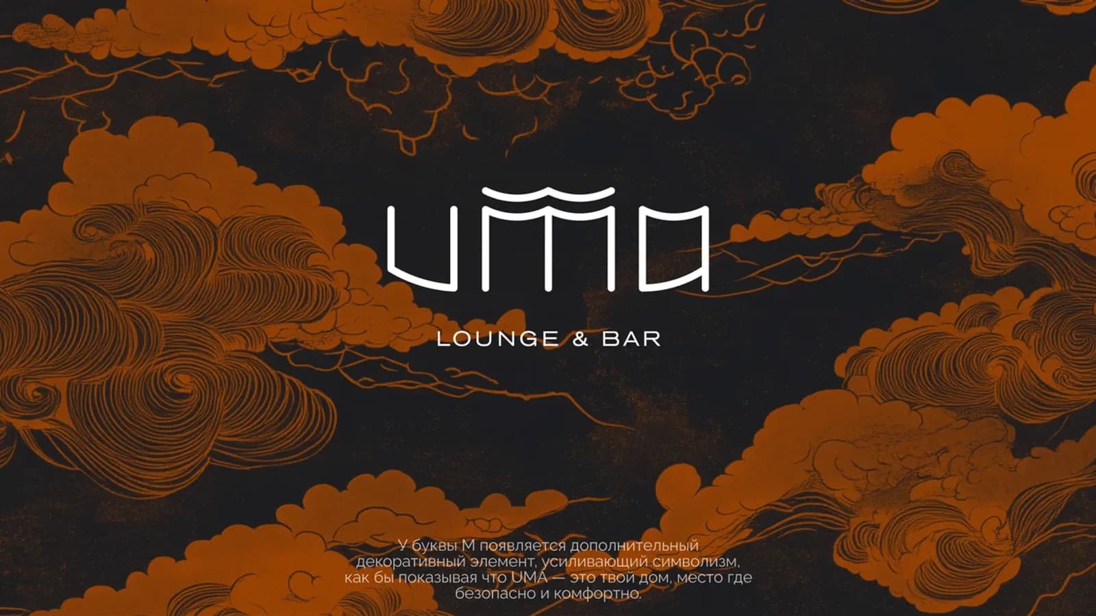
Identity for a hookah lounge by the Patriarch Ponds, blending European and Asian mythology.
View case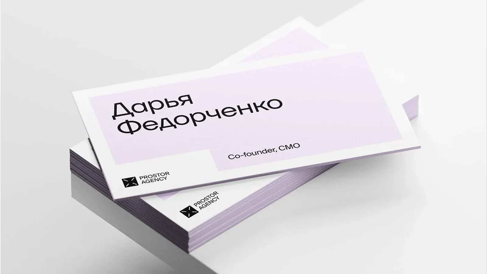
Prostor’s own rebrand — a rethought mark, a palette and the agency’s brandbook.
View case