The task
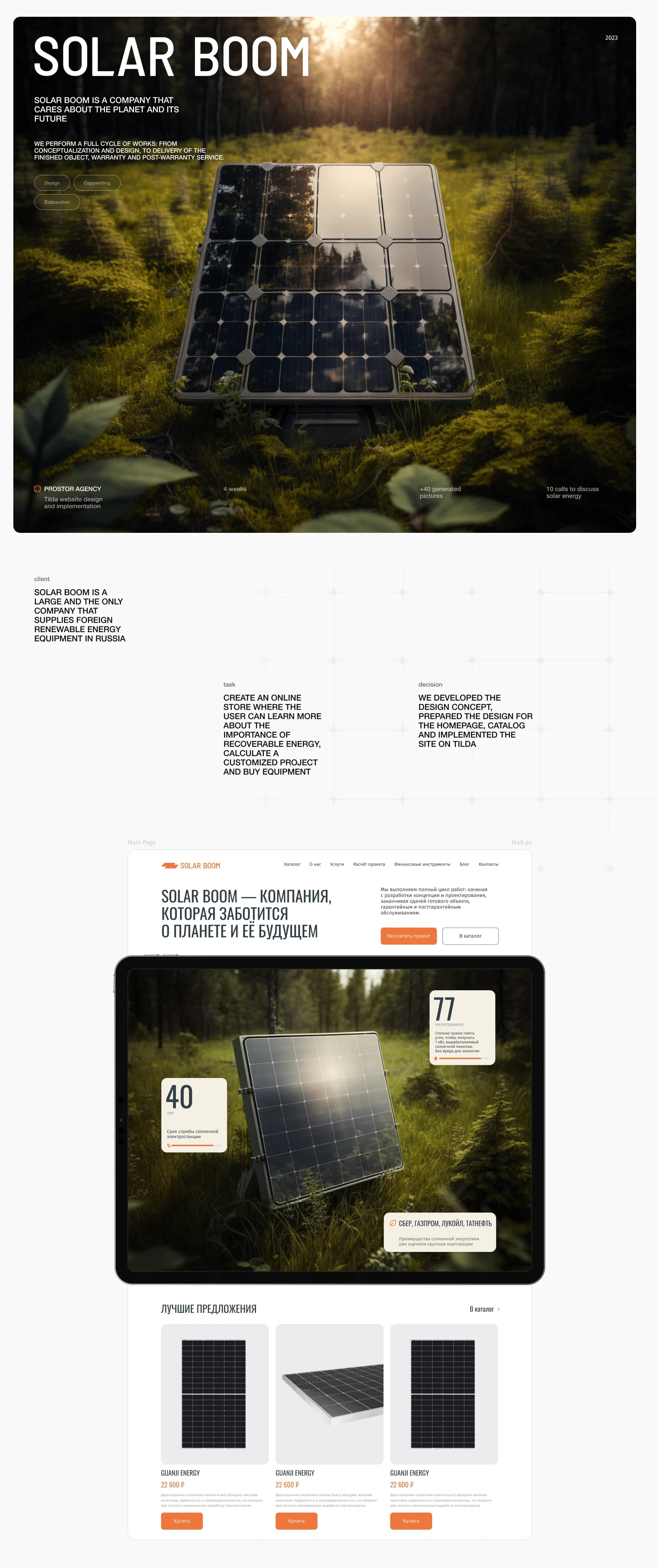
Solar Boom is a large company supplying foreign renewable energy equipment in Russia. It works a full cycle: from conceptualisation and design through to delivery of the finished object, warranty and post-warranty service.
The brief was stated plainly: create an online store where a user can learn more about the importance of renewable energy, calculate a customised project and buy equipment.
Those three verbs — learn, calculate, buy — are the difficulty. An equipment catalogue and an explanatory section live by different rules, and between them sits the calculation, without which nobody knows how many panels they need or when it pays back.
The solution
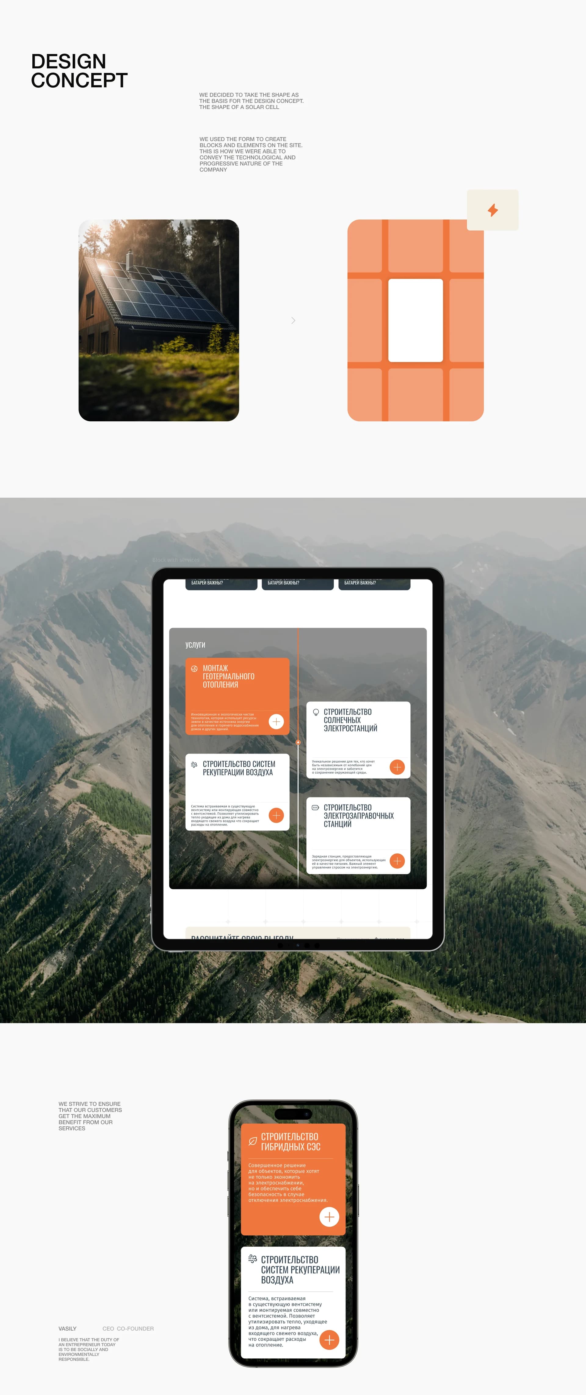
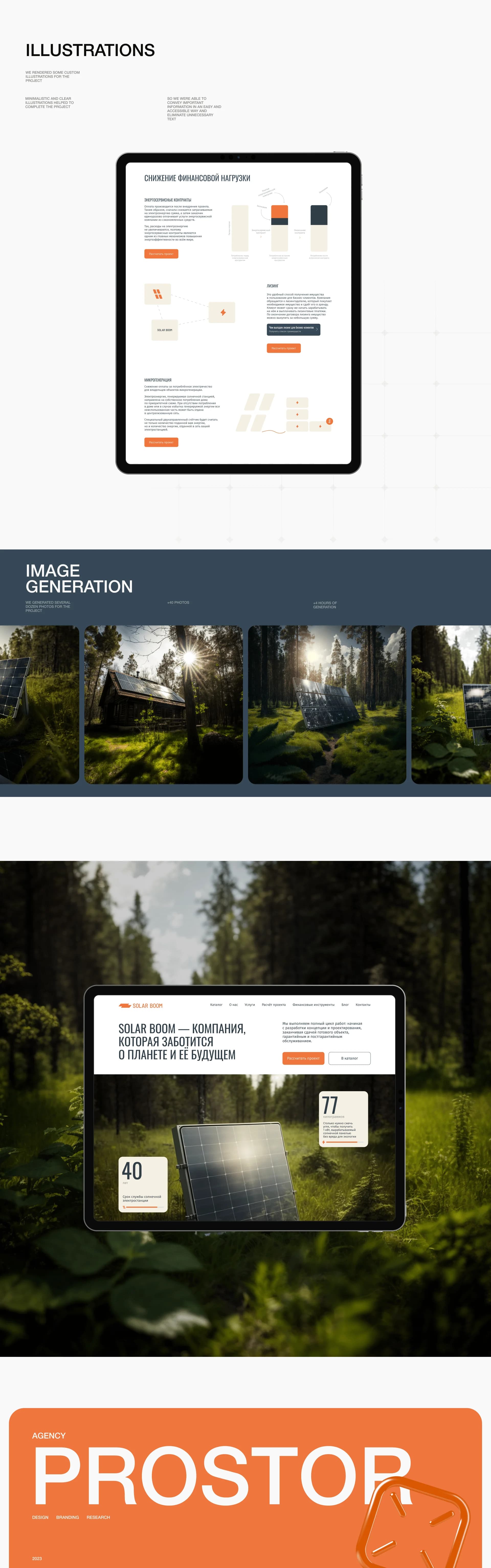
We decided to take a shape as the basis for the design concept: the shape of a solar cell. We used that form to create the blocks and elements on the site, conveying the technological and progressive nature of the company — the page grid literally repeats the grid of a panel.
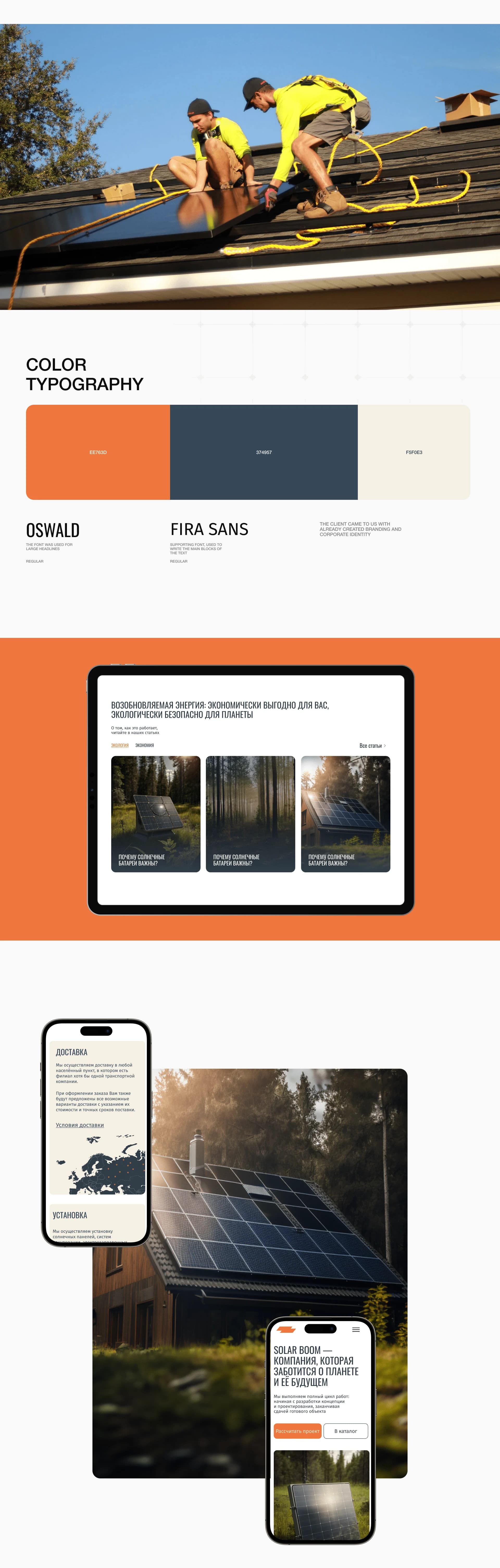
The client arrived with branding and a corporate identity already in place, so the palette stayed theirs: orange #EE763D, slate blue #374957 and cream #F5F0E3. The typography pairs Oswald for headlines with Fira Sans for text: the condensed face gives density, the workhorse gives legibility across long descriptions.
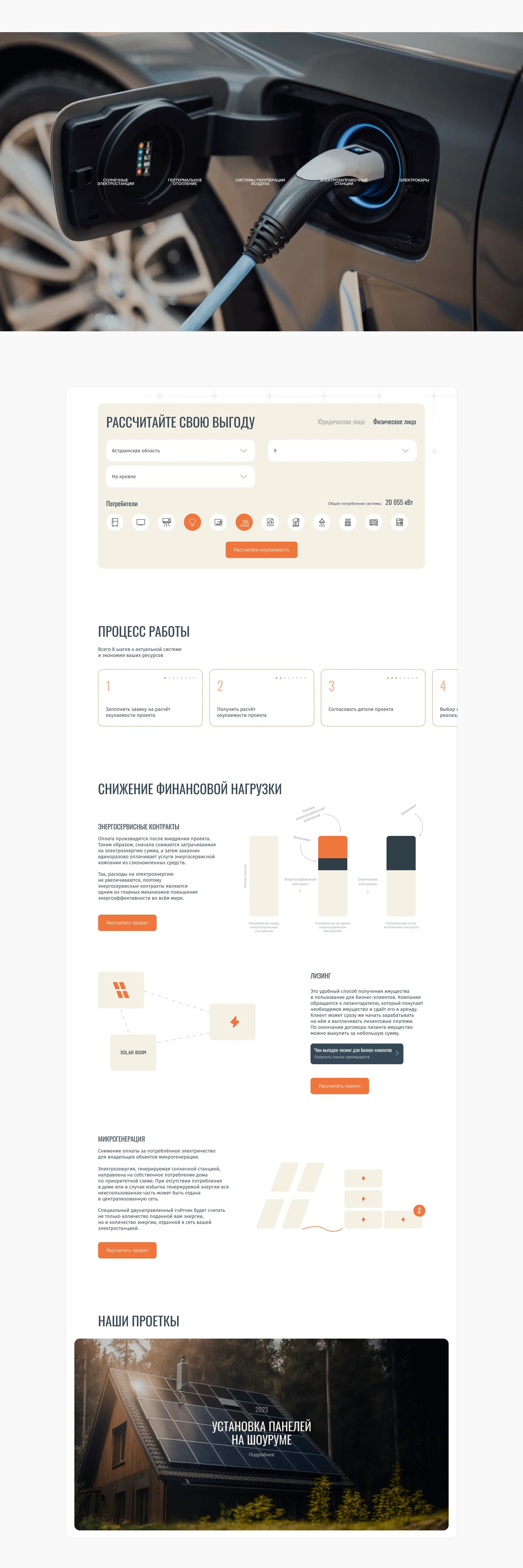
For the harder subjects we drew our own minimal illustrations: energy service contracts, leasing and microgeneration cannot be photographed, and we took solid text to be the wrong answer for them.
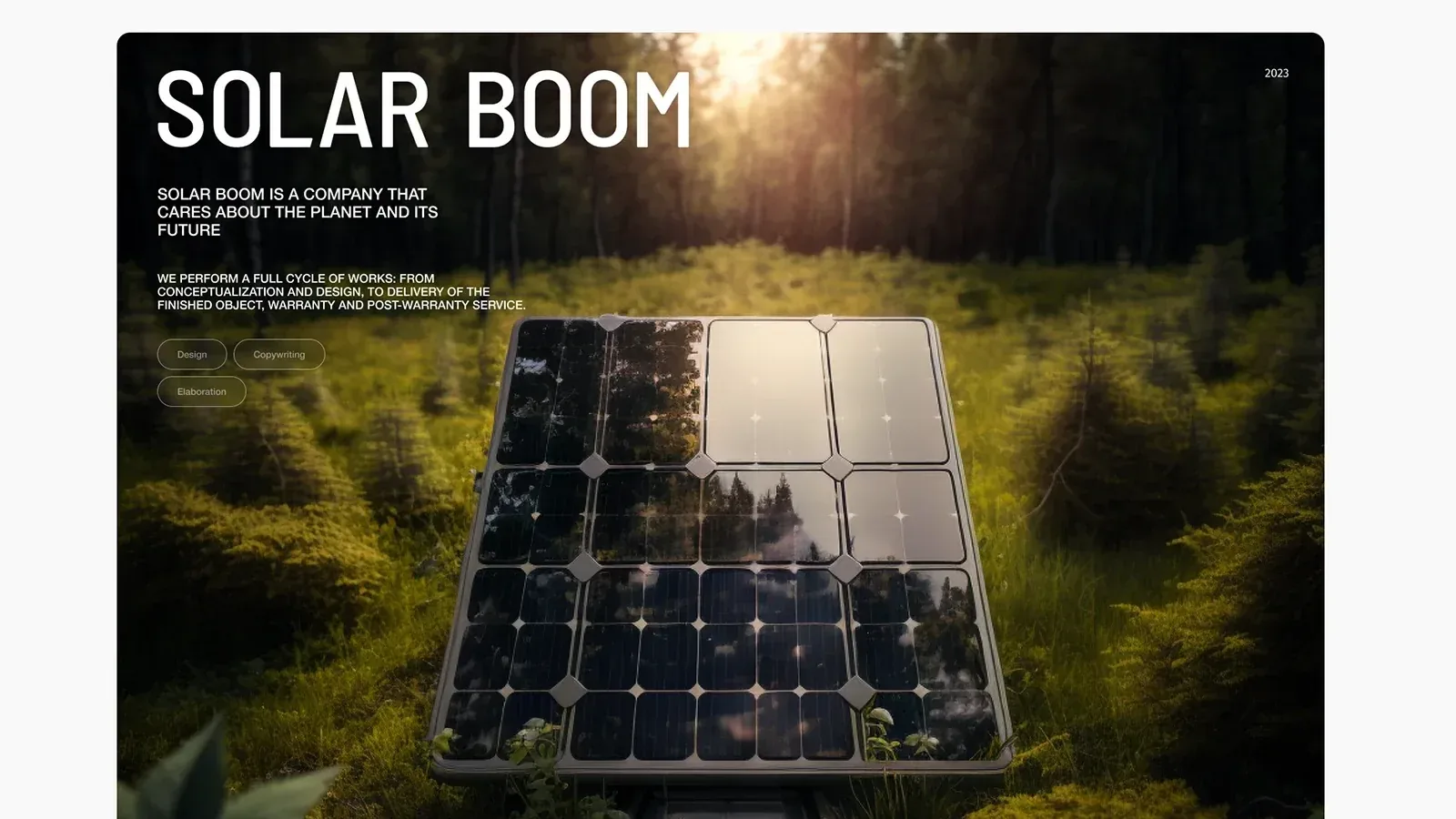
The photographic layer was produced through image generation: more than 40 frames and over four hours of generation — panels in forests, on roofs and in natural settings.
What we did
Design concept. A visual language built on the shape of a solar cell, and the modular grid derived from it.
Home page and catalogue. A first screen carrying the line about a company that cares for the planet and its future, a best-offers block with panel cards and prices, and a route into the catalogue.
Services block. Geothermal heating installation, construction of solar power plants, construction of air recuperation systems, construction of EV charging stations — as cards that open.
Calculator. A "calculate your benefit" screen: region, tariff, consumption — and a figure for a specific site.
Process. An eight-step scheme — eight steps to an up-to-date system and lower running costs.
"Reducing the financial load". A section on energy service contracts, leasing and microgeneration, carried by our own illustrations instead of walls of text.
Copywriting. Texts for the product sections and for the financial schemes offered to clients.
Delivery and installation. Screens of their own with a map and the terms.
Mobile. Services, catalogue and calculator on a phone.
The result
An online store where a complex product is explained visually: the panel's shape holds the composition, illustration covers the financial schemes, and the calculator moves the conversation from the general to the specific.
The site was designed and implemented on Tilda and runs at solarboom.tilda.ws.
The full breakdown is published on Dprofile and Behance — links below.