The task
UMA Lounge & Bar is a hookah lounge at Patriarch's Ponds in Moscow. The concept is a space that, through its identity, recalls an abode of celestials — a place where gods and people meet.
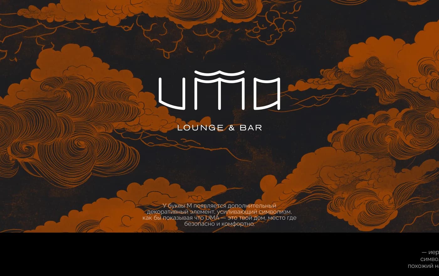
In that space Greco-Roman and Asian gods are brought together, depicted in the style of Japanese woodblock prints. The mixing of European and Asian cultures had to be underlined, and it shows in the patterns used — clouds and mountains.
The mixing is exactly what makes the task hard. What was needed was a single pictorial language in which pantheons from different cultures read as parts of one world rather than as a set of quotations.
The solution
The common denominator turned out to be the technique. Every deity — Greco-Roman and Asian alike — is drawn in the manner of a woodblock print: outline, flat fills, characteristic hatching. The technique levels the figures' origins: they enter one image not as quotations from different cultures but as inhabitants of one sky.
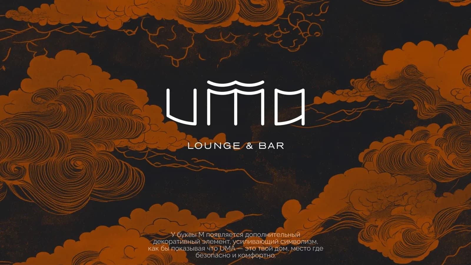
There are two patterns in the system. Clouds and mountains are the conceptual layer, pointing to the mixing of cultures: an orange outline on dark stays recognisable even without the logo. The applied pieces carry the second one — a pattern built from the mark, a bamboo forest.
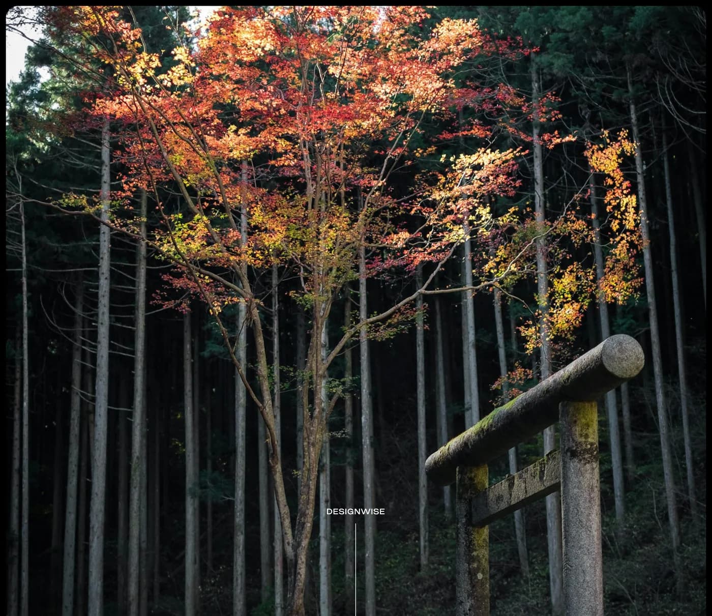
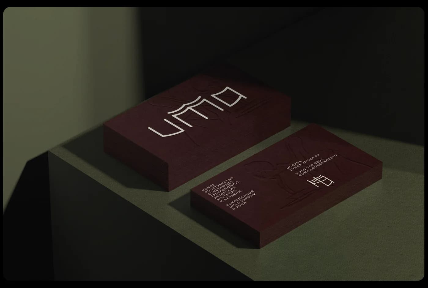
In the UMA mark, the letter M carries an additional decorative element. It strengthens the symbolism and suggests that UMA is your home, a place where it is safe and comfortable. The monogram is assembled from the logo's own symbols: its authors describe it as a character resembling bamboo, and the mark itself is built on a square grid, recalling classical Japanese pagodas.
What we did
Logotype. UMA with the structure above the M and a Lounge & Bar lockup.
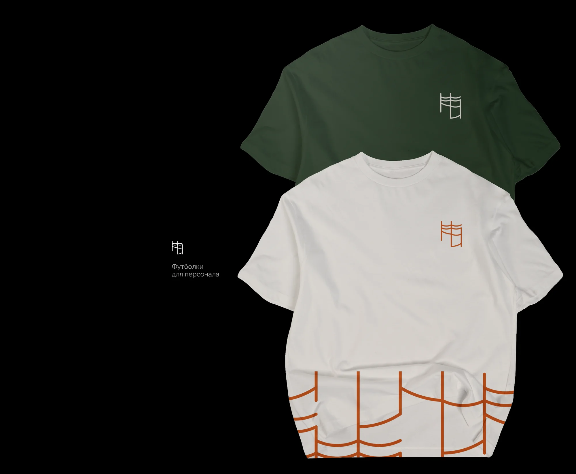
Monogram. A mark built from the logo's symbols, an element in its own right for small applications and merchandise.
Illustration. The deities in the woodblock manner — Greco-Roman and Asian held in one pictorial key.
Patterns. A cloud ornament for the dark grounds of the brand presentation, and a bamboo pattern built from the mark for textiles and packaging.
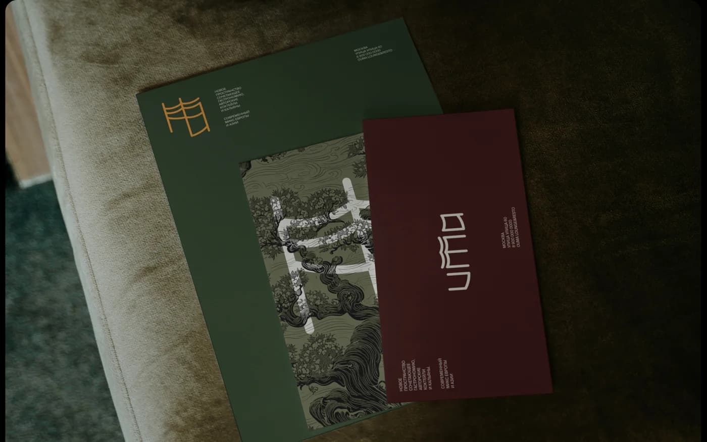
Palette. A dark base, orange as the main accent, deep green and burgundy on the printed pieces.
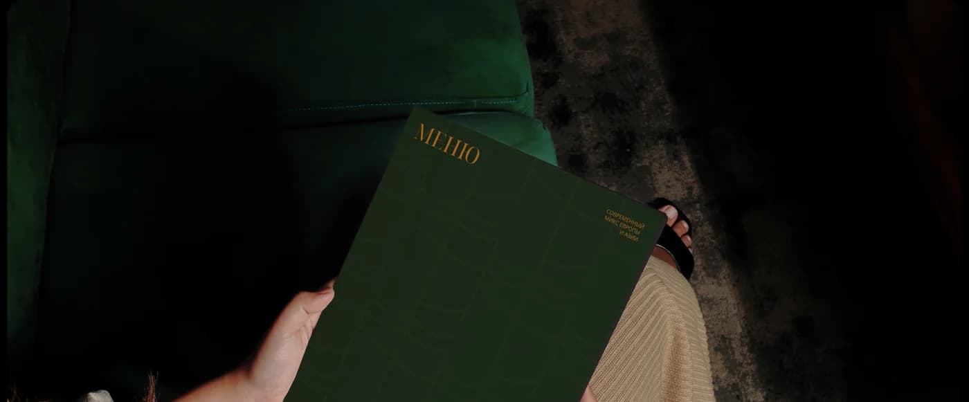
Menu. A green cover with gold and the inside spreads.
Print. Business cards with the mark embossed, a folder and a letterhead in burgundy and green.
Merchandise. Staff t-shirts — green and white, with the mark on the chest and the bamboo pattern along the hem. A kraft bag carrying the monogram.
The result
The place has a visual language that carries its concept: the monogram, the ornaments and the woodblock deities do their work before a guest reads any description of it.
The identity is applied across the whole set — from the sign and the lightbox through to the menu, the packaging and the staff t-shirts.
Prostor worked as part of the project team alongside the DESIGNWISE agency, responsible for part of the identity and illustration work.
The project is published on Dprofile — link below.