The task
The brief read: develop a strategic and visual foundation for the brand that can attract a young audience without relying on product-based USPs.
Those last four words are the whole problem. A cosmetics brand is usually built on what is inside the jar — the percentage of the active, the patented complex, the clinical trial. Our position on that: it is a clear foundation and it is also a trap. Jars on the same shelf make similar promises, telling them apart by formula is hard, and the language of formulas does not work on every audience.
So the brand needed a different foundation. Not what is inside, but how it feels in the hand and in a life.
The solution
We shifted the focus from the product to the user experience, translated the strategy into a cohesive identity and assembled a brand platform whose visual language carries a sense of lightness and flexibility.
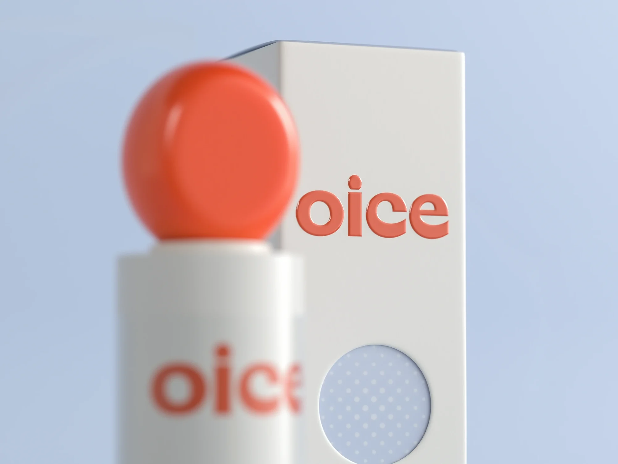
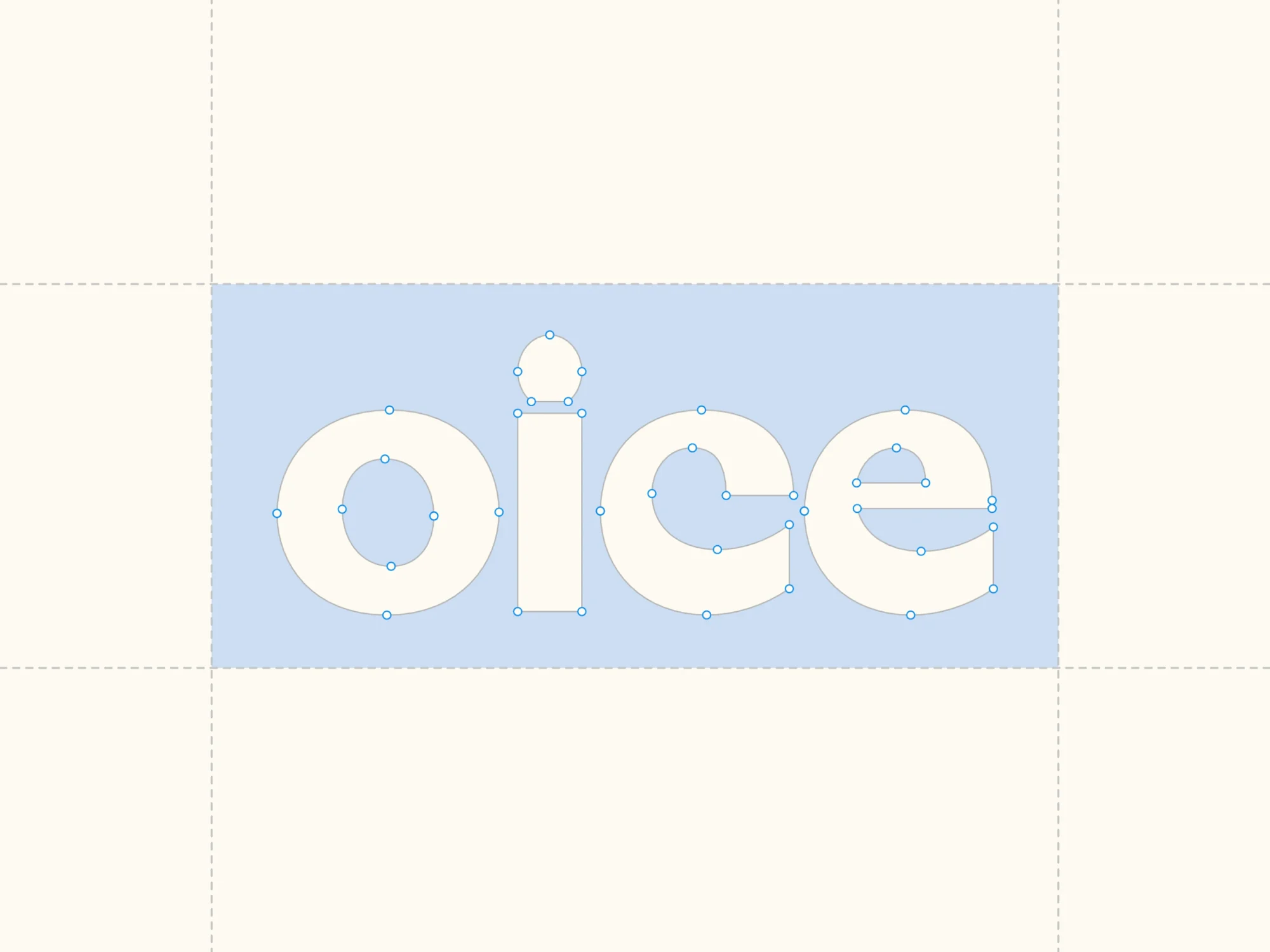
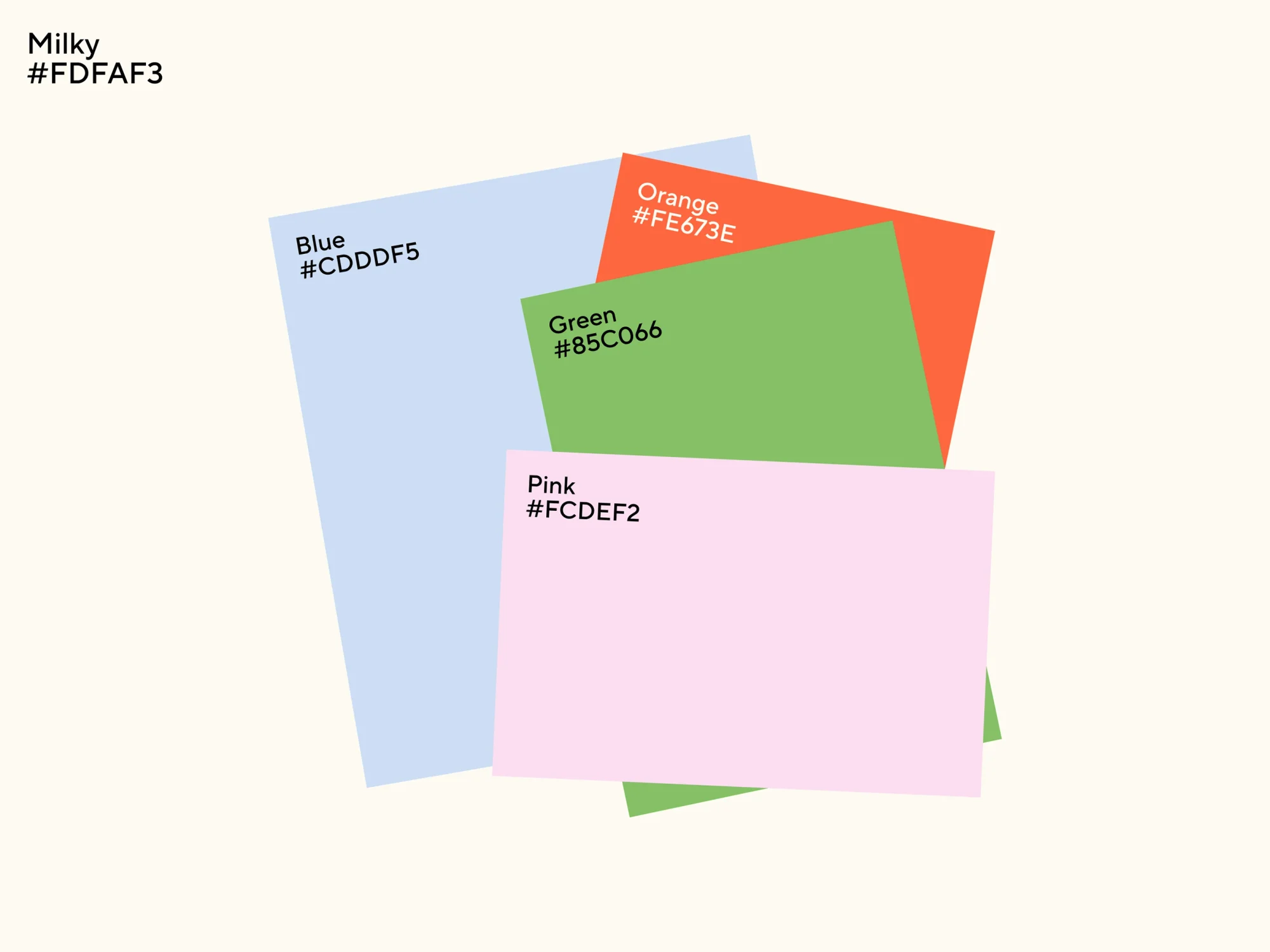
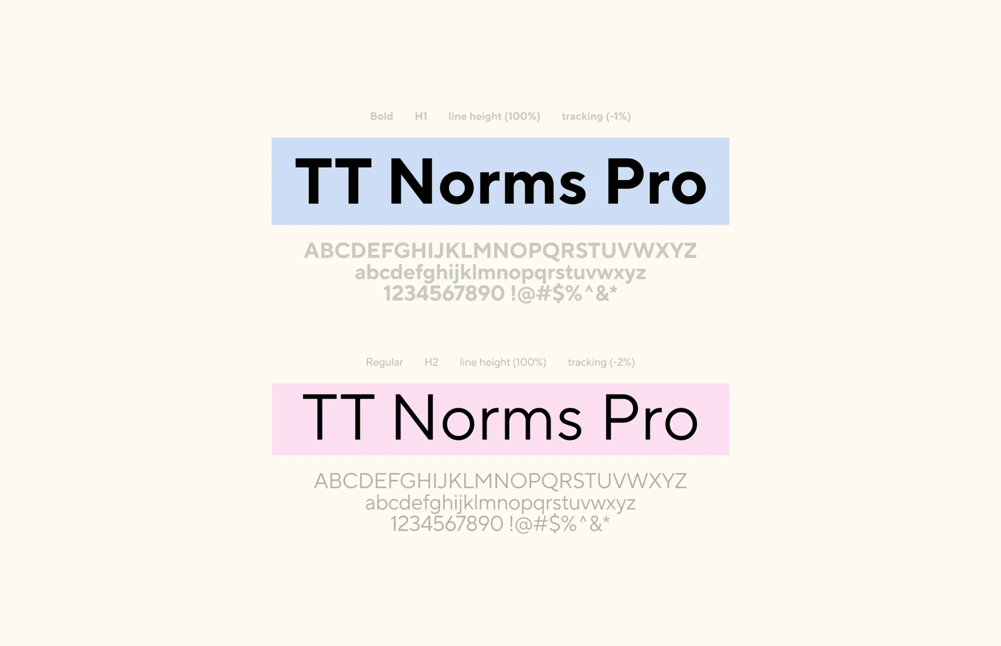
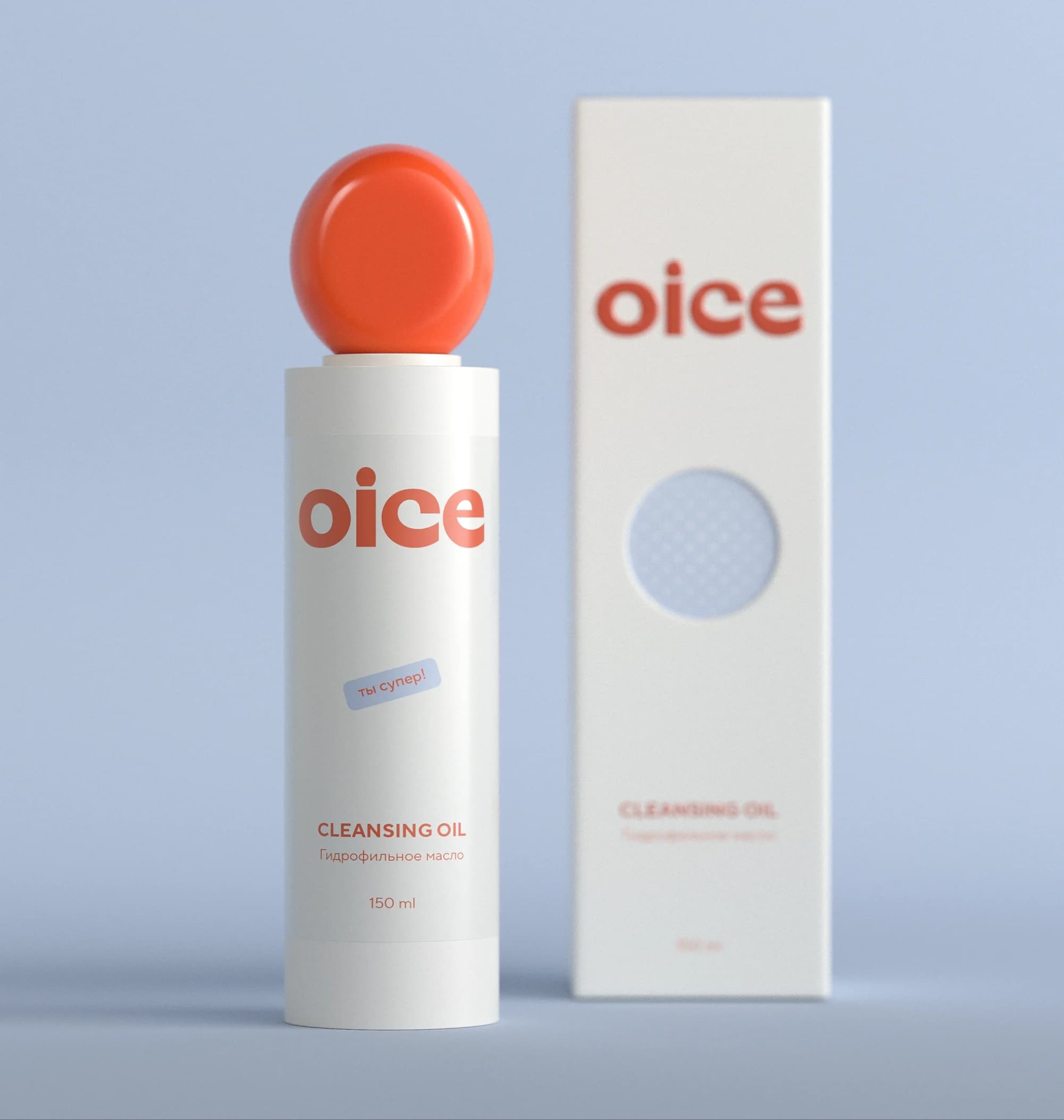
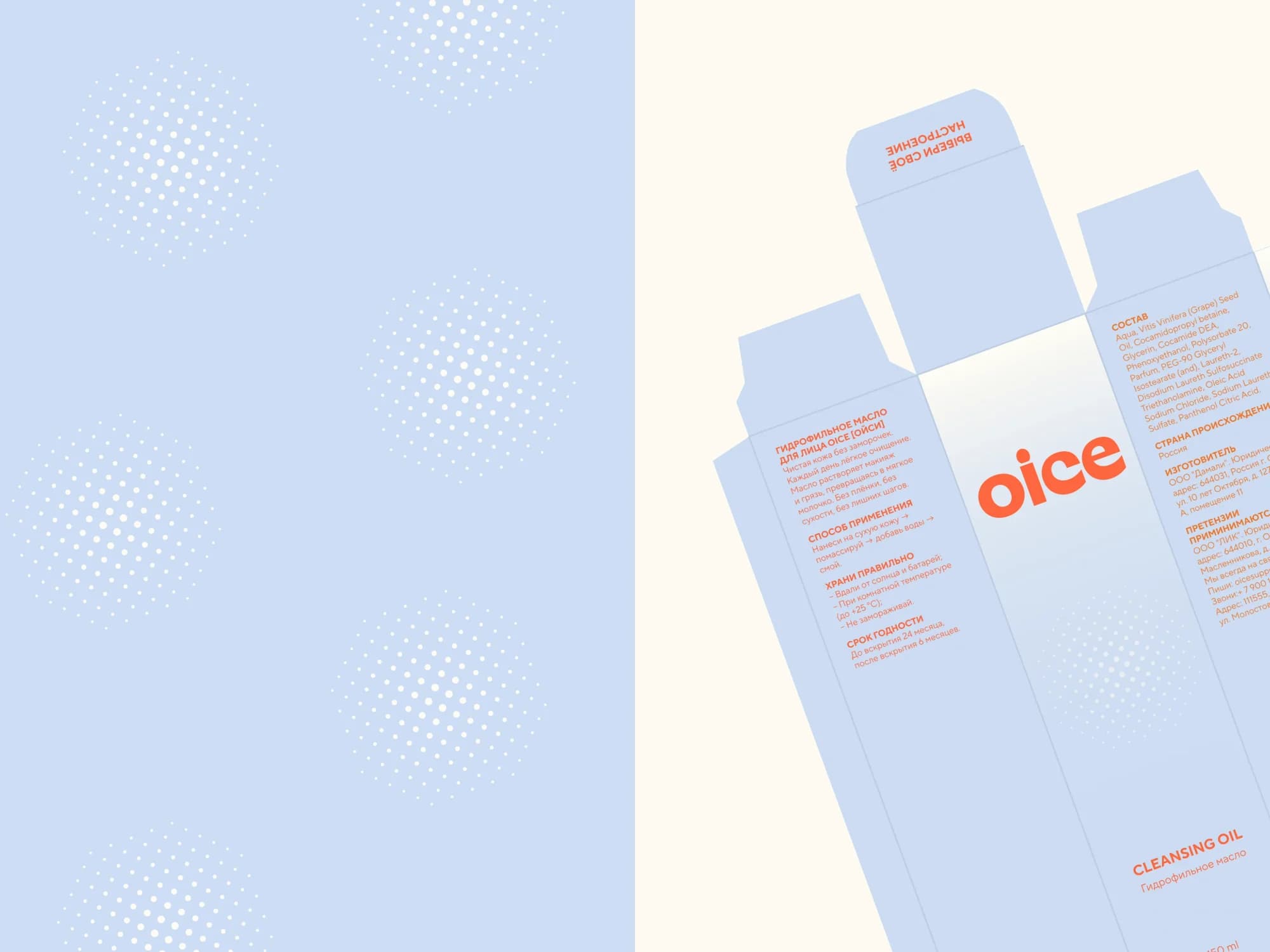
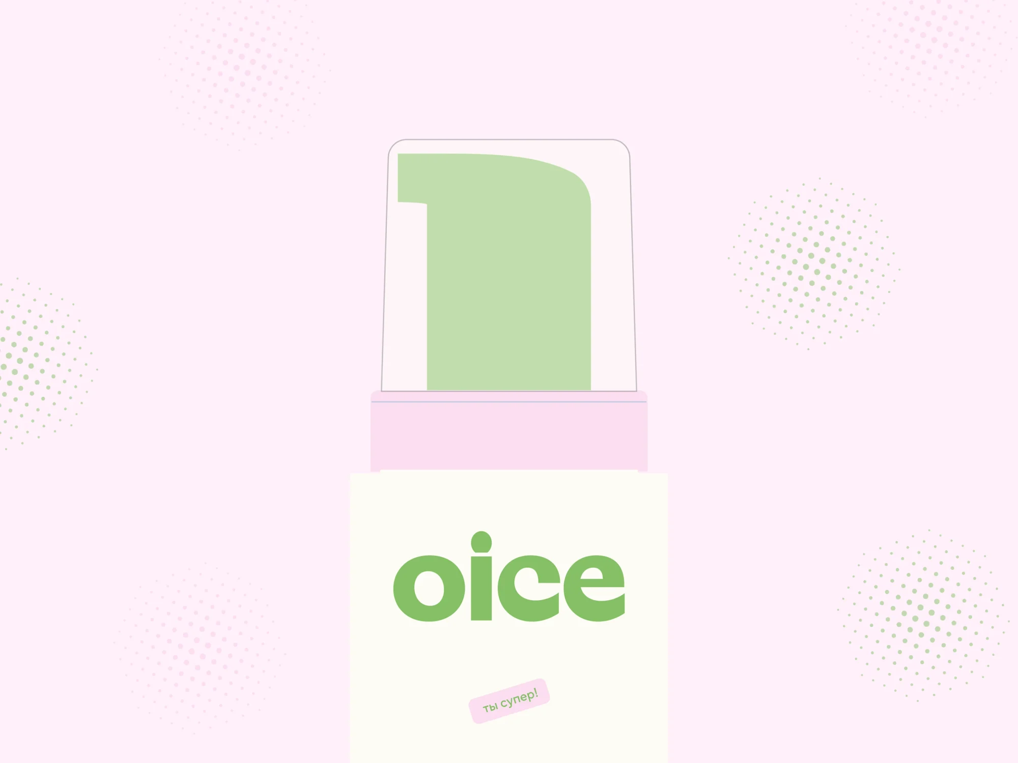
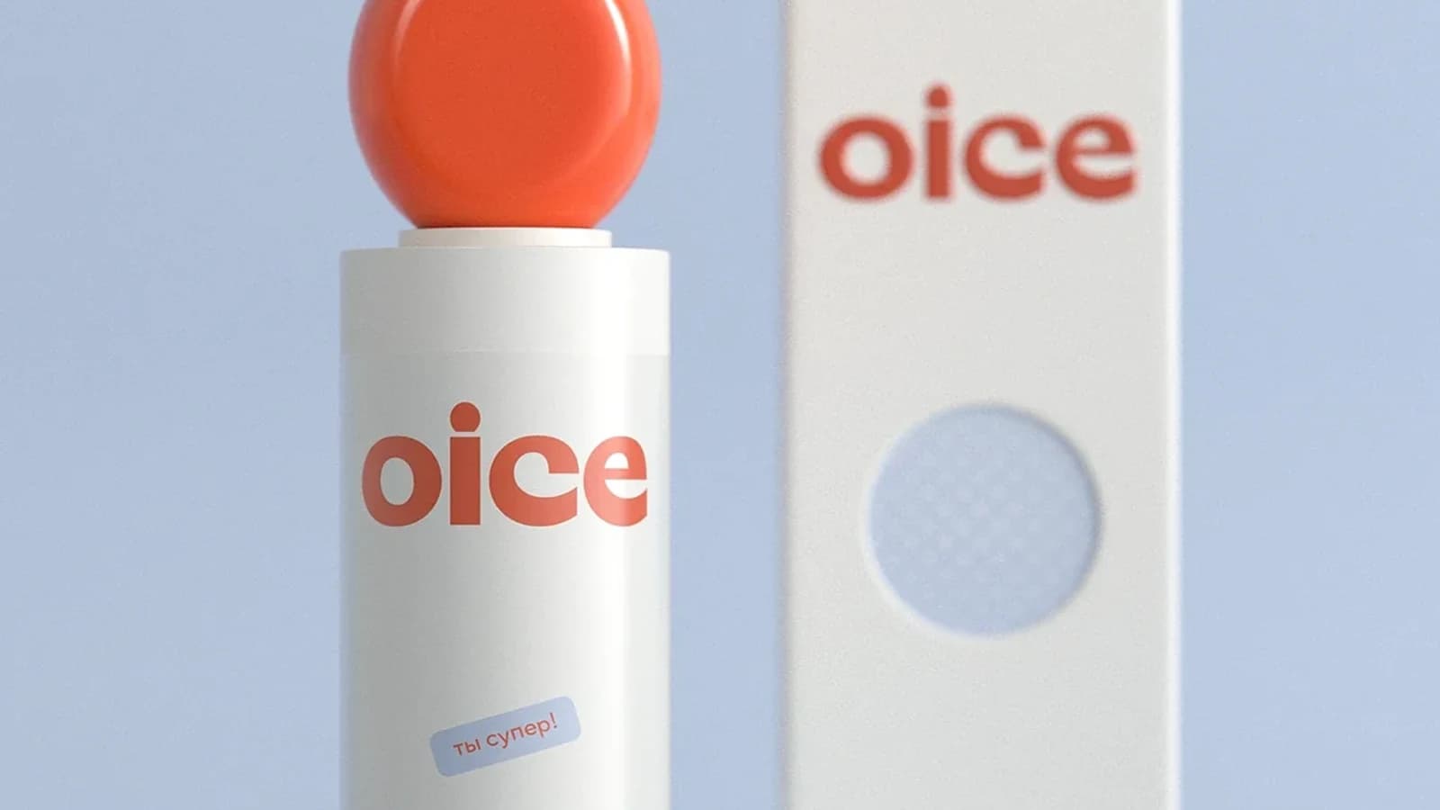
The lightness is built literally. The logo is set in lowercase in a rounded sans — not a sharp form anywhere. The palette runs to five colours: milky #FDFAF3, blue #CDDDF5, green #85C066 and pink #FCDEF2, all muted — plus one saturated orange, #FE673E, which carries all of the brand's brightness. On the cleansing oil it is also the colour of the logo and of the sphere cap. A halftone dot texture adds air where a solid block would usually go. The typeface is TT Norms Pro, neutral and unobtrusive: the character is carried by colour and form, not by the letterforms.
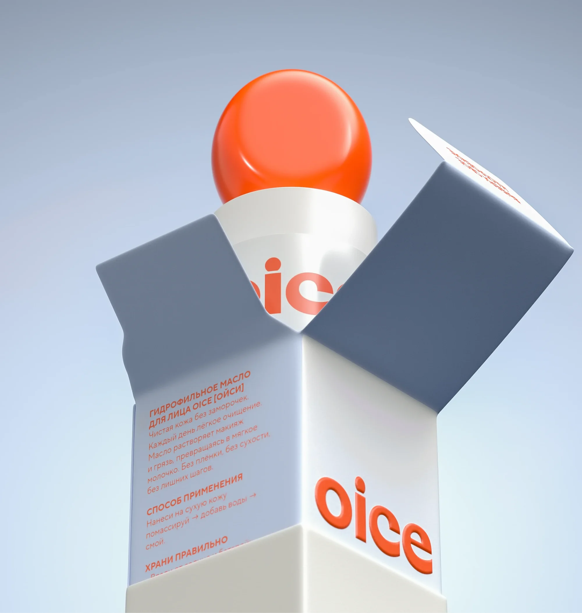
The key move in the packaging is the sphere cap. It reads as a drop and as a toy at once, and it is what makes the bottle recognisable in a frame: shot from any angle, it stays itself.
What we did
Brand platform. The strategic foundation the identity and the packaging are derived from: what lets a range grow without the style drifting.
Identity. Logo, a five-colour palette with fixed codes, the TT Norms Pro weights (Bold for H1, Regular for H2), and the halftone texture as a signature device.
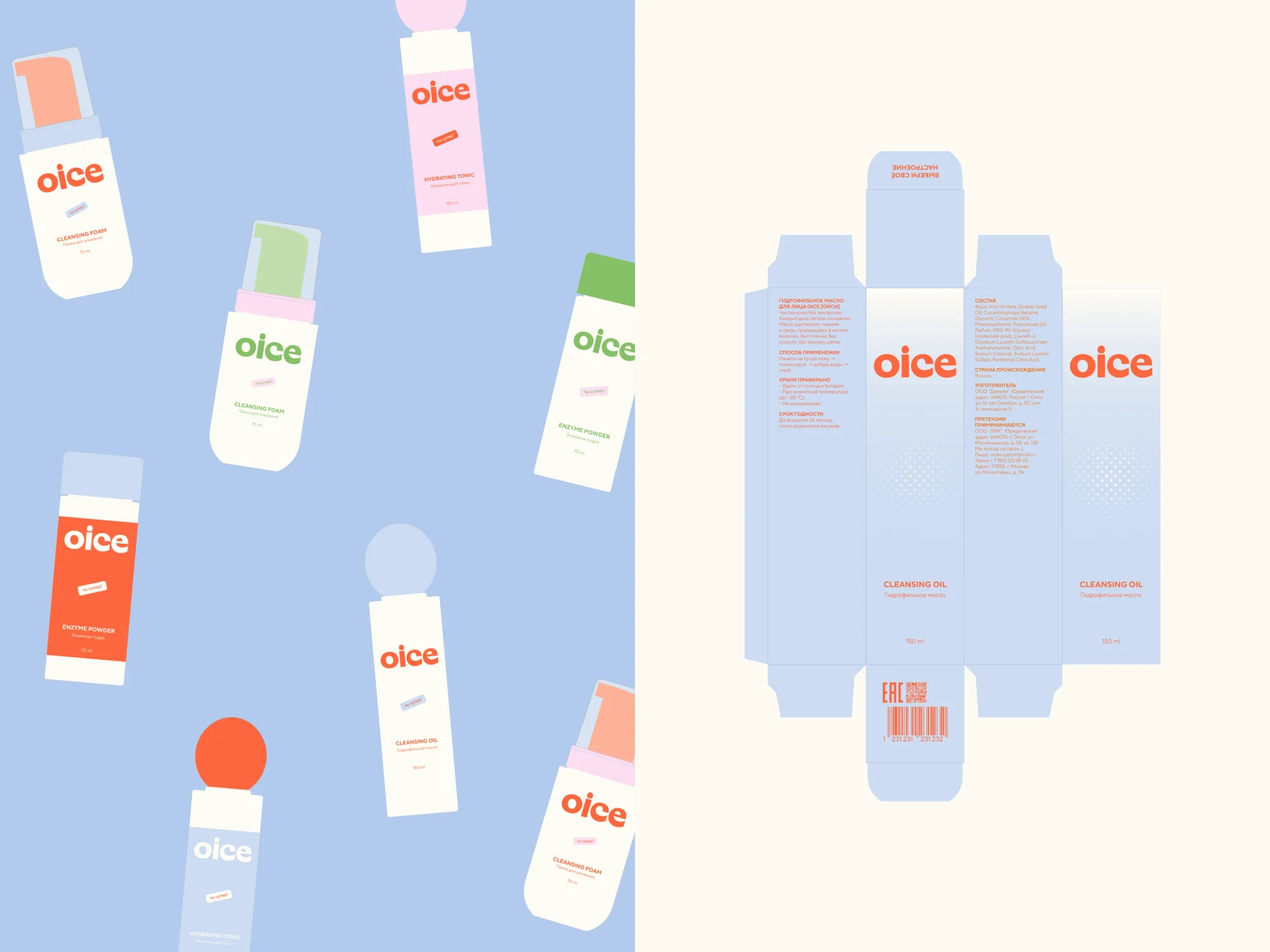
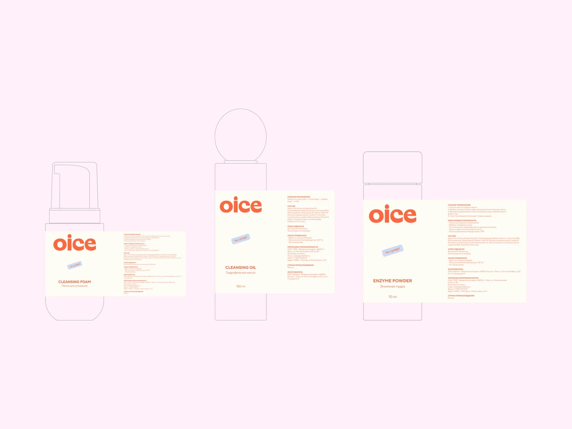
Packaging system. Bottle with a sphere cap, carton, stickers. Colour is free in the system: the same product is assembled in different colourways — bottle, cap and logo all change — while form and texture carry the recognition.
Dielines. Carton nets drawn out before print, with the placement of copy, ingredients, barcode and directions for use.
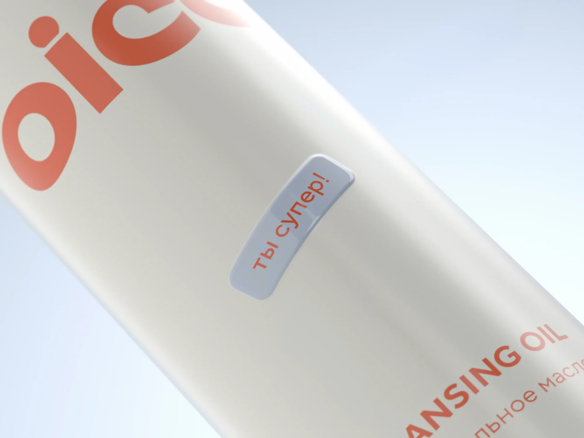
Small things. A "you're great" sticker on the bottle — the shift from formula to person, done in one line.
3D visualisation. The products rendered in the round before the print run, so the packaging can go into a feed and be tested for perception before anything is printed.
The result
The brand now has a foundation that does not depend on what is in the jar: an identity and a platform that work on feeling and need no proof expressed in percentages.
The packaging system is built for two shop windows at once — the shelf and the feed — and stays recognisable in both. New products can enter the range by the platform's rules rather than through a design invented from scratch.
In September 2026 the entry "From strategy to packaging: a cosmetics brand from scratch" won bronze at the G8 Creative Awards in the "Packaging by the rules" nomination (Branding section; ceremony on 11 September at Khlebozavod, Moscow).
The full breakdown is published on Dprofile and Behance — links below.