The task
Work on the agency's own identity. Formally the brief was a rebrand rather than an identity from scratch — Prostor already had a mark. But the brand's meanings, definitions and values had to be developed from nothing: what was never articulated cannot be carried over.
An internal project has no outside client to call it finished. So we ran it as an ordinary client project: with a concept, a brandbook and rules that cannot afterwards be broken on a whim.
The solution
The concept rests on the idea that Prostor is about structure and freedom. Freedom here is understood as internal organisation — freedom through structure.
That idea has a direct graphic consequence. The structure does not occupy the whole surface; it leaves a great deal of air, and it is the air that underlines the freedom while still pointing back to the structural base. Empty space in a layout is not what is left over, it is part of the system.
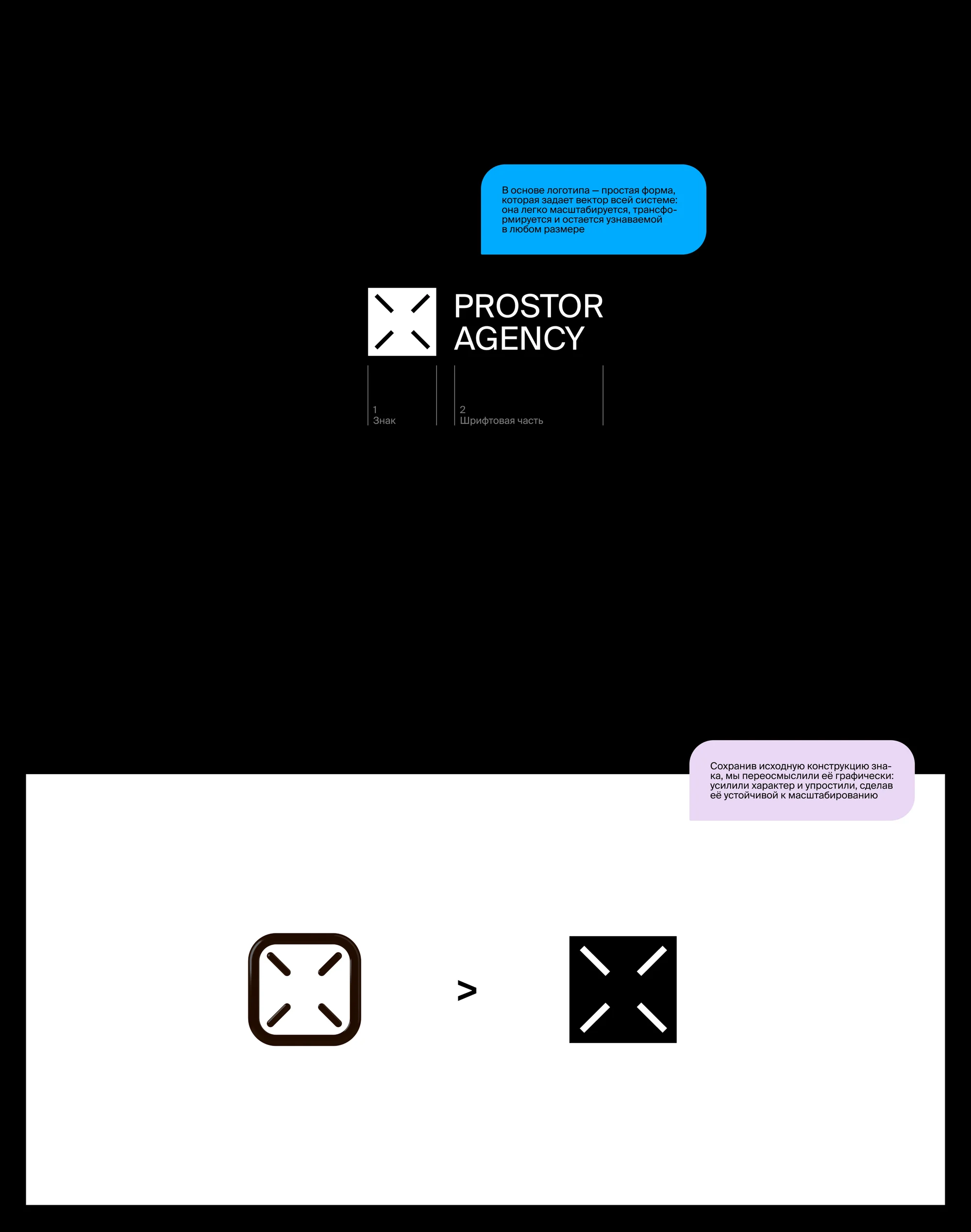
The mark was reworked rather than replaced. The original construction was kept and rethought graphically: its character sharpened and its shape simplified, so it holds up under scaling. What was a rounded outlined square with four inward strokes became a solid black square in which the same cross reads as counterform. At its base is a simple form that sets the vector for the whole system: it scales, it transforms, and it stays recognisable at any size.
The logo has two parts — the mark and the wordmark. The wordmark can be used on its own; both versions are equal in standing, and the choice depends on the task.
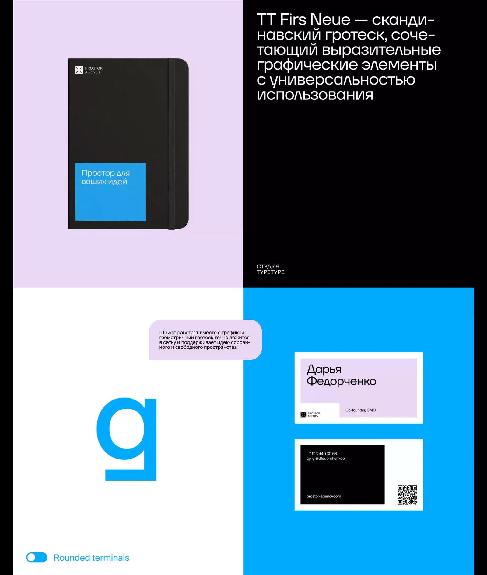
The typeface is TT Firs Neue by TypeType: a Scandinavian sans that combines expressive graphic details with everyday versatility. It was chosen not on taste but on fit with the graphics: a geometric sans sits exactly on the grid and supports the idea of a space that is both ordered and open.
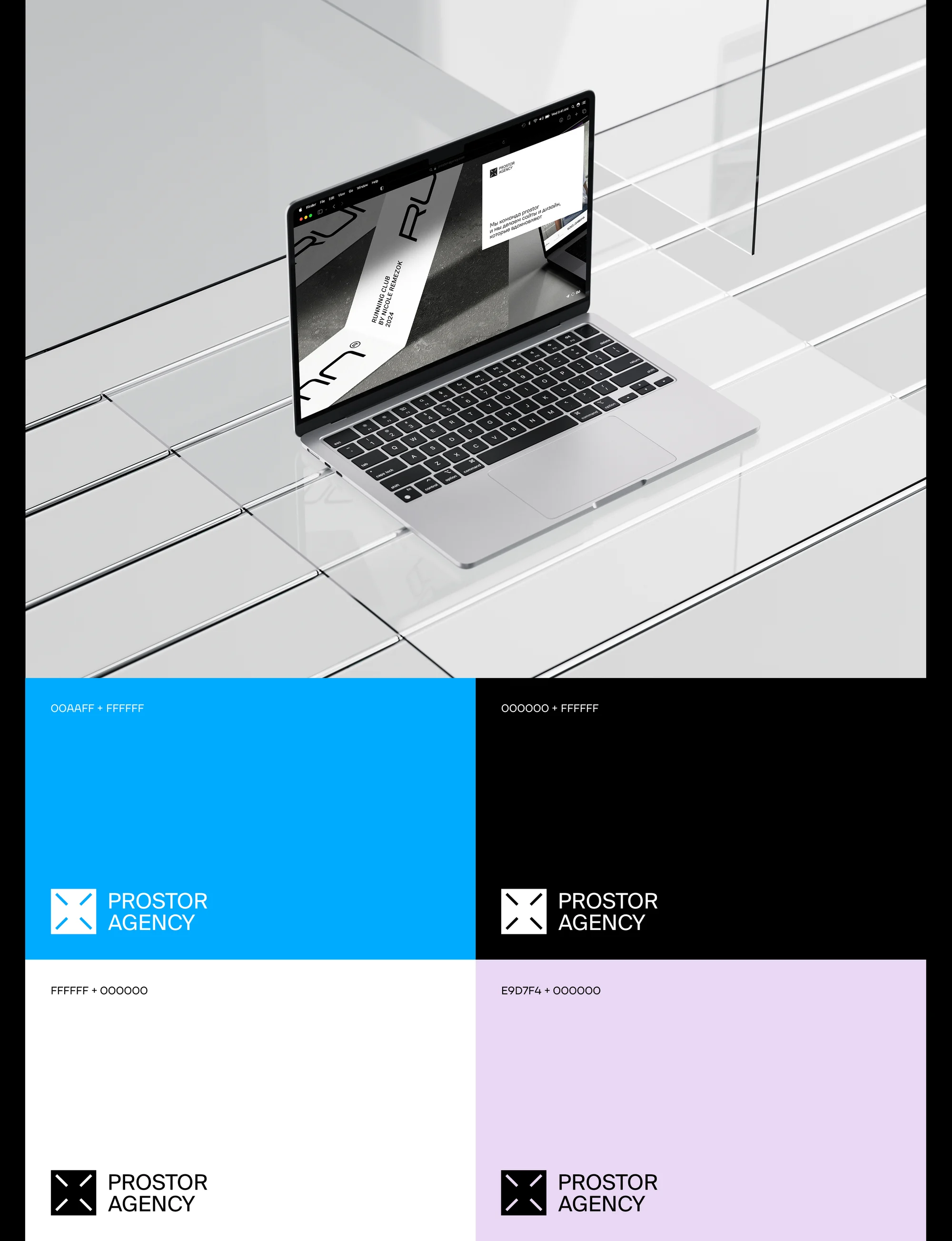
The palette is built in pairs: blue 00AAFF with white, black with white, white with black, lilac E9D7F4 with black. Not a set of colours but a set of permitted combinations.
What we did
Mark and logo. A rethought construction, two equal versions, and the rules for choosing between them.
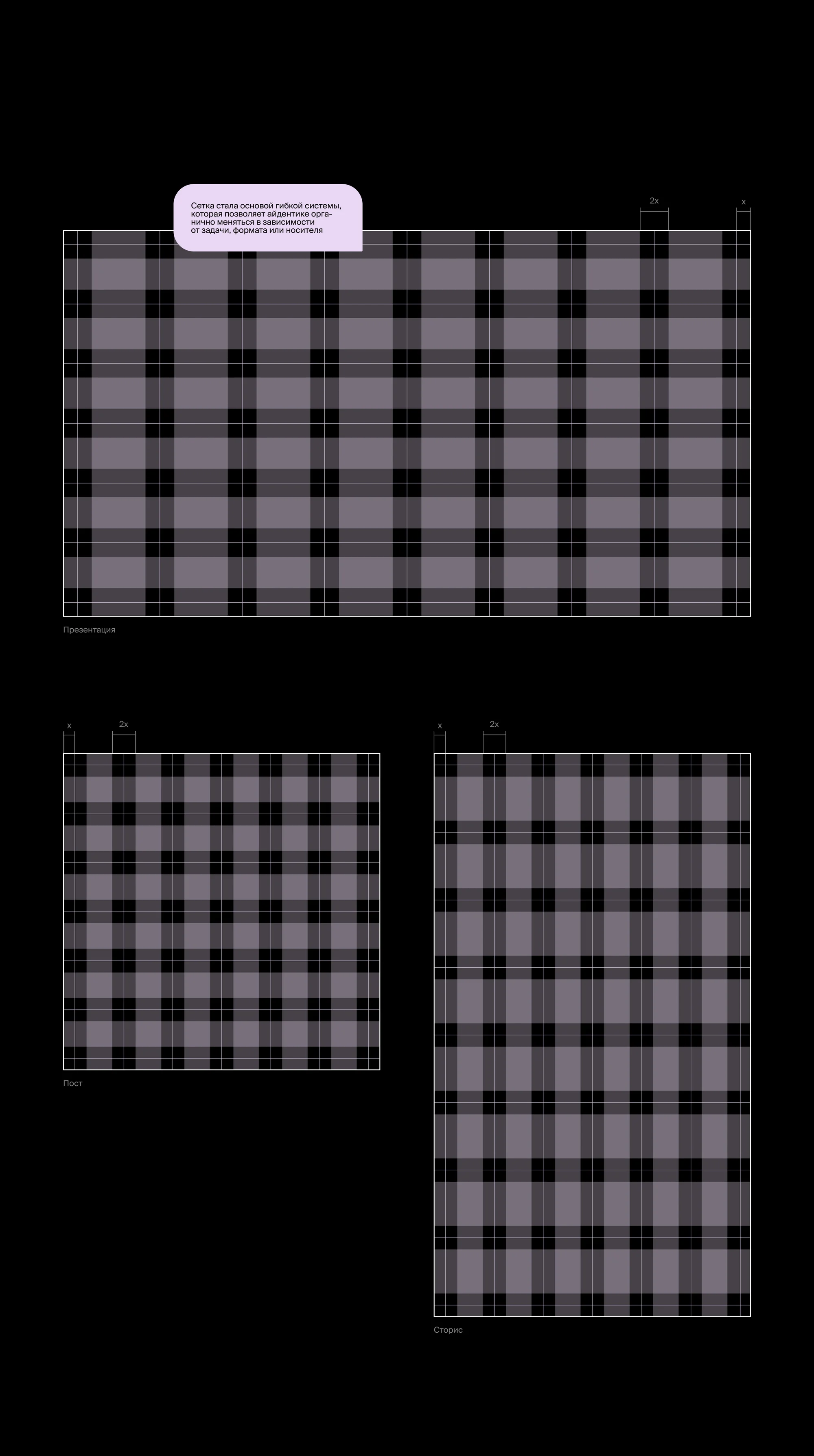
Grid. A modular system on an x and 2x step — the basis of a flexible identity that shifts naturally with the task, the format or the surface. The grid is worked out across three formats: presentation, post, story.
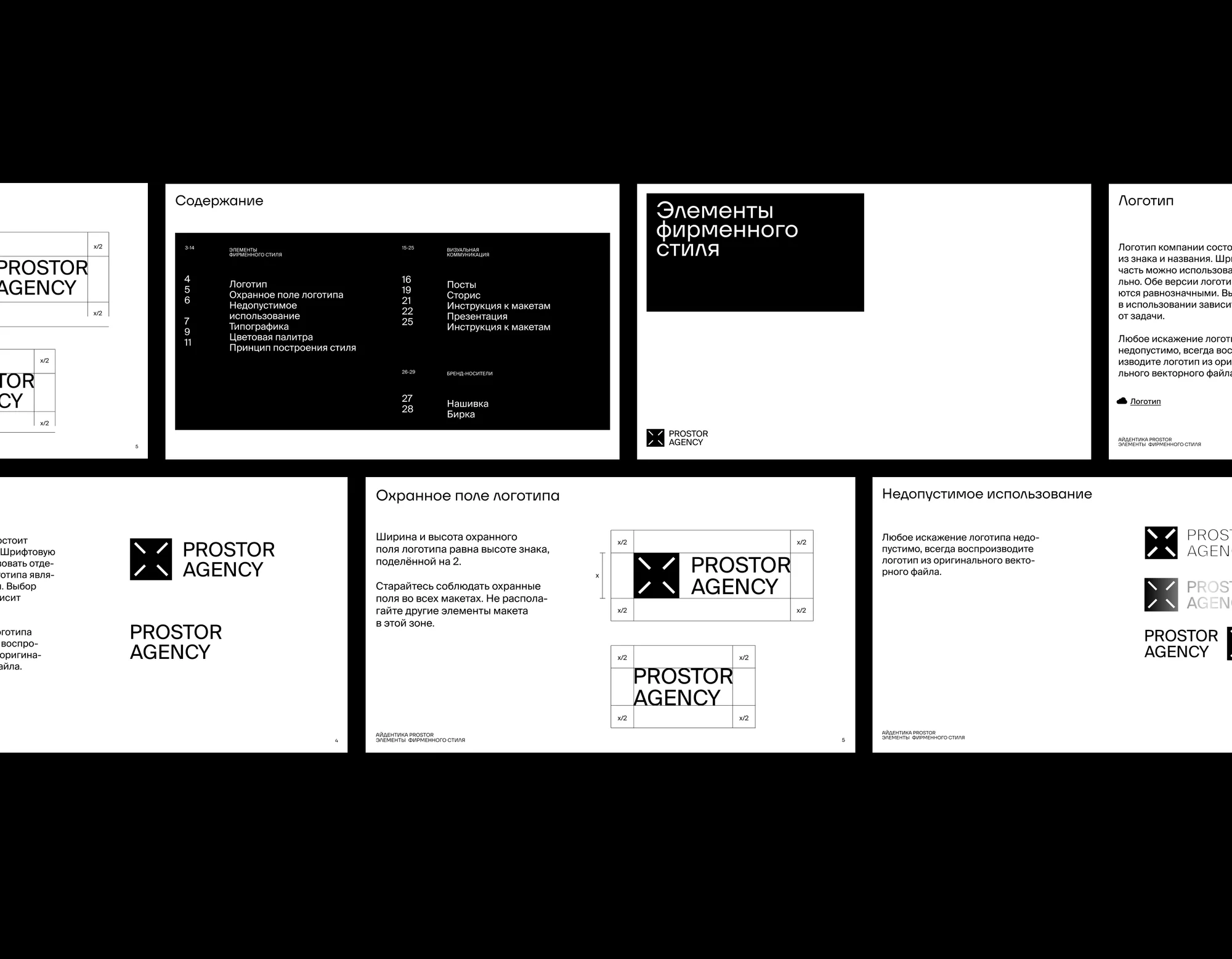
A 29-page brandbook. Three sections. Identity elements: logo, clear space, misuse, typography, colour palette, the principle behind the style. Visual communication: posts, stories, presentations and instructions for the templates. Brand items: a patch and a tag.
Clear space. The width and height of the logo's clear space equal the height of the mark divided by two. A rule, not a suggestion: nothing goes in that zone.
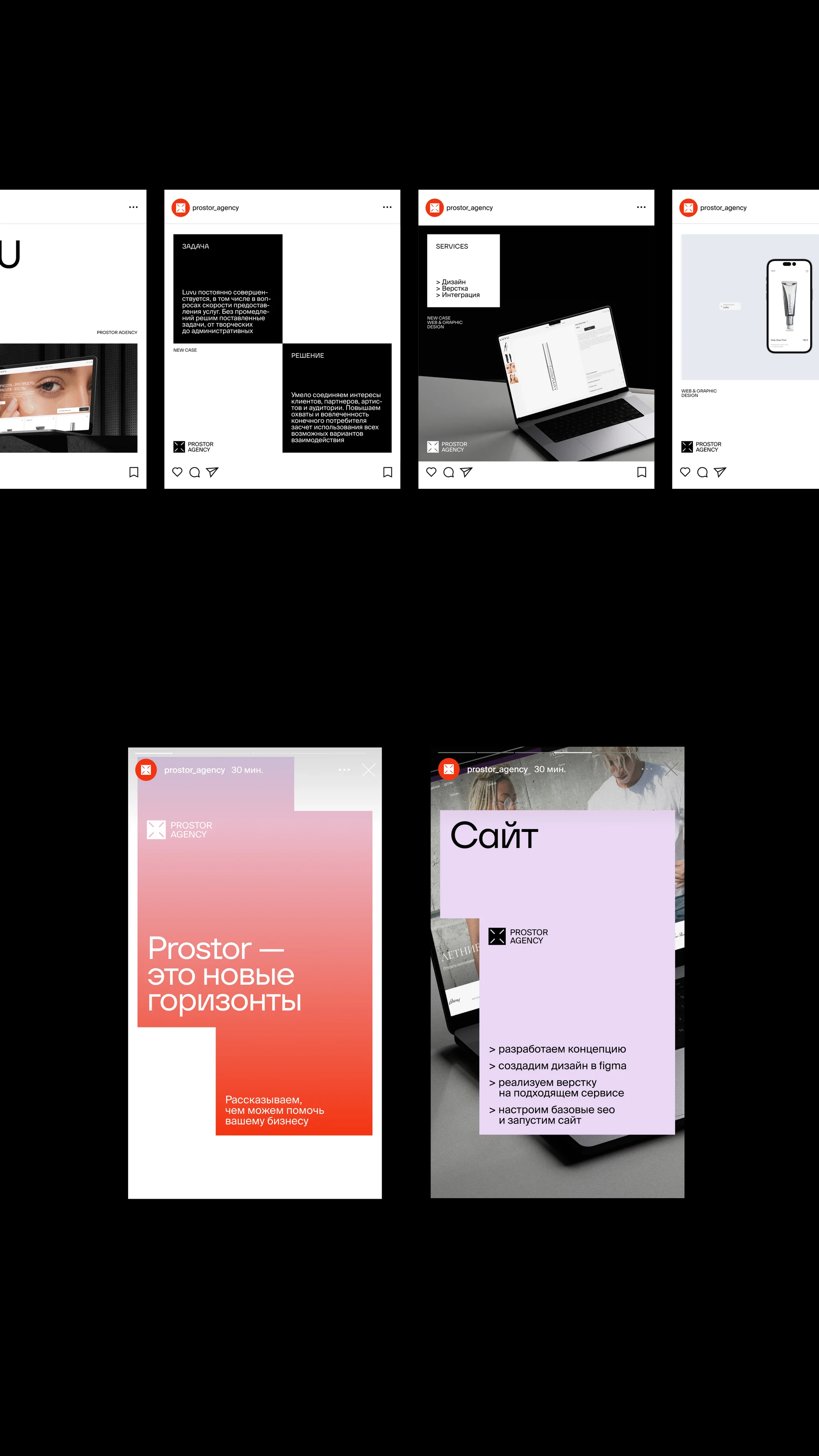
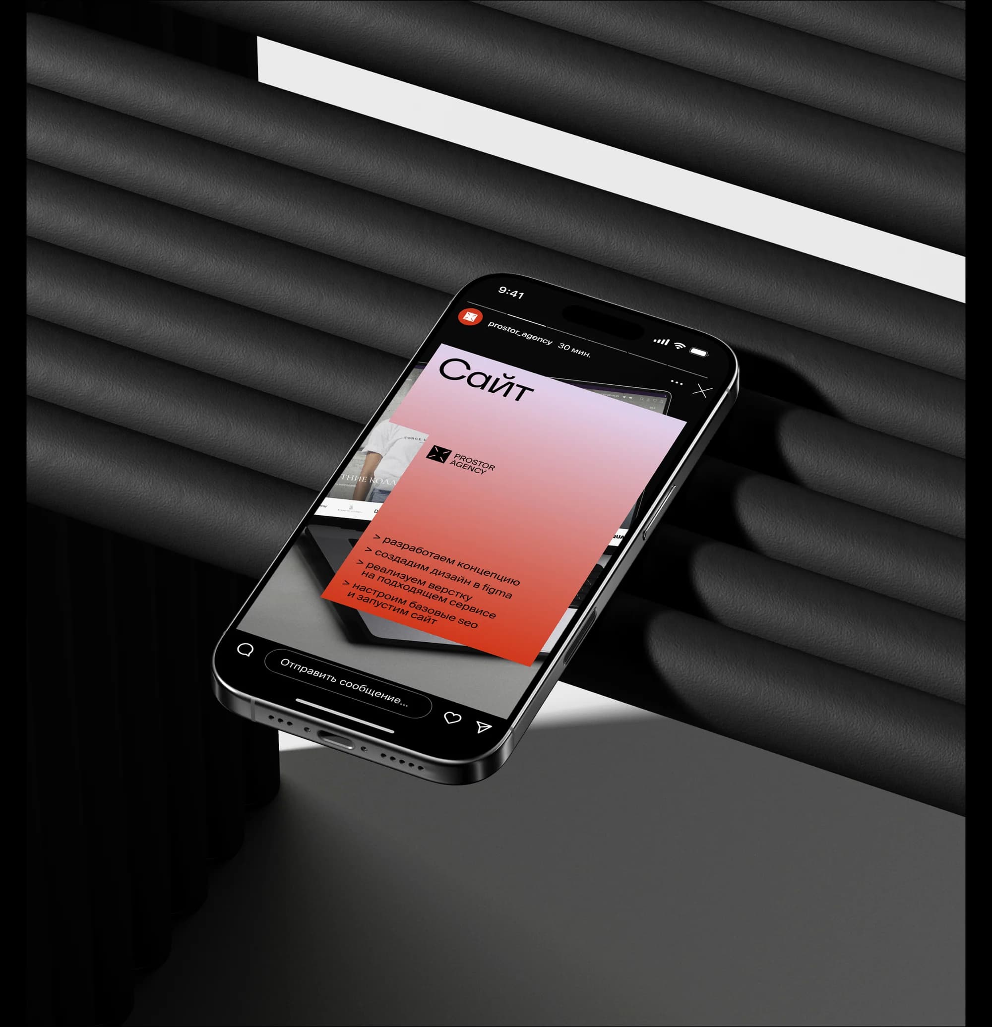
Social templates. Posts and stories on the grid, including a "Website" carousel that walks through the stages of the work — concept, design in Figma, build, basic SEO and launch.
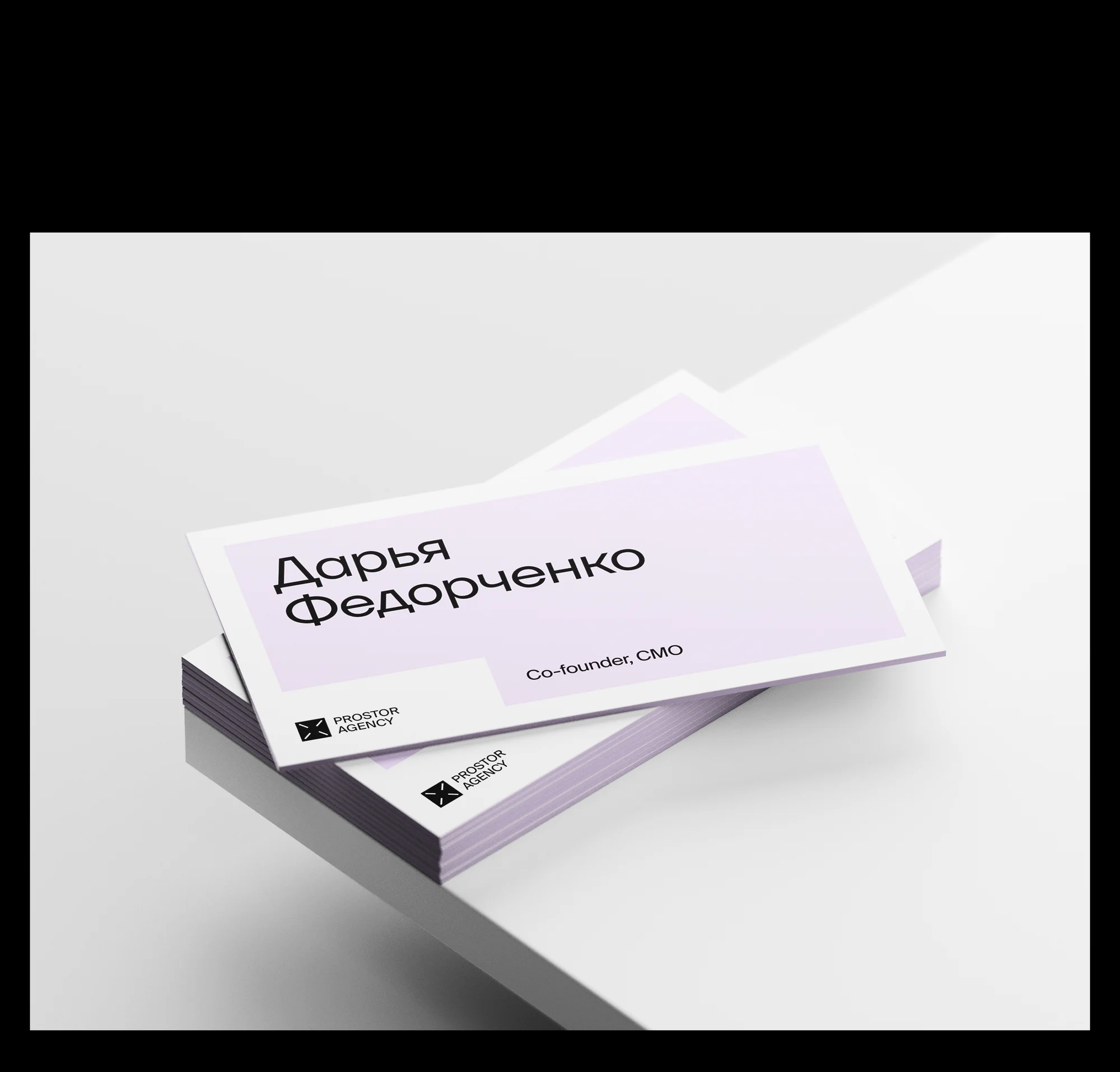
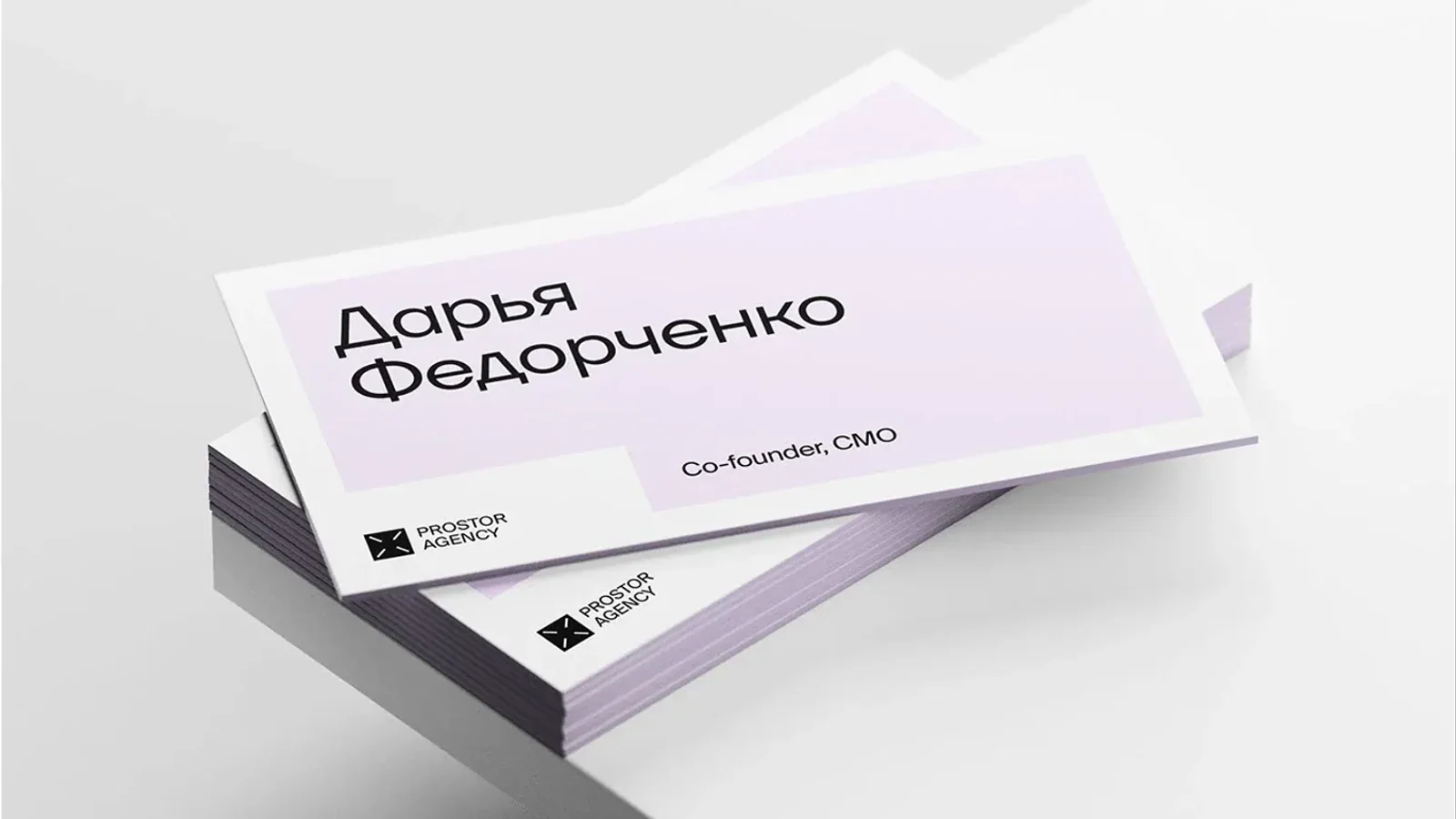
Team business cards. Lilac and black fields, the mark, a role, contacts and a QR code to the site.
Items. A notebook carrying the line "room for your ideas", a patch and a tag.
The result
The agency now has a system it can use without negotiating every detail: the grid sets the composition, the palette sets the permitted pairs, the brandbook sets the edges.
The main decision is not in the mark but in the air around it. The structure holds the form, and the emptiness it leaves is what the brand calls space.
The full breakdown is published on Dprofile, where it carries the Recommended badge, and on Behance. Links below.