The brief
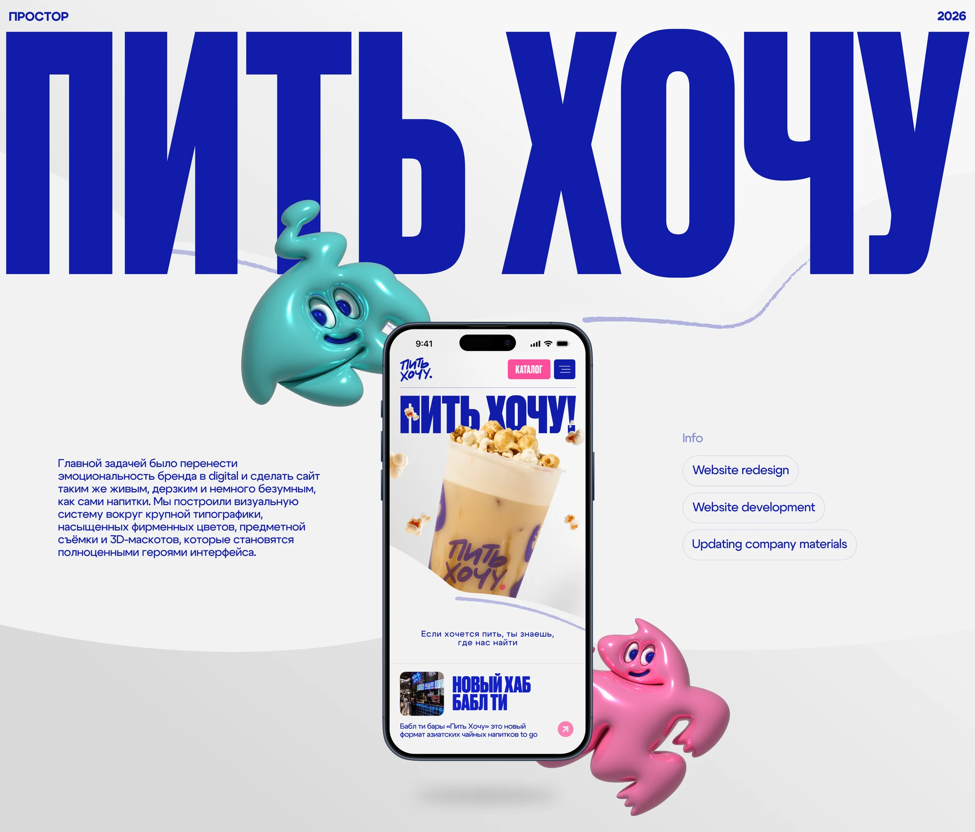
Pit Hochu is a chain of bubble tea bars built around Asian drink culture, rethinking the format of familiar tea and coffee. The brand had a loud, playful, slightly absurd voice — in the drinks, in the bars, in how staff talk to guests. Online that voice went missing: the website read calmer and drier than everything around it.
The job was to carry the brand's energy into digital and make the site feel as alive as the drinks themselves.
The approach
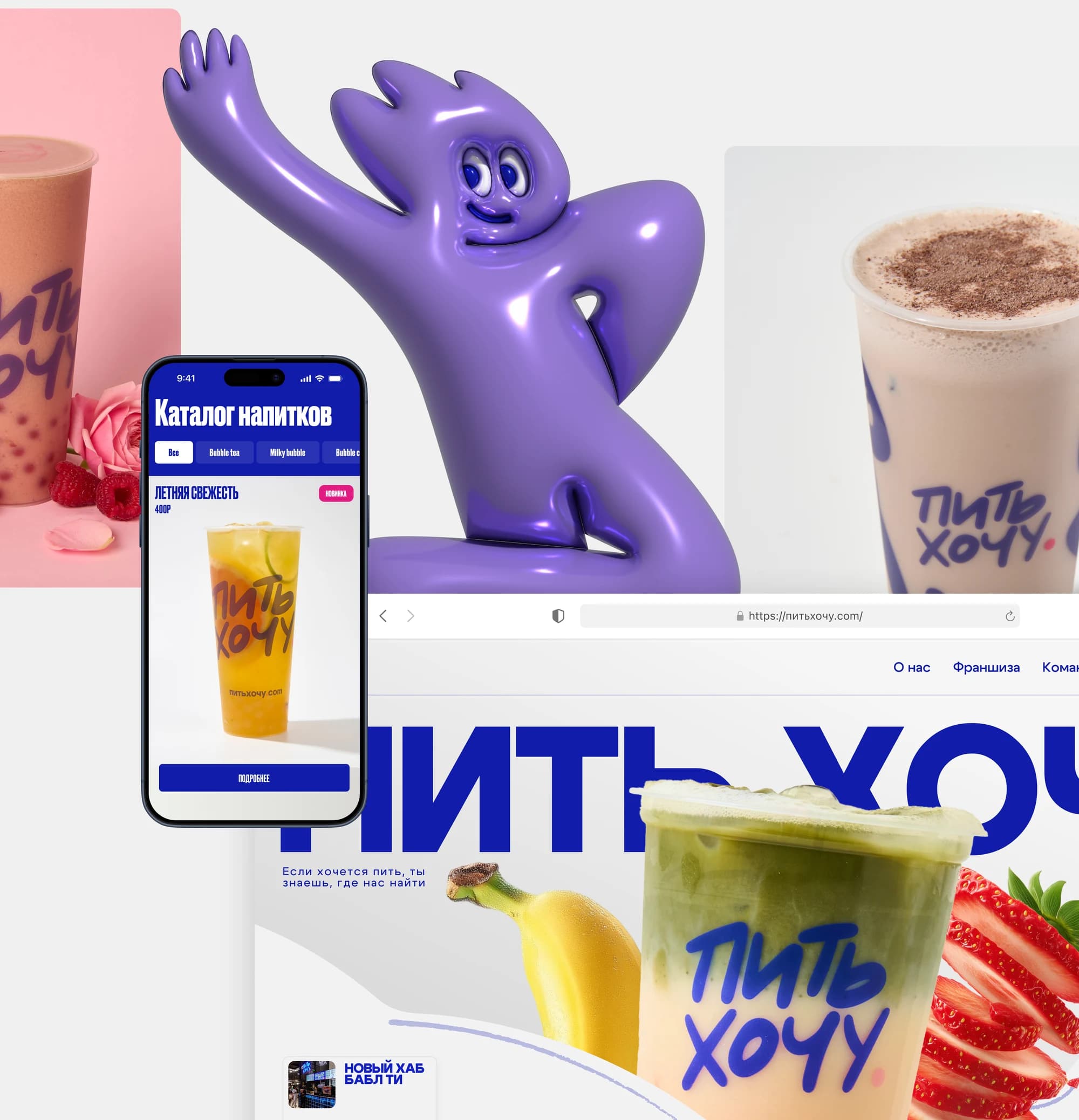
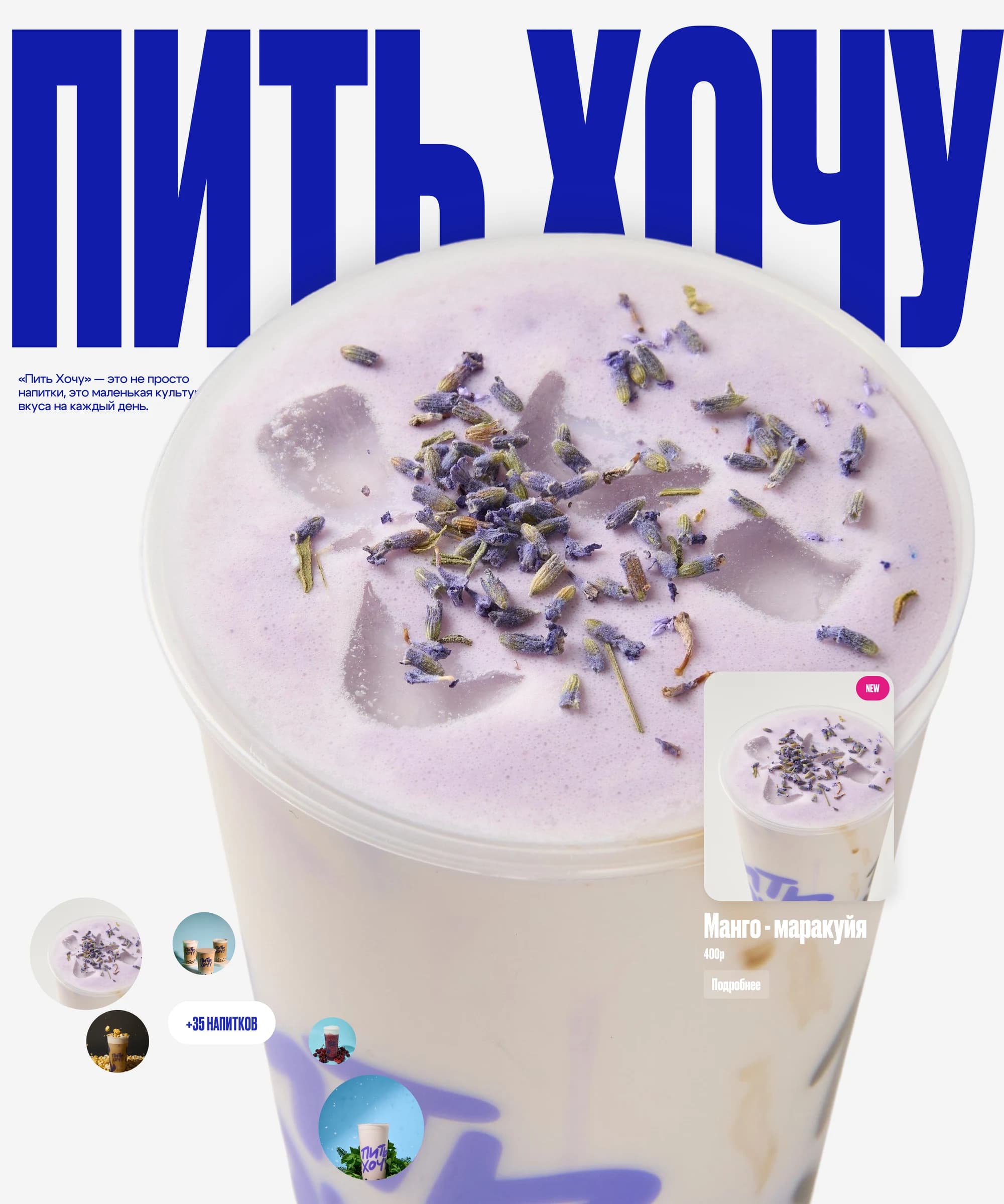
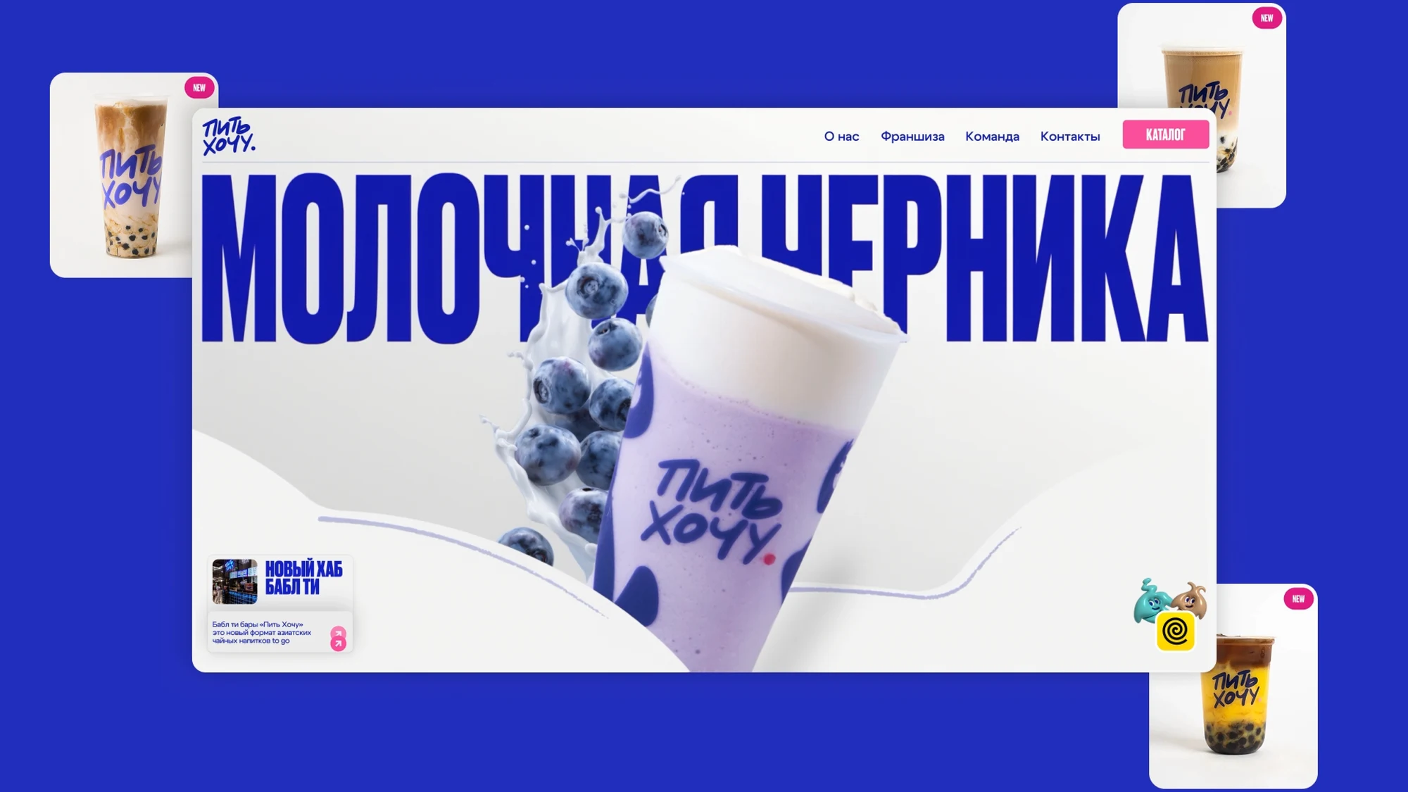
The visual system rests on four things: oversized typography, saturated brand colour, product photography and a set of 3D mascots.
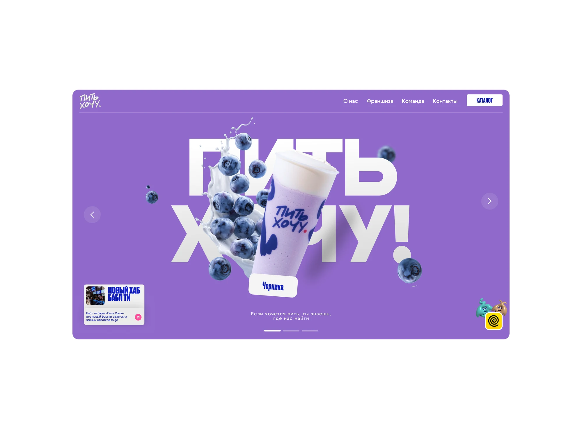
The mascots are not decoration in the margins. They act as characters inside the interface — they live in the blocks, respond to scrolling and set the tone of a section. That is what separates a chain's website from a venue listing: you can see not only the menu but the way the brand speaks.
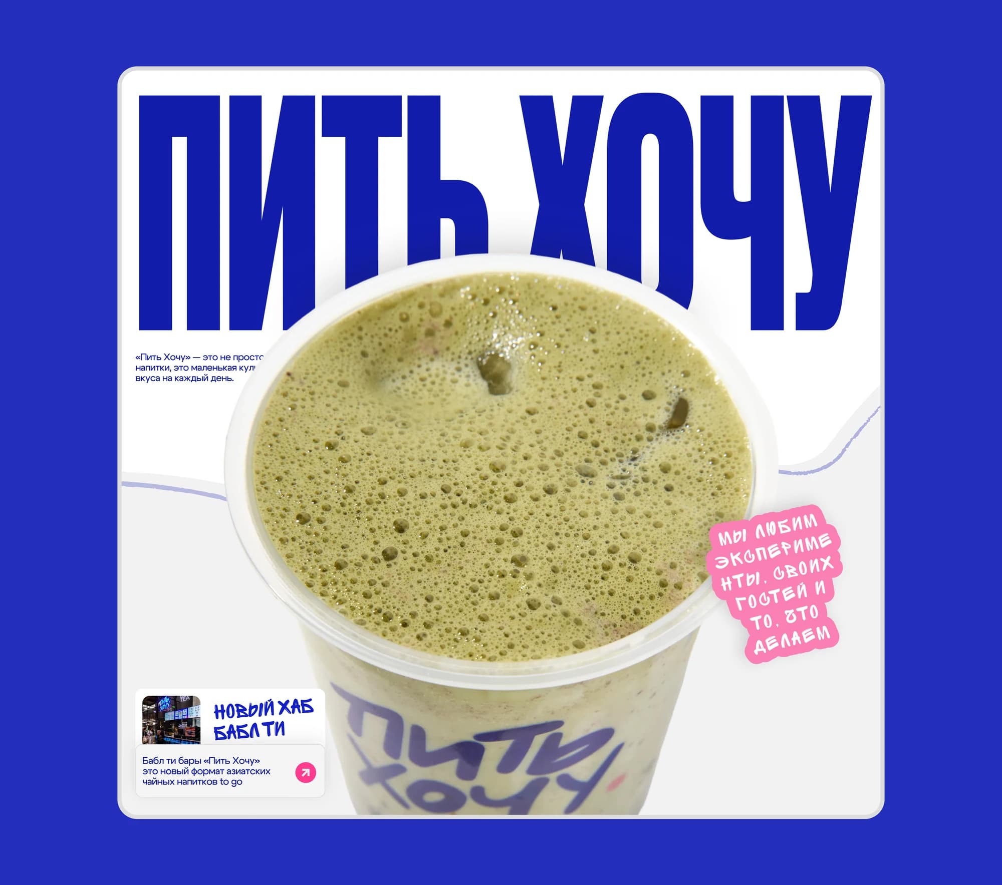
Typography carries the weight usually given to photography. A drink name set large and tight works as a poster — on the site, in print and in the bars themselves.
What we did
Rebranding. Logo, colour system, typography, a set of 3D mascots and the rules for using them.
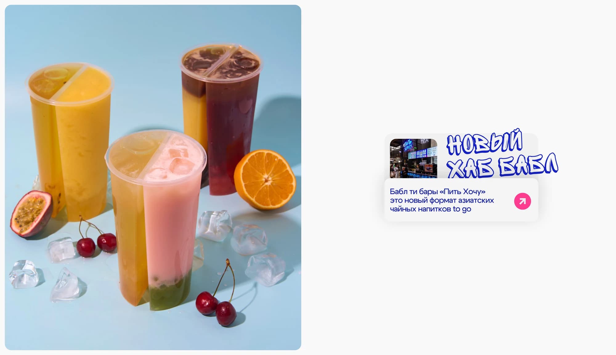
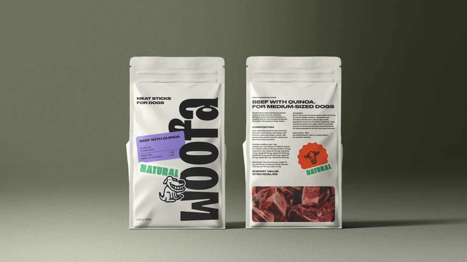
Product photography. Drinks, cups, ingredients — the raw material that feeds catalogue cards, posters and social posts alike.
The website. Home, a drinks catalogue with individual cards, an about section, franchising and contacts. Mobile was designed as the primary case: bubble tea is bought from a phone.
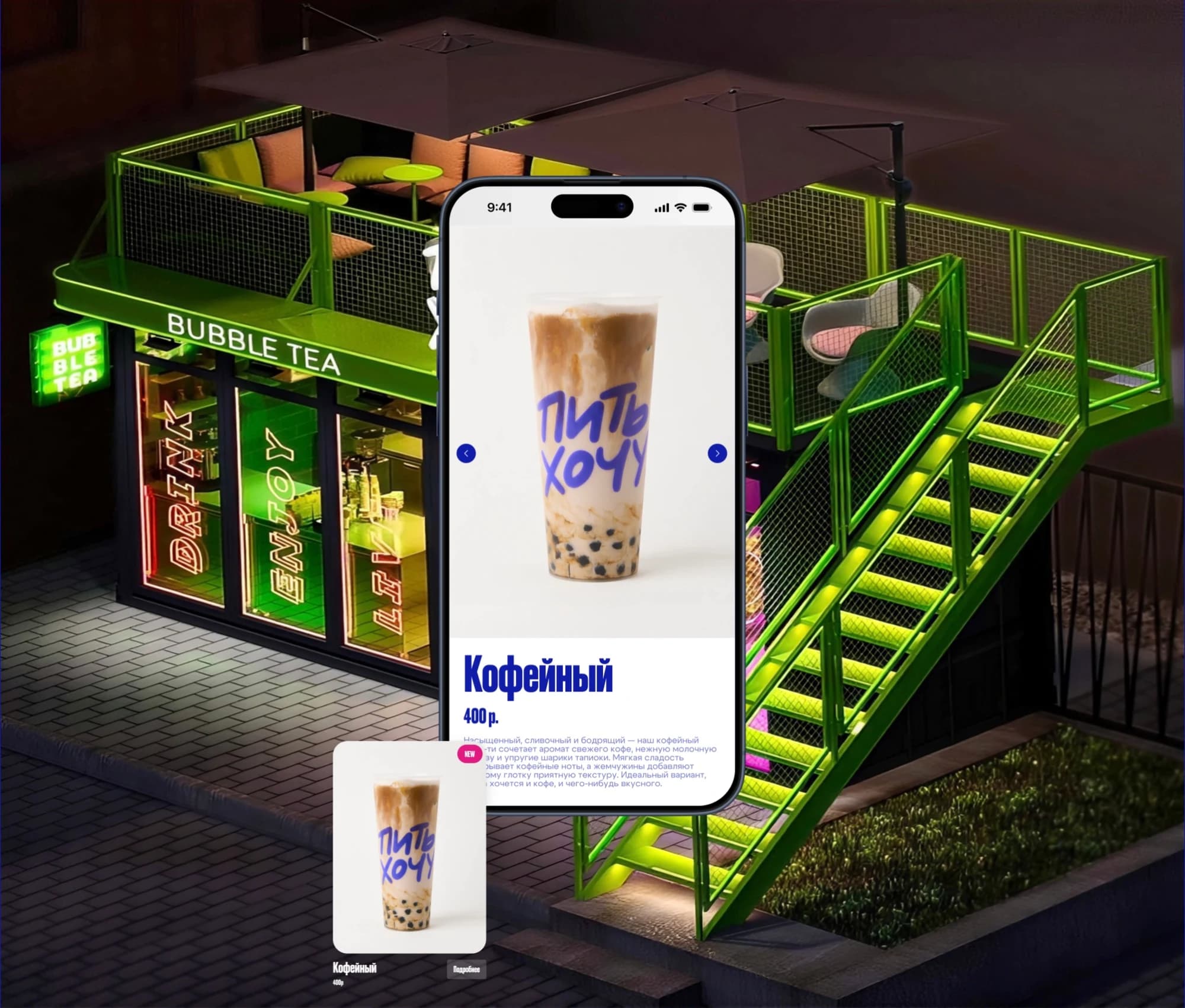
Company materials. We refreshed what the chain uses every day, from posters and menus to in-store signage.
The catalogue
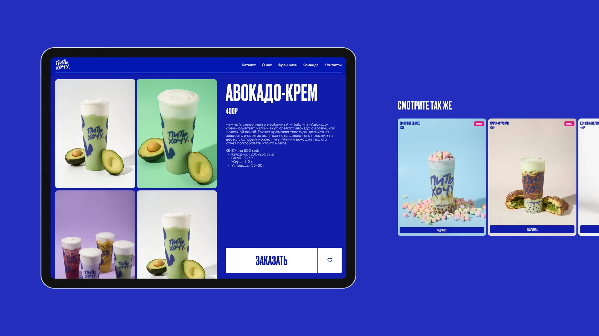
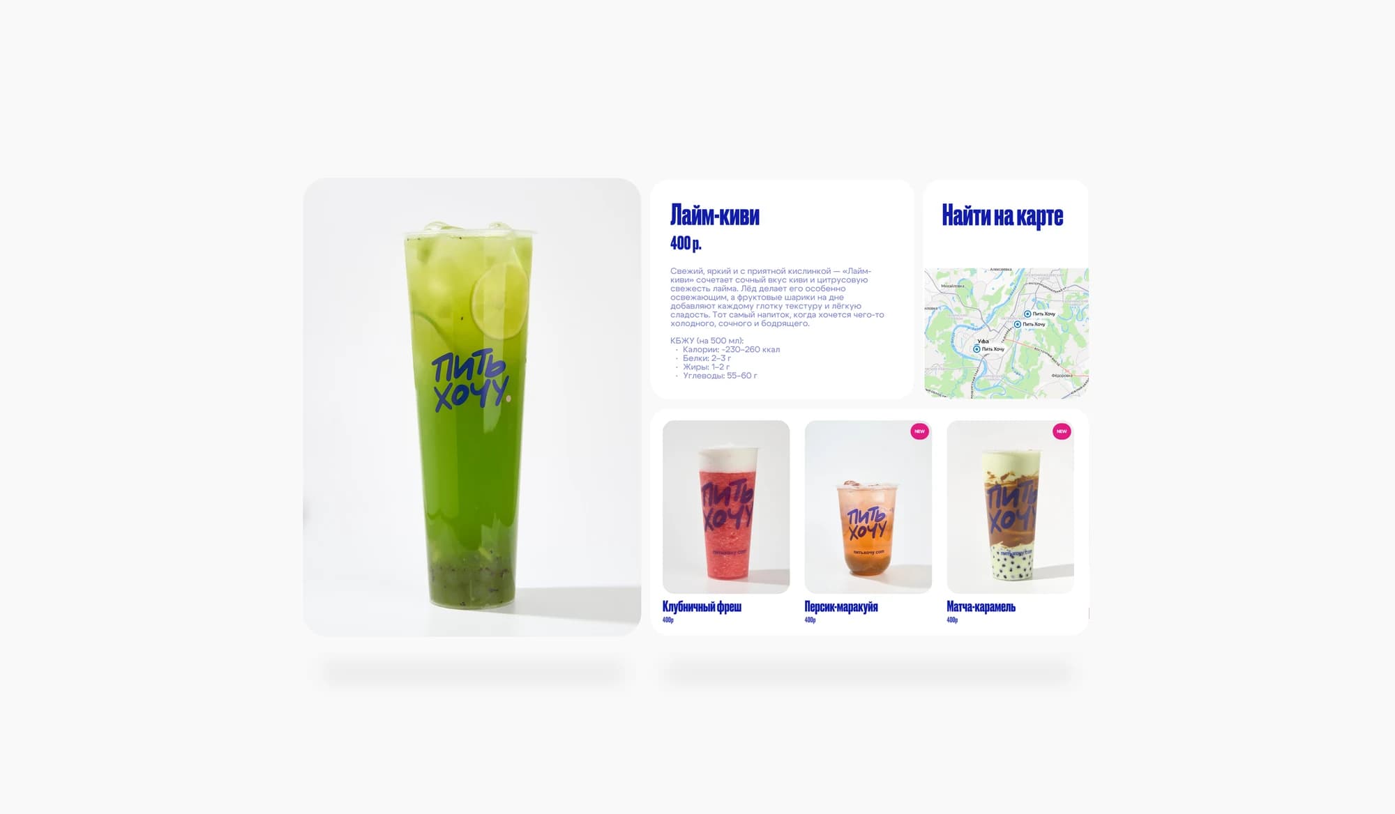
The catalogue is the centre of the site, and it works as a display case rather than a PDF menu. Drinks are grouped by type, each card carries its own photograph, contents and price. Filters switch categories without a page reload, so a guest browses as quickly as they would at the counter.
The drink card itself took separate work. It balances appetite against information: a large image, a short description, contents, volume and a price that is not hidden in small type. This is the page where someone decides what to order, and it has to read on a phone held in one hand.
The outcome
The chain now has a digital presence that sounds like its bars — same character, same tempo, same nerve. Mascots, type and photography work as one system that can be rolled out to new drinks, new locations and new formats without being rebuilt each time.