The task
LIC is a Russian professional make-up brand: it is what make-up artists work with, and it sits on the shelves of Rive Gauche and Golden Apple. The brand needed to look fresher and speak to a younger audience without losing the recognition it had built. The brief came down to this: keep the meaning of the logo while renewing its form, and turn that into a system that works equally well on a tube and on a billboard.
The approach
We started with people rather than drawings: a full audience study with interviews, and a new brand platform built on it. The visual language came after that.
We moved the emphasis from colour to system: instead of a loud accent, we worked with form, proportion and how the elements assemble. The base palette stayed; the principle behind using it changed.
What we did
Research. A full audience study, interviews included.
Brand platform. A new platform for the brand — the ground everything visual was built on.
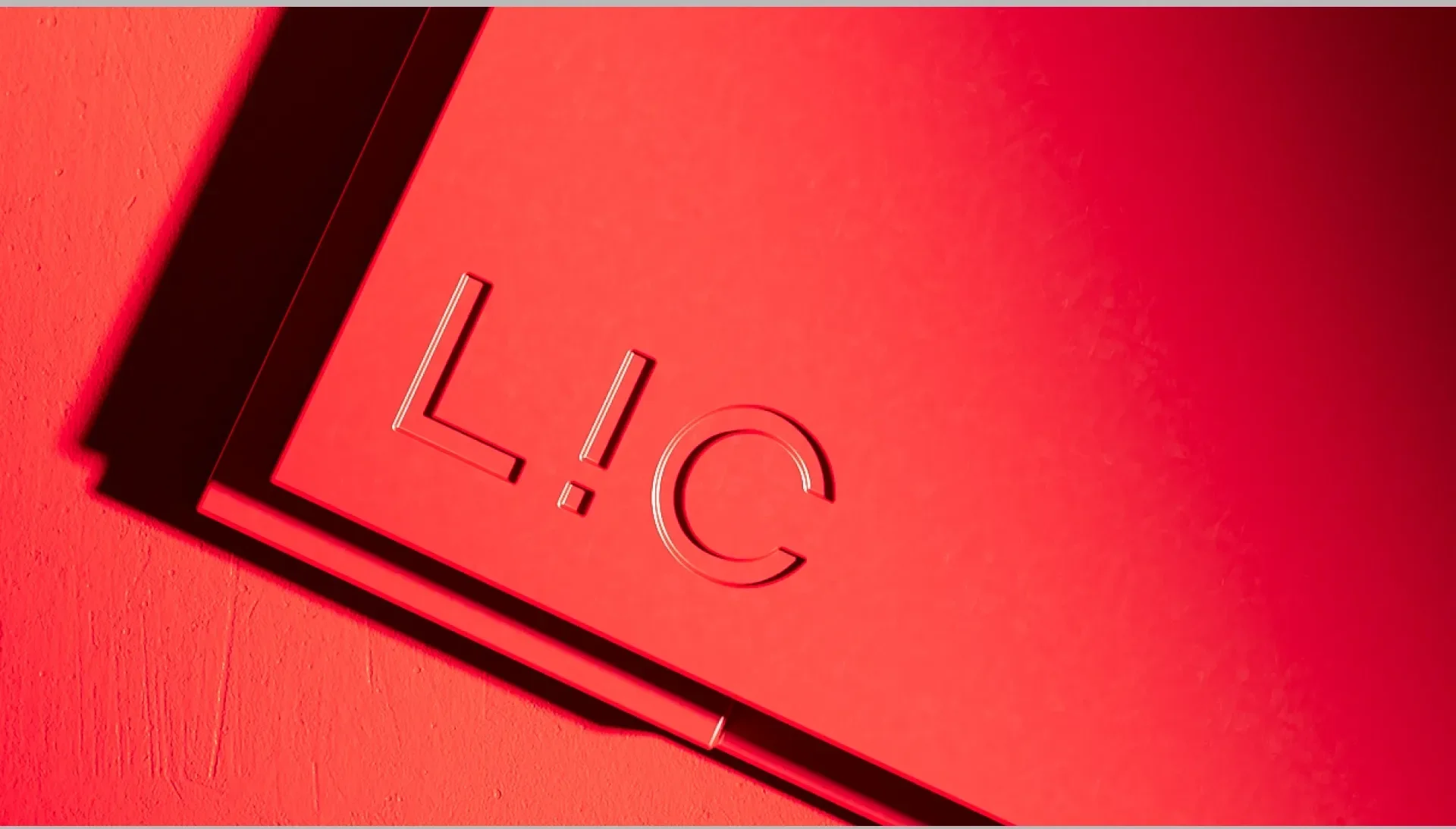
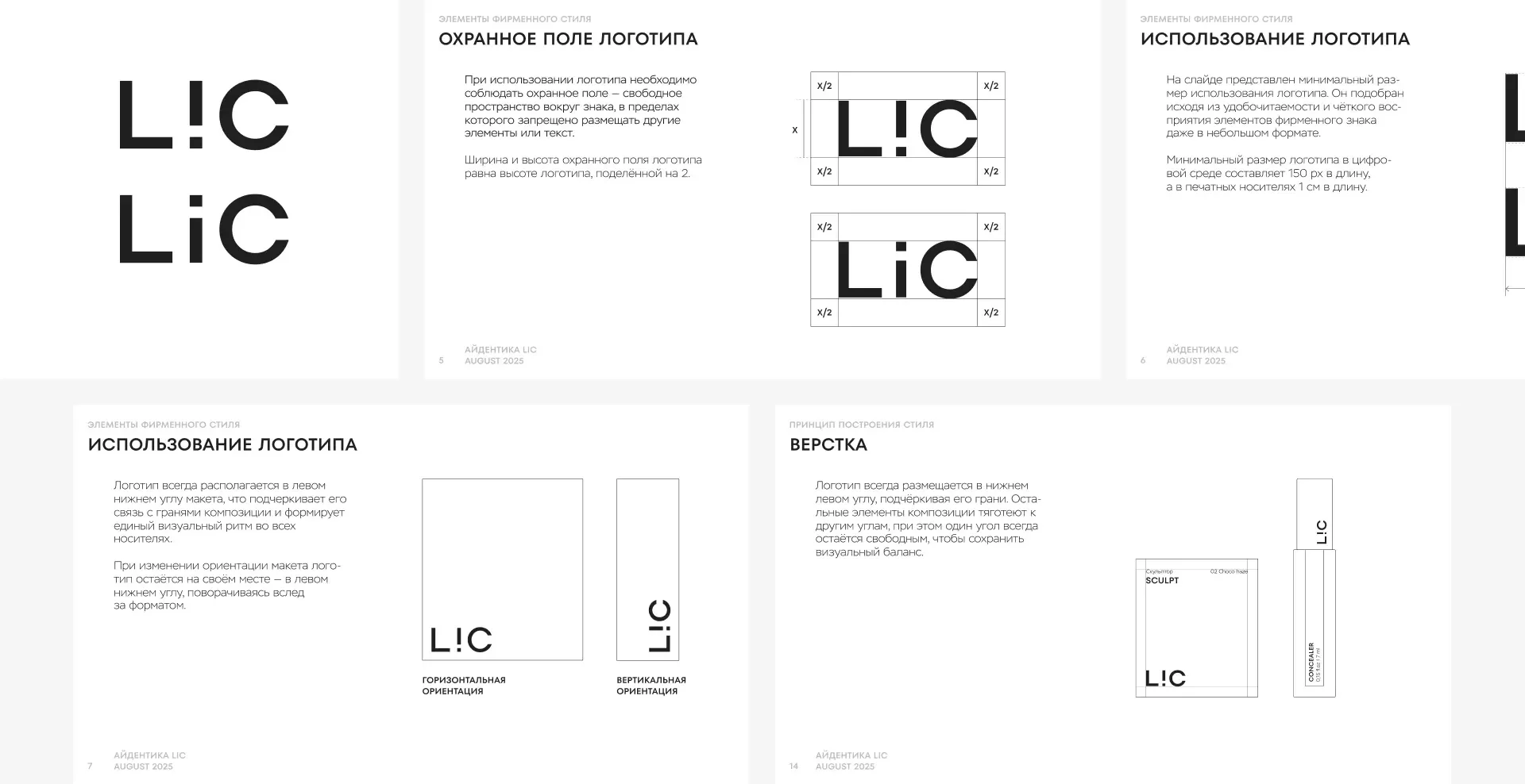
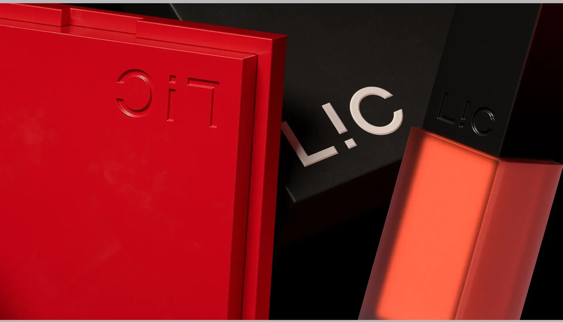
The logo. Built on simple geometric forms: legible at any scale, able to play with the edges of a pack, and easy to place in any format.
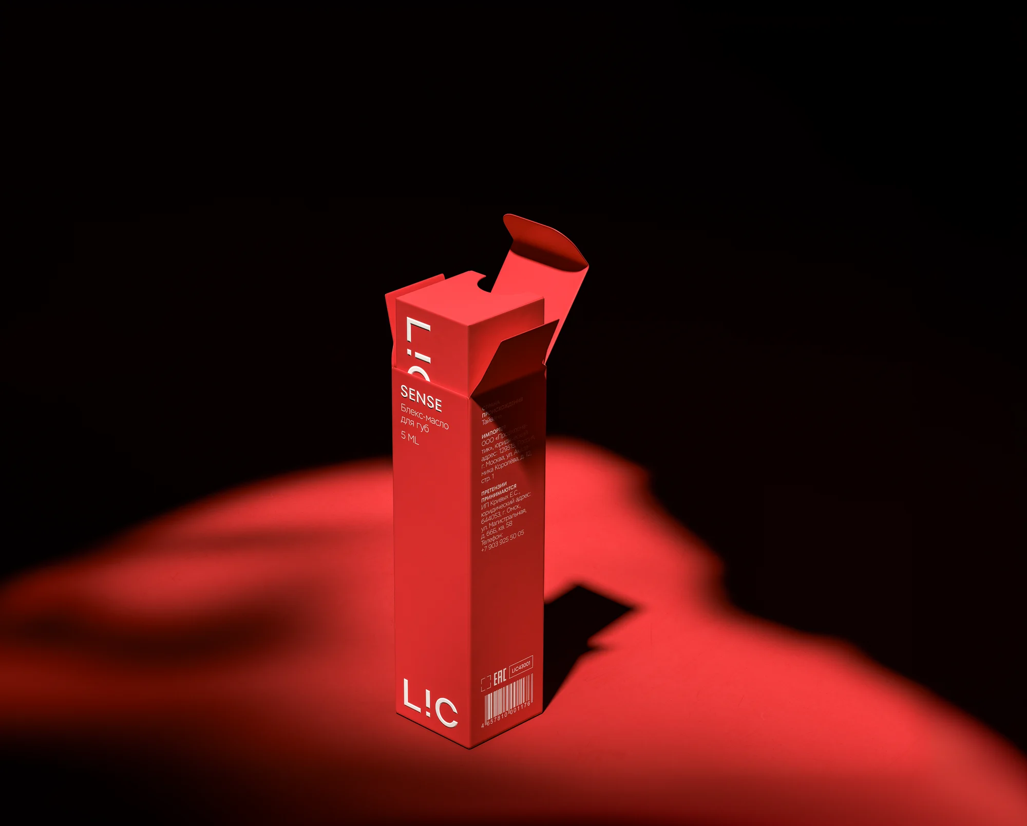
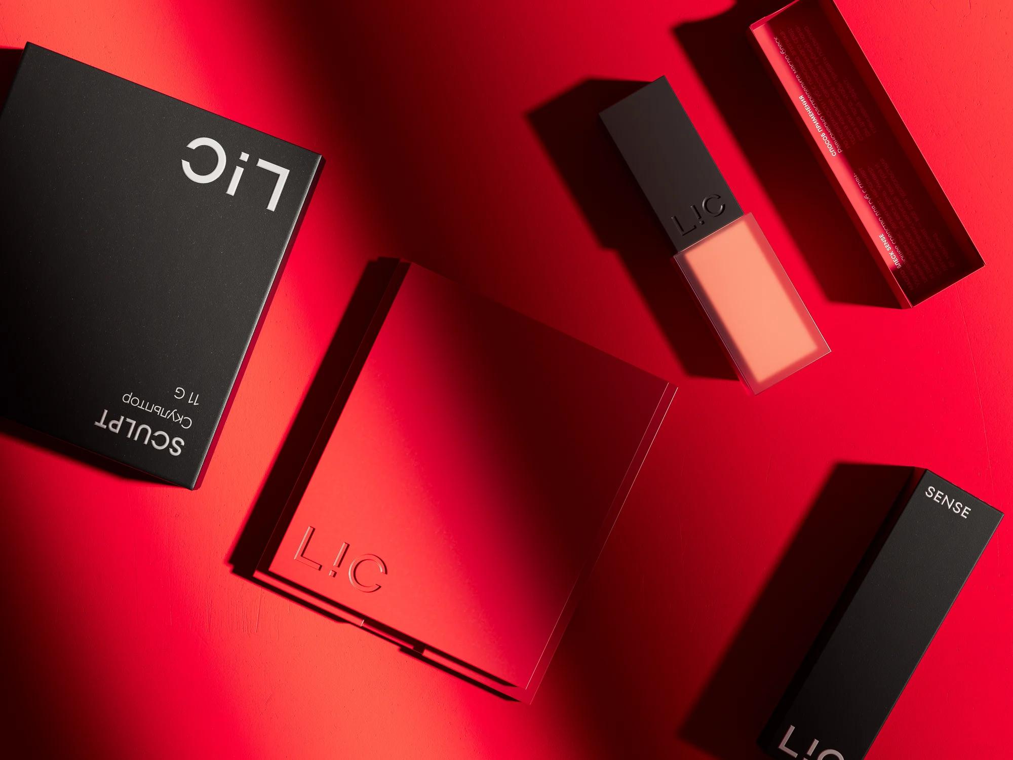
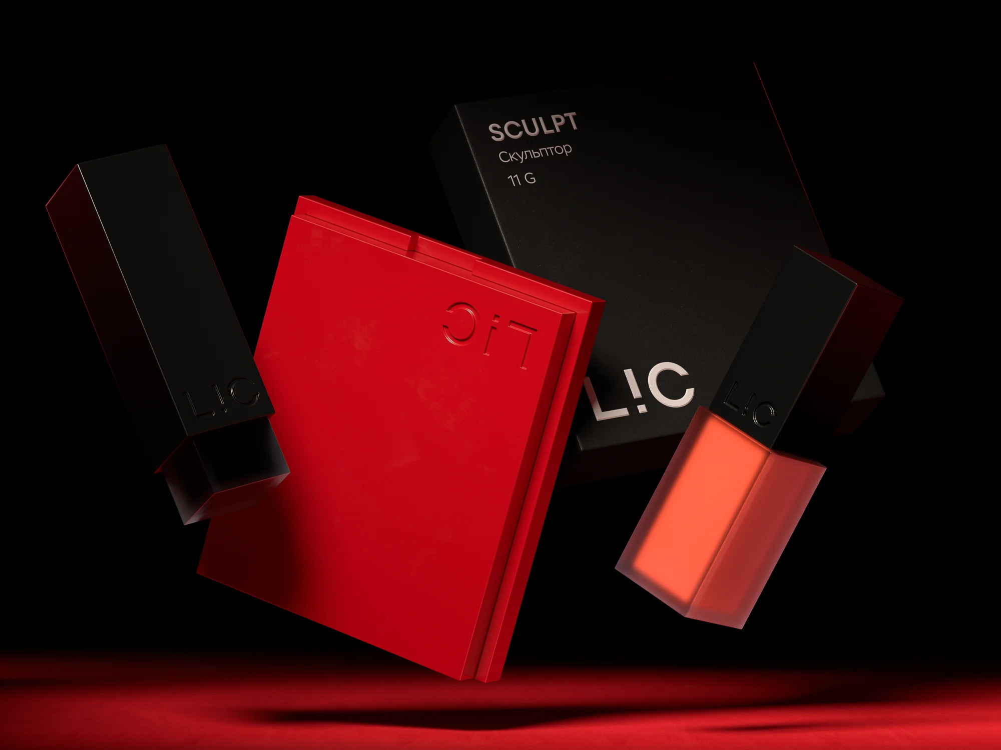
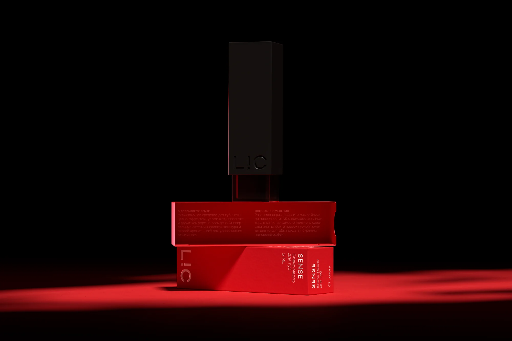
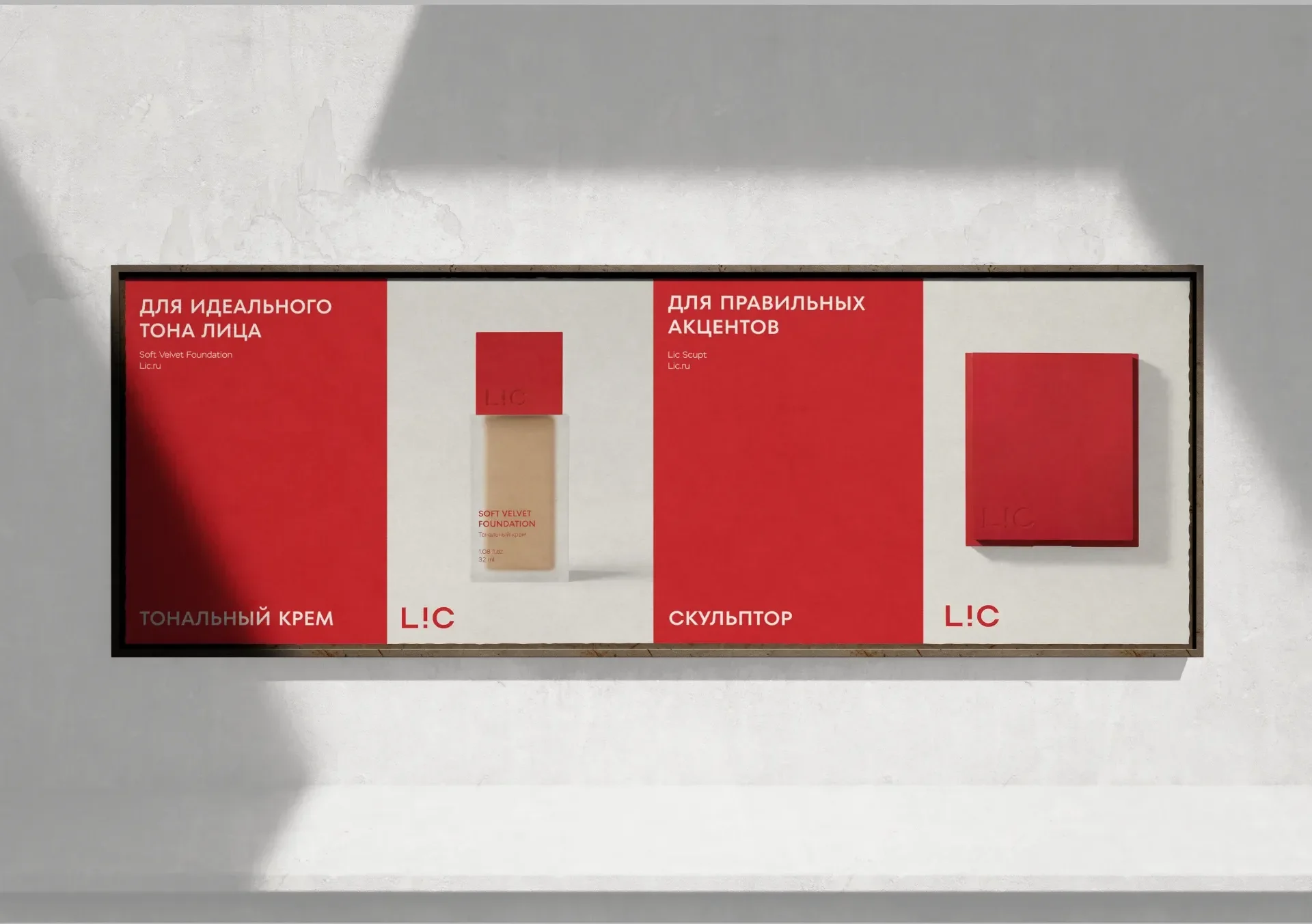
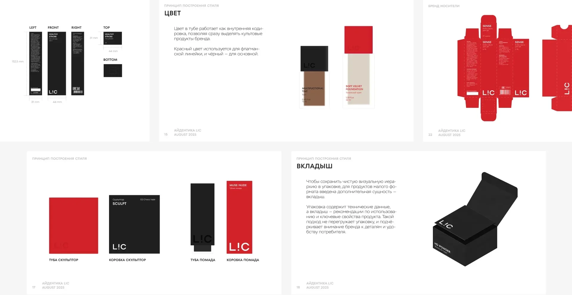
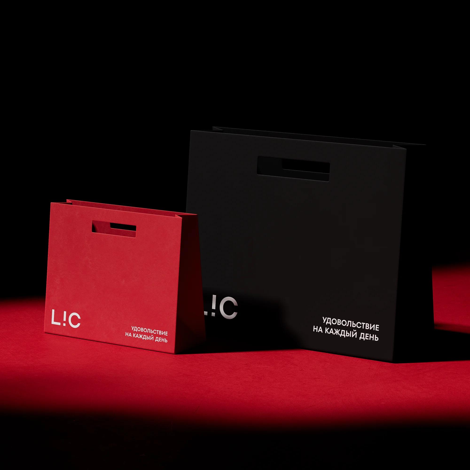
Colour as navigation. White became the link between black and red. Inside the range colour encodes the line: red for the flagship series, black for the core one.
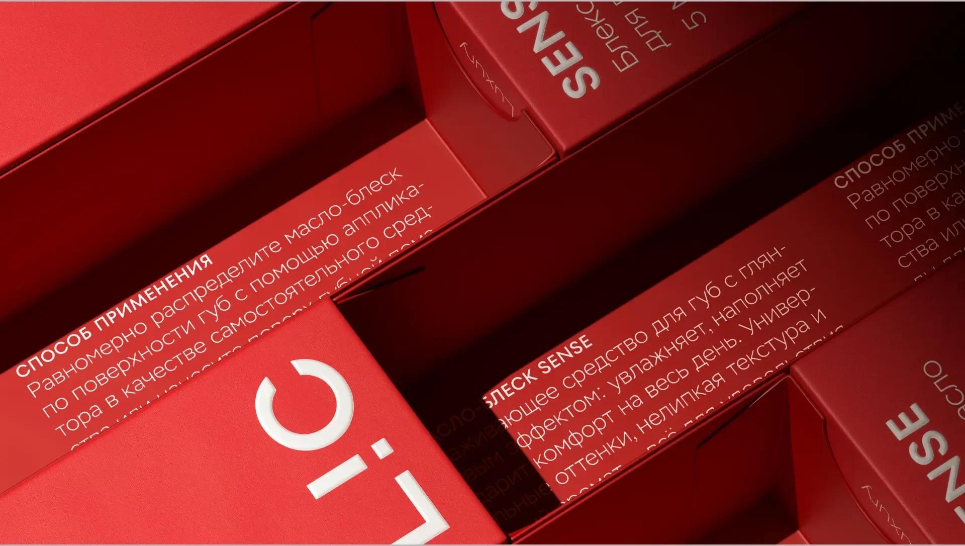
Typography. A pair of geometric sans faces on a close foundation — one sets dense accent blocks, the other an open, readable text.
Layout system. The logo acts as the compositional anchor; everything else follows a zoning principle that gives structure without rigidity.
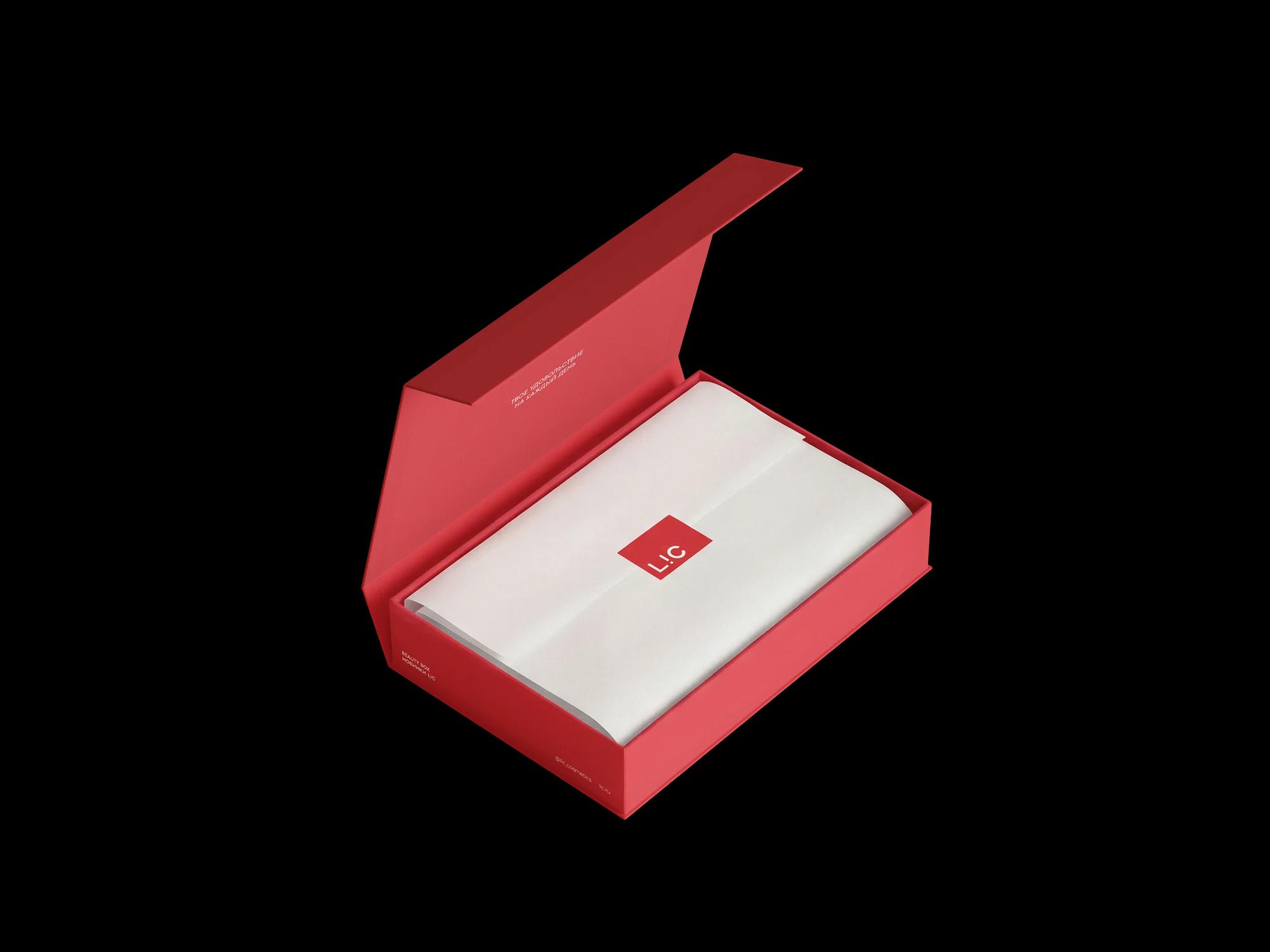
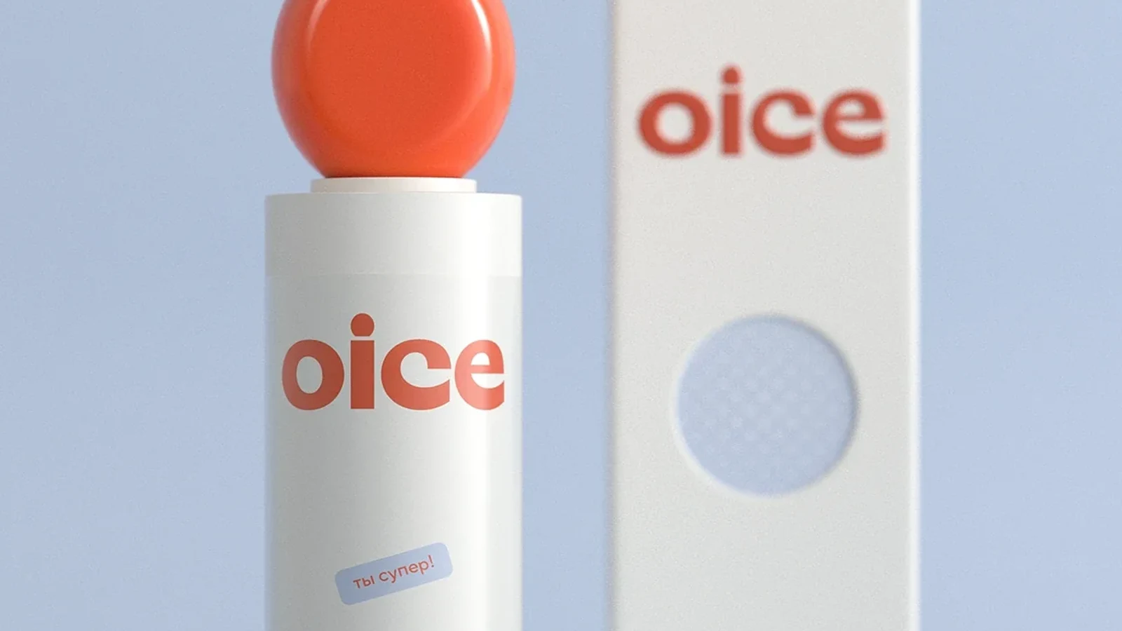
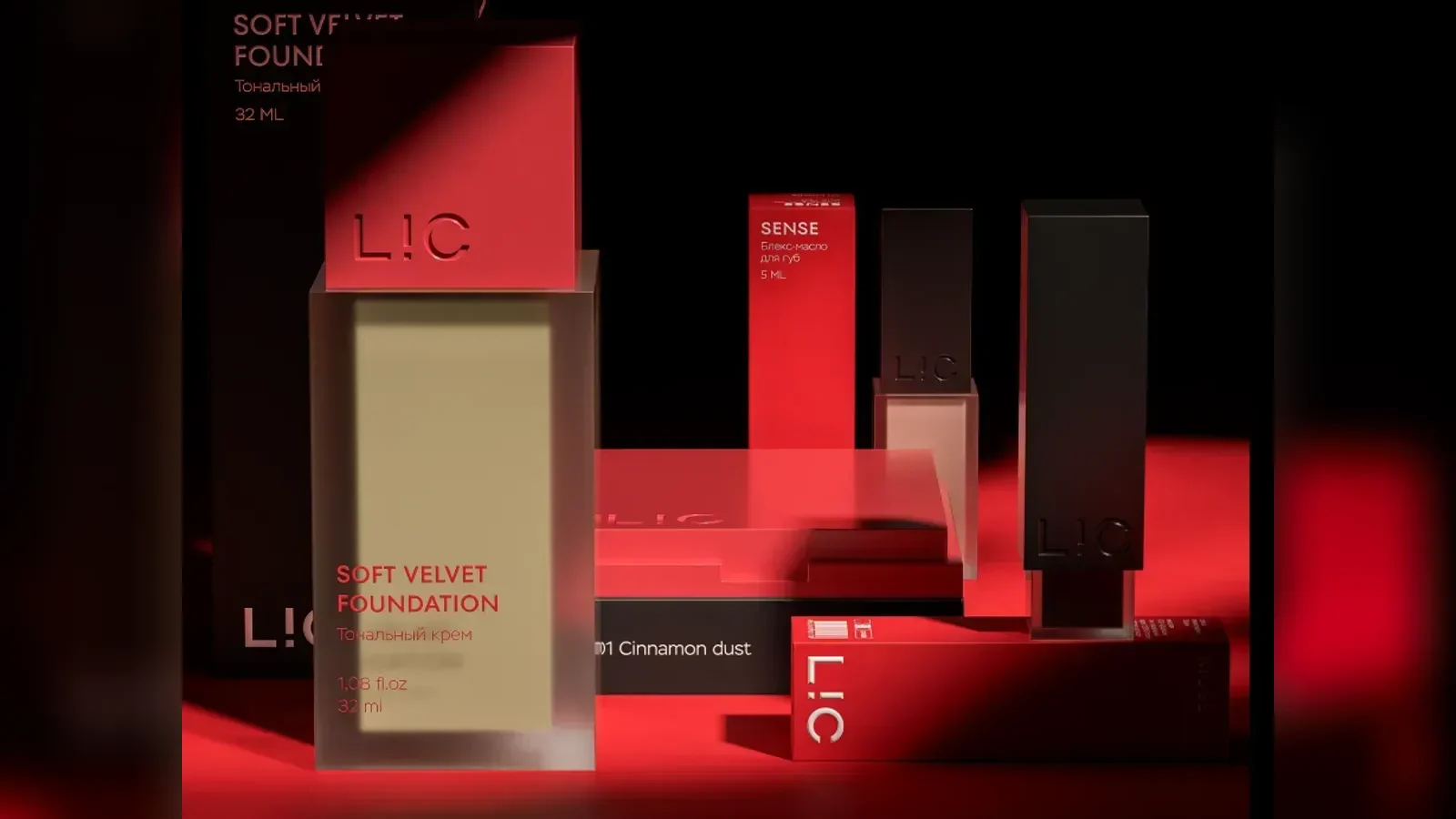
Packaging. The form grew out of the logo's geometry. The tube is built in two layers: the outer one introduces the product, the inner one carries the character of the line. Plus boxes, a bag, a sticker, a welcome card and a branded ribbon — unboxing is built as a sequence.
The result
- the decisions rest on research and interviews, not on taste
- the meaning of the logo is kept, its form is current
- colour does navigation work, not only decoration
- new carriers are assembled from the system rather than drawn from scratch