The task
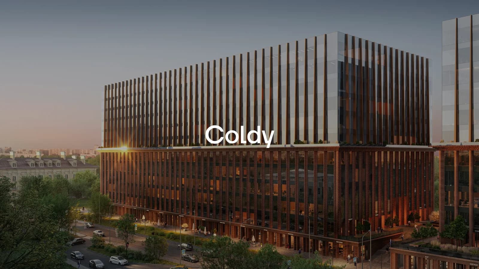
Coldy is a developer of private residential clubs. The team wanted an independent outside view: a read of the site and part of the internal materials through a buyer's and a designer's eyes, not through the eyes of the team that works with them every day.
The approach
We walked the buyer's path through the site from the first screen to the enquiry form, noting where it stumbles and why. We reviewed the internal materials the team uses when working with clients. The findings went into a structured report with concrete recommendations, not general notes to "make it nicer."
The result
The Coldy team got a specific breakdown of their materials and a prioritised list of what to fix first.