The starting point
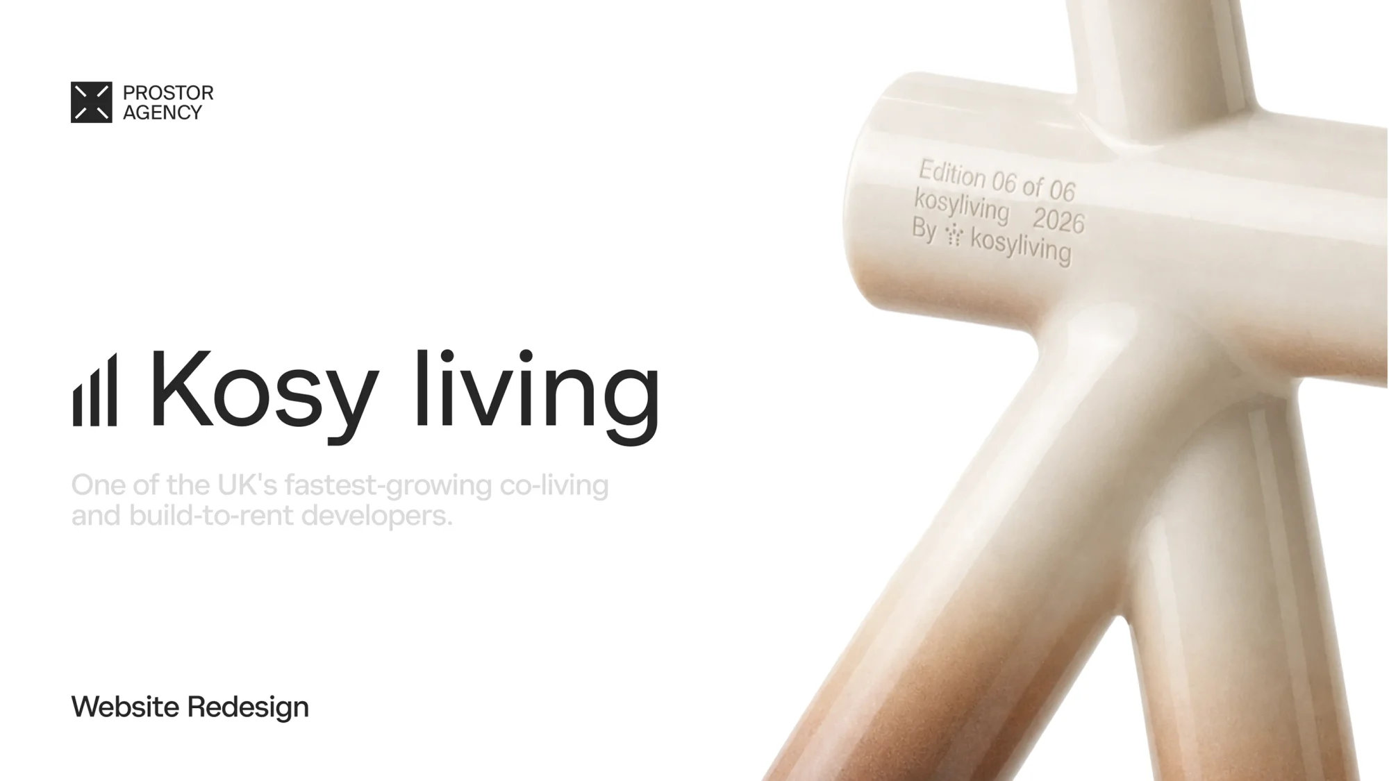
We came across Kosy, spent a while on their site, and had the thought we keep having with strong property companies: the business is impressive, the website doesn't say so. Nobody asked us to fix it. We wanted to see what Kosy could look like if the site carried the same ambition as the company behind it.
We started with the market, not the mockup
Before drawing anything, we spent time in the European and London co-living market and read how operators talk about themselves. Almost all of them sell the same thing in the same words: community and lifestyle. Renders, amenities, empty rooms lit like a catalogue. Barely anyone shows a real person, and barely anyone shows a price.
That gap became the brief. If the whole category hides behind renders, the way to stand out is simple. Show people. Be honest.
The idea: bring the brand closer to the person
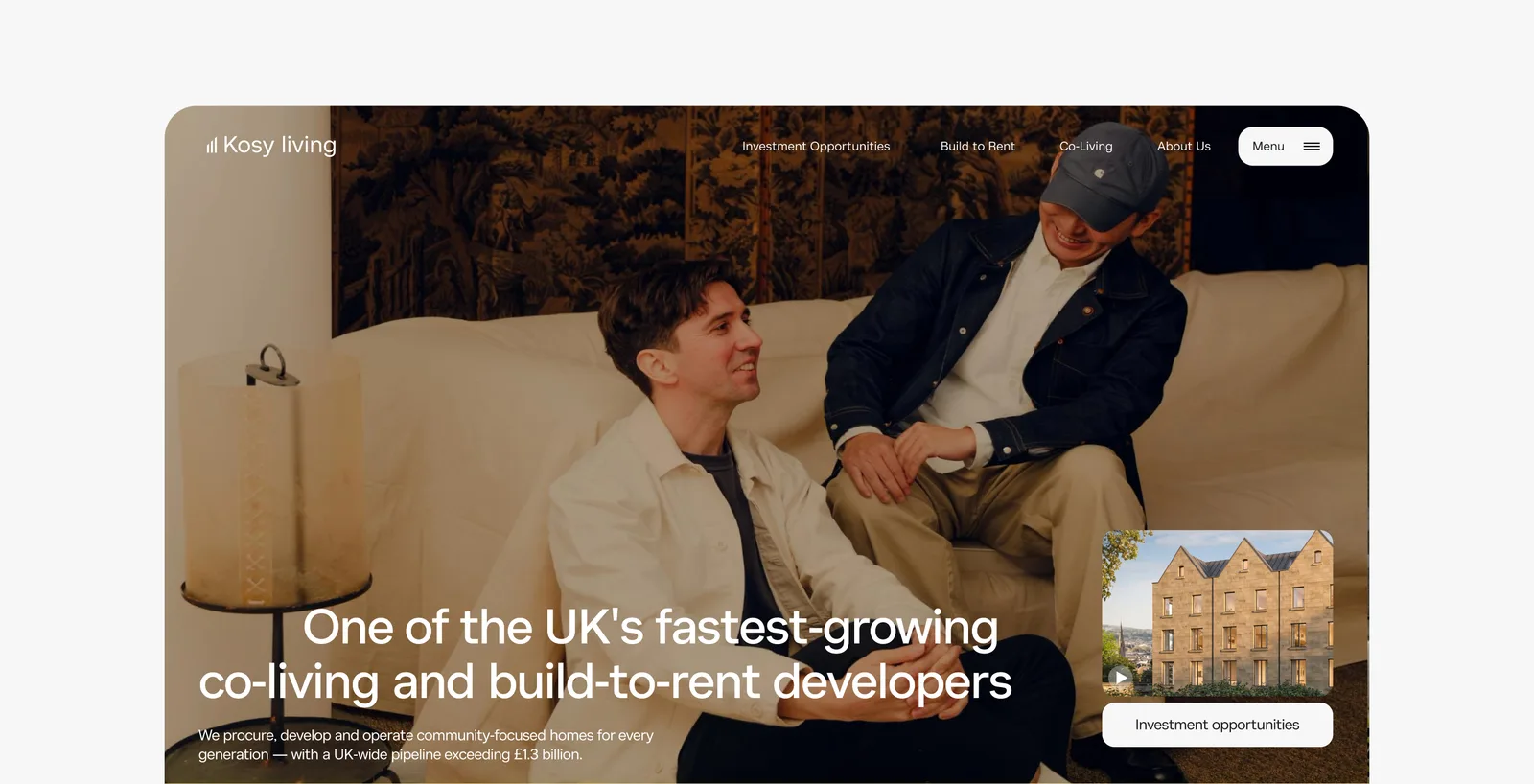
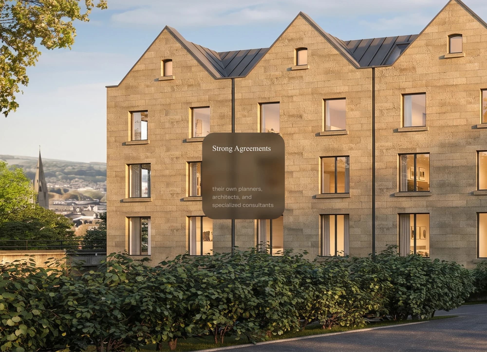
Kosy is about people living together, so we wanted the site to feel that way before you read a single word. People became the base of everything. Real residents, warm light, ordinary moments instead of staged interiors.
We kept what worked. Kosy reads as premium, and we had no interest in flattening that. We wanted to add warmth on top of it.
Design decisions
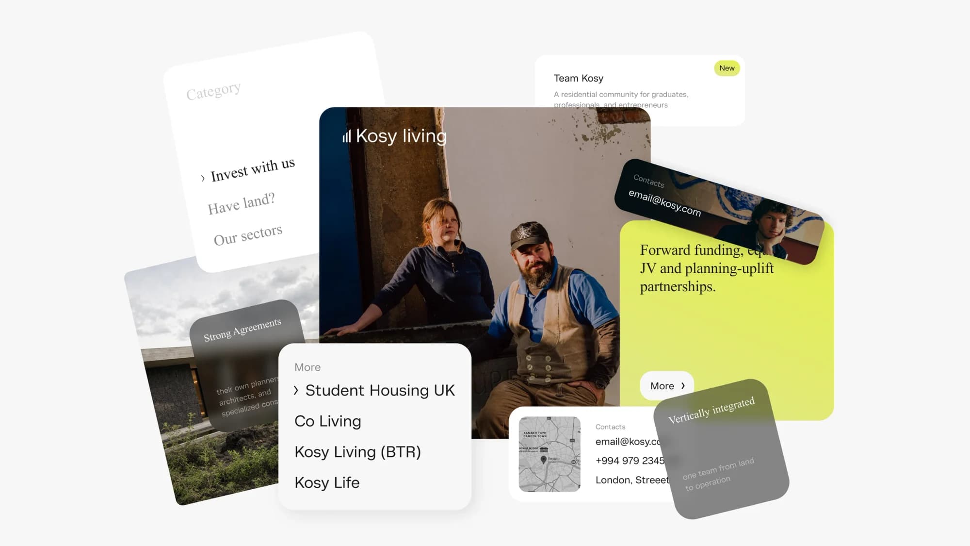
Colour. We took Kosy's own palette and updated it. Same character, a little warmer and more current, so it feels alive rather than rendered.
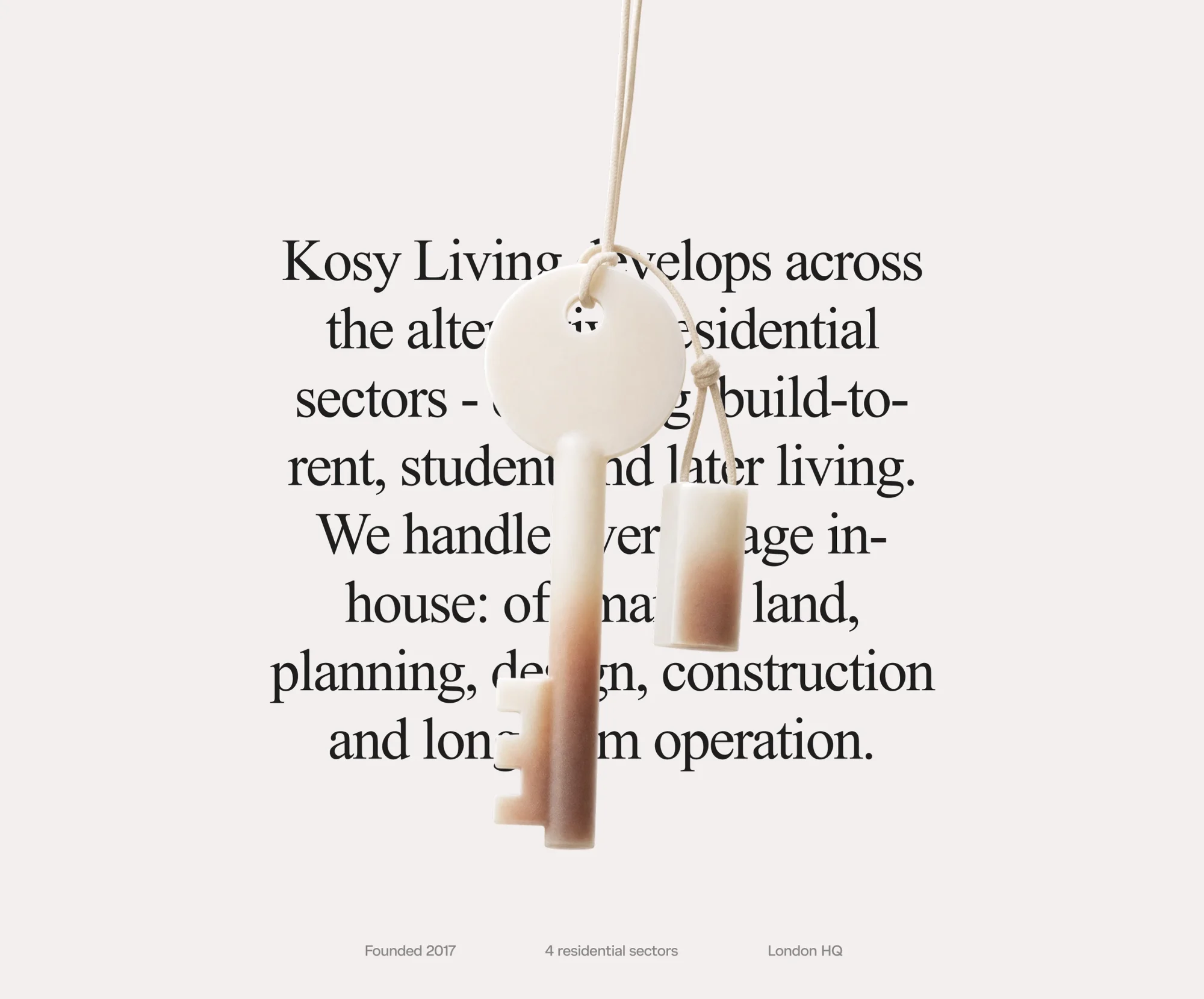
Type. Serif headings hold the premium tone and sit in nice contrast against the cleaner interface below.
Photography. Real people in warm light, front and centre. People are the base, and every page keeps a human in frame.
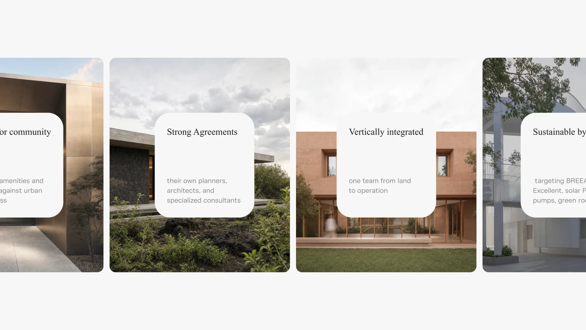
The four lines. Kosy runs four products: Student, Co-Living, Build-to-Rent and Later Living. The pages share one system and one feel, but each carries its own blocks, written for the needs and worries of that audience.
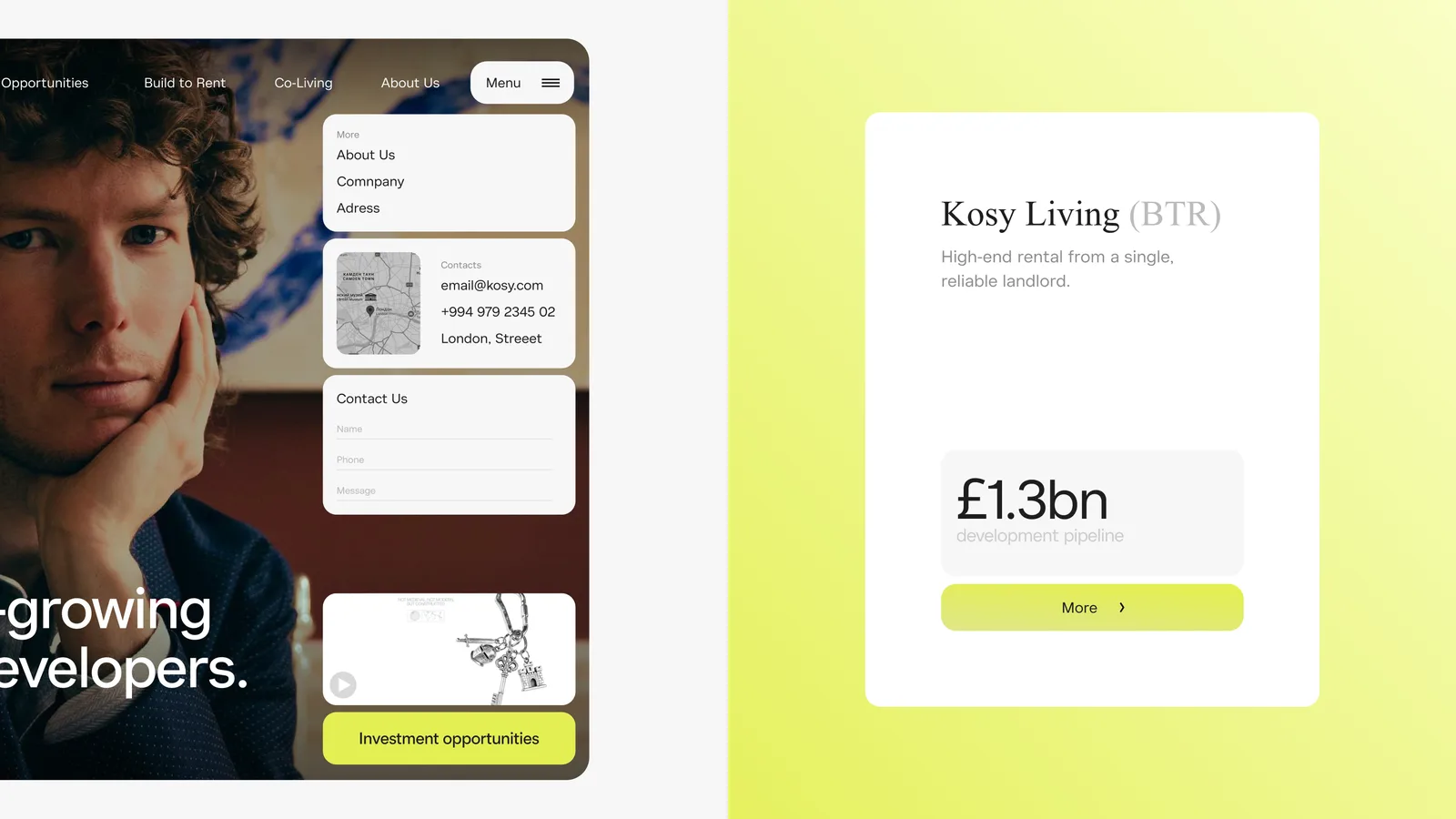
Transparency. The category stays quiet about numbers. We added an investor layer that shows its figures, because a company at this scale earns trust by showing its hand.
What we made
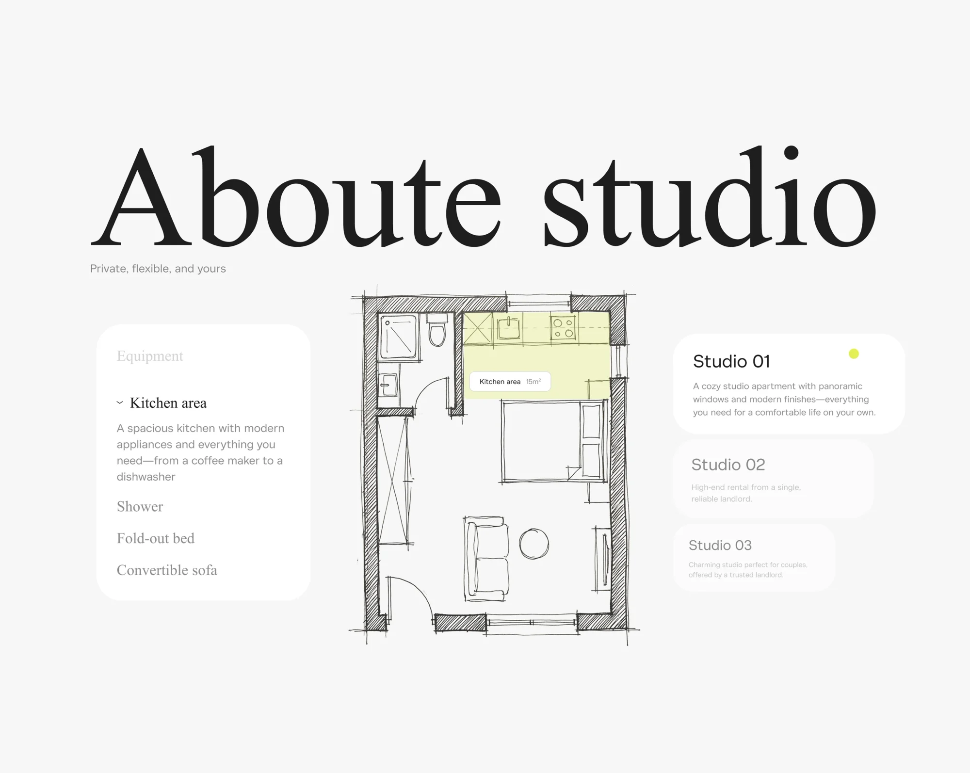
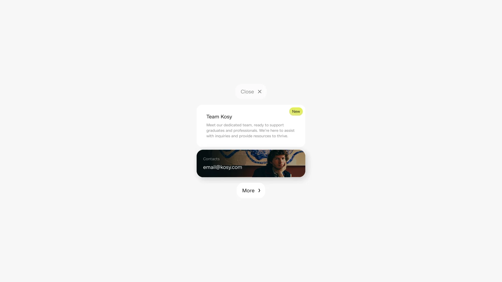
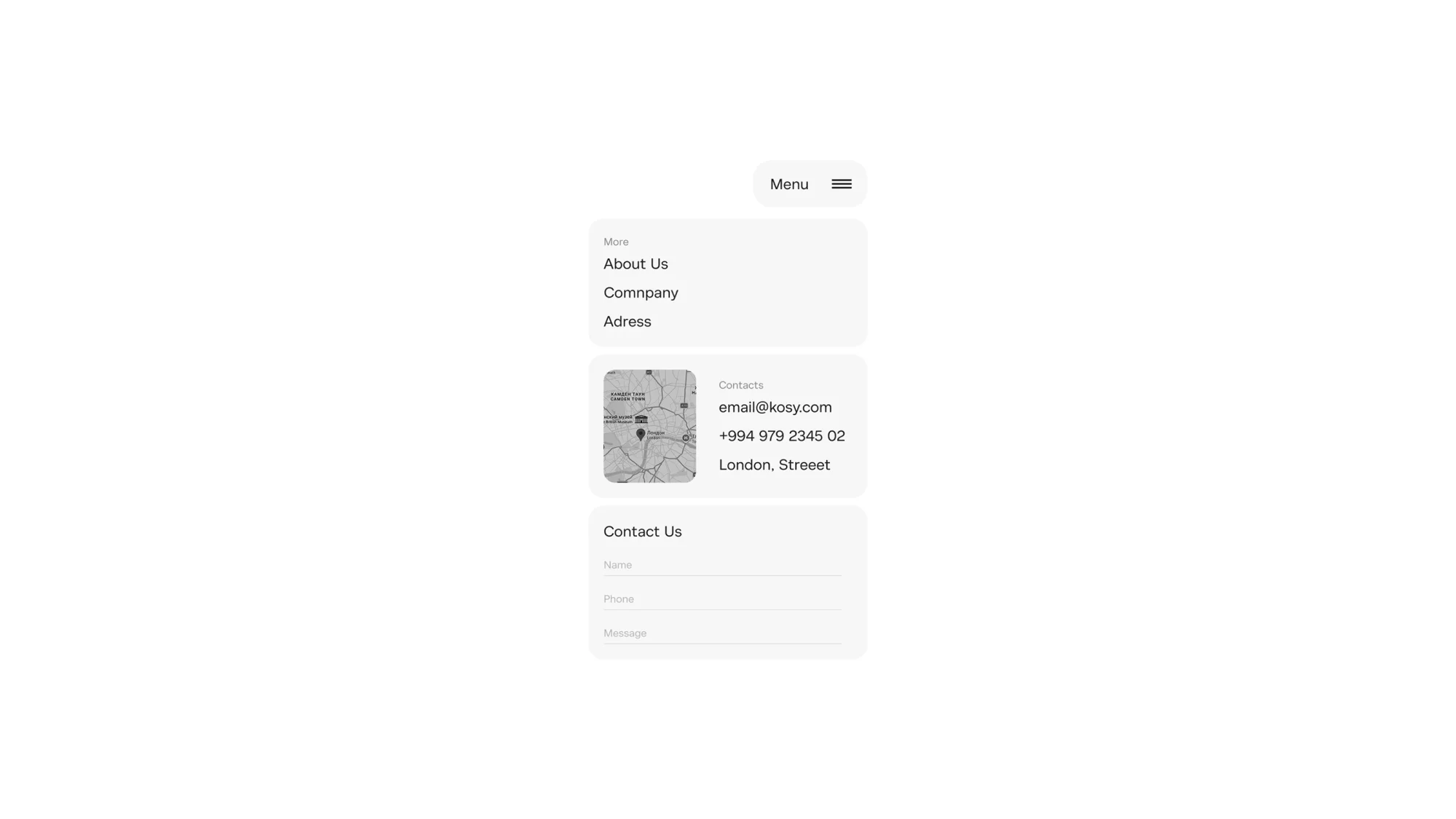
We redesigned the key pages, enough to carry the concept end to end: the homepage, the company story, the co-living experience and a project page. Enough to feel like a real site rather than a single hero shot.
What we take from it
Big companies, even ones with a lot of process behind them, can look fresh and human. And a two-week concept is worth more than it sounds. It launches nothing, but it finds a direction and turns a vague "we should redo the site" into something you can react to.