The task
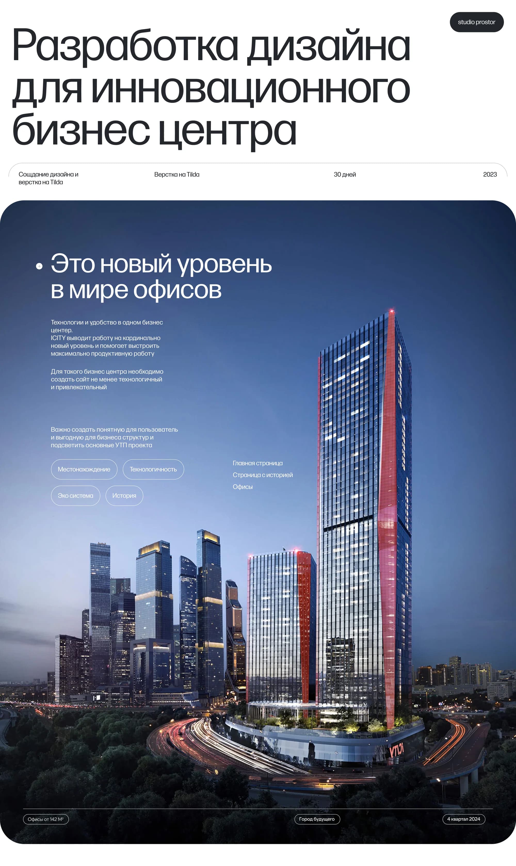
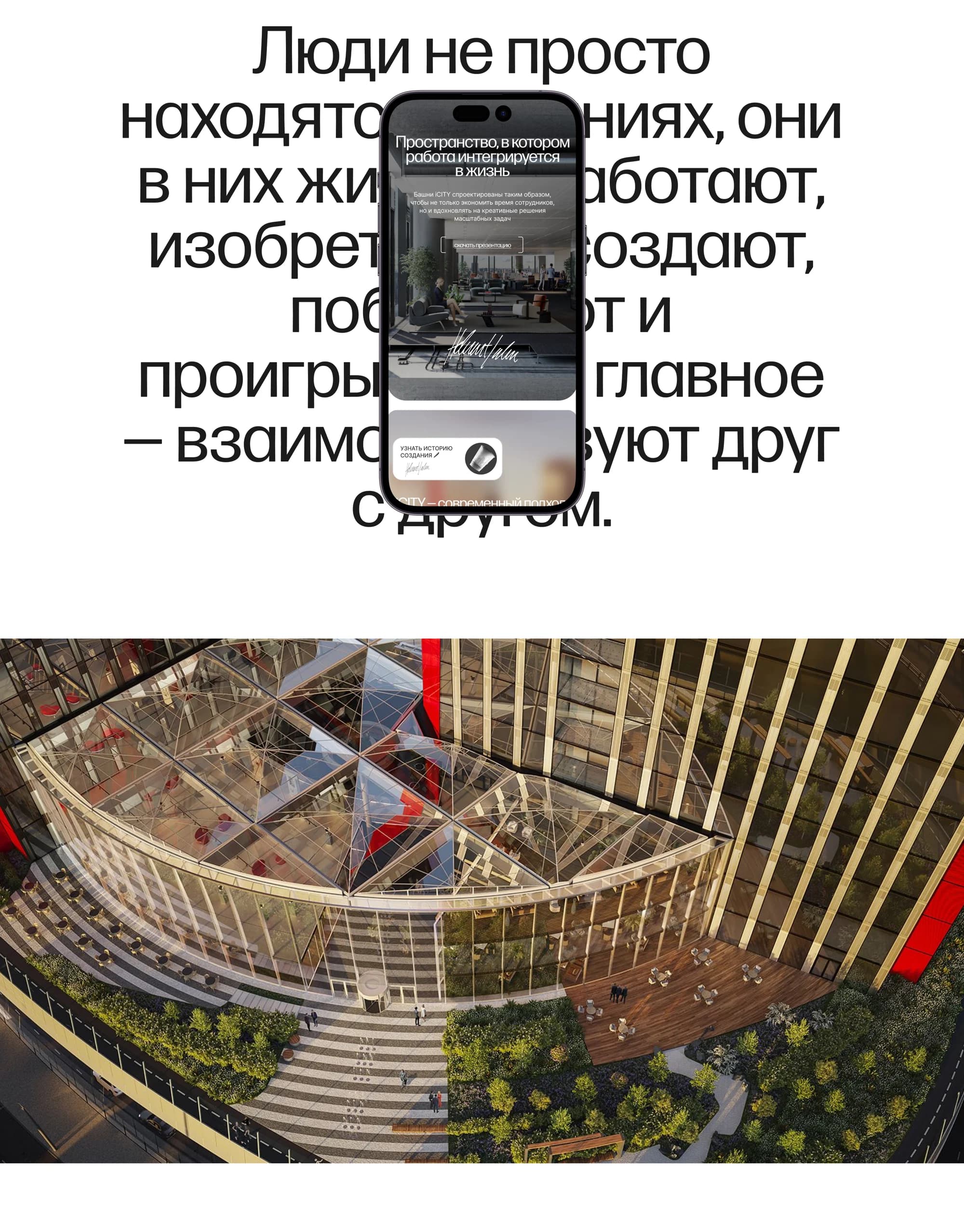
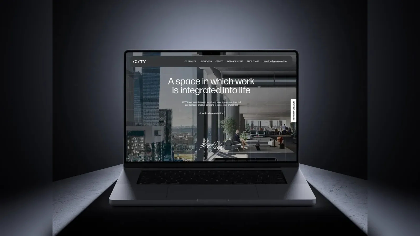
In early May a client came to us saying they needed a website for selling offices in the newest and most technological business centre in Moscow.
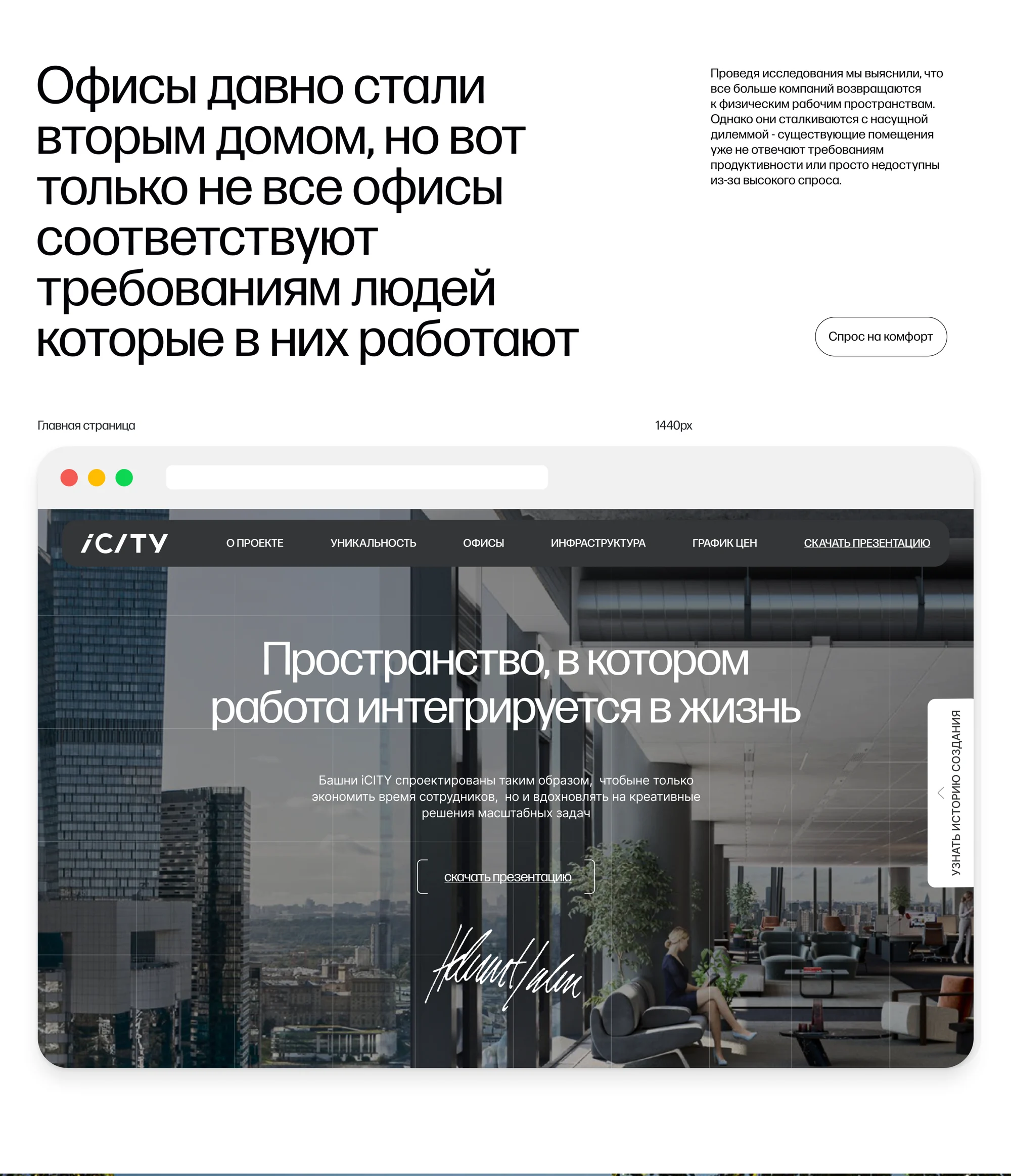
The site itself frames the question we had to answer: offices have long since become a second home, yet not every office meets the requirements of the people working in it; technology has long been part of our lives, yet business centres built decades ago cannot give us what we need.
The solution
The project had two concepts, and we brought both in.
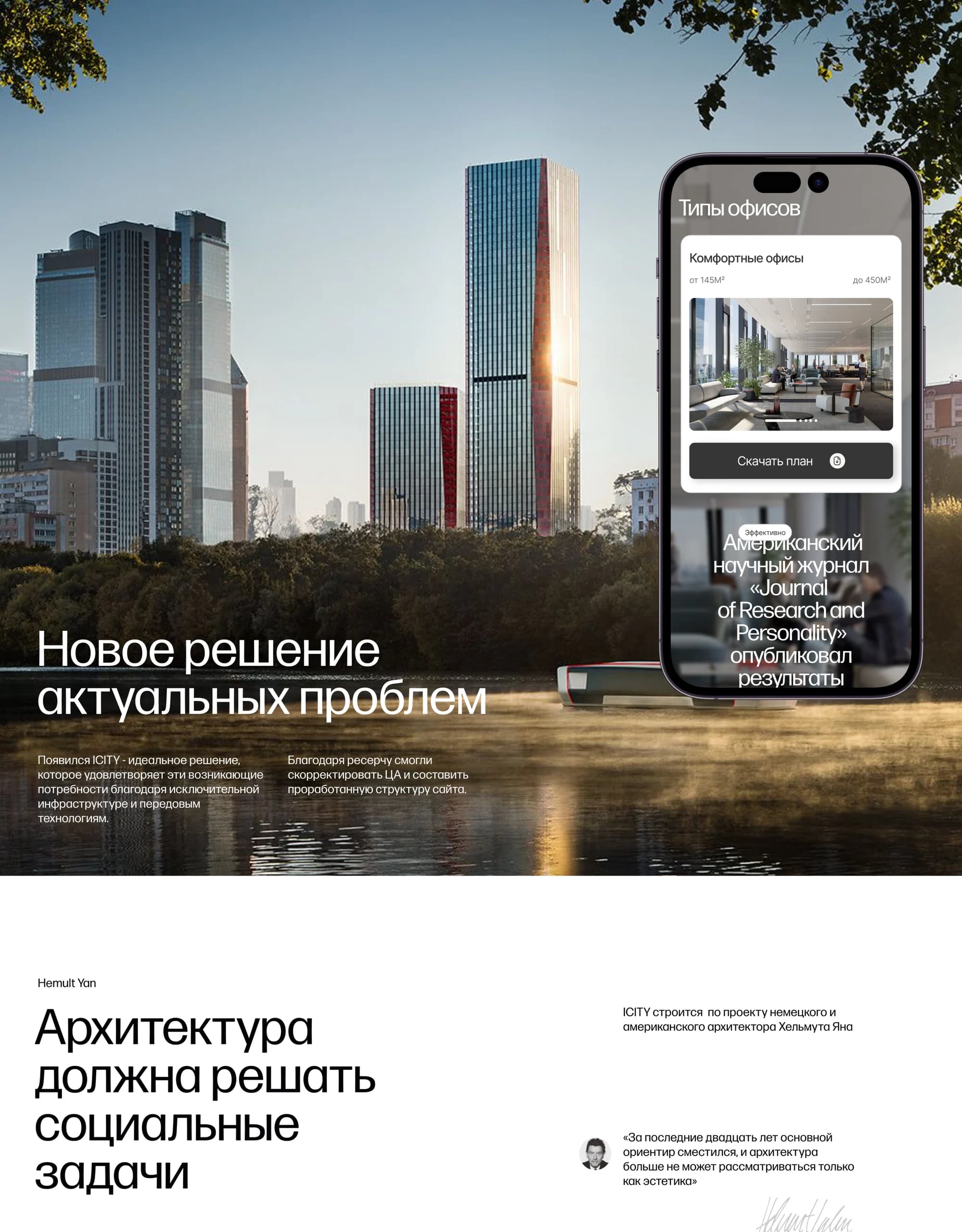
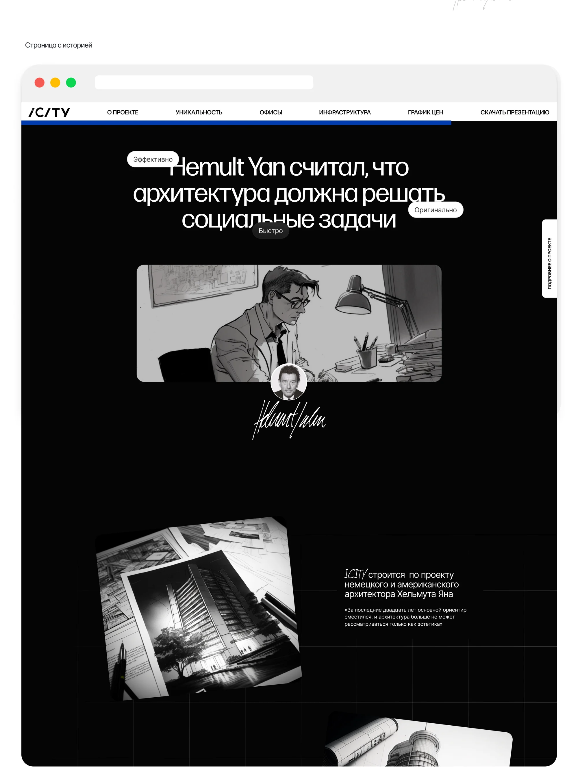
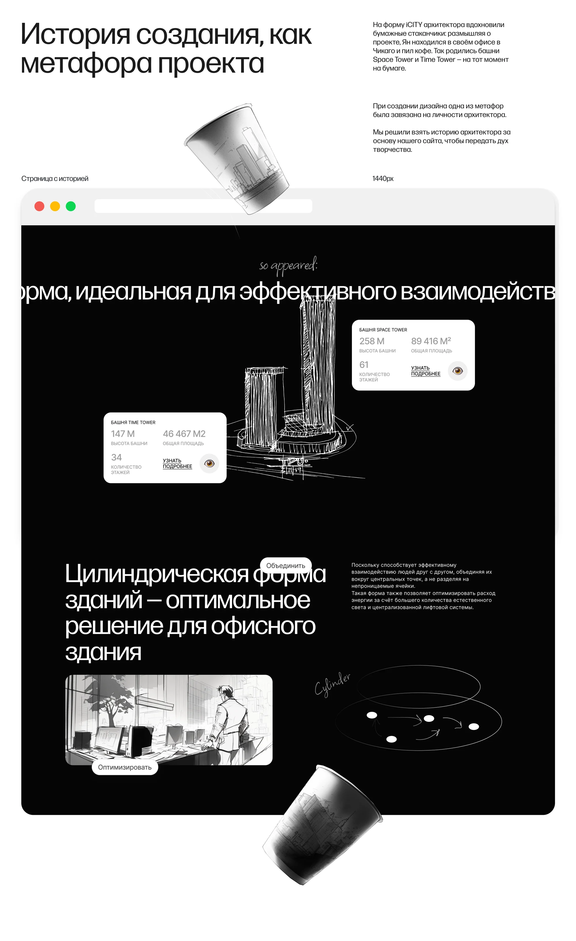
The first is the architect's story. iCITY is built to the design of the German-American architect Helmut Jahn. He held that architecture should solve social problems: over the past twenty years the principal reference point has shifted, and architecture can no longer be considered as aesthetics alone. He arrived at the towers' form in his own office in Chicago, inspired by disposable coffee cups — and so Space Tower and Time Tower appeared. We took the architect's story as our foundation, to carry that spirit of invention.
The second is the technology. The home page kept that one, because it reveals the business centre's main features well, while the story got a page of its own, which helps immerse the visitor in the project still further and with it increase the number of enquiries about buying offices.
We combined both concepts and built a multi-page site on Tilda, adding animation and interactions. The whole project took 30 days.
What we did
Two concepts on one site. The home page for technology, a separate page for the story of how it came about, told as the project's metaphor.
The architect section. Helmut Jahn, his position, the sketches, and the explanation of the cylindrical form as the optimal solution for an office building.
The towers in figures. Space Tower and Time Tower with their height, area and number of floors.
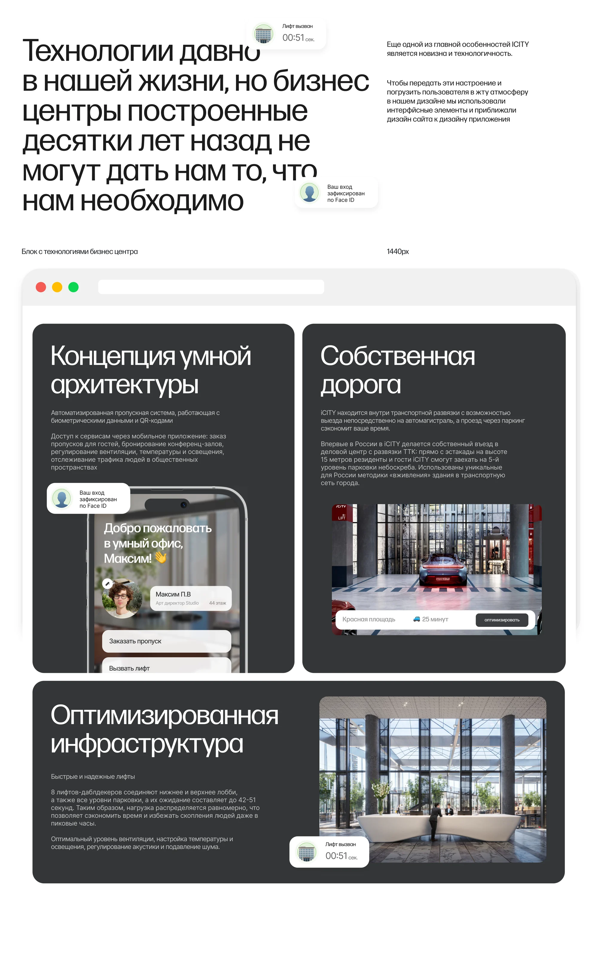
Technology block. A smart-architecture concept with automated access systems, a dedicated road, an optimised infrastructure.
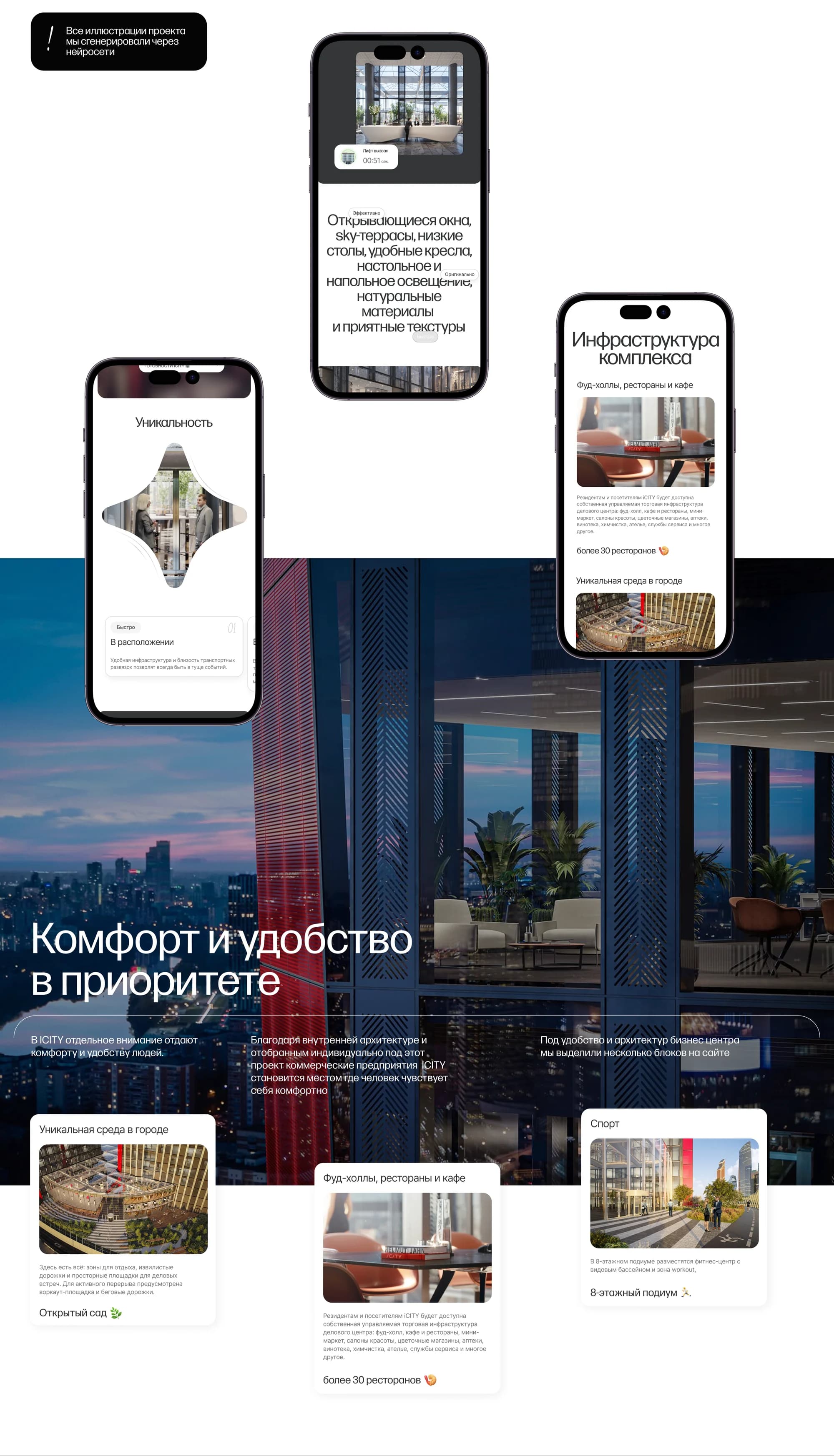
Smart-office interfaces. Screens for ordering a pass and calling a lift — the building shown through its app rather than through description.
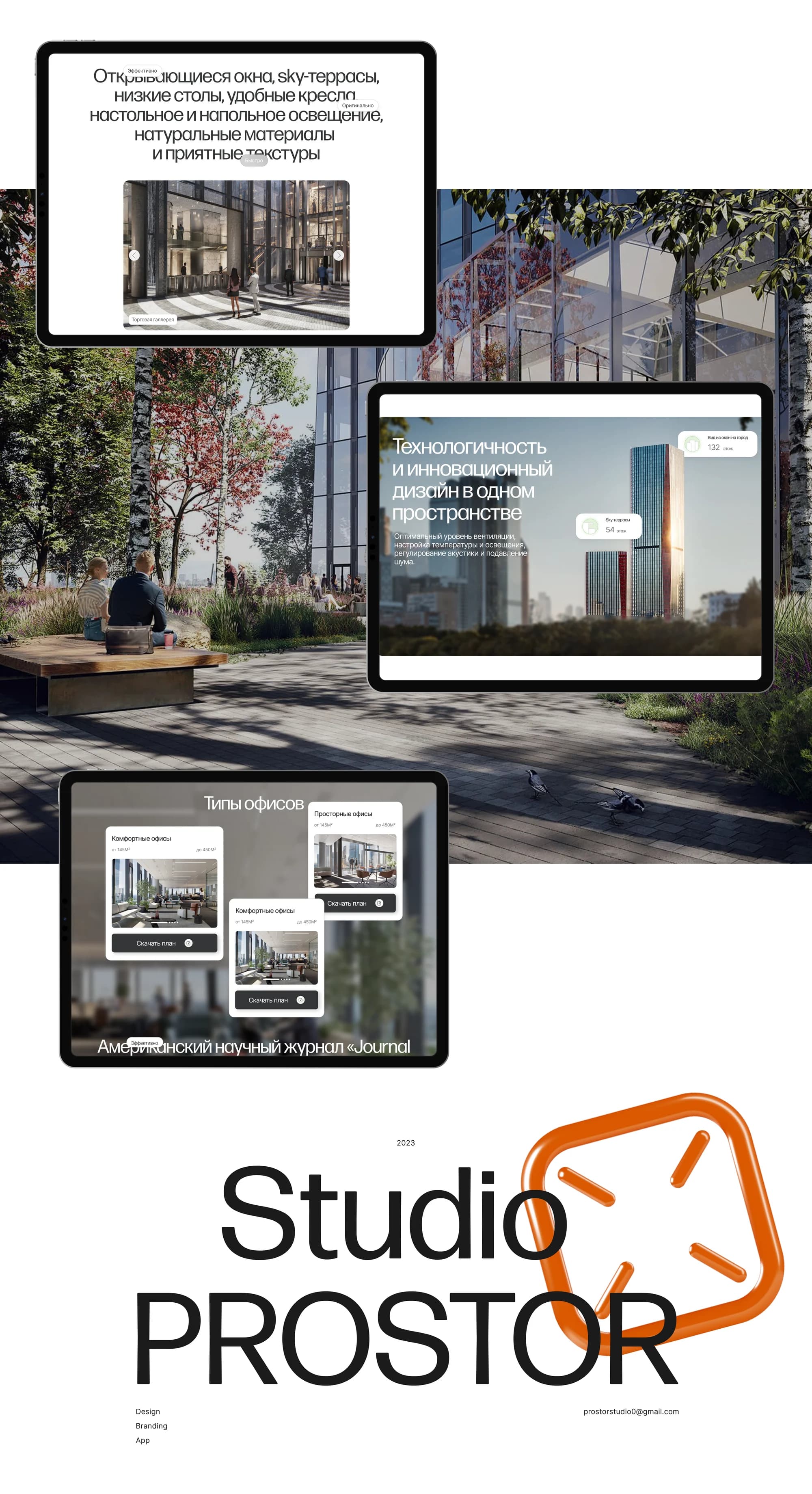
Infrastructure and comfort. Food halls, restaurants and cafés, an open garden, sport, plus the details of the environment: opening windows, sky terraces, natural materials.
Offices. Office types, the price schedule, and downloads for the plan and the presentation.
Neural-network illustration. Every illustration in the project was generated with neural networks and brought to a single style.
Animation and interaction. Smooth transitions and animation at the key points of the storytelling; where Tilda's built-in capabilities ran out, we wrote the rest by hand.
The result
The client did not have to choose between two concepts: the site holds both, separating them into routes and tying them together with shared navigation and styling.
According to the client, as of the fourth quarter of 2024 feedback requests had risen seventeenfold and browsing depth by 86%.
The site runs at icitymoscow.com. The full breakdown is published on Behance and on Dprofile, where it carries the Recommended badge. Links below.