The task
Kvartira po chastyam is a product the market did not have: property bought by the square metre, without a mortgage, through digital financial assets. A person puts in the money they actually have and gets metres in a specific building.
The hard part of a product like this is not the interface, it is the explanation. We worked from the assumption that a digital financial asset is an unfamiliar instrument: until someone grasps the mechanism, they will not start reading the terms. The brief said as much — explain the model to a person hearing about it for the first time.
That splits into two jobs. The website explains the model. The personal account walks the user through a first purchase and show how to keep accumulating metres towards a whole apartment. Two months for all of it.
The solution
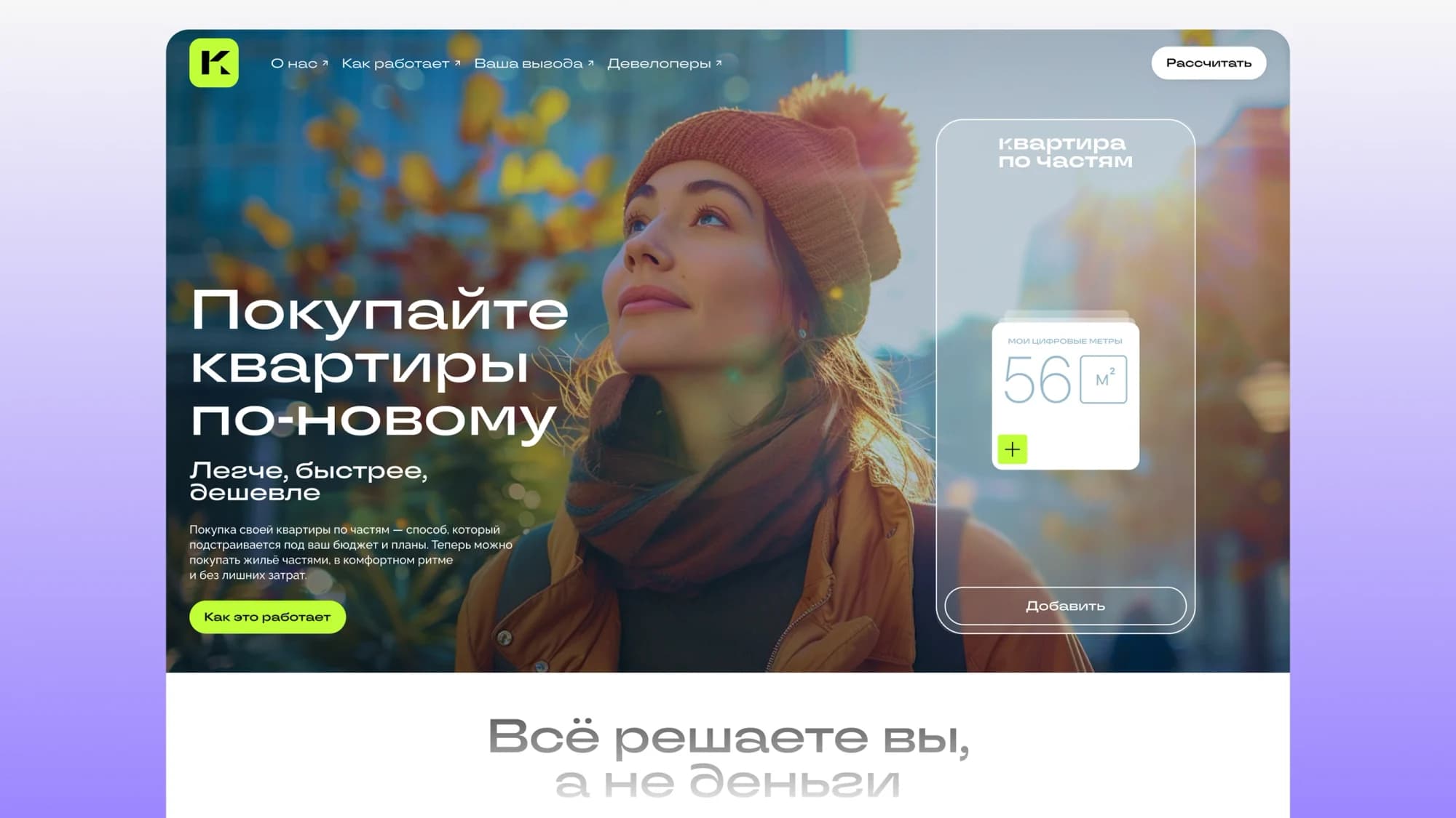
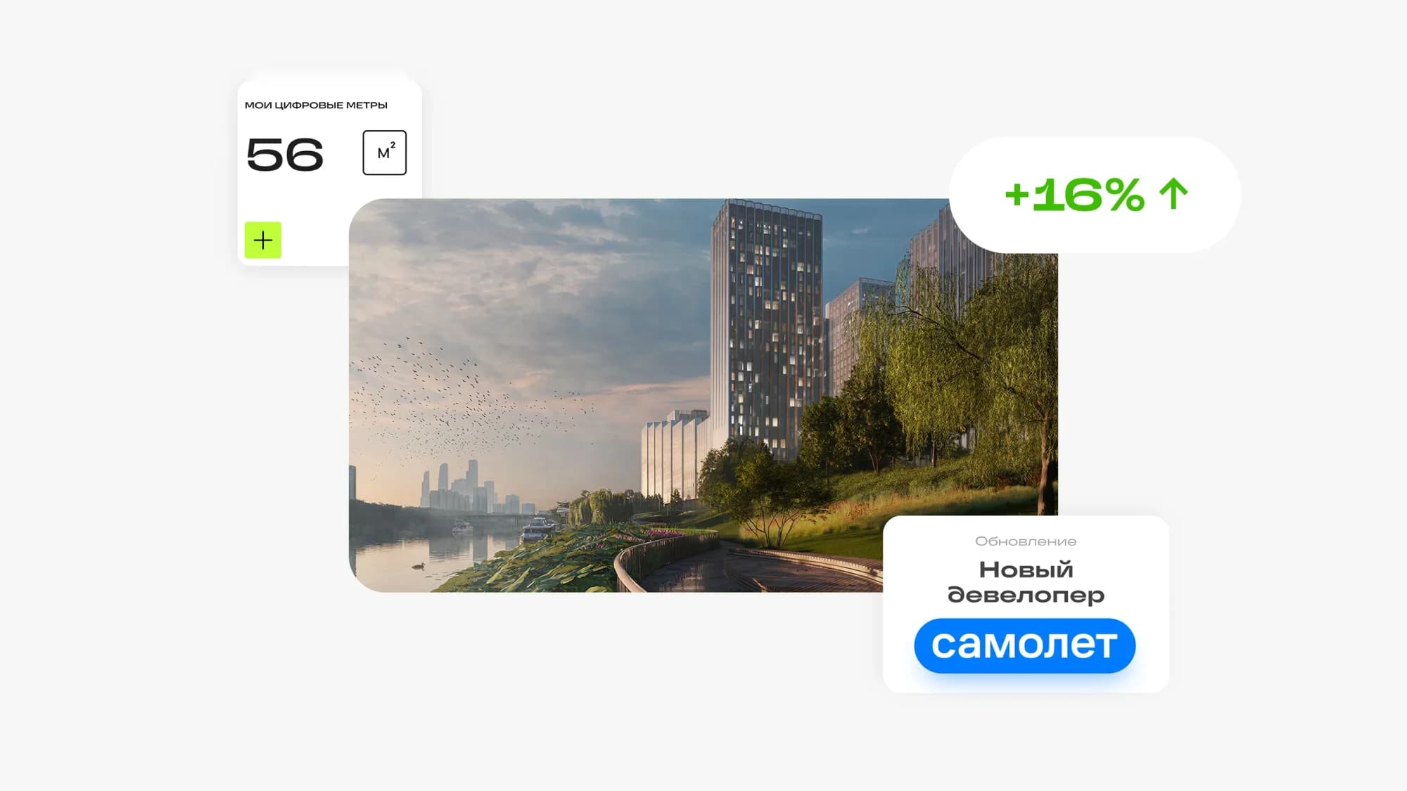
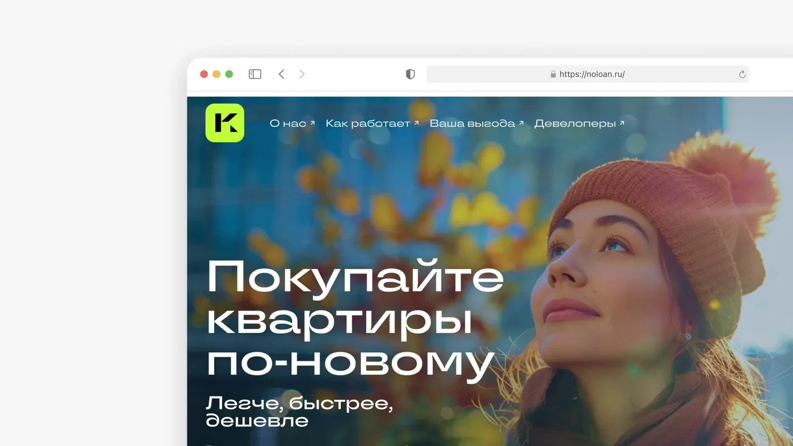
The first screen leads with the outcome, not the mechanism: buy apartments a new way — easier, faster, cheaper. Beside it sits a widget with the number of metres accumulated and an Add button, so the mechanic is demonstrated before it is described. The second screen takes on the main objection with a line that moves the conversation from the sum to the buyer: you decide, not your money.
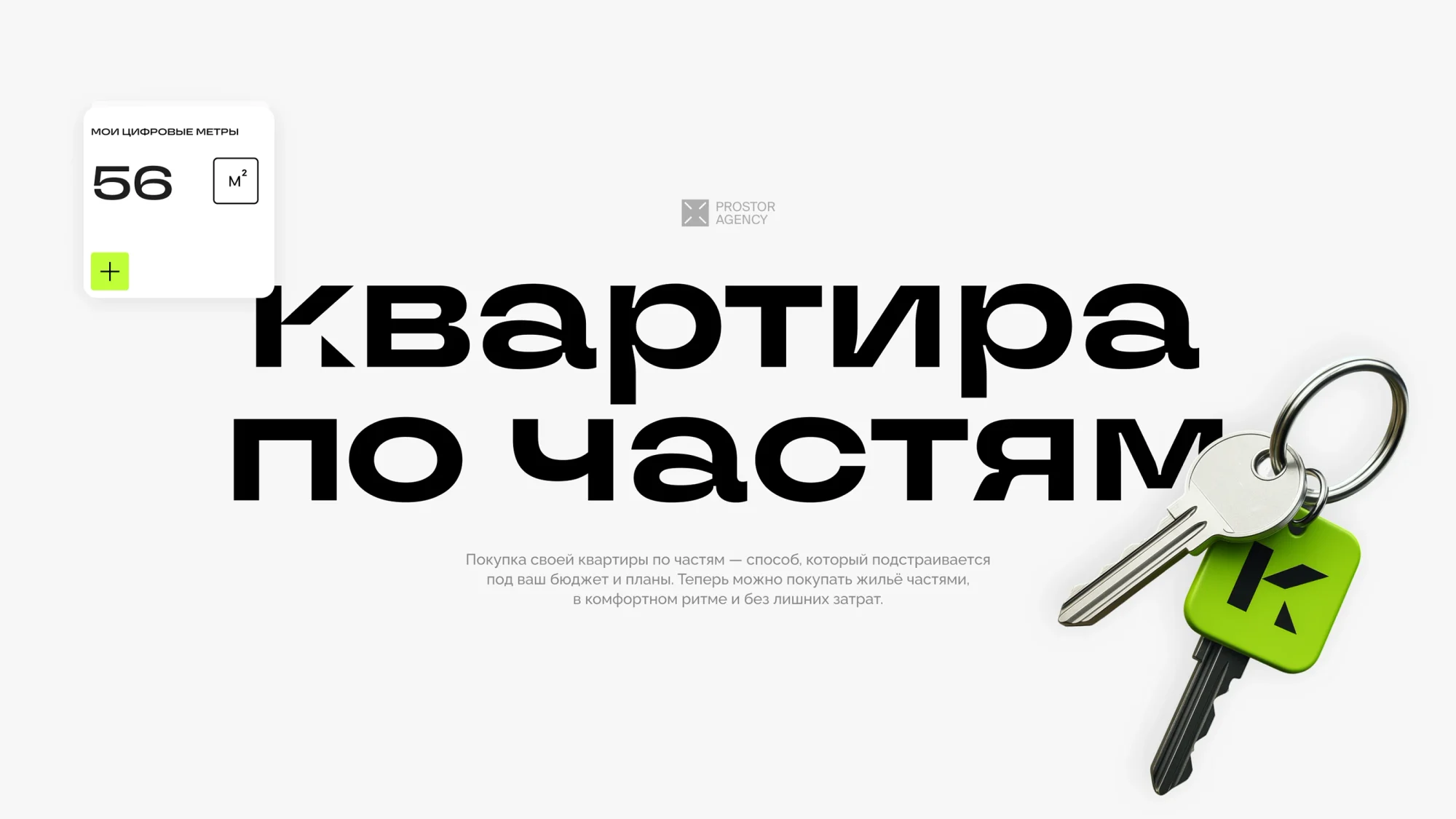
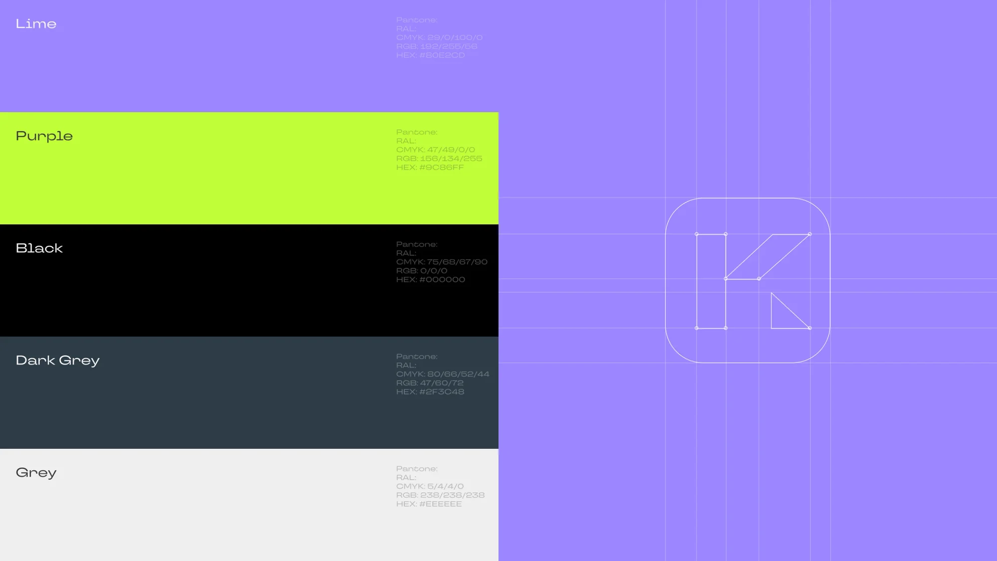
The unit of the product is a square metre, and the whole visual system is built on it. A metre counter with a plus sign works as the brand mark: 56 m² on the promo material, the actual balance inside the account. The logo is a letter K in a lime square, a nod to a key fob. The palette is short — lime, purple, black and two greys — which is enough to carry both marketing material and interface.
What we did
Home page. The model explained step by step, a storefront of residential complexes, and sections on the company, how it works, what the buyer gains, and one for developers.
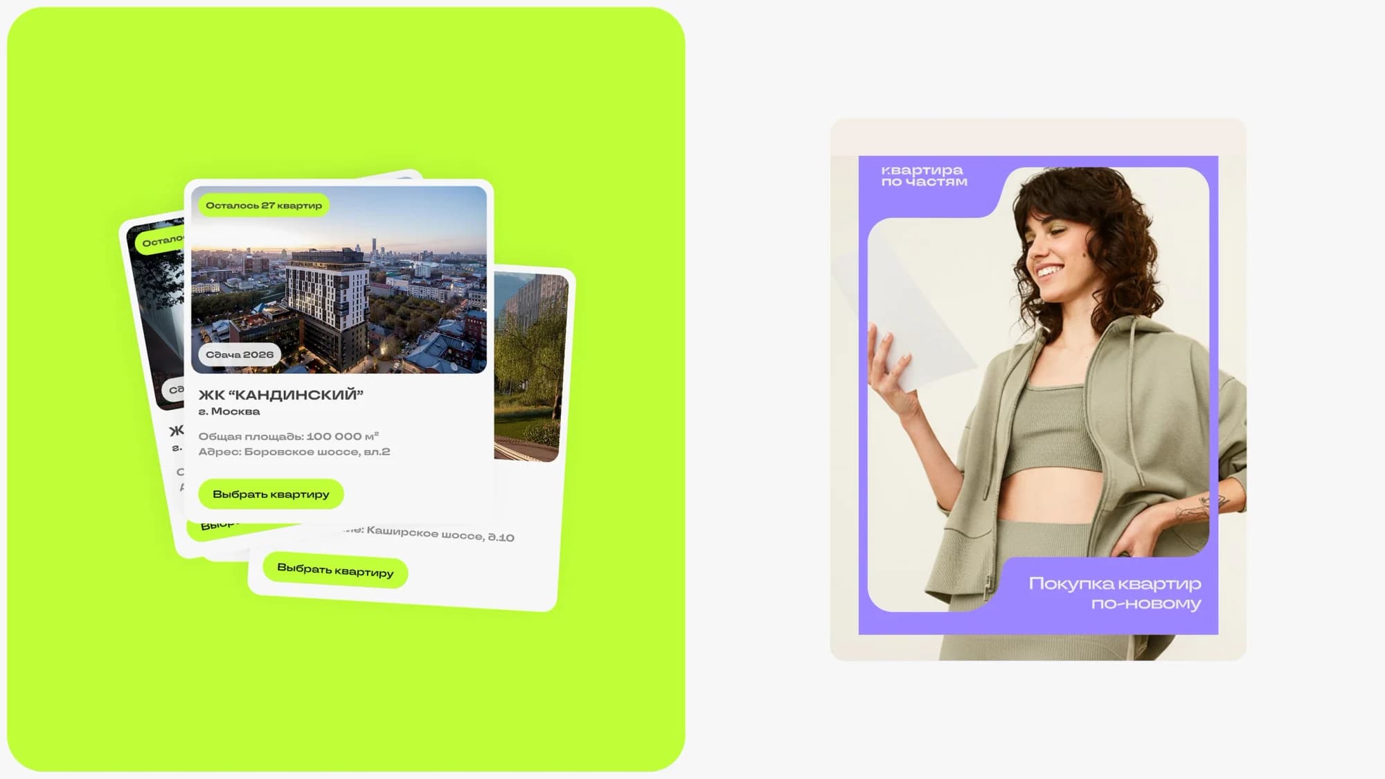
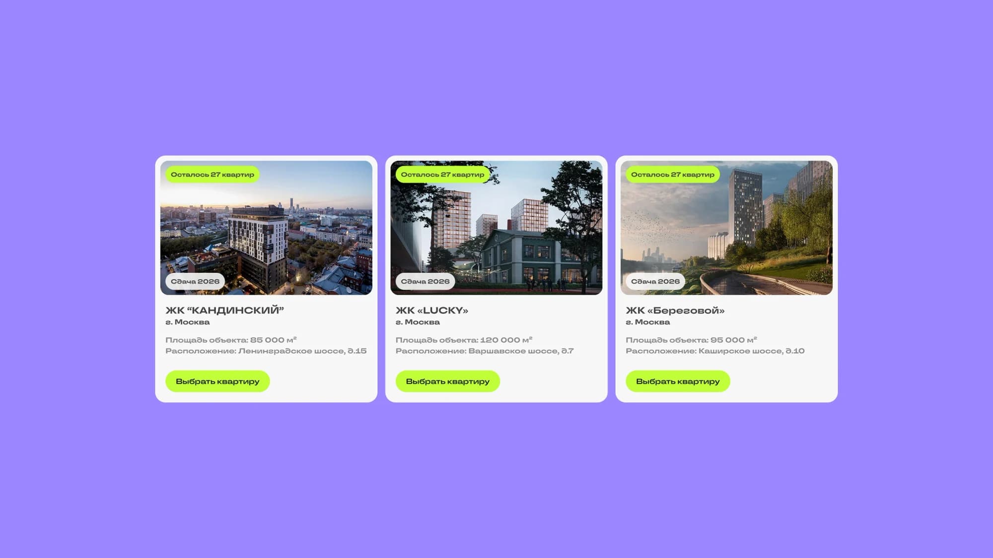
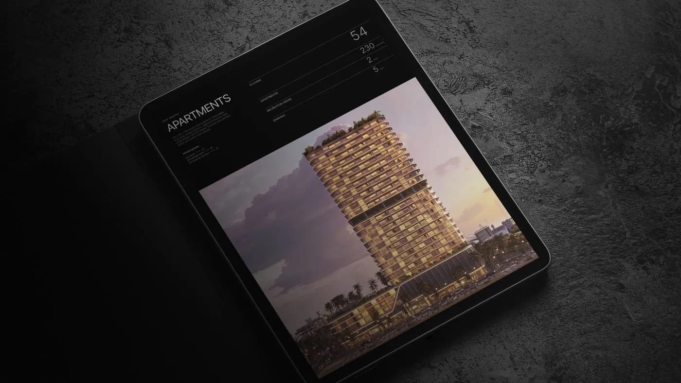
Complex storefront. Cards for the developments — Kandinsky, LUCKY, Beregovoy: a photograph, city and address, floor area, completion date, how many apartments are left, and a Choose an apartment button.
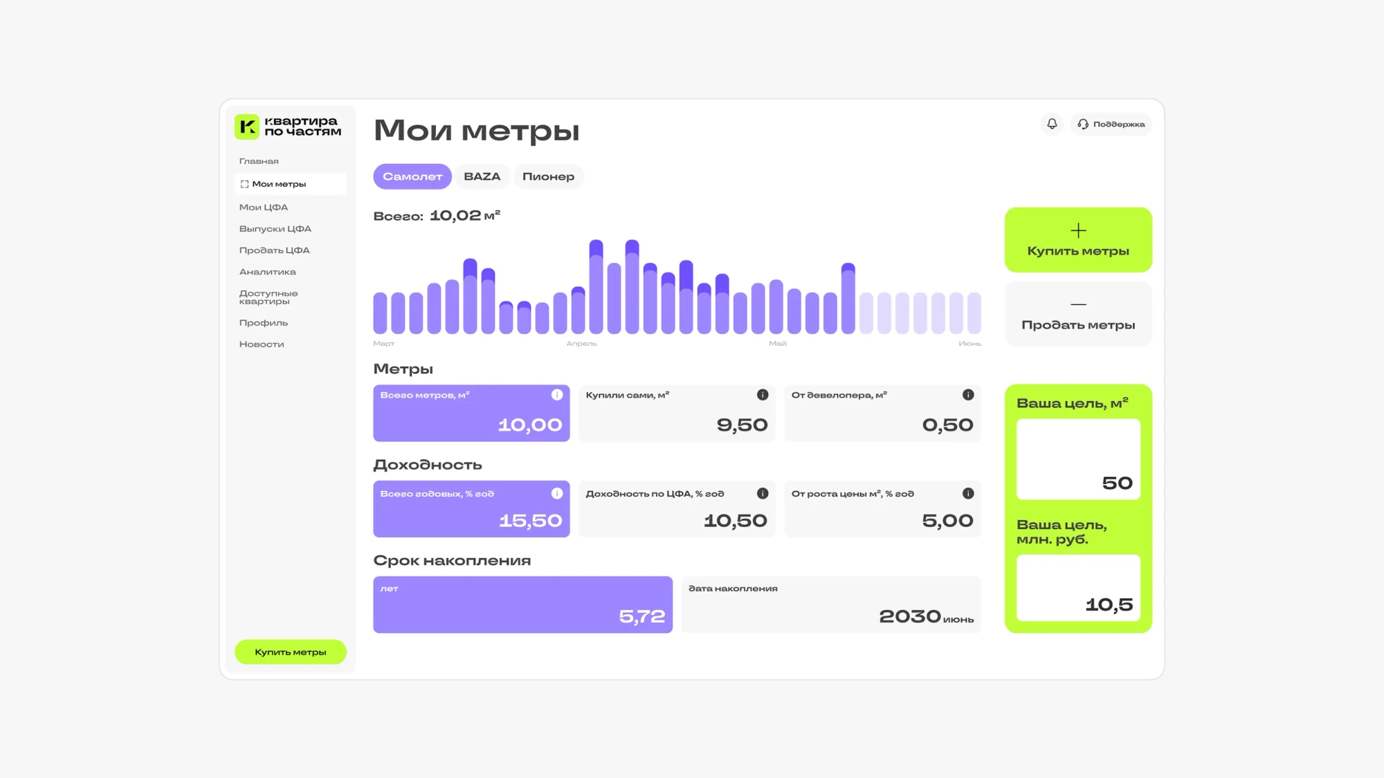
The account, "My metres". A month-by-month accumulation chart, the total held, yield, time to target, and the goal itself — in metres and in roubles. Buy metres and Sell metres sit side by side: the exit is as visible as the entry, which removes half the anxiety around an unfamiliar instrument.
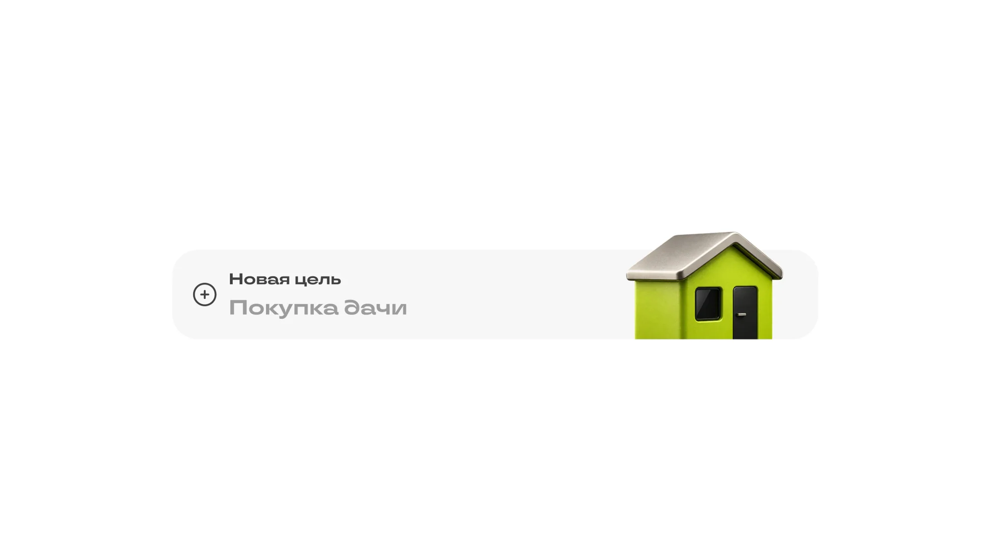
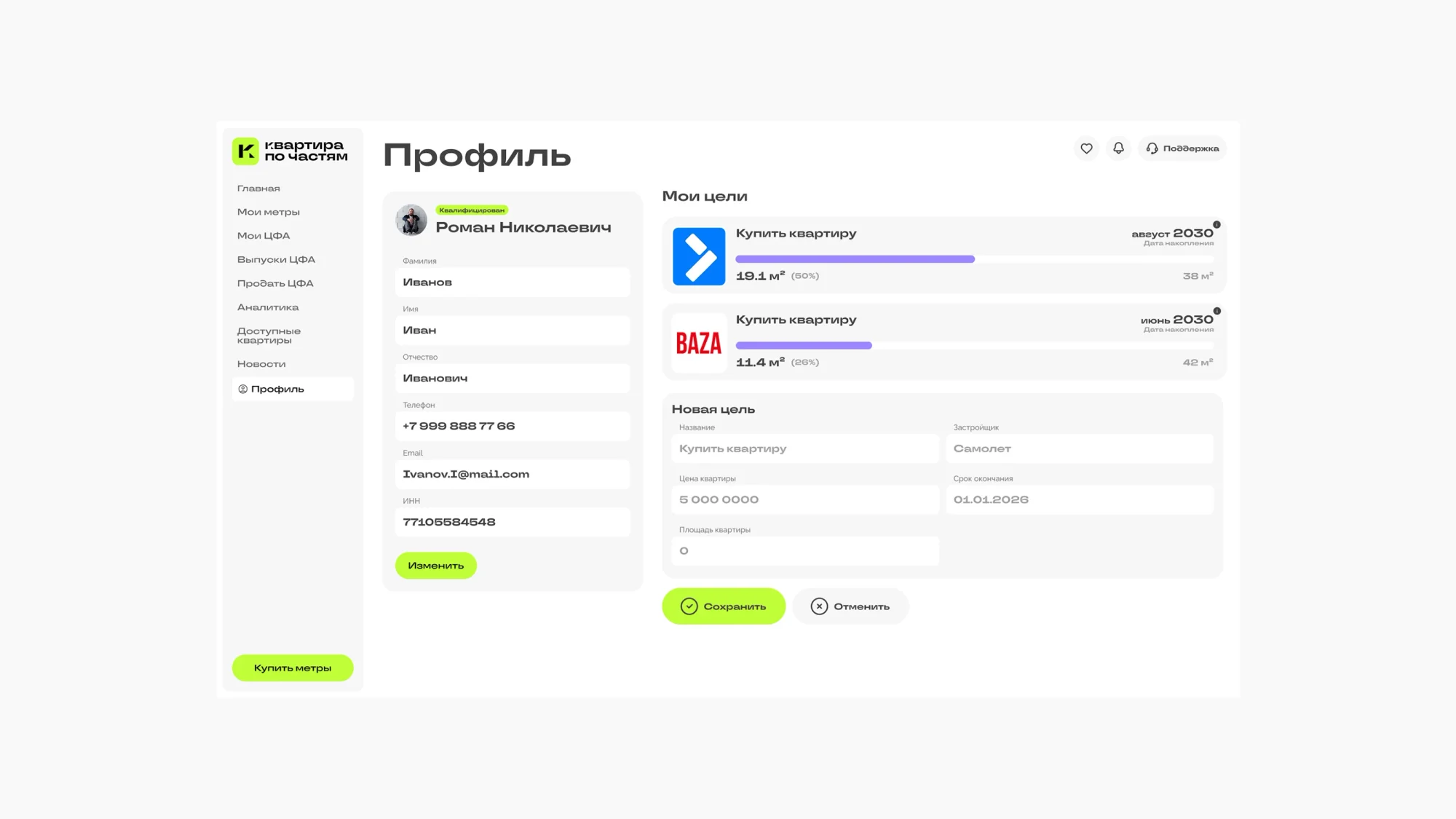
Goals. The user sets a goal — buy an apartment, buy a country house — and sees progress against each: metres held, metres needed, and the year it lands at the current pace.
Profile and sign-up. Personal details, the list of goals, consents. The form is kept short so nobody is lost at the door of an unfamiliar product.
The result
The site introduces a model new to the market through plain language and one visual metaphor: a key, metres, a progress bar. The account carries the user from a first share to a full apartment and shows movement towards the goal in the unit people actually think in — metres.
Design of the website and the account, plus development of the website, ran in two months.
The full breakdown is published on Behance and Dprofile — links below.