The task
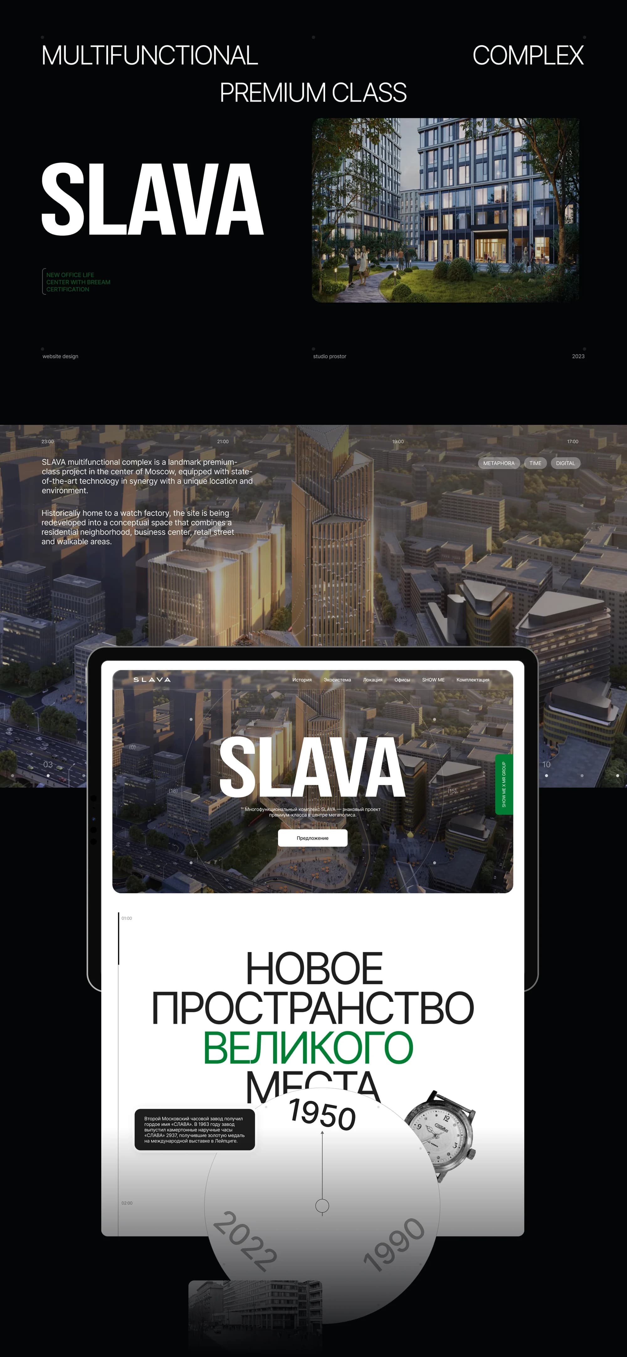
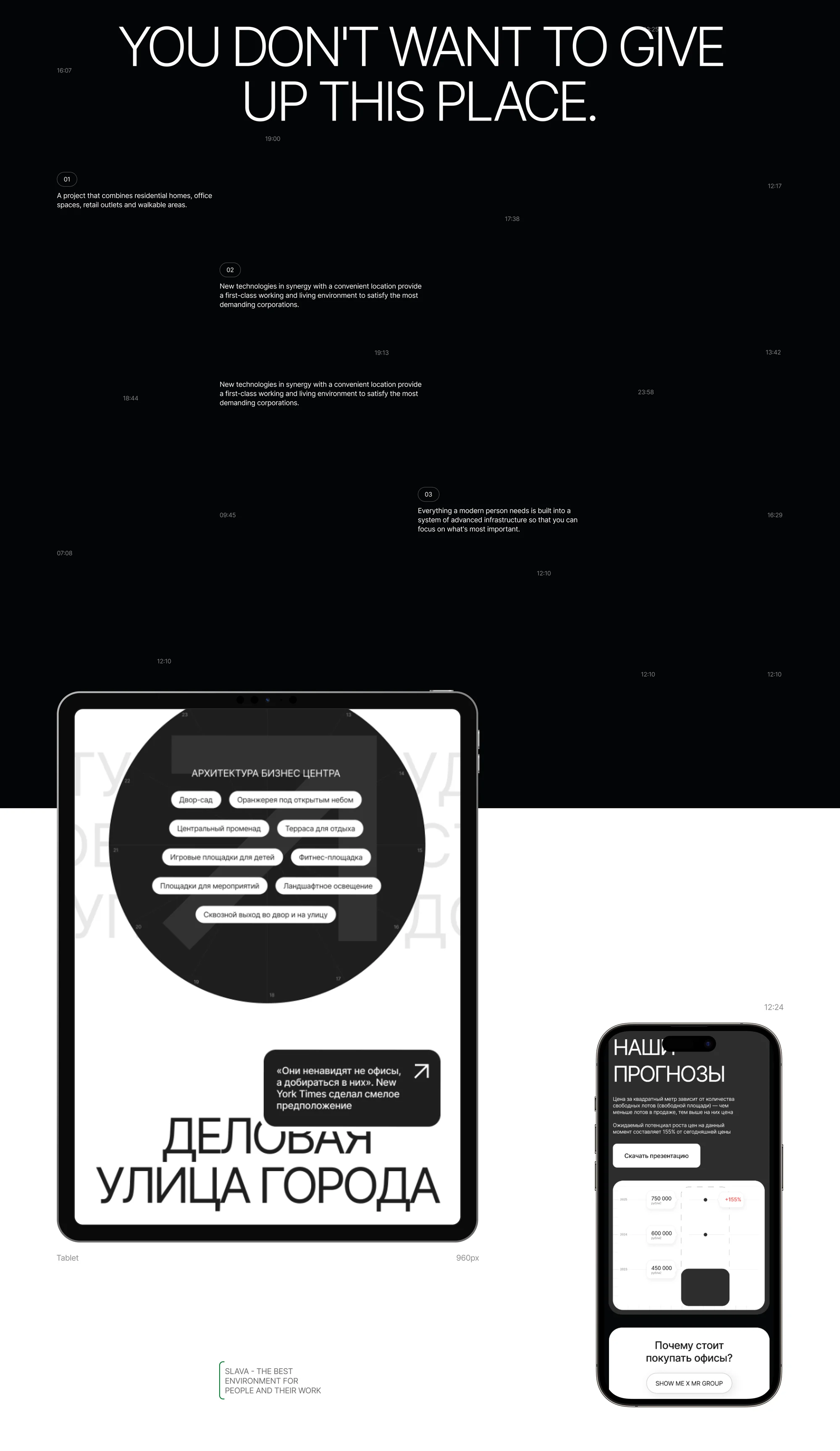
SLAVA is a new premium-class multifunctional complex in the centre of Moscow, at the junction of 1st Yamskaya Street and Leningradsky Prospekt, beside the transport hub at Belorussky station. The layouts describe it as a new office-life centre with BREEAM certification: the project combines residential homes, office spaces, retail outlets and walkable areas.
The clock metaphor, taken from the complex's name, sets the site apart from typical business-centre pages and carries its strengths.
The deadline was tight — 25 days for the whole cycle, from concept to launch.
The solution
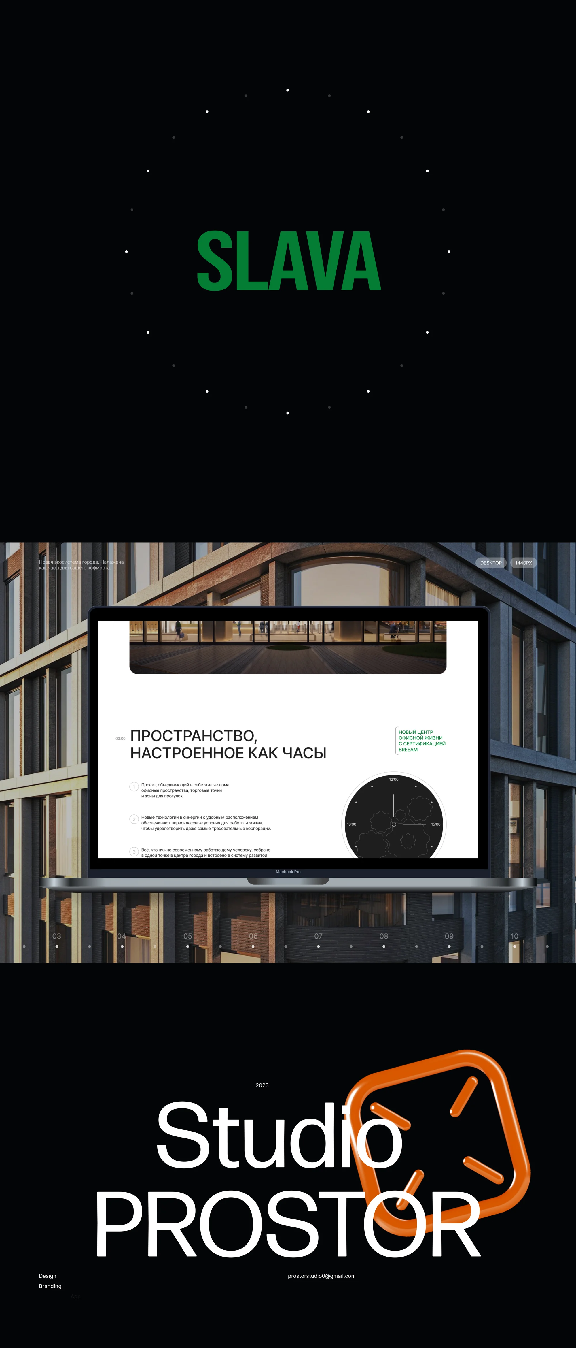
The metaphor came from the name. Slava is a watch, and clockwork became the basis of the whole presentation. The first screen carries a dial with the years 1950, 1990 and 2022, a headline about a new space in a great place, and the line that runs through the site: a space set up like clockwork.
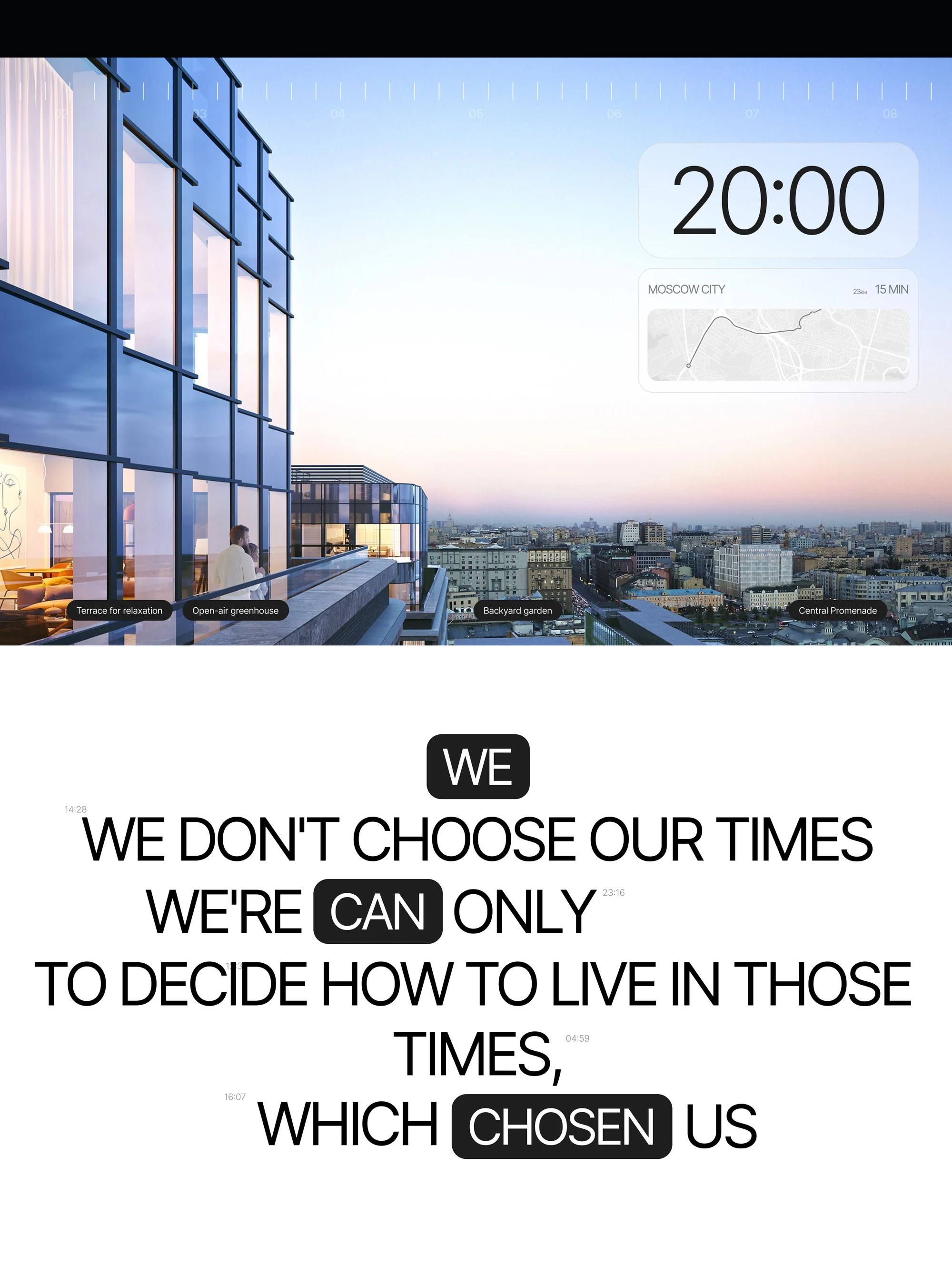
The same metaphor produced the site's central thought, given a screen of its own: we don't choose our times, we can only decide how to live in the times that chose us.
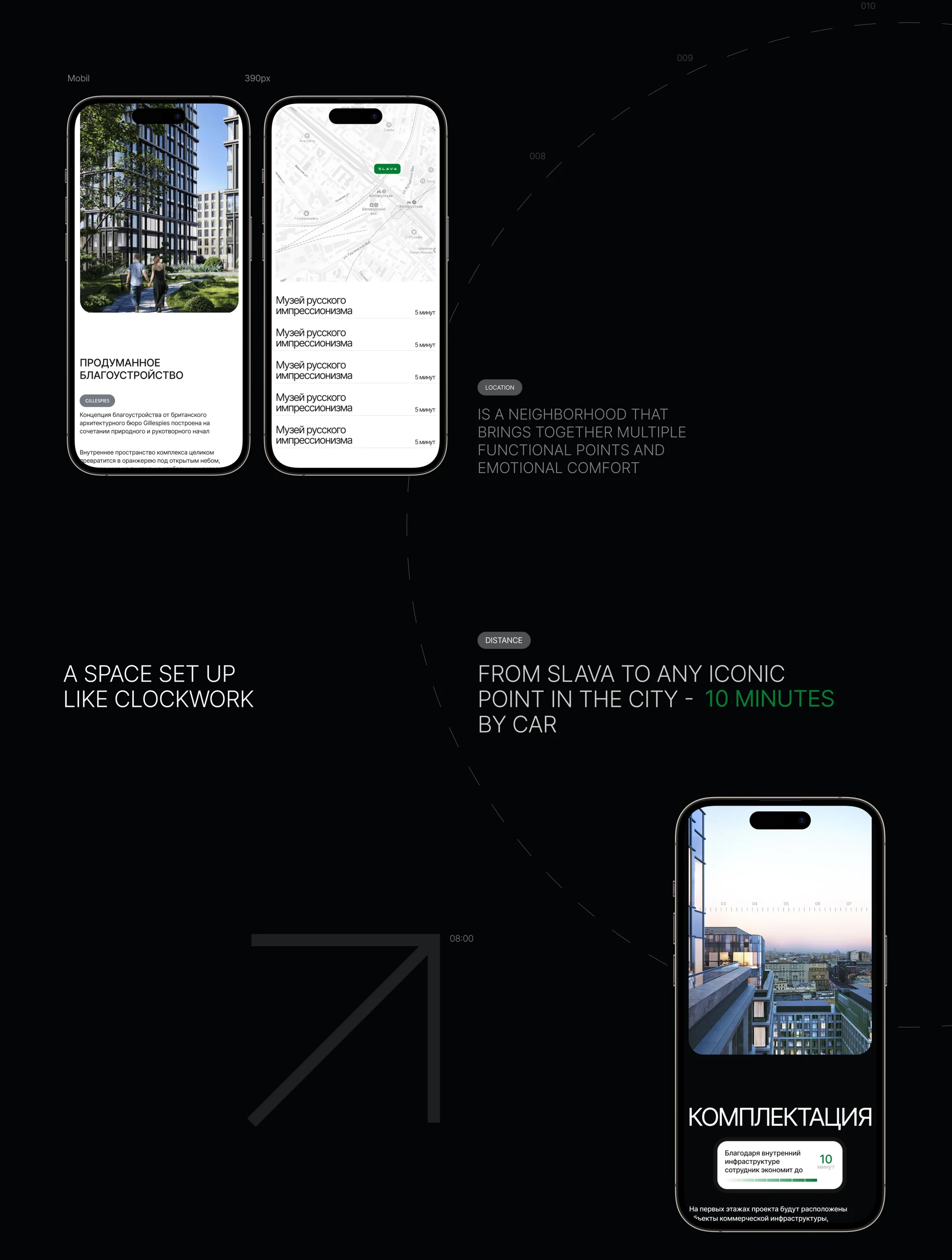
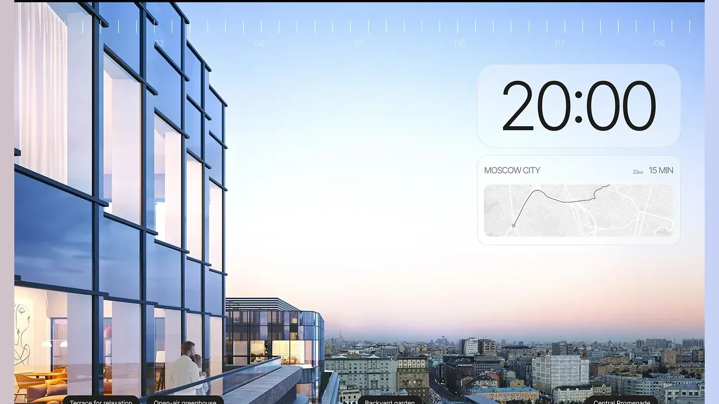
The clock also does functional work. SLAVA and the neighbouring White Square form a neighbourhood that brings together multiple functional points and emotional comfort: from SLAVA to any iconic point in the city is 10 minutes by car, and Moscow City is 23 km and 15 minutes away. To our mind, precision and schedule are exactly what an office tenant needs, and exactly what clockwork promises.
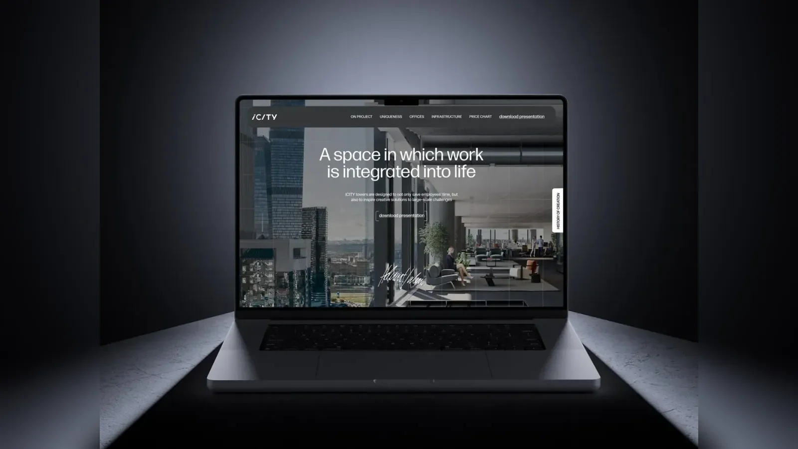
Visually the project sits on black with a single green accent and large type; the circle of the dial recurs as graphics across the sections.
What we did
Metaphor and visual language. An individual visual language for a positioning built on a new format of office life.
First screen. The dial with its dates, the line and the way into the project.
Location. A block on the 10 minutes to the city's landmarks, the 15 minutes to Moscow City, and the district that gathers several functions at once.
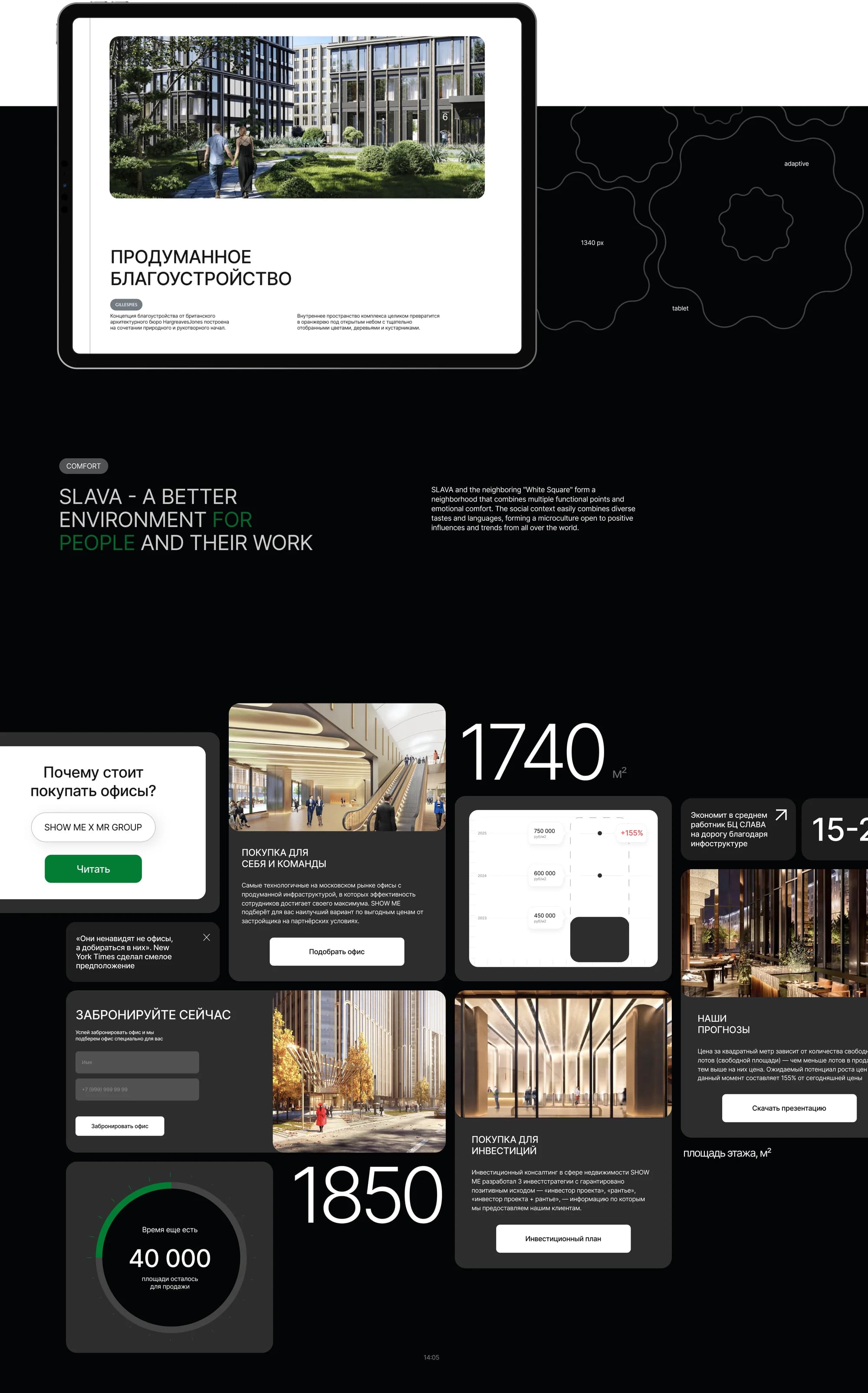
Landscaping. A section on the considered landscaping, with visualisations of the courtyard and the public spaces; the landscape concept was developed by an outside architectural practice.
Architecture. The device explained: by dividing office volumes with slits and arches, harmonisation with the urban context becomes possible.
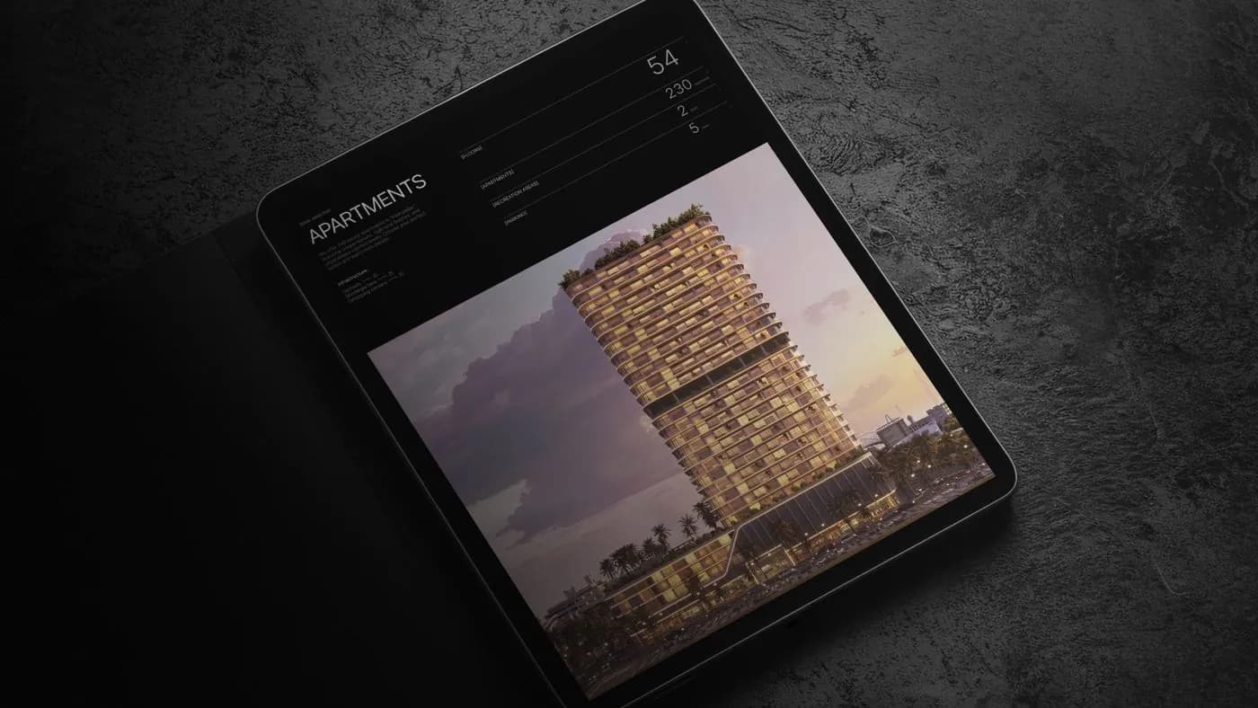
"The city's business street". A section on the complex's business function, with the project's figures.
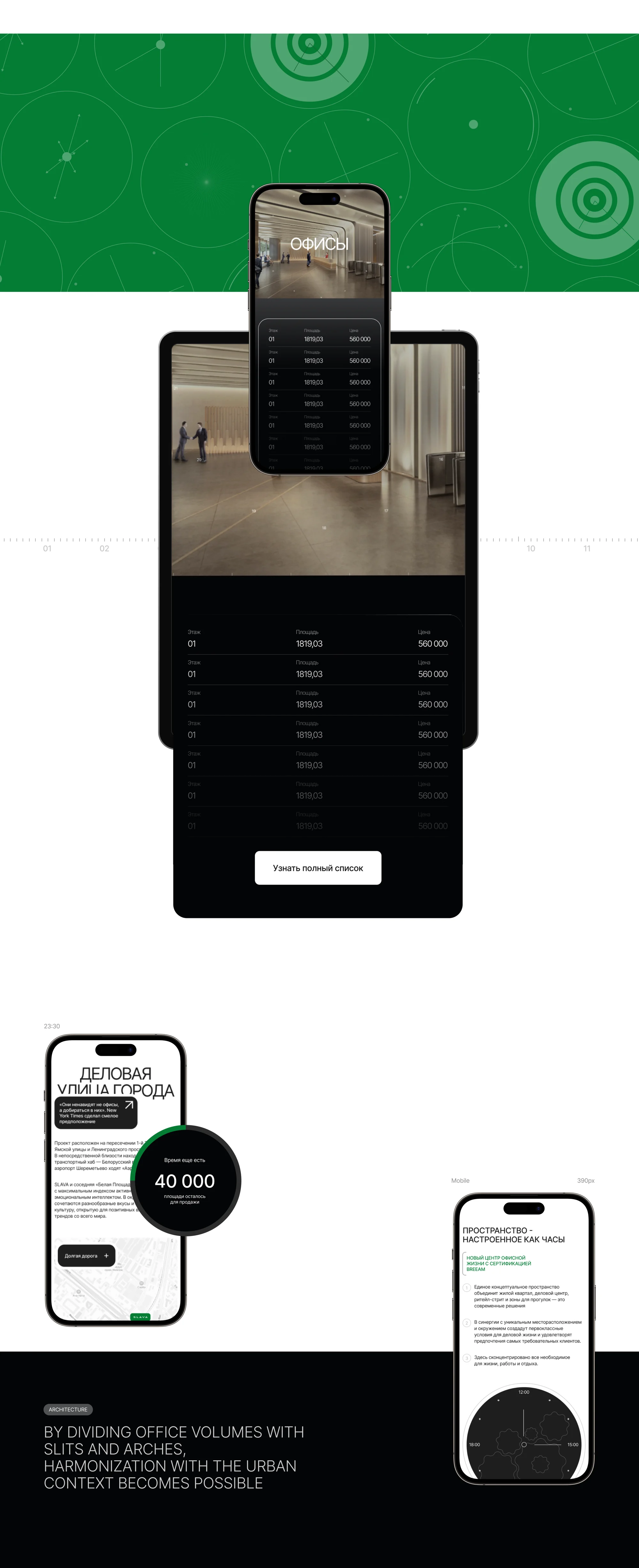
Offices. A screen listing the blocks, their areas and prices, with a control to request the full list.
Forecasts and the investment case. Sections for a buyer who is counting returns.
Responsive versions. Desktop, tablet and mobile.
The result
A site with a metaphor of its own instead of the standard business-centre template: clockwork ties the name, the history of the place — the site of the Second Moscow Watch Factory, which was given the name Slava — and the promise of precision into one system.
The whole cycle — from metaphor to finished site — fit into 25 days. The site is launched on Tilda.
The full breakdown is published on Dprofile and Behance — links below.