The task
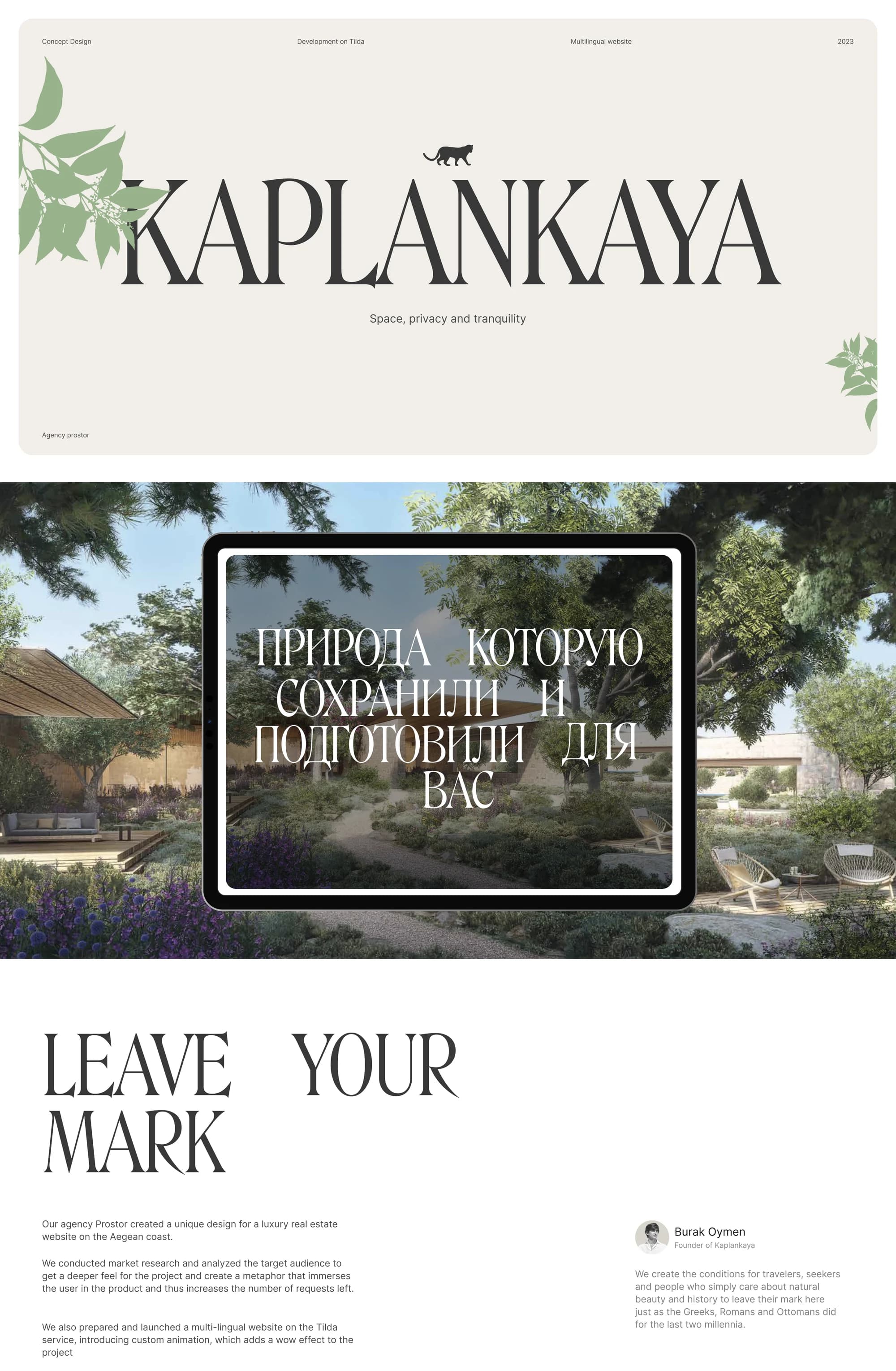
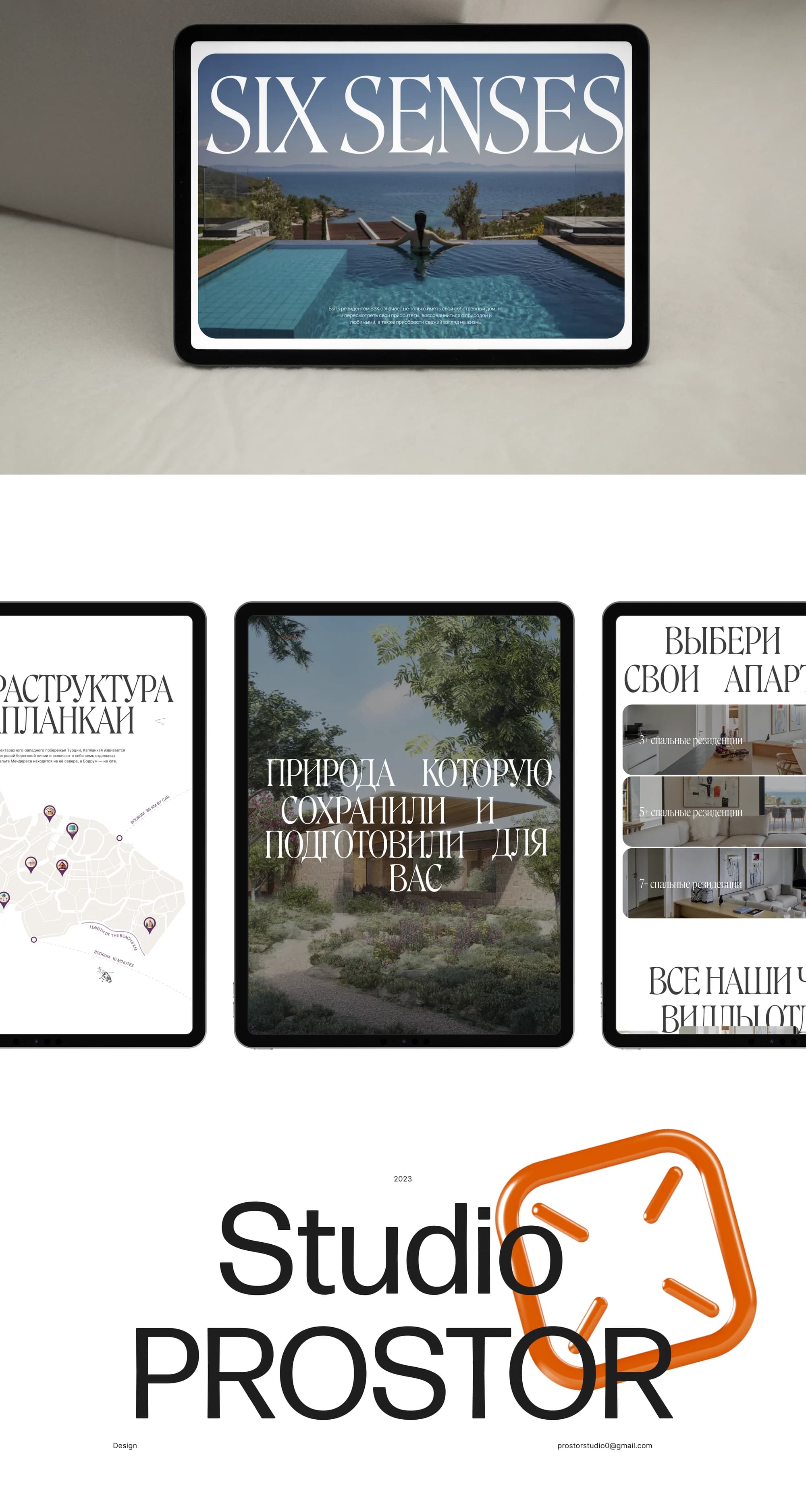
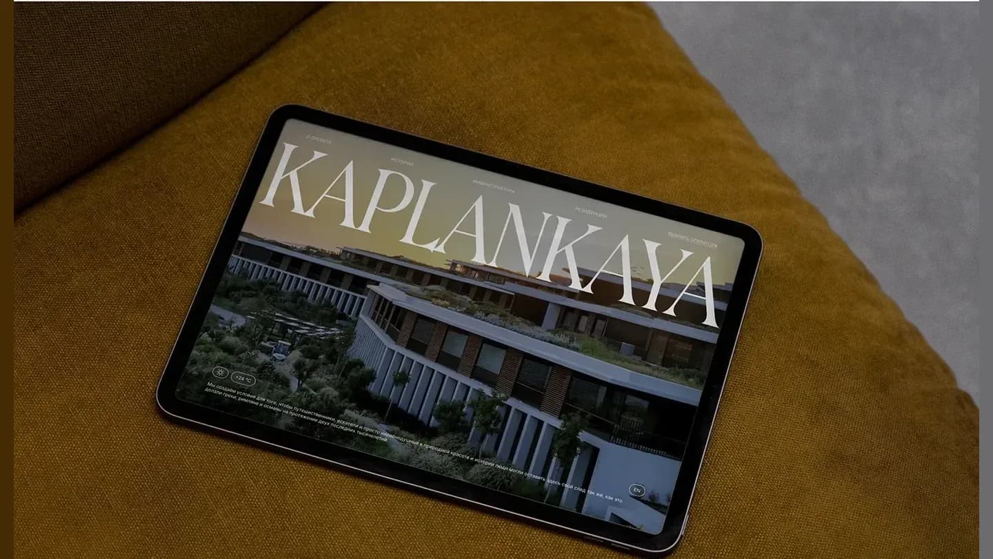
Kaplankaya is a premium resort on the Aegean coast, and the project was carried out as part of creating landing page designs for a real estate company.
The task was set out as follows: create the design of a landing page for a premium hotel in Turkey. The site should have a well-thought-out and selling structure, emphasising the main USP of the project. The goal of the landing page is to immerse the user in the project through metaphor and engaging mechanisms, eventually leaving a request for feedback or consultation. Optionally: adaptation of the landing page for the English-speaking audience.
The solution
We conducted market research and analysed the target audience to get a deeper feel for the project and create a metaphor that immerses the user in the product and leads to the enquiry form.
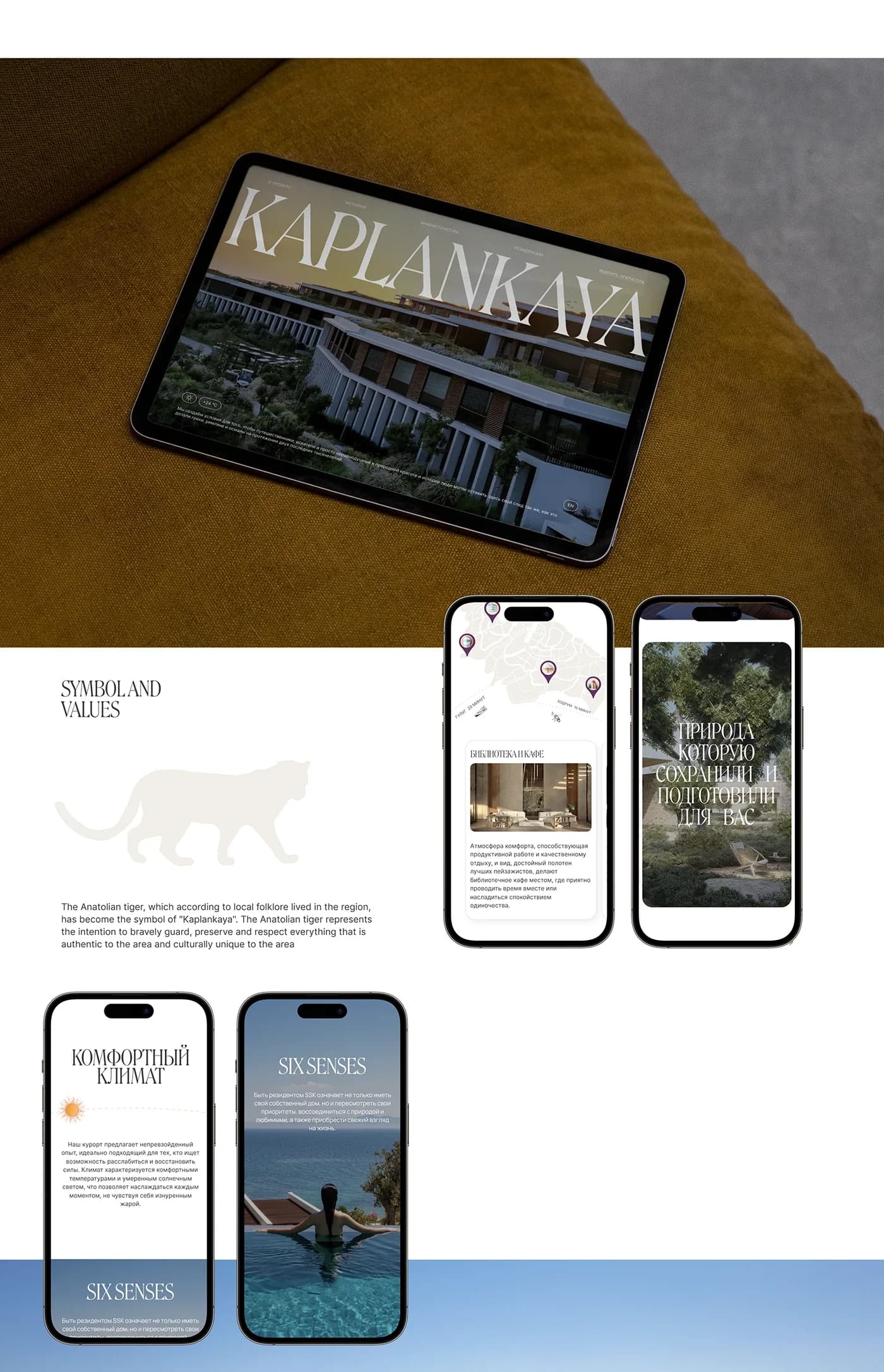
The metaphor came from local legend. The Anatolian tiger, which according to local folklore lived in the region, became the symbol of Kaplankaya. It represents the intention to bravely guard, preserve and respect everything that is authentic to the area and culturally unique to it. The tiger's silhouette runs through the pages as a graphic mark.
The second foundation is the history of the coast. The project's founder, Burak Oymen, puts it this way: we create the conditions for travellers, seekers and people who simply care about natural beauty and history to leave their mark here just as the Greeks, Romans and Ottomans did for the last two millennia. Hence the line running through the site: leave your mark.
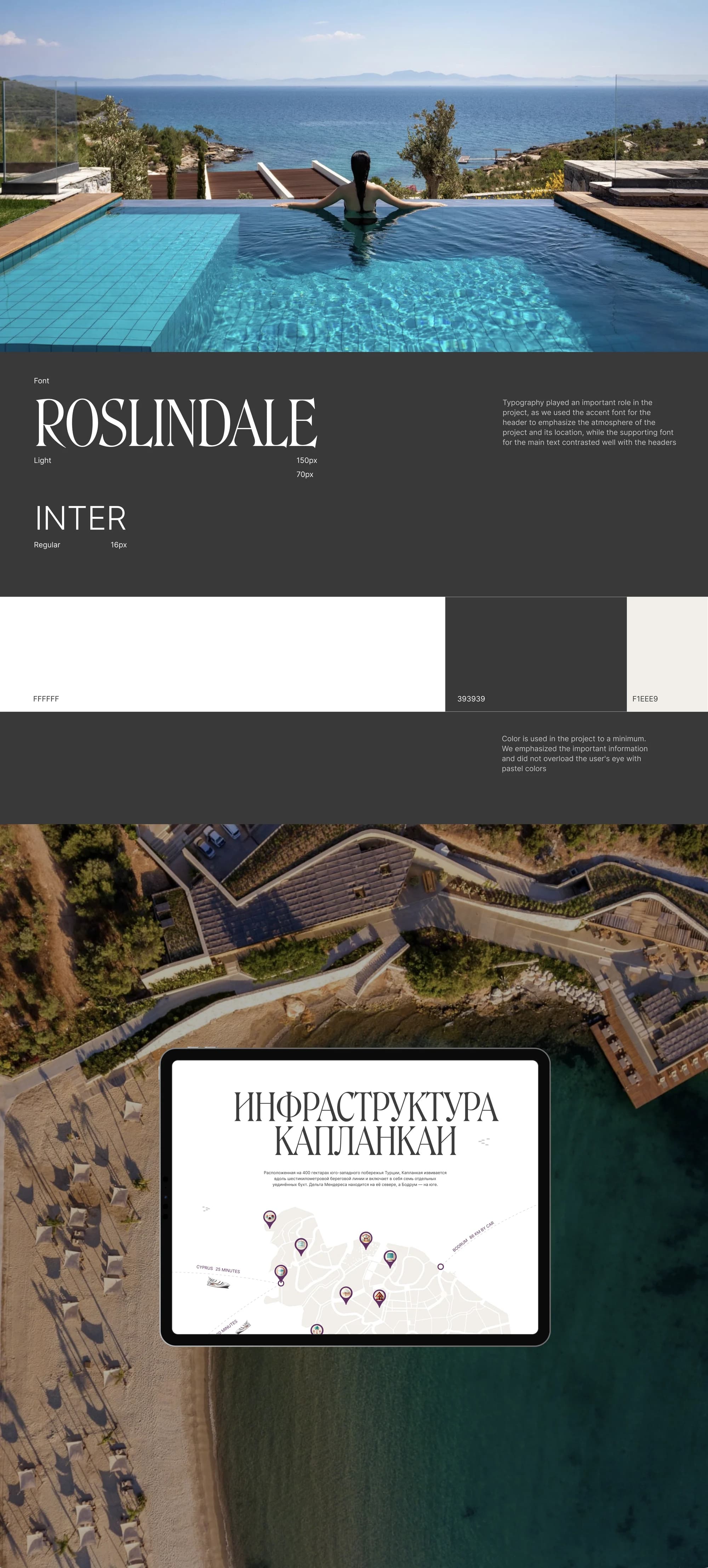
Typography played an important role in the project: the accent face for the headers emphasises the atmosphere of the project and its location, while the supporting face for the main text contrasts with the headers. The pair is Roslindale Light at 150 px and Inter Regular at 16 px.
Colour is used in the project to a minimum: white, a dark grey #393939 and a warm #F1EEE9. The important information is emphasised without overloading the user's eye with pastel colours.
What we did
Landing page UI/UX. A structure and engaging scenarios leading the user to a consultation request.
The nature section. Nature preserved and prepared for you, carried by renders of the grounds.
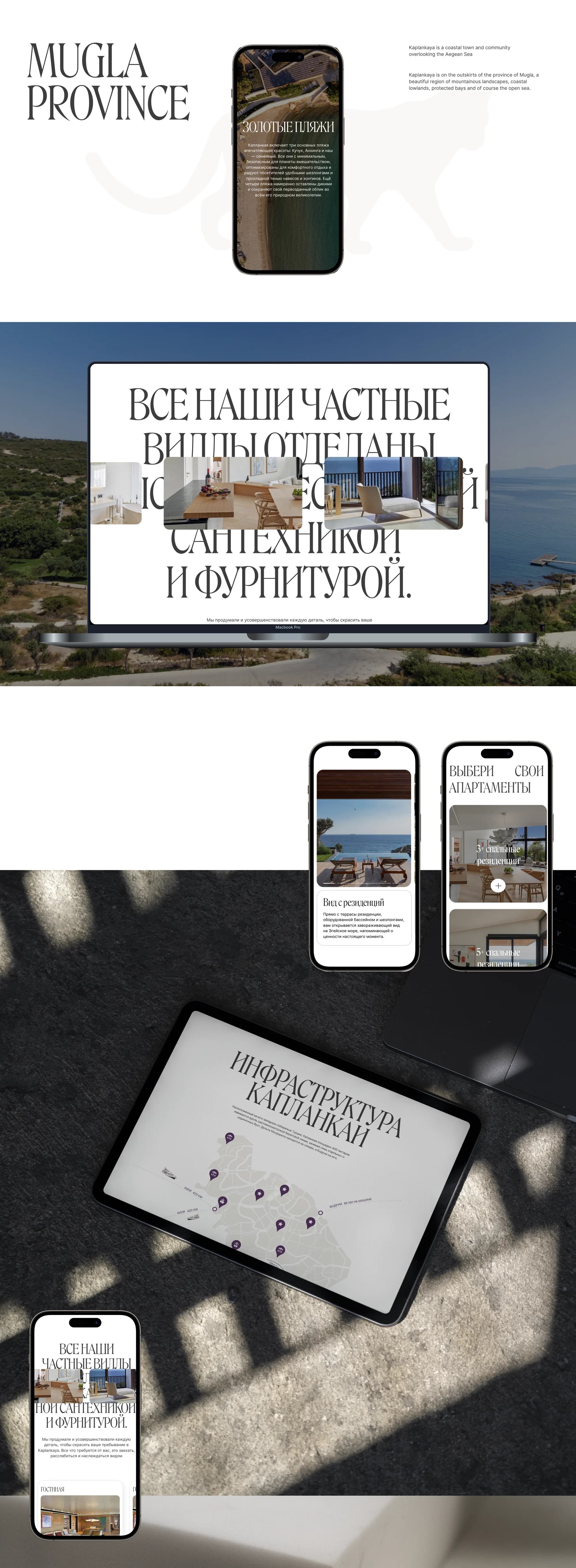
Infrastructure. An interactive map of Kaplankaya with pinned locations over an aerial view of the coast.
Geography. A block on the province of Mugla: mountainous landscapes, coastal lowlands, protected bays and the open sea.
Residences. A "choose your apartment" section with a choice by number of bedrooms, a separate block on the Six Senses residences, and a block on how the private villas are finished.
Climate. A screen of its own on the climate.
Multilingual. Russian and English versions with a language switch.
Custom animation. Written on top of Tilda's standard capabilities.
The result
The landing page tells the story of a place instead of presenting a resort: a tiger as its symbol, two thousand years of coastline as its context, and one line — leave your mark.
The site was prepared and launched on Tilda in two language versions.
The full breakdown is published on Dprofile and Behance — links below.