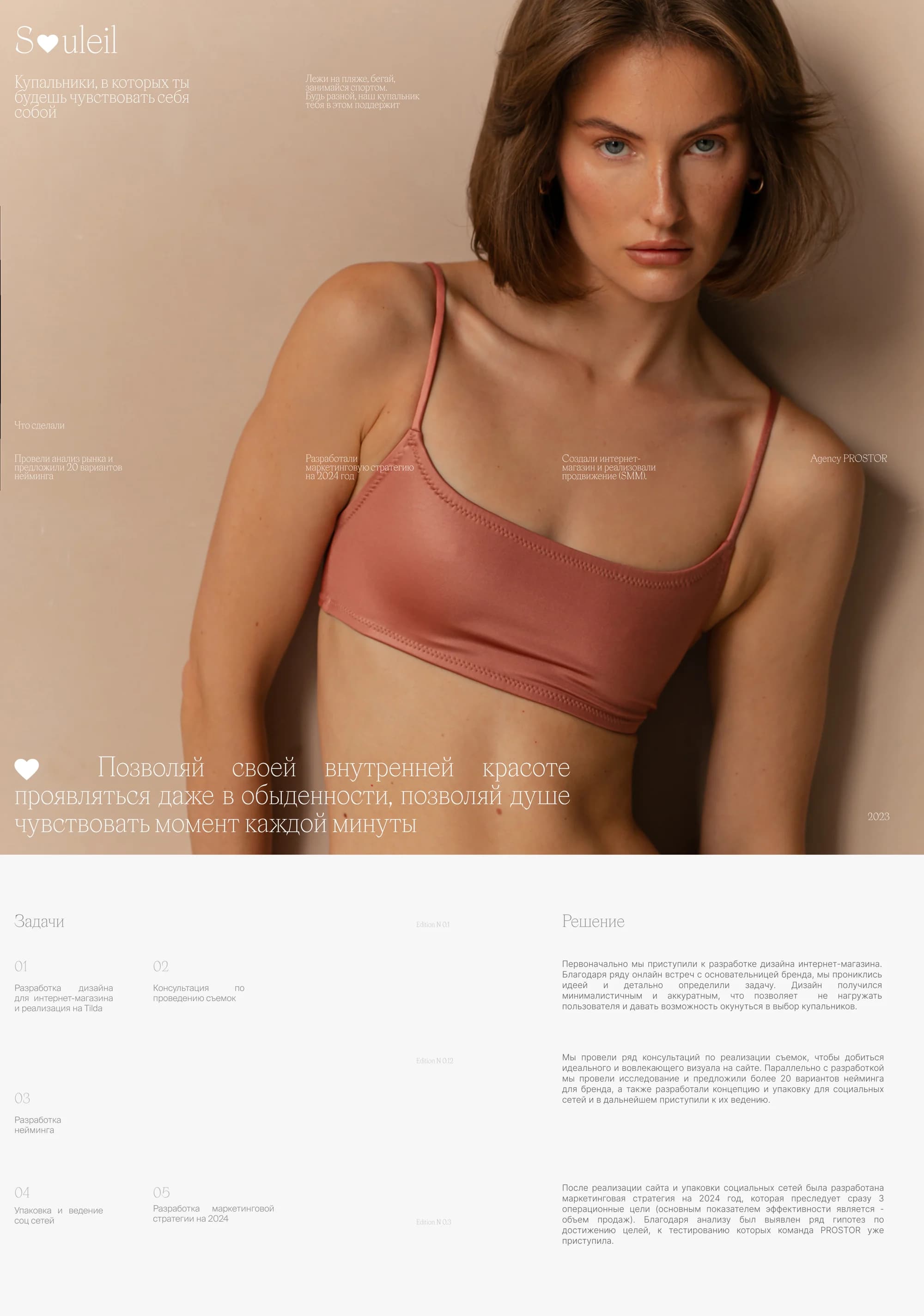
The task
The brand's founder arrived with five tasks at once, and we wrote them down exactly so: design an online store and build it on Tilda, advise on running the photoshoots, develop the naming, package and run the social channels, and put together a marketing strategy for 2024.
These are not five separate commissions but one project. Our position: the feeling a piece gives has to be carried equally by the photography, by the brand's name and by the store's first screen — so the shoot, the naming and the site were run as one piece of work rather than in sequence.
The solution
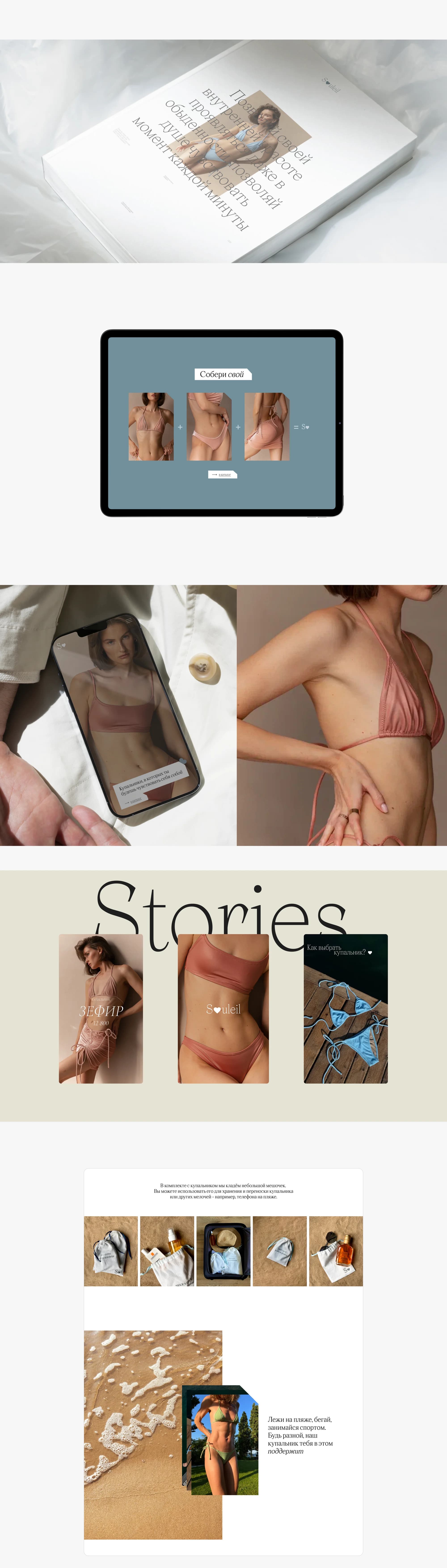
We began with the store design. Several video calls with the founder went into absorbing the idea and defining the task in detail. The design came out minimal and neat: it does not overload the visitor and lets her sink into choosing swimwear.
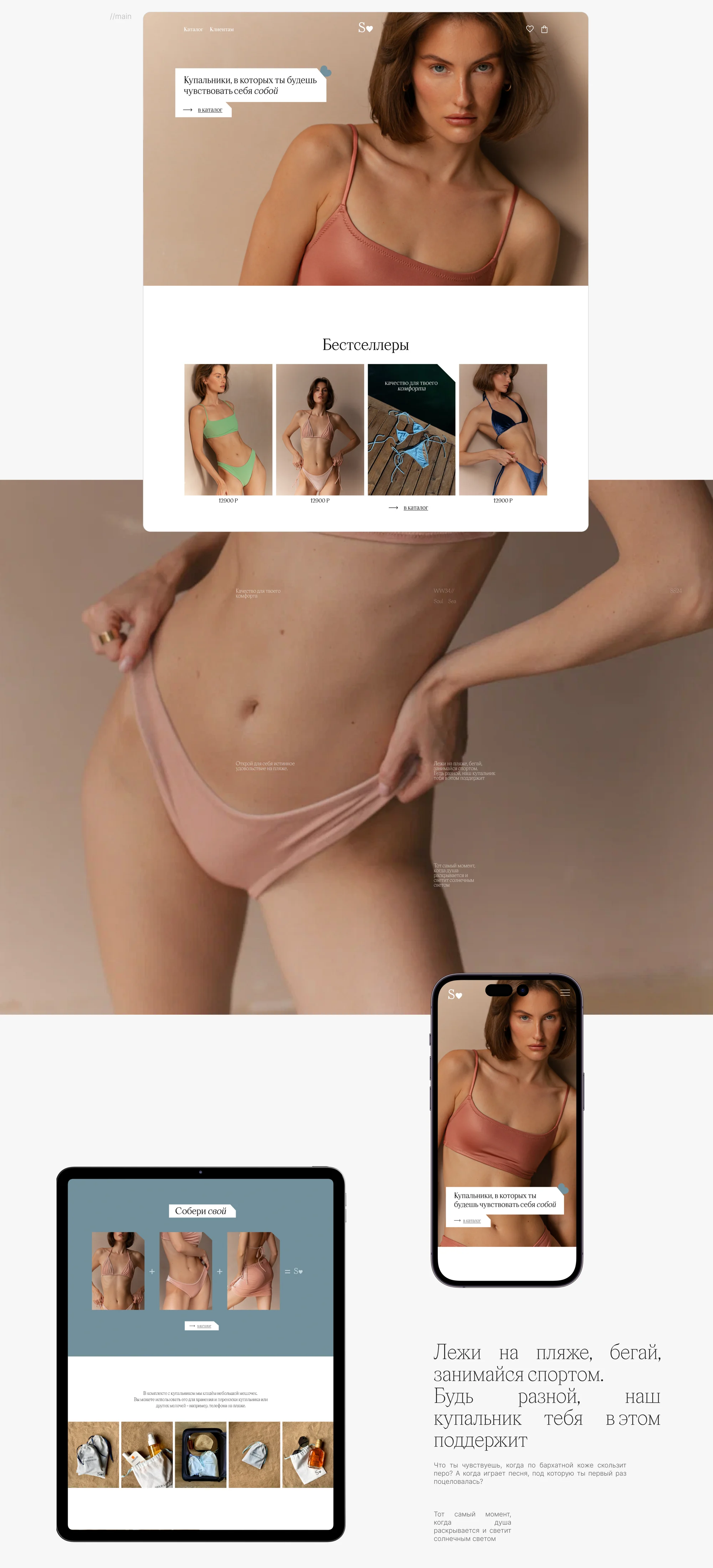
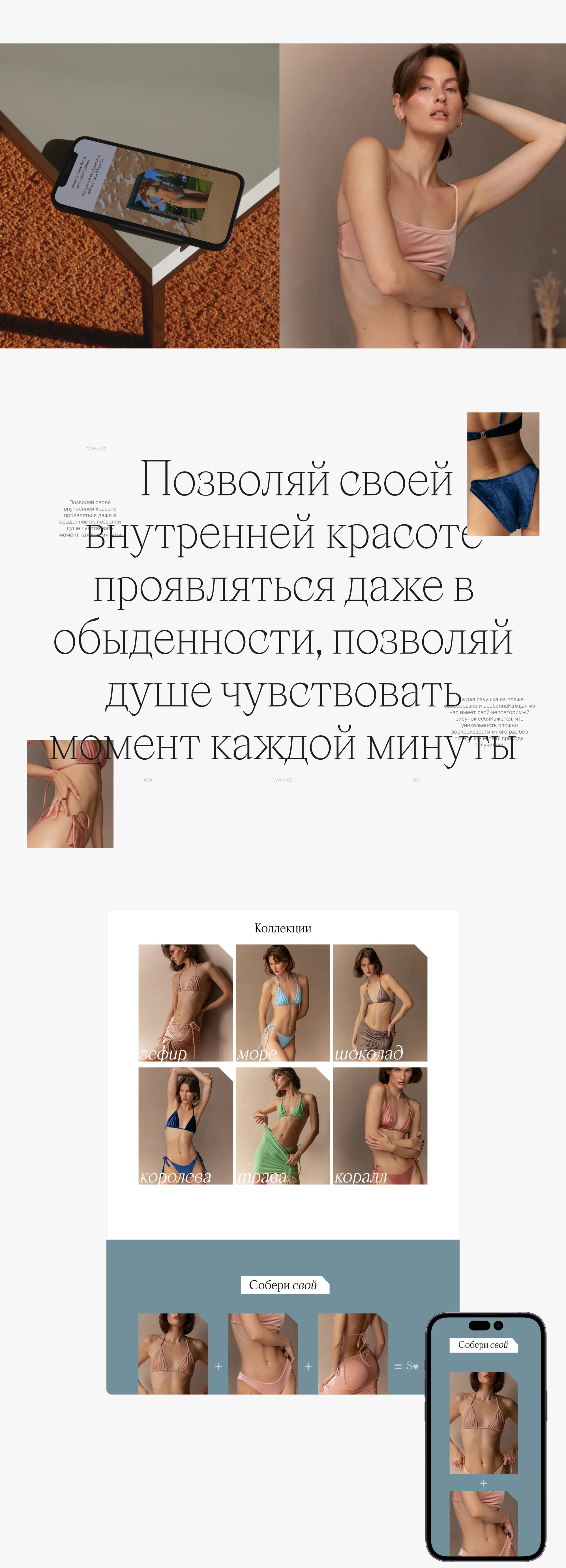
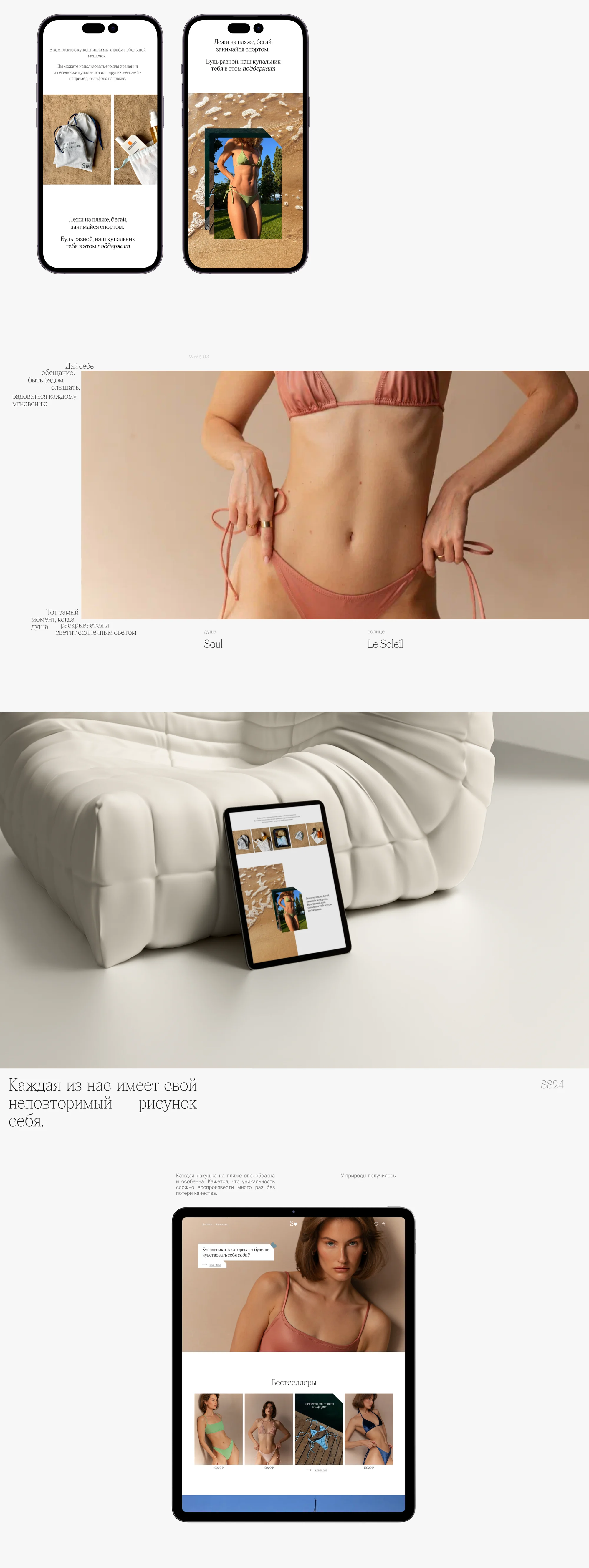
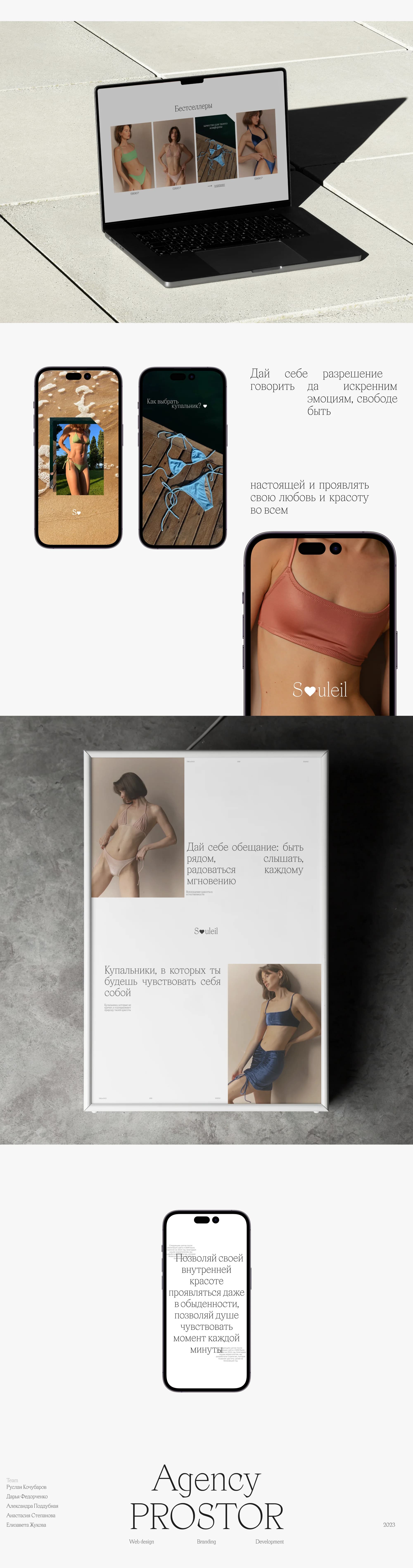
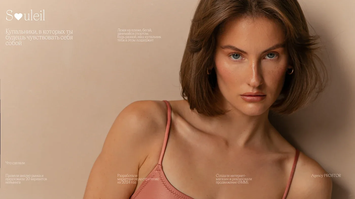
The register is set by the site itself. The first screen states it directly: swimwear you will feel like yourself in. Then comes a manifesto — let your inner beauty show even in the everyday, let your soul feel the moment of every minute. And a separate line about how the piece lives: lie on the beach, run, play sport — be different, our swimsuit will back you up in that.
A warm sand palette, a serif for the manifestos and a calm sans in the interface. The one contrasting element is a muted blue-grey block for the mix-and-match tool. It is also the main accent: where the action begins, the background changes colour.
What we did
Online store on Tilda. A first screen, bestsellers, catalogue, product cards and stories.
Collections. Six collections with names of their own: marshmallow, sea, chocolate, queen, grass, coral. Not article numbers but words a swimsuit is remembered by.
"Build your own". A top plus a bottom plus a tie skirt makes a set. It is laid out as a formula right in the interface: three cards, plus signs, and the brand mark at the end.
Photoshoot consulting. A series of consultations on producing the shoots, to reach the ideal, engaging visual on the site.
Naming. Market research, and more than 20 naming options proposed for the brand.
Social media. A concept and packaging for the channels, followed by running them.
Marketing strategy for 2024. Once the site and the channels were done, a strategy was assembled around three operational goals at once, with sales volume as the key metric. The analysis produced a set of hypotheses that the team began testing.
Responsive versions. Desktop, tablet and phone: the catalogue and the mix-and-match tool behave the same on all three.
The result
The brand did not get a bundle of services but an assembled system: a store, a name, a visual register for the photography, channels and a plan for the year — made in one logic and one voice.
The store runs at souleil.shop. The full breakdown is published on Behance and Dprofile — links below.