The task
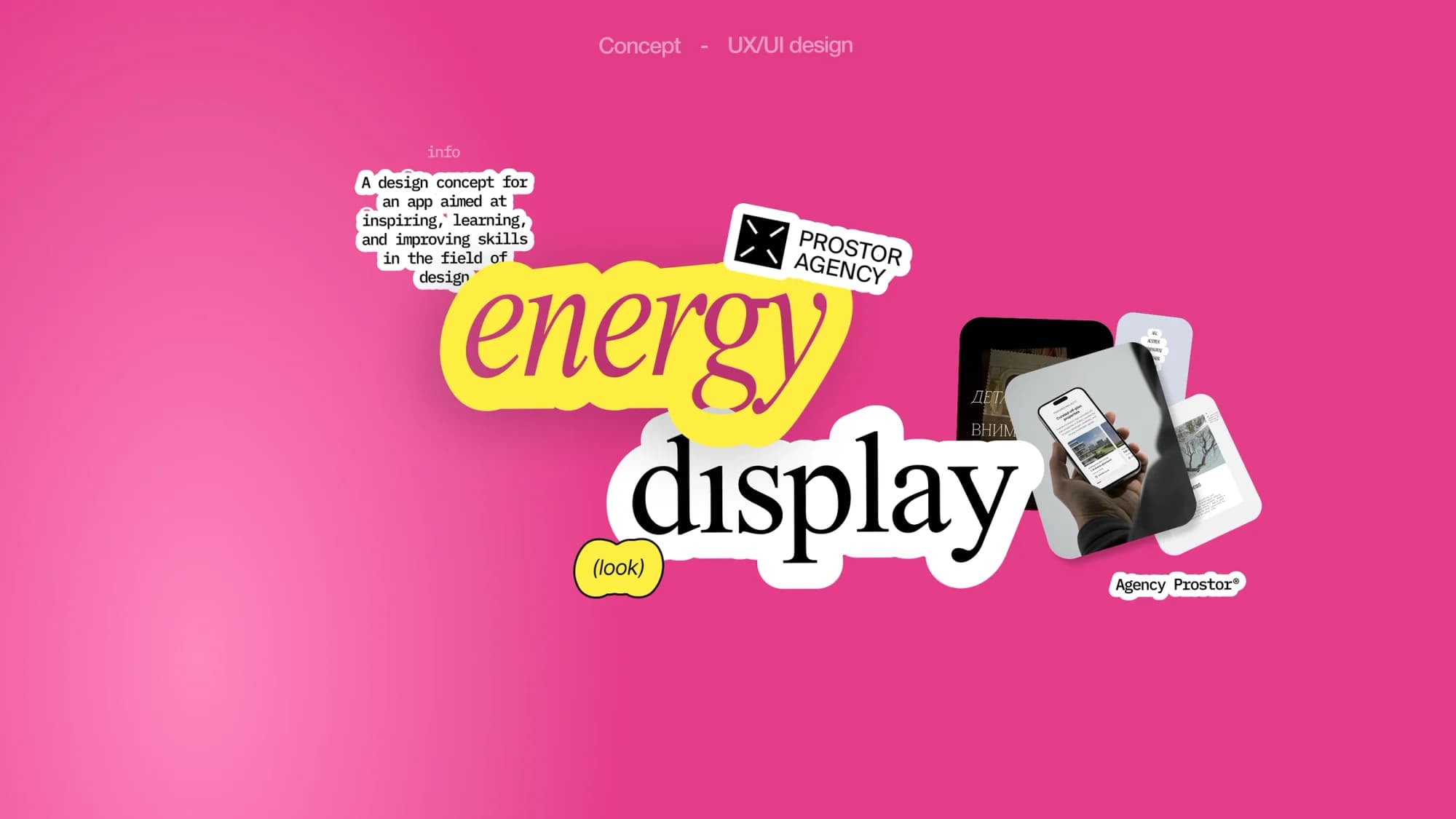
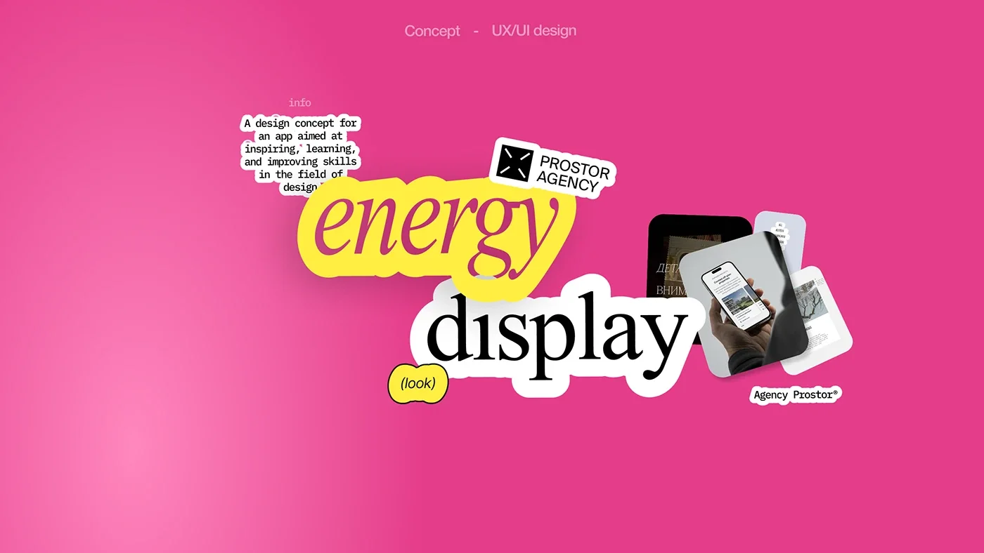
There was no client and no brief — this was the studio's own initiative. The title page puts the task simply: a design concept for an app aimed at inspiring, learning and improving skills in the field of design.
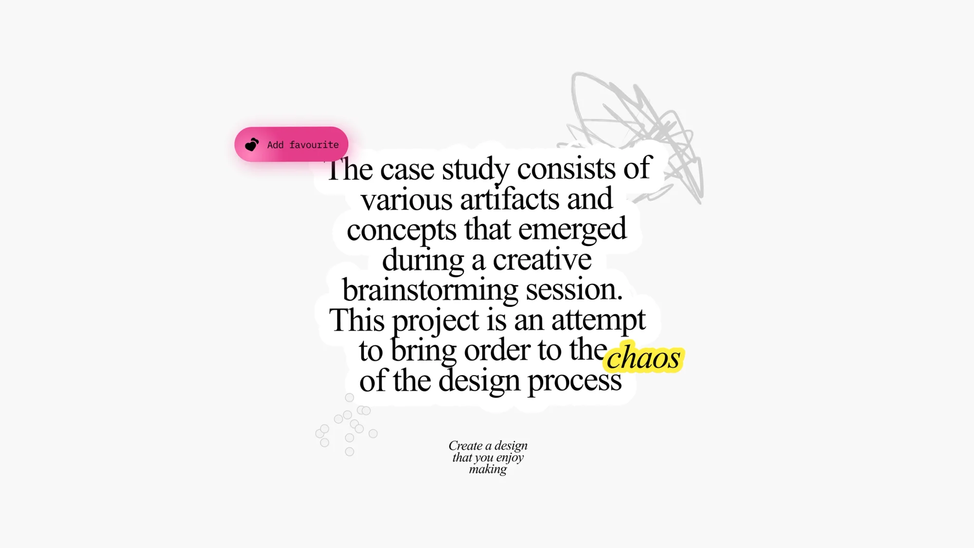
The project's second meaning matters more than the first. By its own description, the case is an attempt to bring order to the design process: to gather the scattered artifacts and concepts that emerged during a creative brainstorming session into one system.
That is the real subject. A brainstorm leaves a scatter behind: fragments of ideas, accidental finds, screens that went nowhere. We decided that bringing such a scatter into order is a worthwhile result in itself, and made a case out of the attempt.
The solution
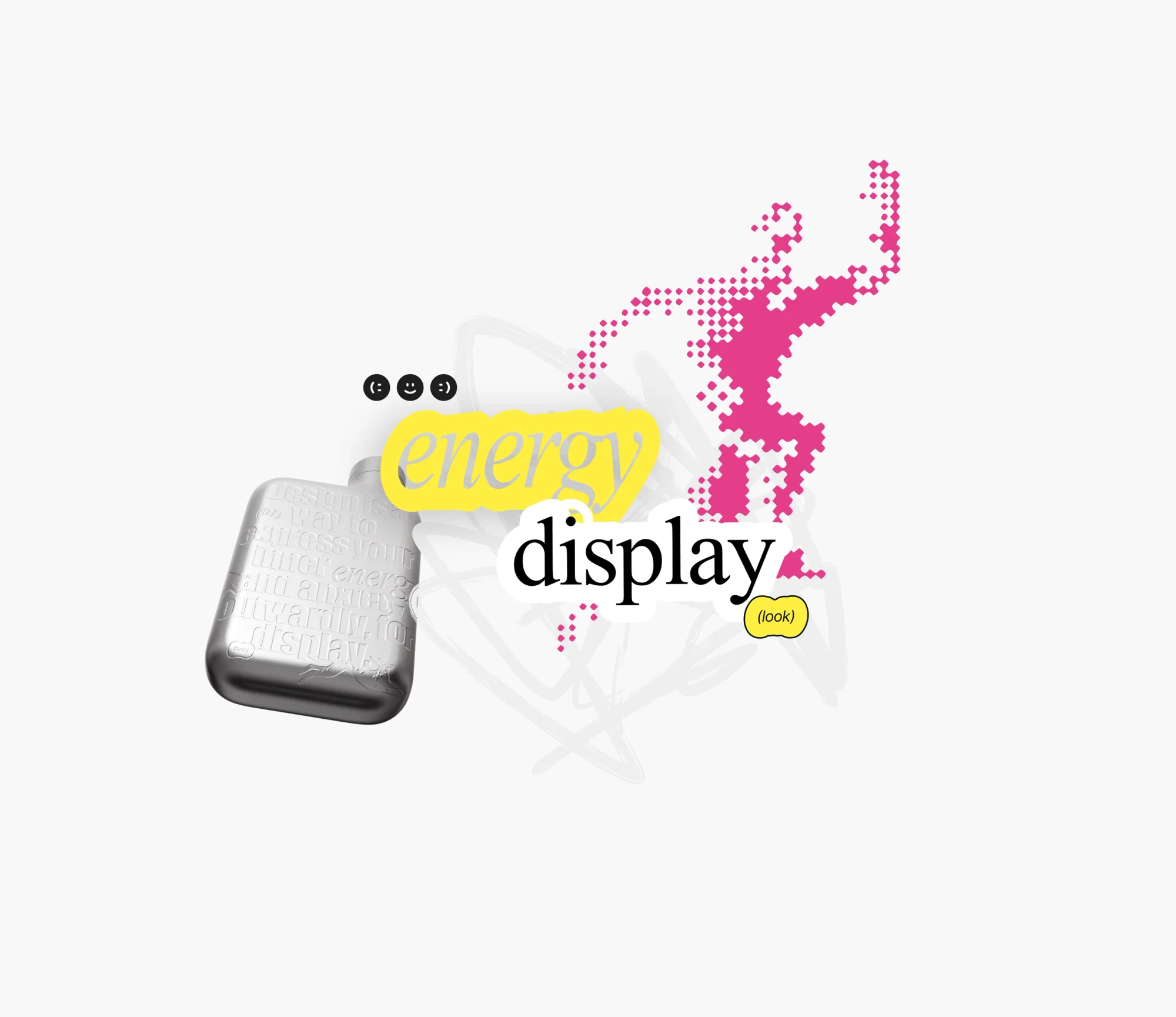
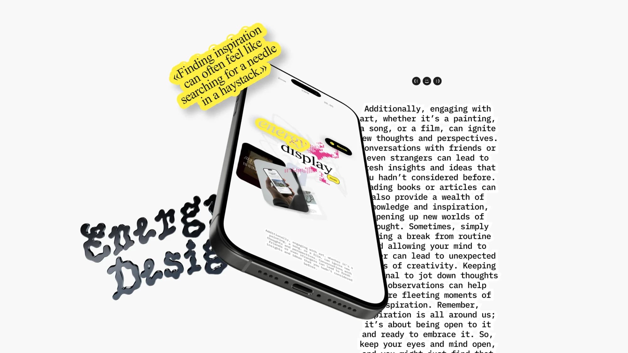
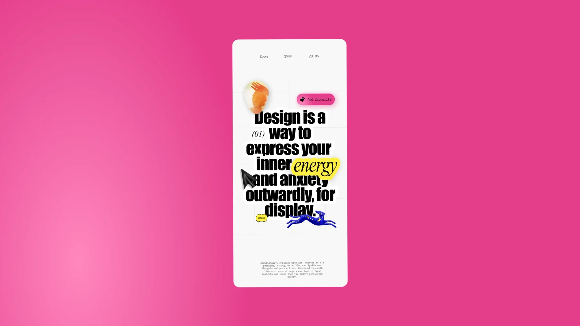
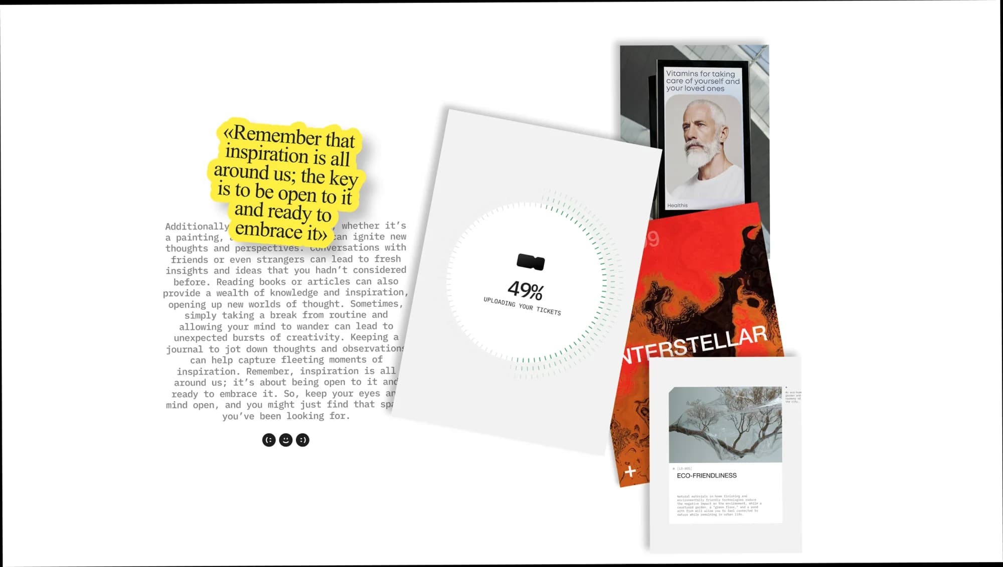
The key device is the sticker. Every element is cut out along its contour and sits on top of the ground: captions, notes, controls, objects. That way the scatter is not disguised but made into a method — the collage is honest about being assembled from pieces.
The palette works towards the same idea: a saturated fuchsia ground, with acid yellow, green and blue as markers. Colour here works as a marker rather than as decoration.
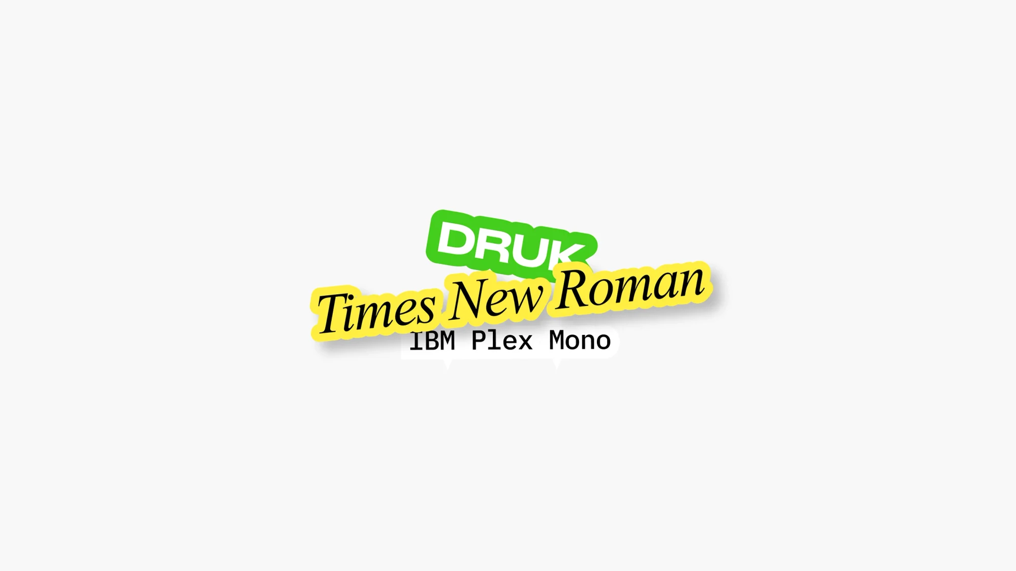
The type system is built from three voices: DRUK for the heavy headlines, Times New Roman where a text register is needed, IBM Plex Mono for the utility labels and figures. Three registers — technical, editorial and poster — collide on one spread.
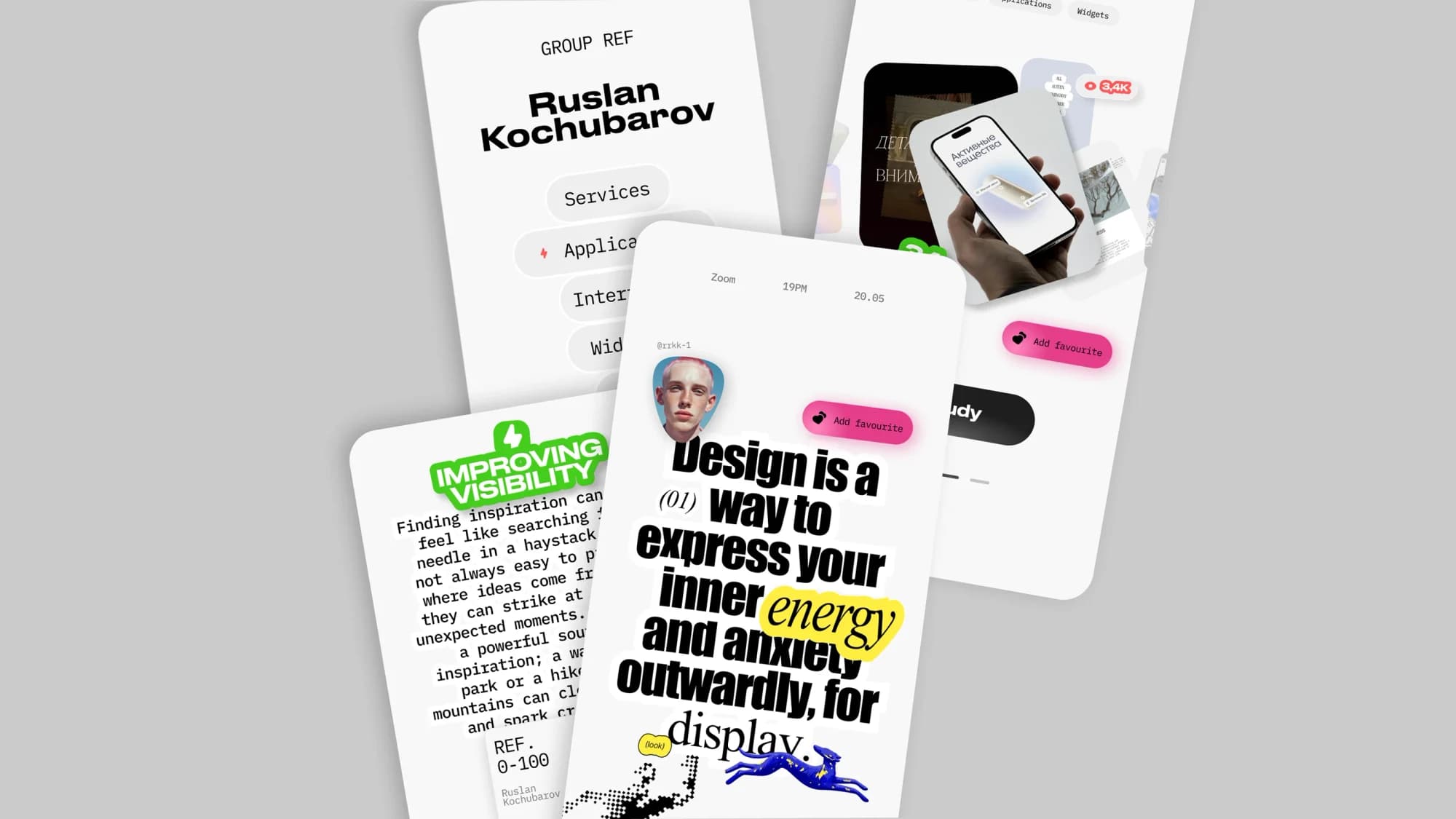
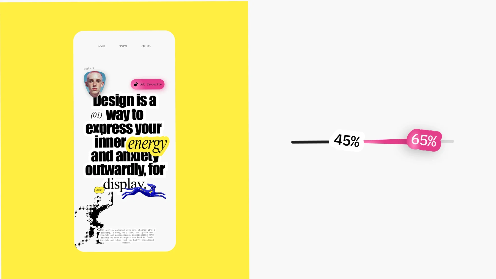
One line runs through the whole case: design is a way to express your inner energy and anxiety outwardly, for display. It is set differently from spread to spread and holds the collection together as a refrain.
What we did
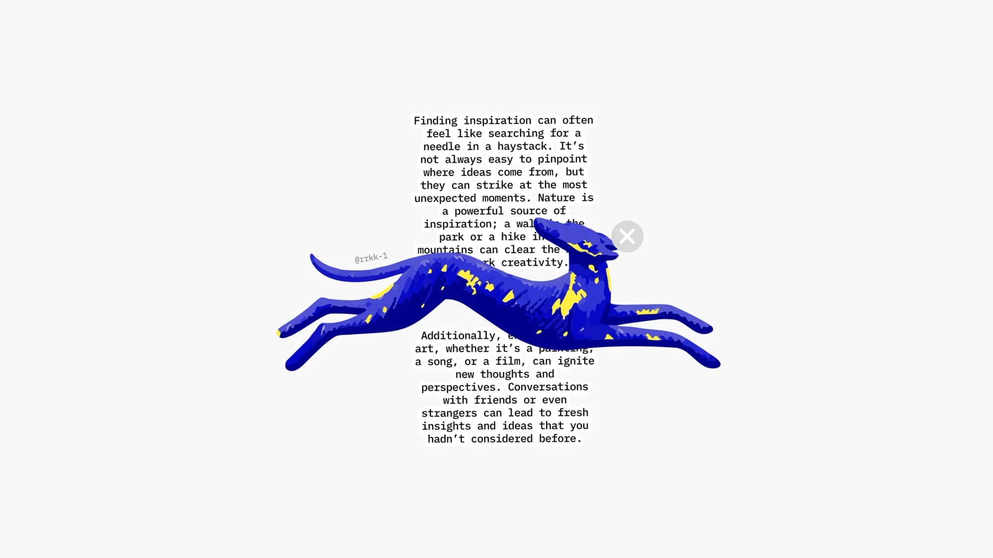
App screens. Content cards, a feed, a detail page with a long text about where inspiration comes from, a profile with a services block, progress bars at 45%, 65% and 49%.
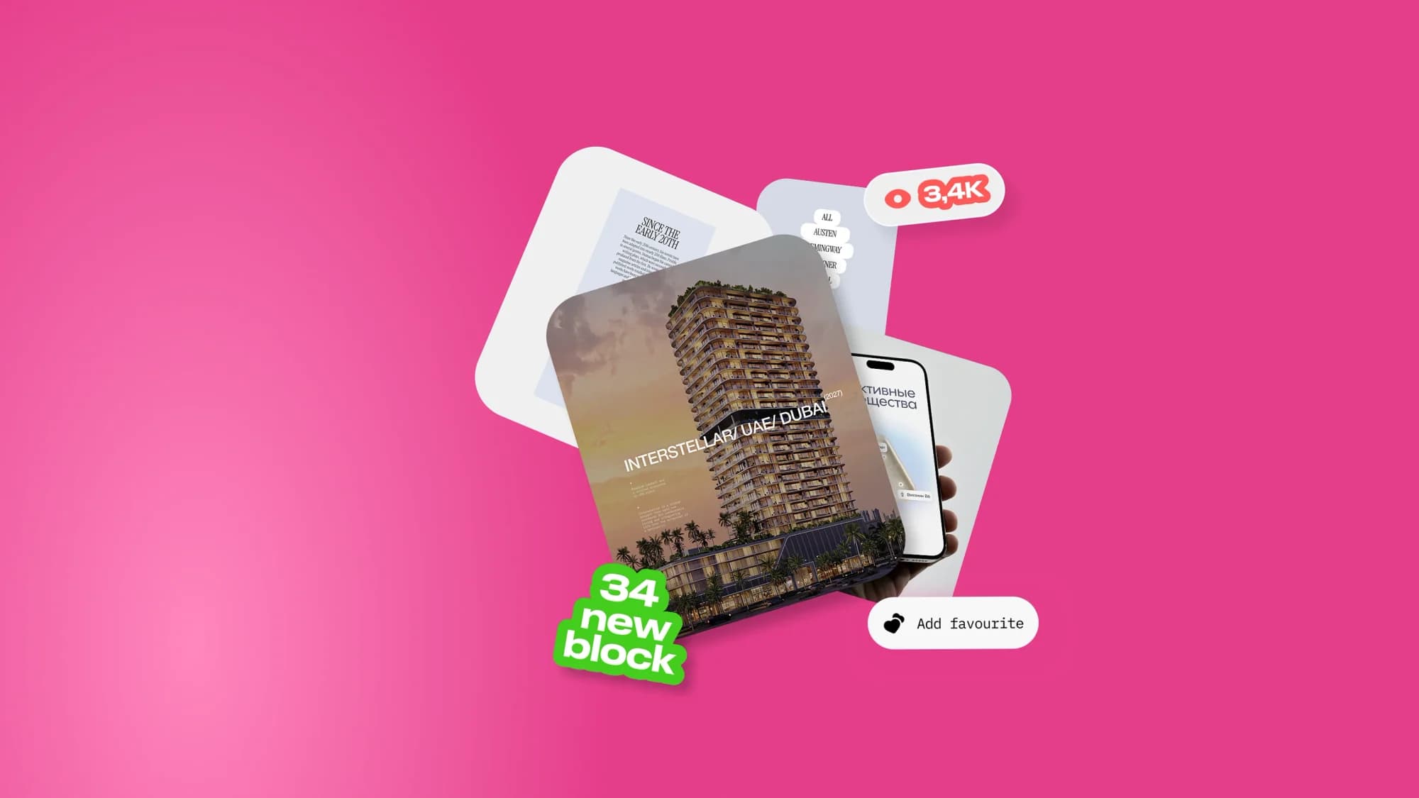
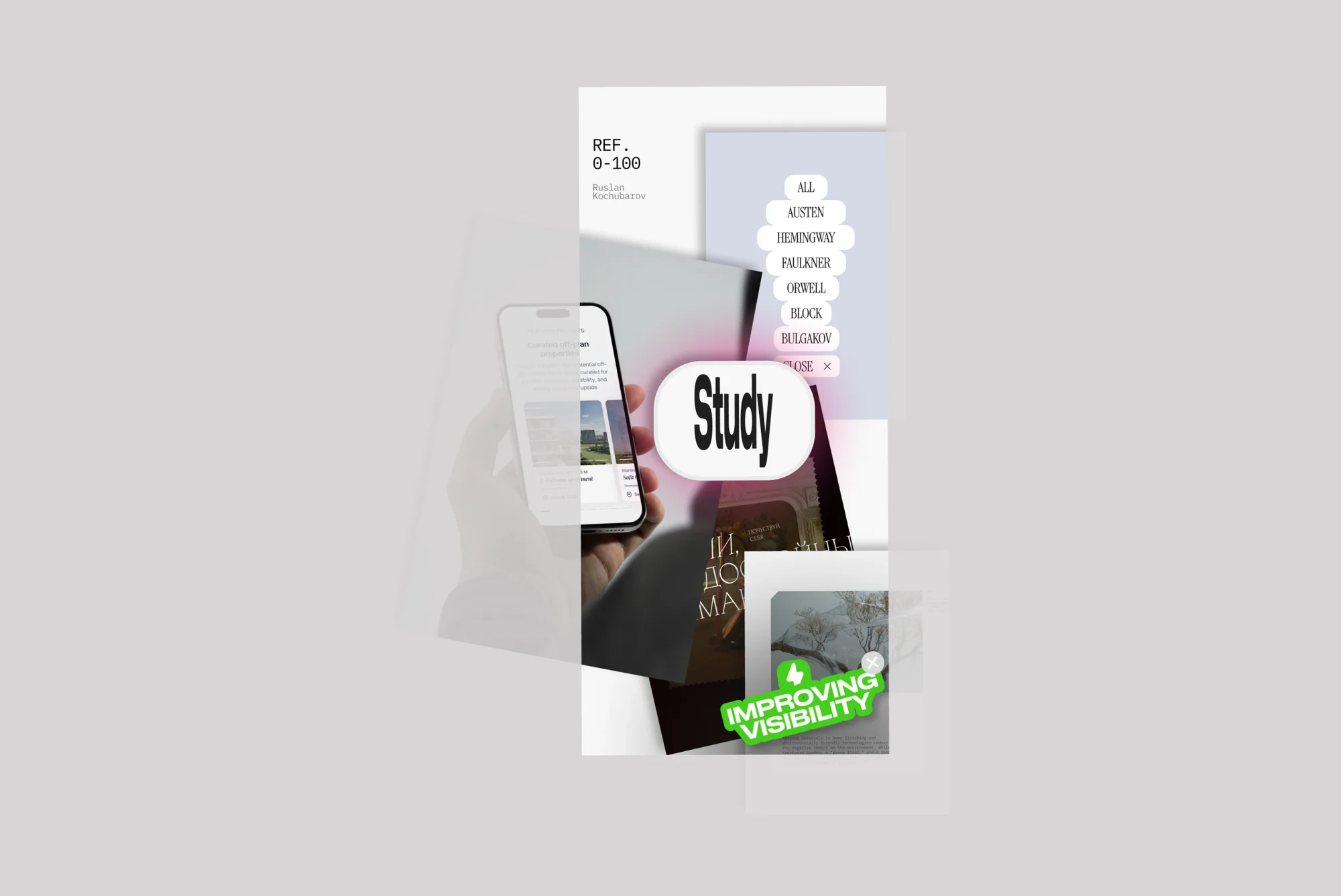
A system of markers. Sticker pills: "improving visibility", "34 new block", "add favourite", a 3.4K counter, a "study" tag, a running REF 0-100 numbering. Interface language pushed up to the level of graphics.
Three-dimensional objects. A blue running dog, a silver rounded block, a pixelated leaping figure. Not illustrations for the sections but artifacts of the same session in their own right.
Typographic experiments. Spreads where type works as image: distorted, stretched and overlaid lettering.
Object photography. A phone in hand, cards laid out, posters — the concept shown in a setting rather than only in a layout.
Studio stickers. The Prostor mark and the Agency Prostor signature as part of the collage: the studio signs the work in the same language the work is made in.
The result
A concept collection of screens and artifacts — not a finished product, but a showcase of the studio's approach to design thinking and idea generation.
The case shows what normally stays off-screen: what the raw material of a brainstorm looks like once it has been taken far enough to be worth showing.
The full breakdown is published on Behance and Dprofile — links below.