The task
Nicole Remezok came to the agency asking for a logo for her running club. RUN DAMN brings together people for whom running is not just a workout but a way of living.
The distance between "a workout" and "a way of living" is the whole brief. A club people join for the people lives closer to street culture than to sports formalism — and the mark had to speak that language.
Hence the question the work started from, set out as its own spread in the guidelines: how do you bring running and street culture together.
The solution
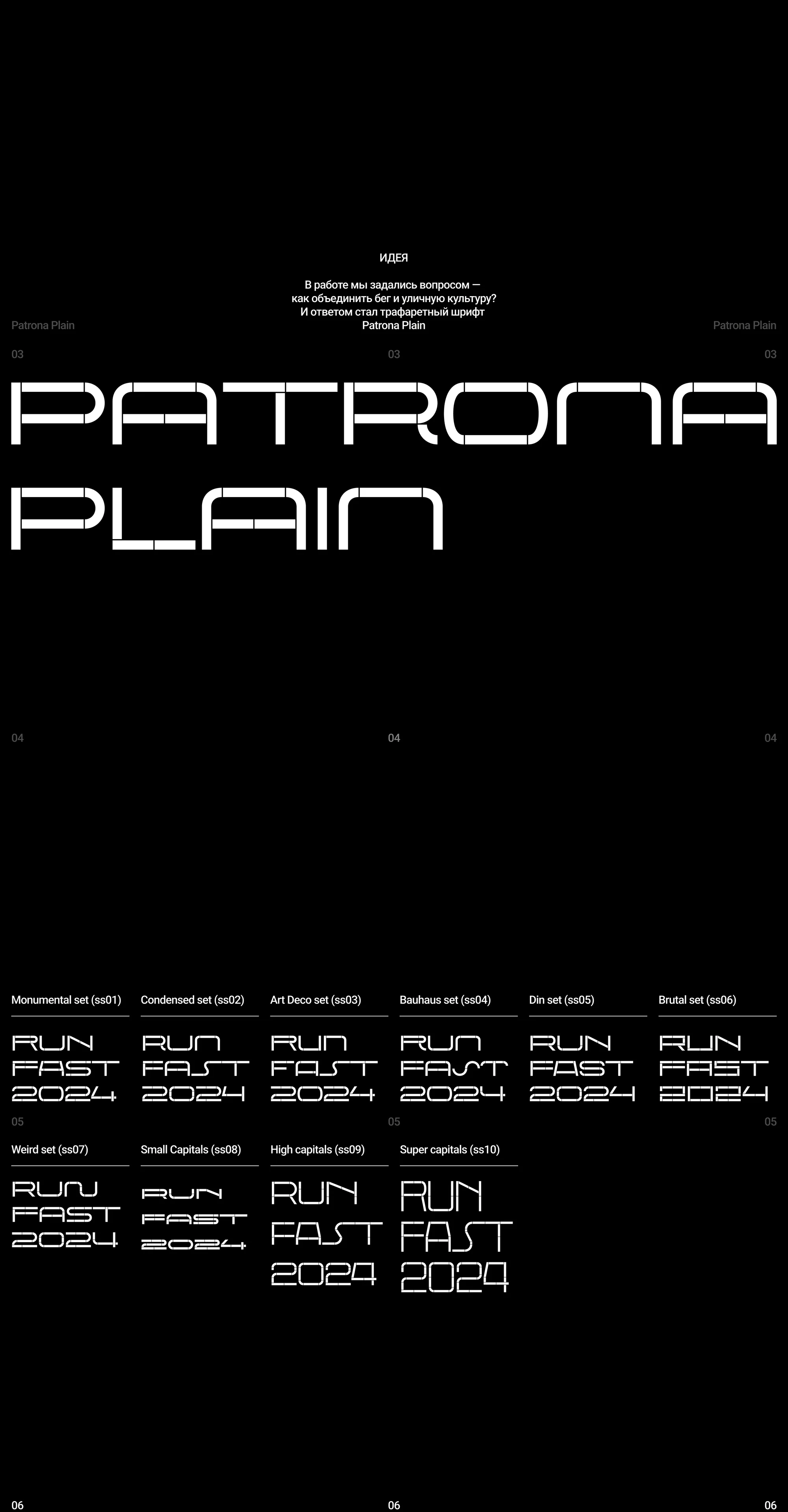
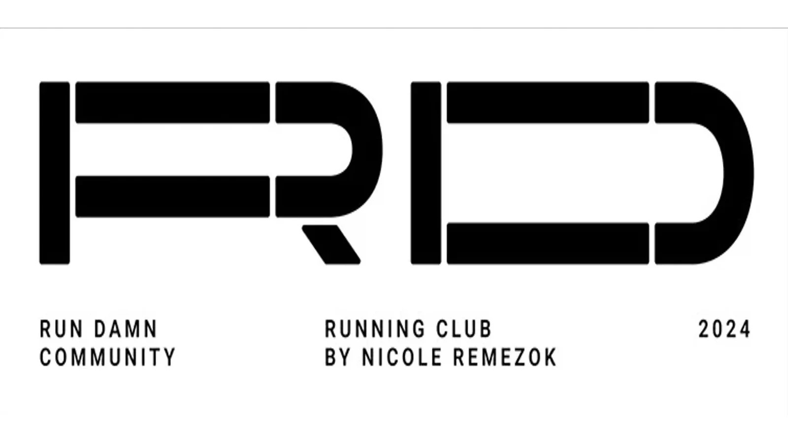
The answer turned out to be a stencil face. A stencil is street-native — it is how lettering goes onto walls, asphalt and track markings.
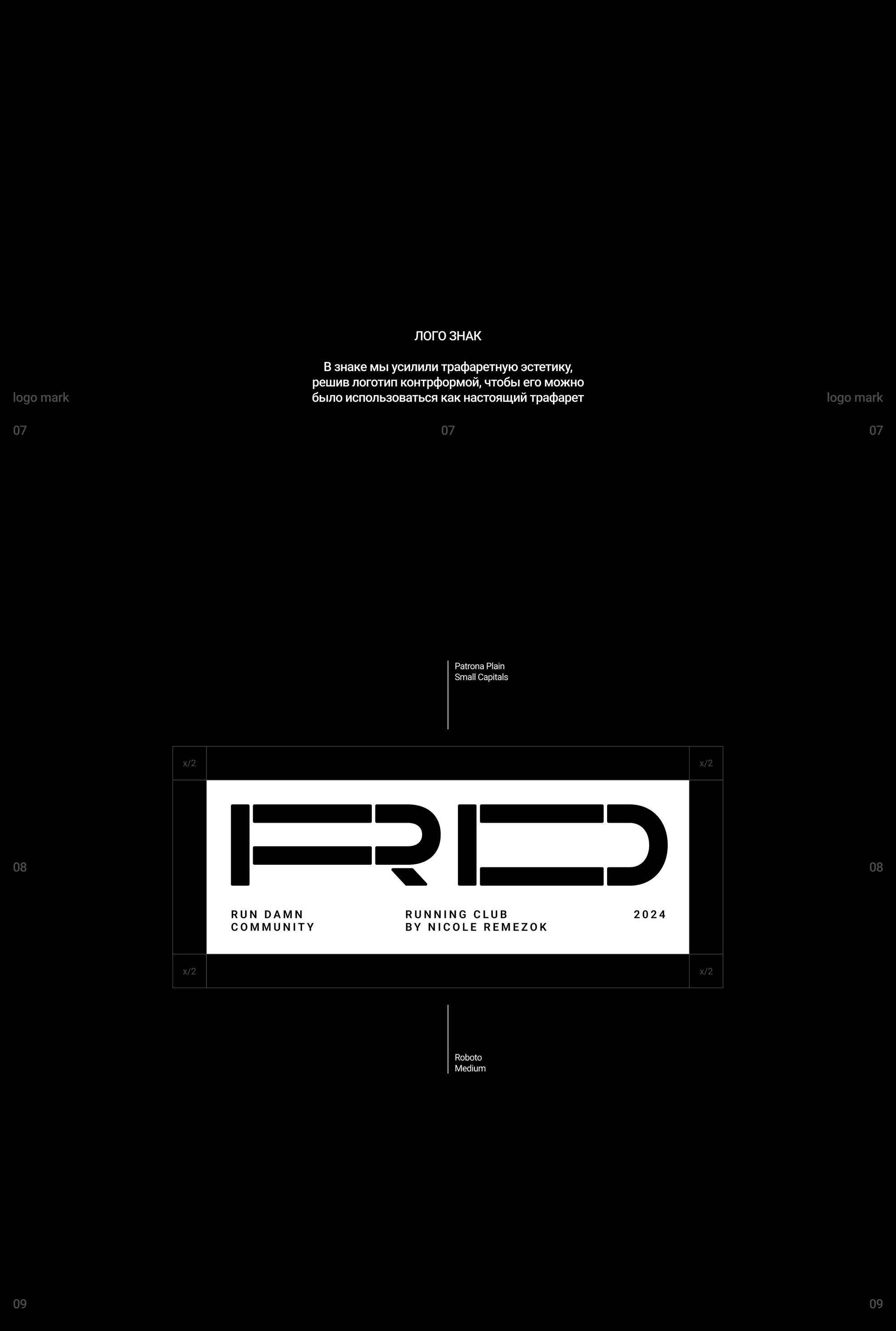
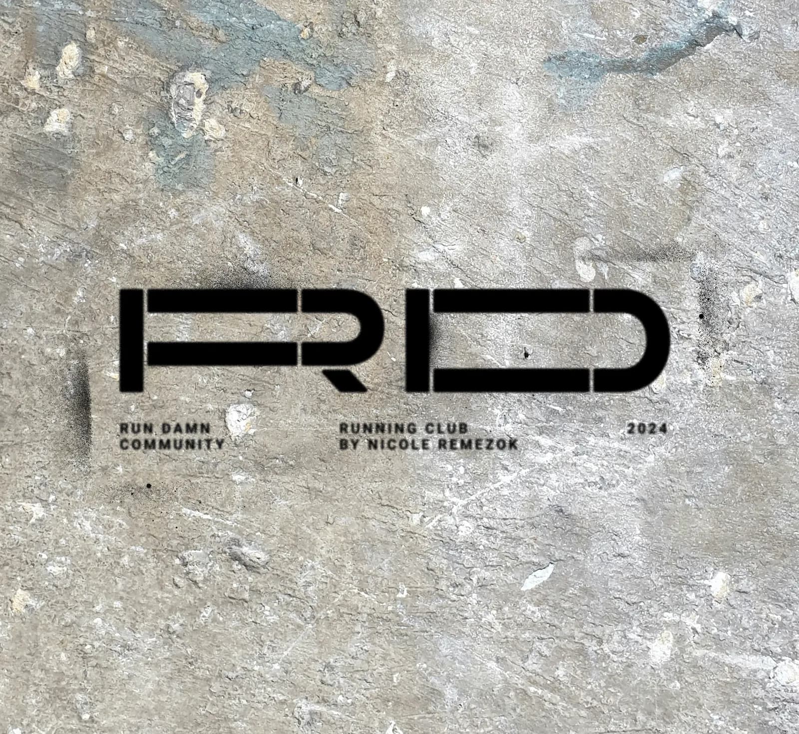
The mark is built on counterforms: the breaks in the letters hold the construction together so the logo can work as an actual stencil, not only as a picture in a file.
The type foundation is Patrona Plain by Superior Type — a digital revival of the Czech Patrona of 1928, made by Matyáš Machat. We chose it rather than drew it. The family carries its own stylistic sets — Monumental (ss01), Condensed (ss02), Art Deco (ss03), Bauhaus (ss04), Din (ss05), Brutal (ss06), Weird (ss07), small (ss08), high (ss09) and super capitals (ss10) — and that whole range stays one system. The logo lockup adds Roboto Medium for the small supporting lines.
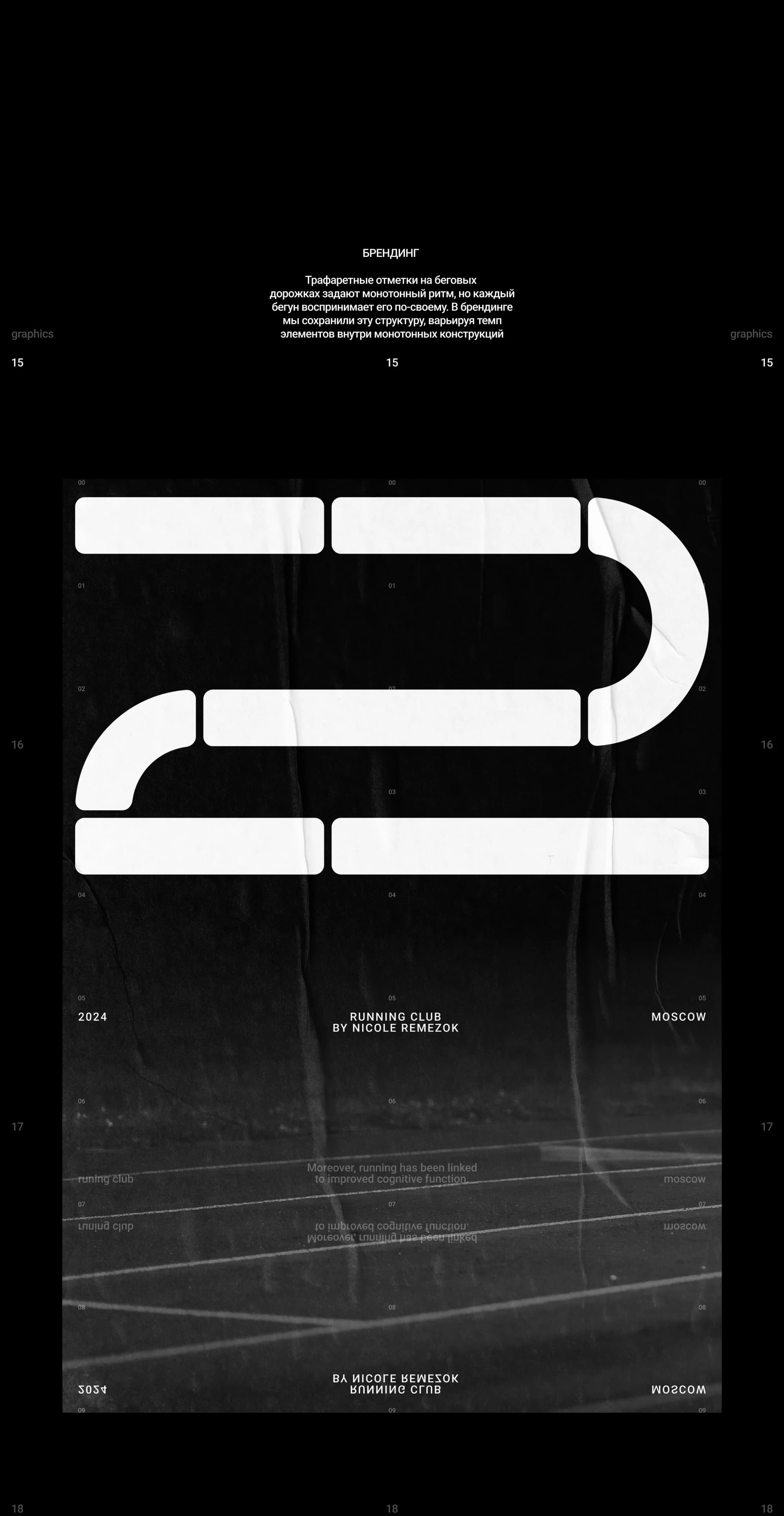
The branding keeps the metaphor of track markings: stencilled marks on a running lane set a monotonous rhythm, but every runner reads that rhythm their own way — and the pace of the elements inside those monotonous structures varies in the same way.
What we did
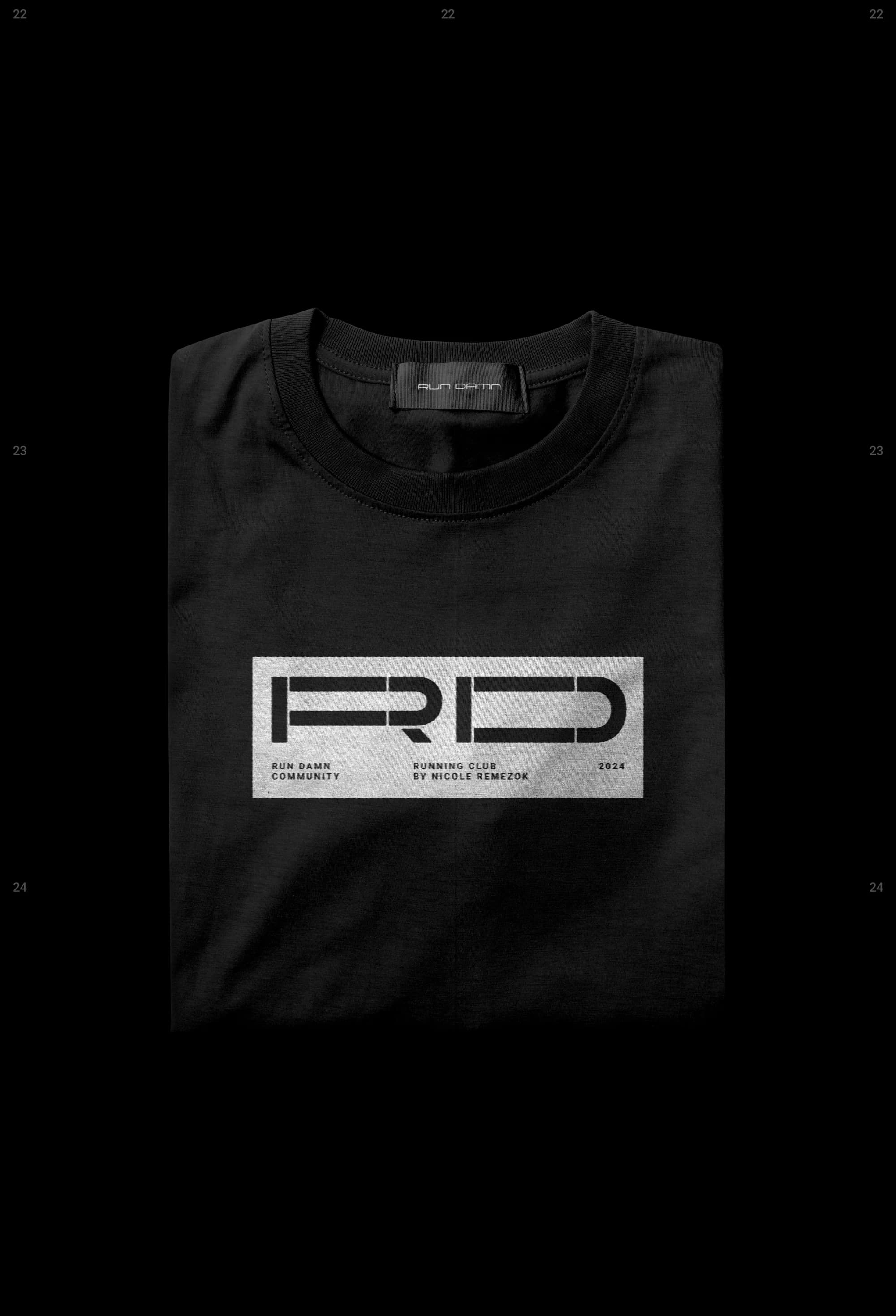
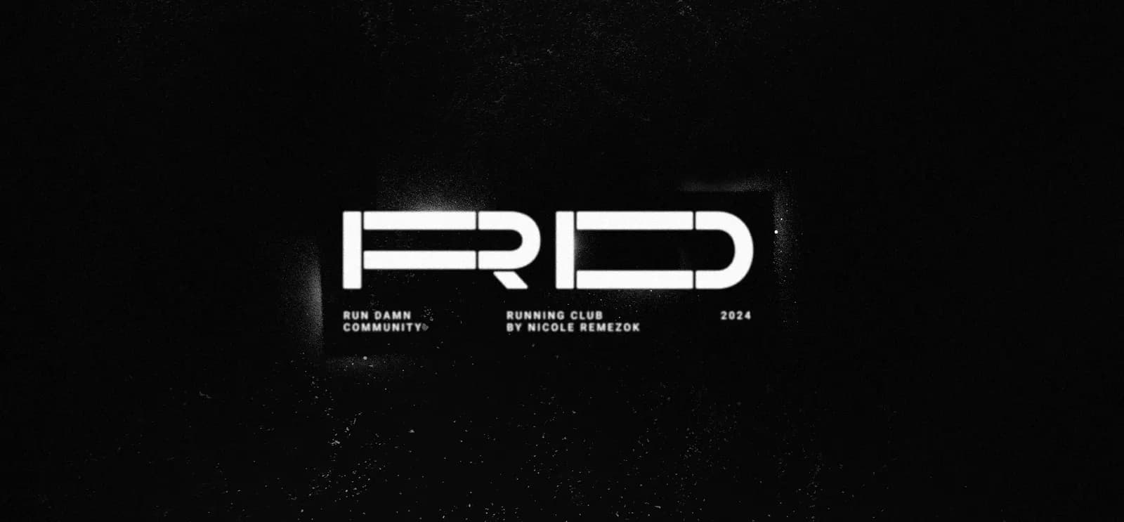
The mark. A counterform RD monogram — the stencil mark.
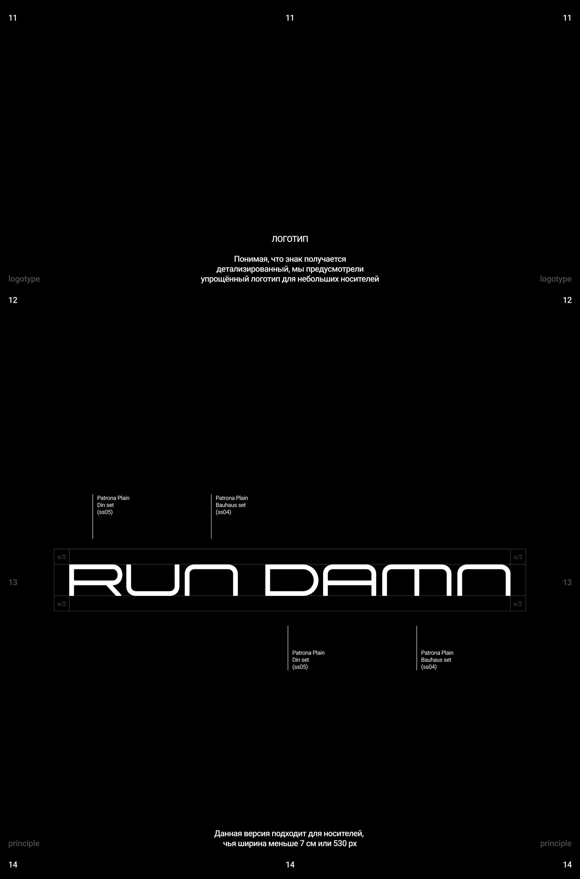
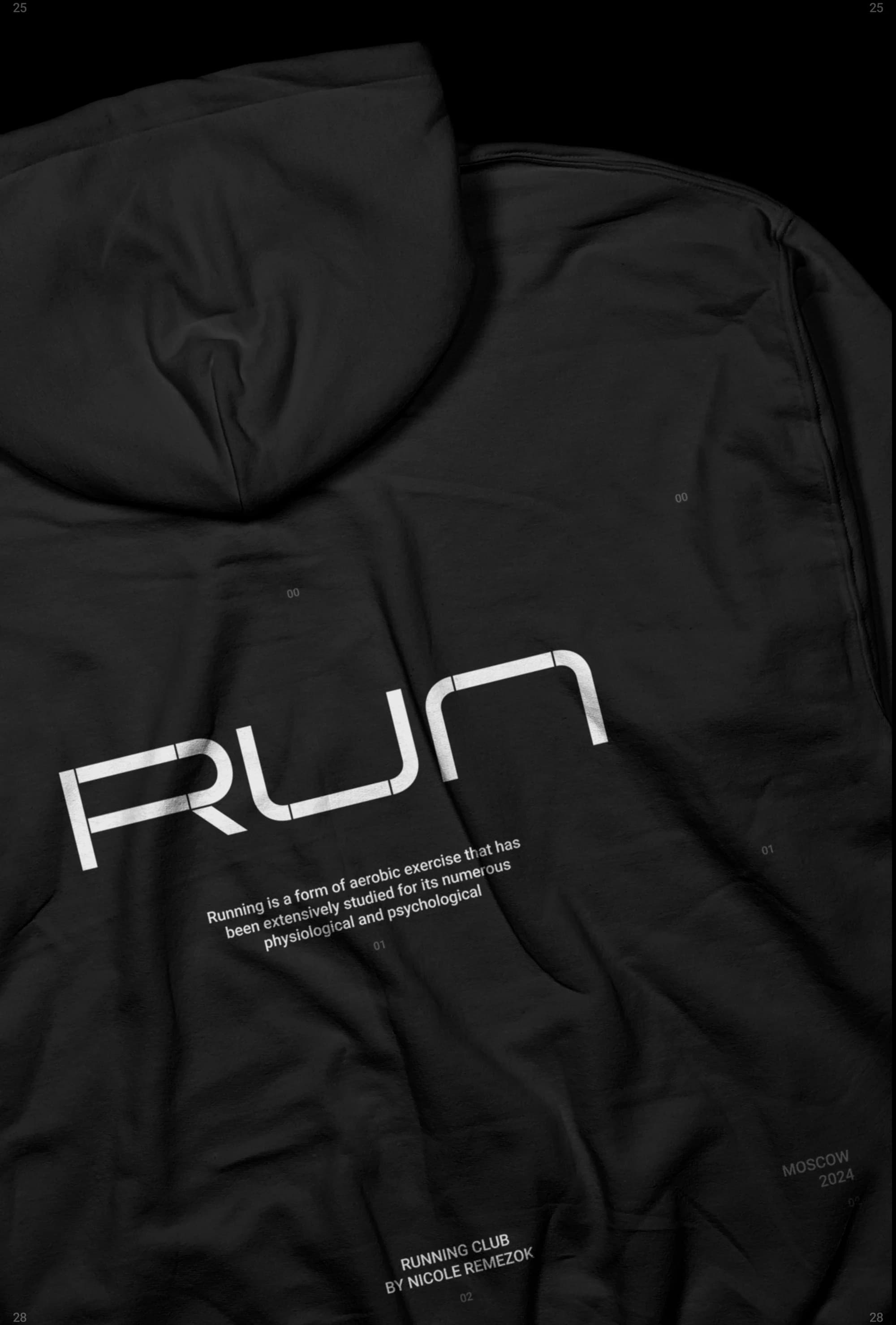
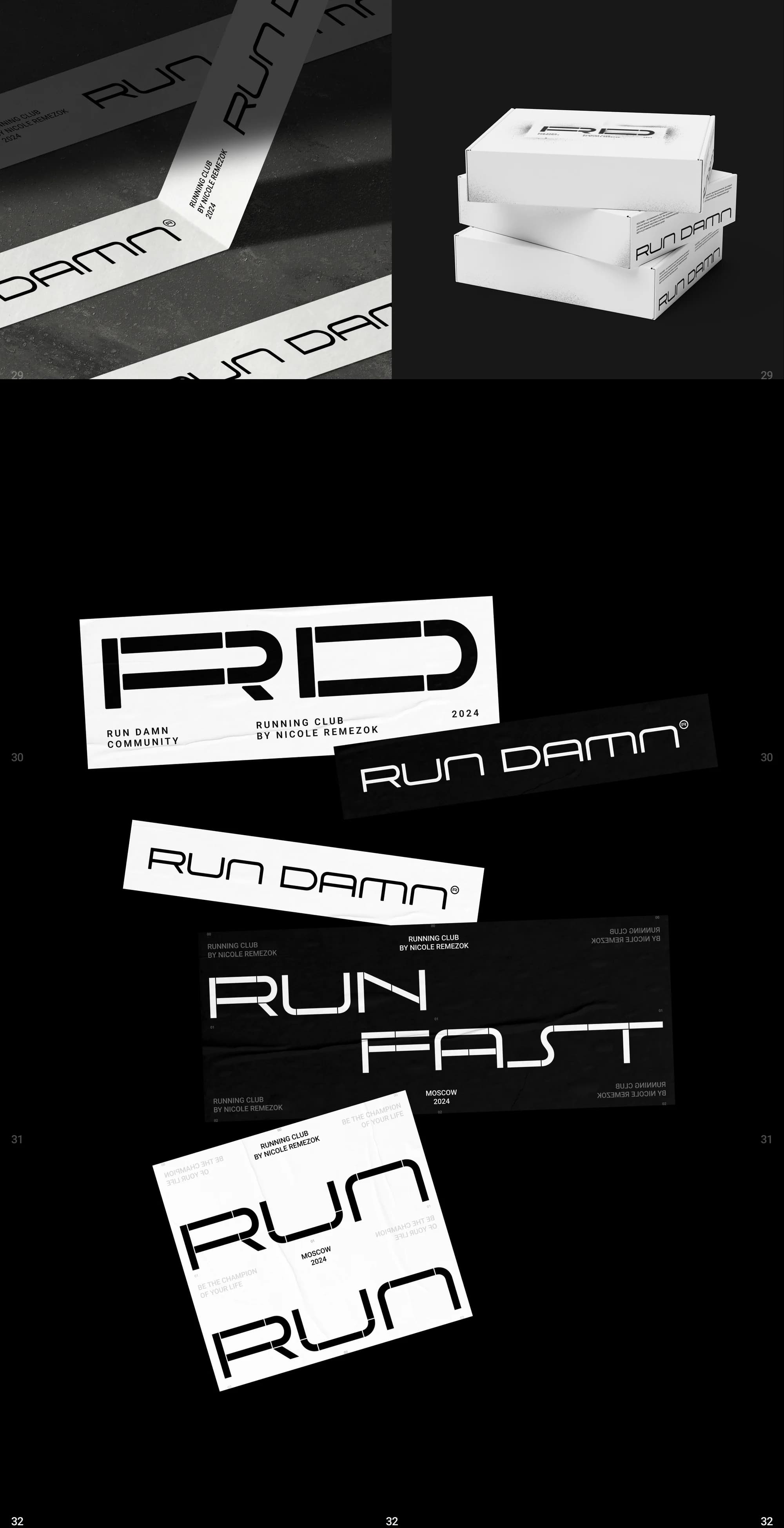
The logotype. RUN DAMN set in Patrona Plain: Din (ss05) and Bauhaus (ss04). This version is the one for surfaces narrower than 7 cm or 530 px, where the counterform breaks stop reading.
Type system. Rules for working with the Patrona Plain stylistic sets: what goes on a headline, what on a caption, where the decorative variants are allowed.
Guidelines. A document covering the logo, its sizes, the counterform and the rules of use, dated August 2024 — written as a guide rather than assembled as a set of pictures.
Merch. A t-shirt, a hoodie, a sticker pack with RD / RUN DAMN / RUN FAST / RUN variants, and packaging. The stickers are not souvenirs here but a direct extension of the stencil logic: a mark you put wherever you like.
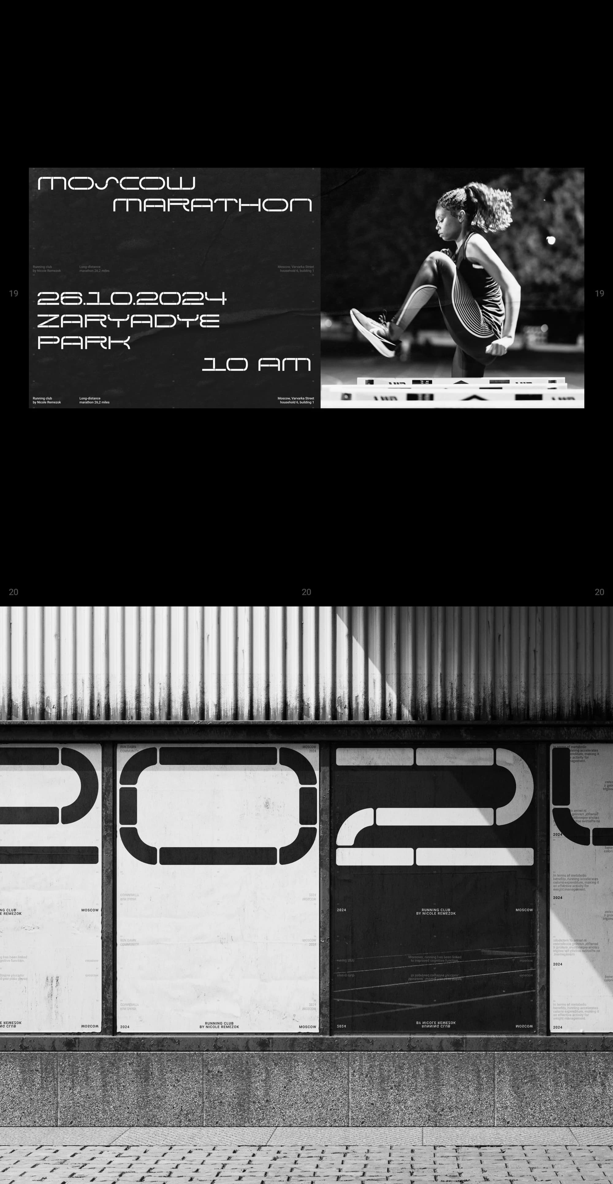
Race poster. A Moscow Marathon poster: 26.10.2024, a 10 a.m. start, the meeting point at Zaryadye Park.
The result
The club has a mark that behaves differently across surfaces and stays itself: a counterform monogram at large sizes, the wordmark at small ones.
The type system is written into the guidelines: the rules for choosing a cut are fixed, and posters, merch and any new surfaces are built from them.
The full breakdown is published on Behance and on Dprofile, where it carries the Recommended badge. Links below.