The task
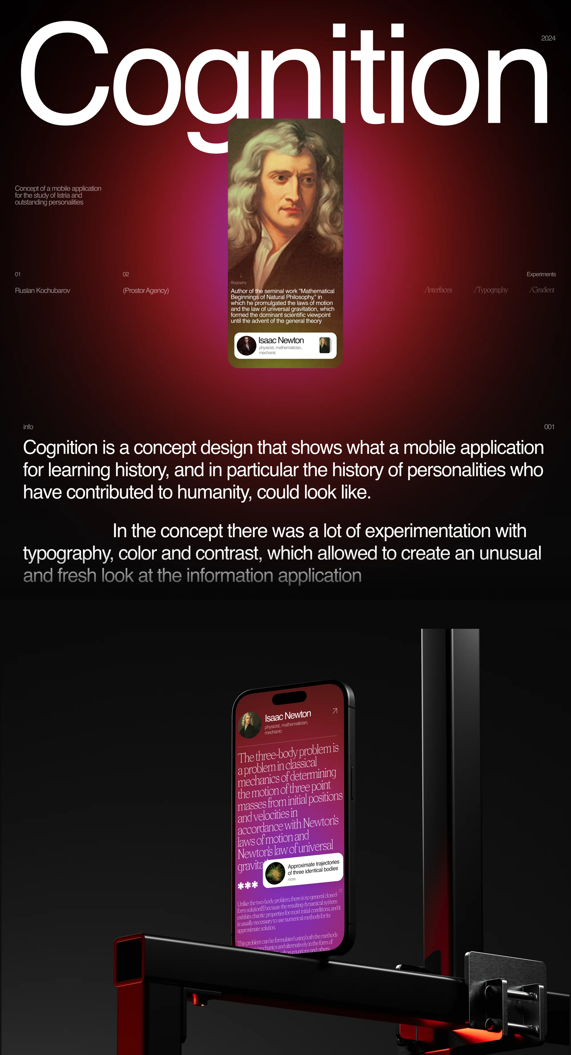
Cognition is a concept design that shows what a mobile application for learning history — and in particular the history of personalities who have contributed to humanity — could look like.
This was internal agency work rather than a client commission. Hence the character of the task — not to solve someone's problem but to test a device. In the concept there was a lot of experimentation with typography, colour and contrast, which allowed an unusual and fresh look at the information application.
The solution
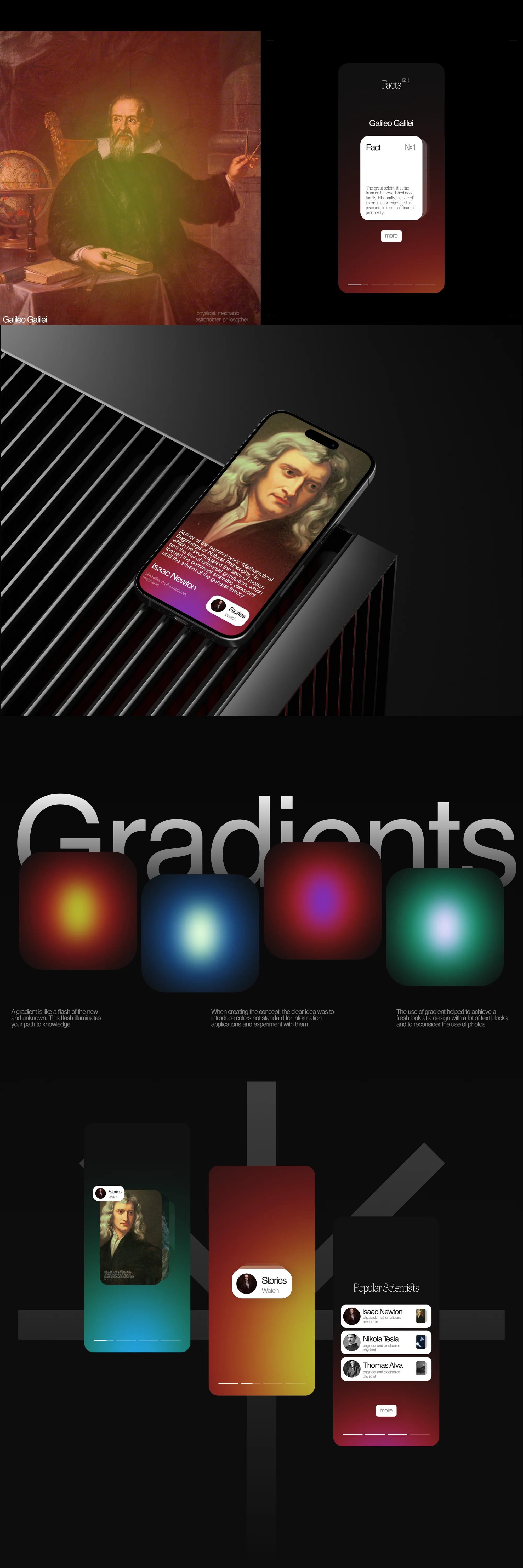
The key decision is gradient instead of photography. We put it this way: a gradient is like a flash of the new and unknown, and this flash illuminates your path to knowledge. When creating the concept, the clear idea was to introduce colours not standard for information applications and to experiment with them.
The practical effect is stated there too: the use of gradient helped to achieve a fresh look at a design with a lot of text blocks, and to reconsider the use of photos.
For an app about history that solves a practical problem: a suitable portrait does not exist for every topic, and repeating the same one on every card costs you the ability to tell them apart. A gradient gives each card a character of its own without pretending to be a document of its period.
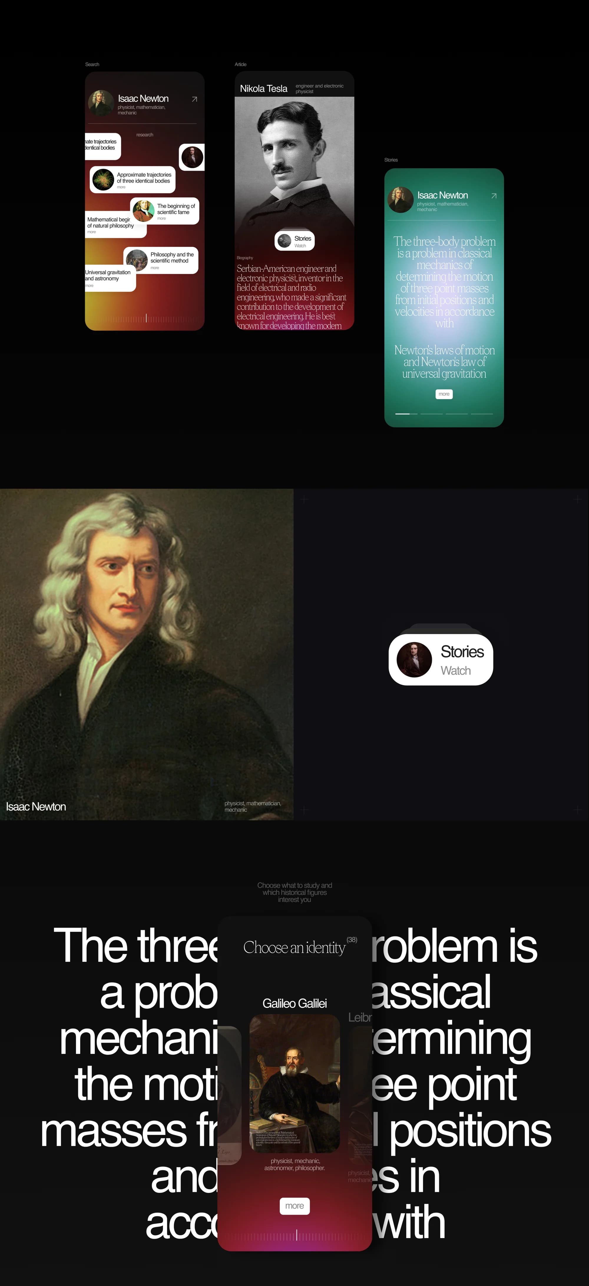
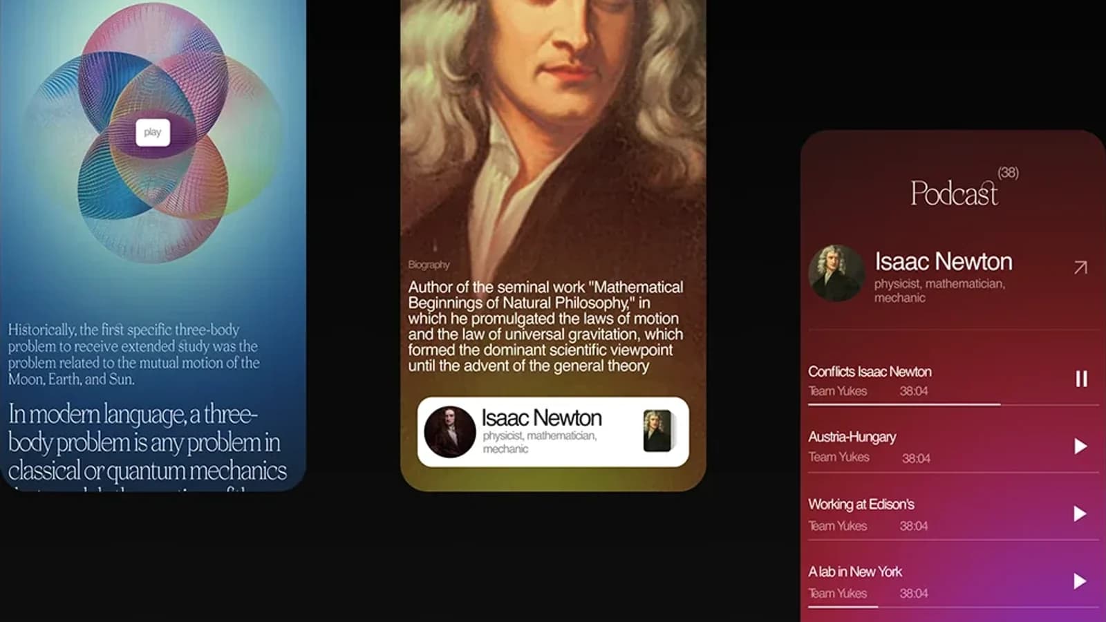
The second layer is typography. Large setting fills the screen, a long quotation about the three-body problem unfolds across the full width, and a personality card is laid over it. Text works here as image.
What we did
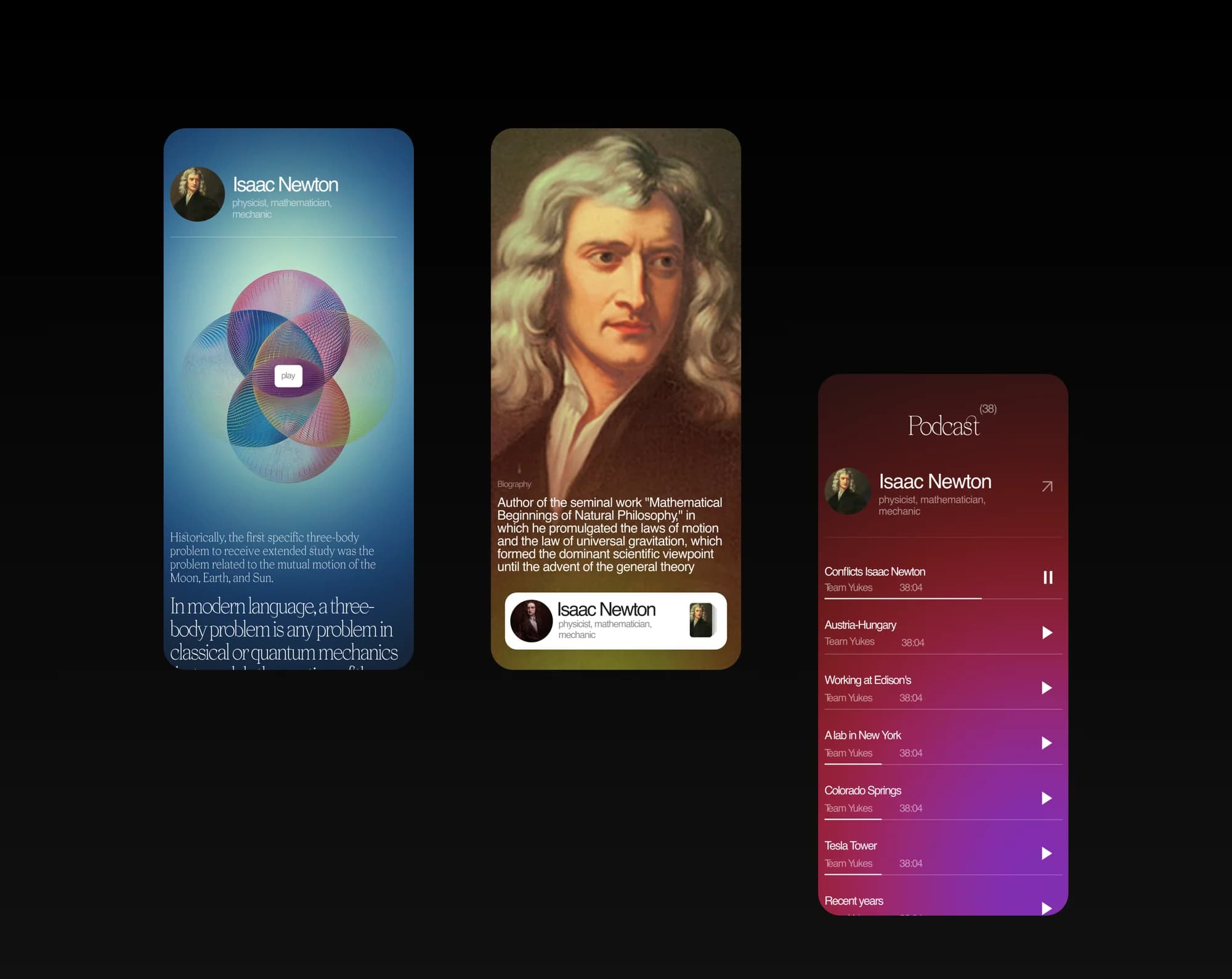
Personality screens. Cards with a portrait, fields of work and a short biography: Isaac Newton, Nikola Tesla, Galileo Galilei, Leonardo da Vinci, Thomas Alva Edison, Elias Howe.
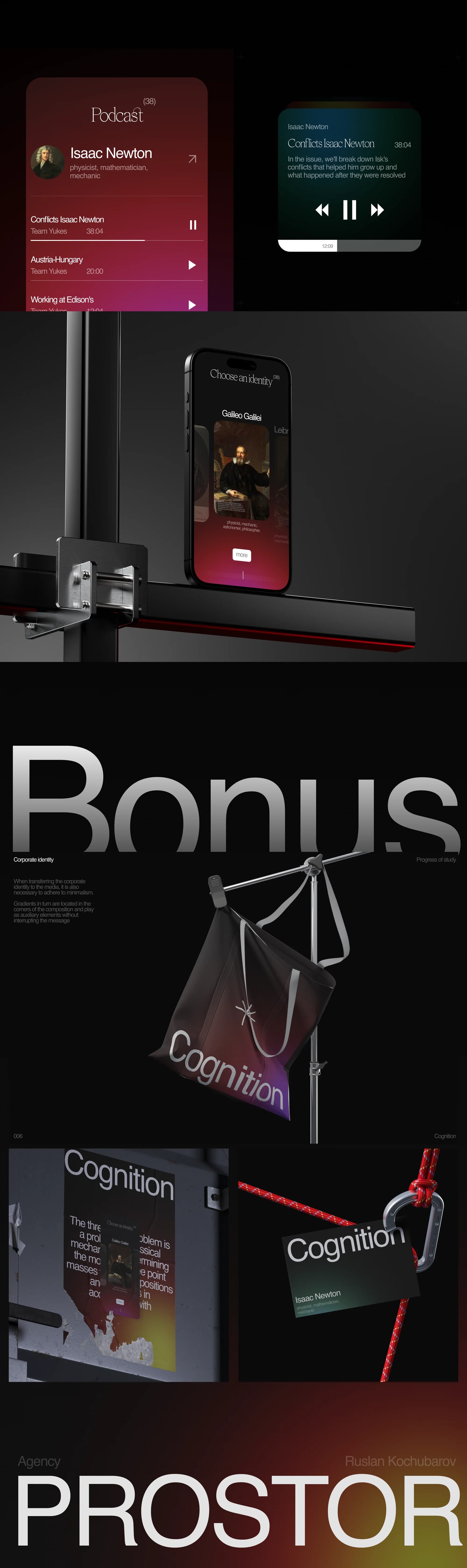
"Choose an identity". Picking the personality your study starts from — the way into the app is a person, not a topic and not a century.
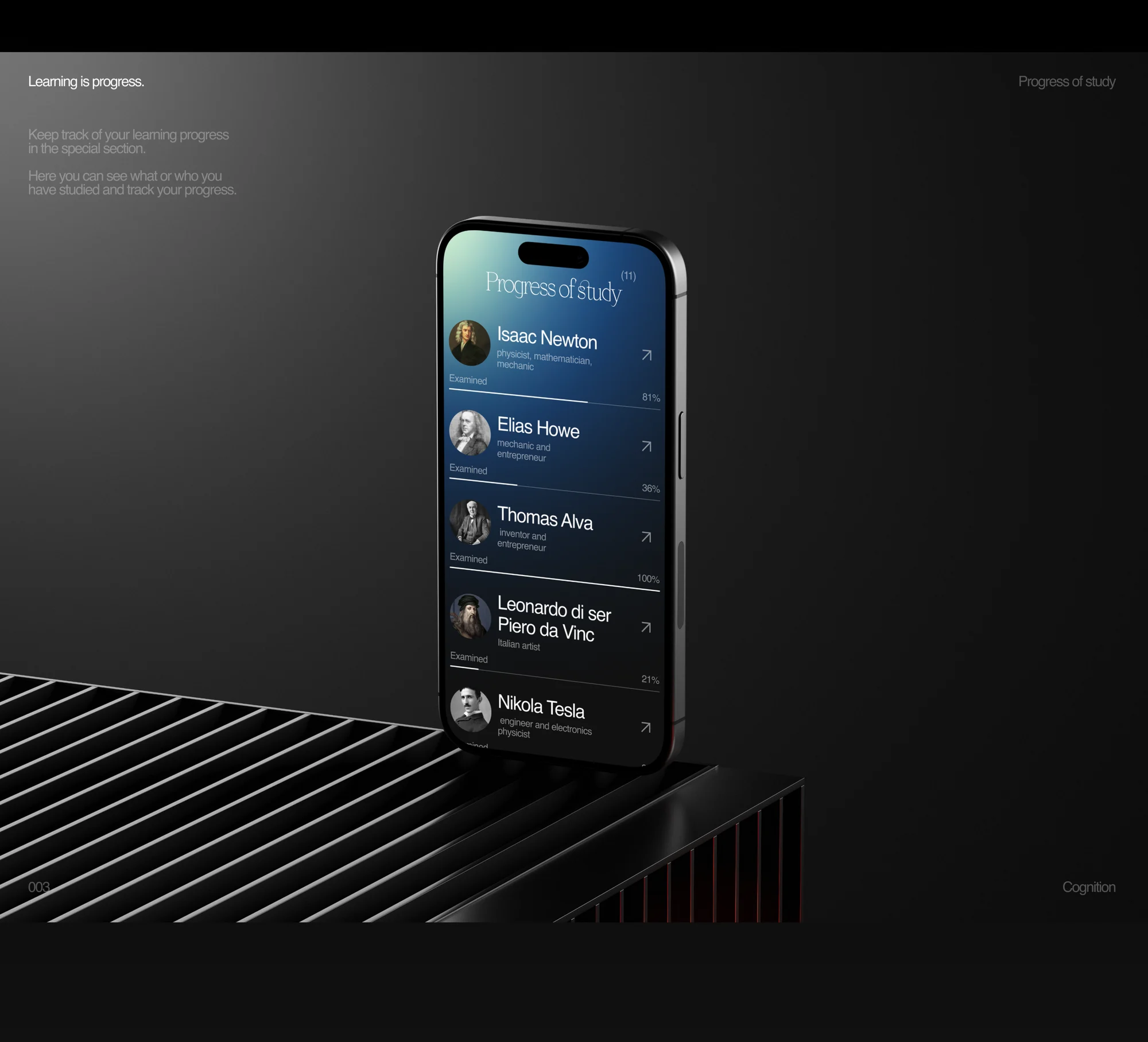
Progress of study. A progress screen listing personalities and how far each has been studied.
Podcasts. A player and a feed of episodes with names of their own — conflicts in Newton's life, Austria-Hungary, working at Edison's, a lab in New York, Colorado Springs, the Tesla Tower, the recent years.
Stories and facts. A Stories format for short pieces and a Facts screen that switches between them.
Gradient system. Four colour schemes as the base of the visual language, with the rules for using them written down.
Brand items. A bonus section carrying the concept's identity: a flag, a tag, posters.
The result
A concept in which an information application looks like a cultural publication while staying readable: colour carries the mood, typography carries the hierarchy, and photography stops being compulsory.
The project is published on Behance and on Dprofile, where it carries the Recommended badge. Links below.