The task
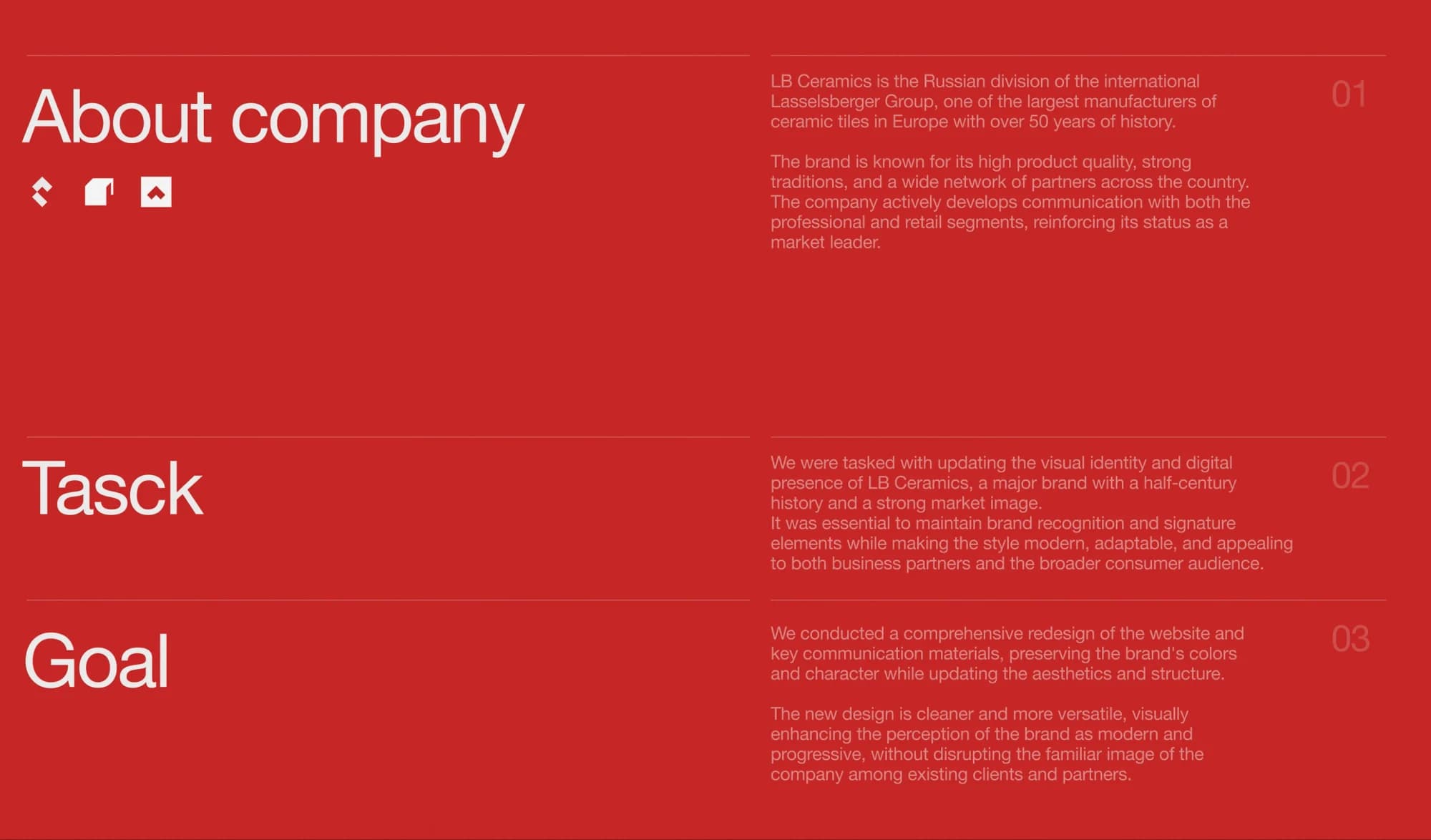
LB Ceramics is the Russian division of the international Lasselsberger Group, one of the largest manufacturers of ceramic tiles in Europe, with over 50 years of history. In Russia the company runs its own plant in Ufa; the site puts it as: in the industry since 1957, in Russia since 2006.
The task was set out as follows: update the visual identity and digital presence of a major brand with a half-century history and a strong market image. The essential condition was to maintain brand recognition and its signature elements while making the style modern, adaptable and appealing to both business partners and the broader consumer audience.
The solution
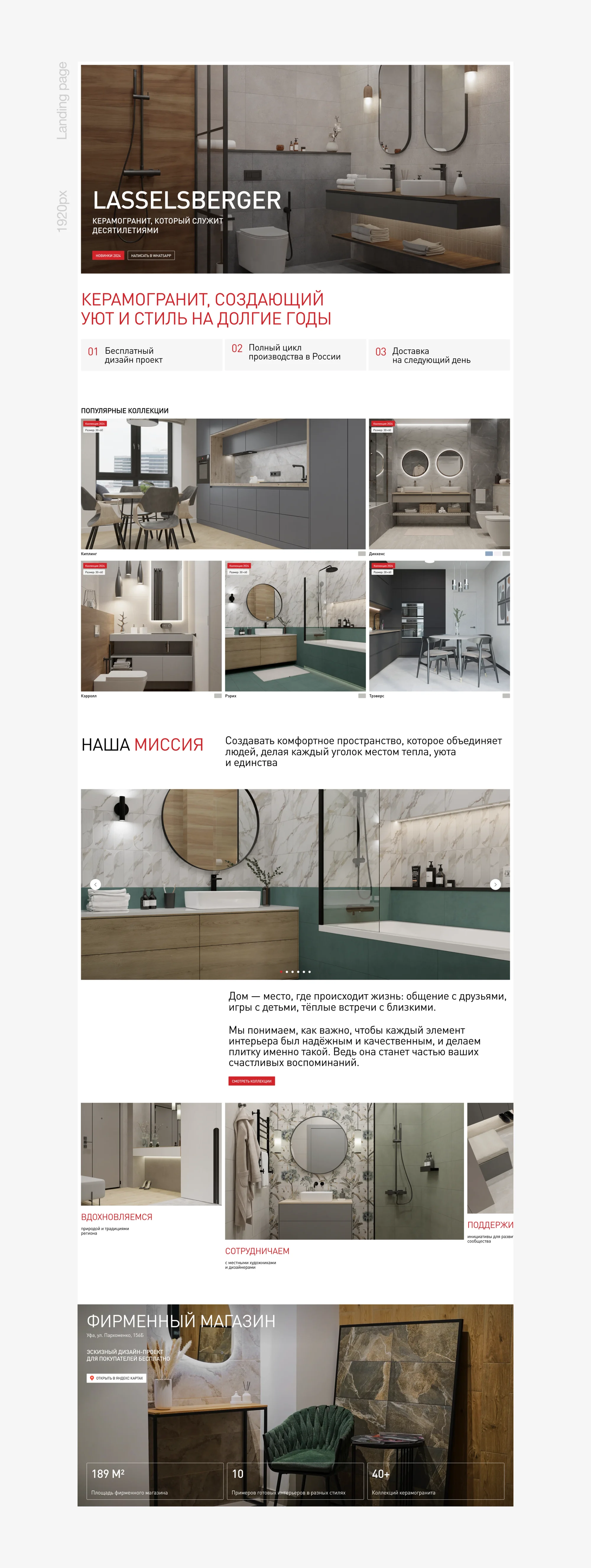
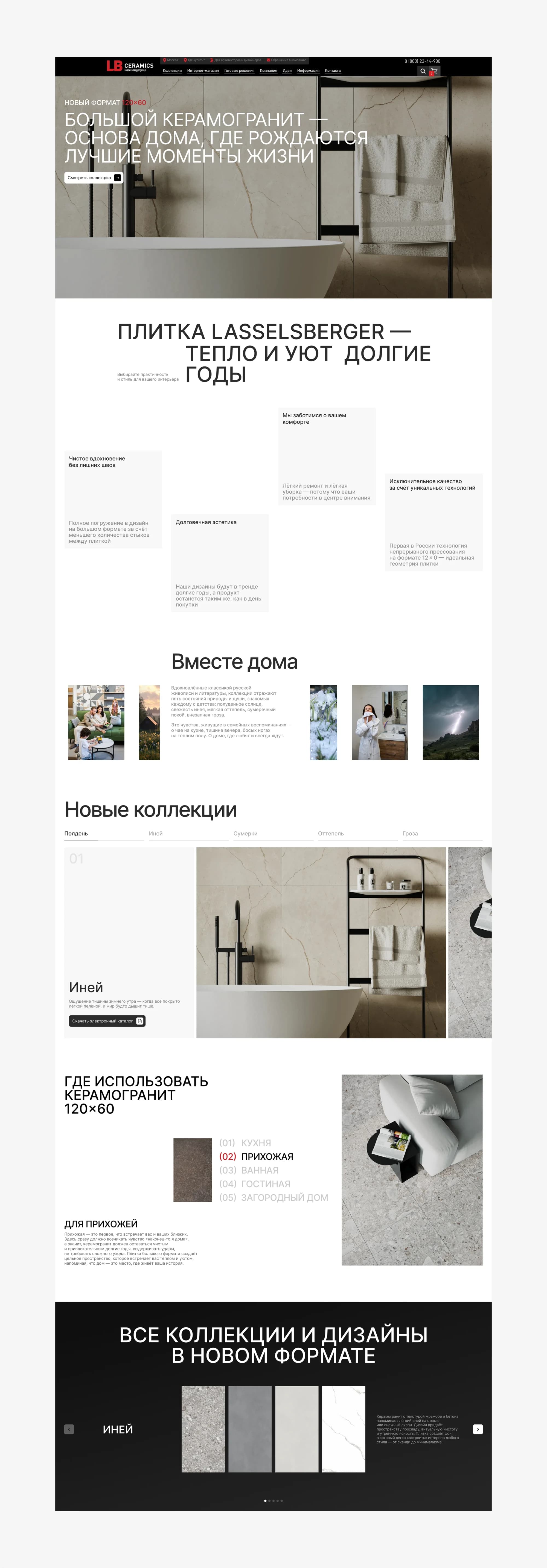
We conducted a comprehensive redesign of the website and the key communication materials, preserving the brand's colours and character while updating the aesthetics and the structure. The new design is cleaner and more versatile, and the familiar image of the company among existing clients and partners is kept.
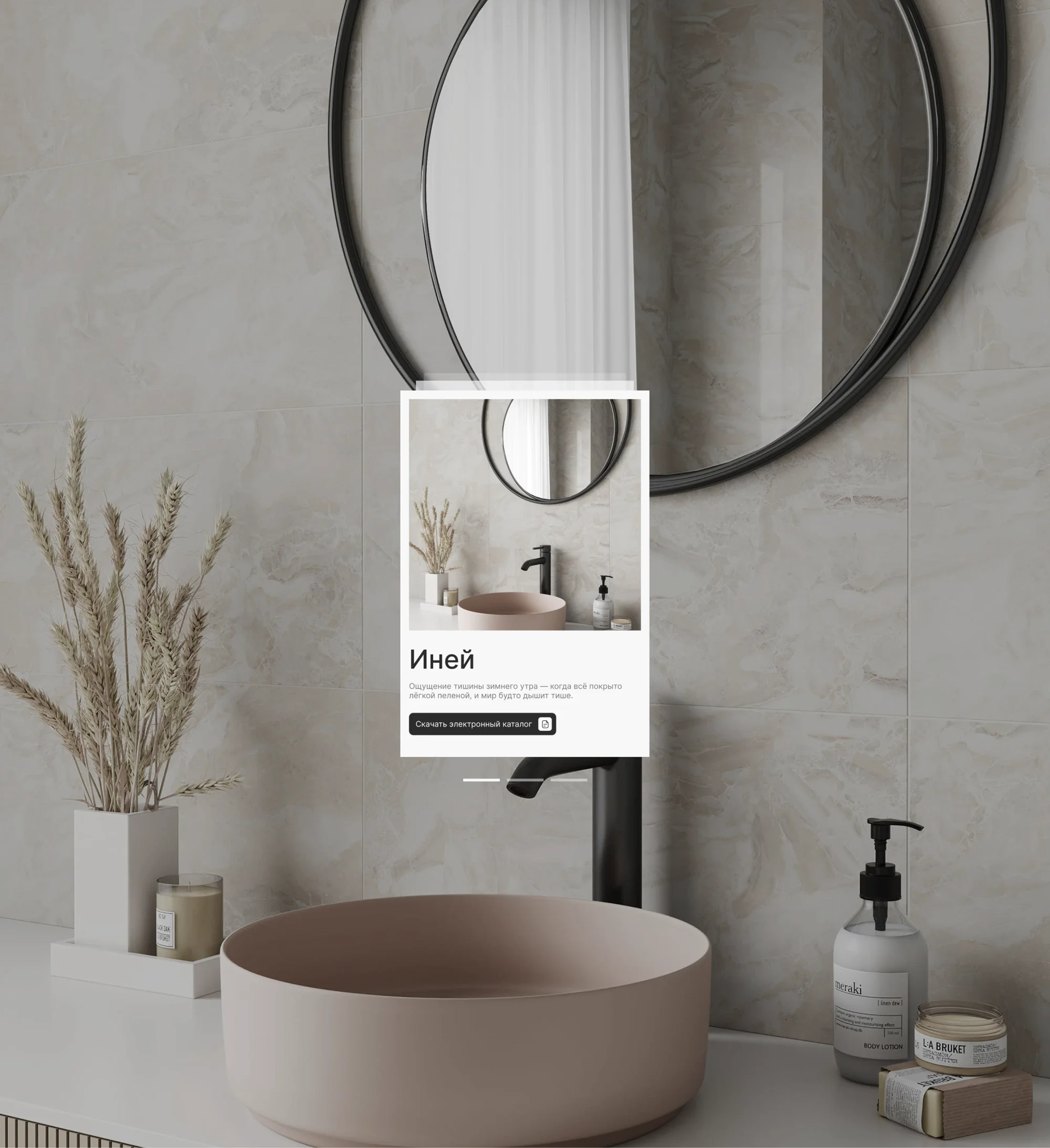
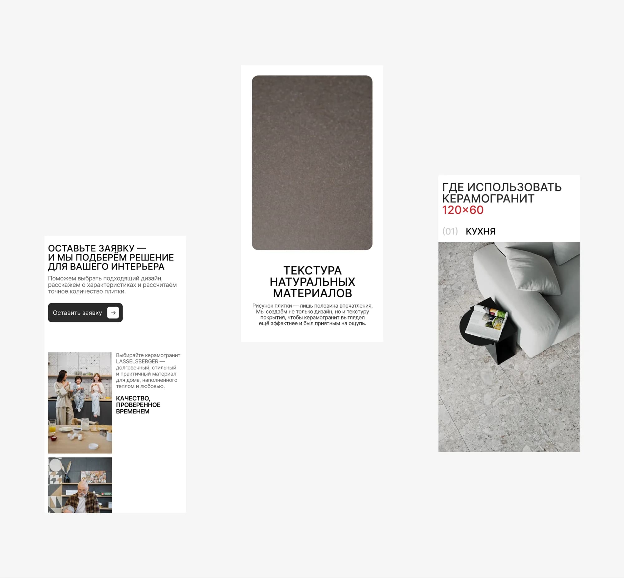
The brand red was left untouched — recognition rests on it. Everything around it changed: the grid, the typography, the way photography is used. Tile is shown in a whole interior rather than as samples on white: our reading is that what gets chosen is a room rather than a material.
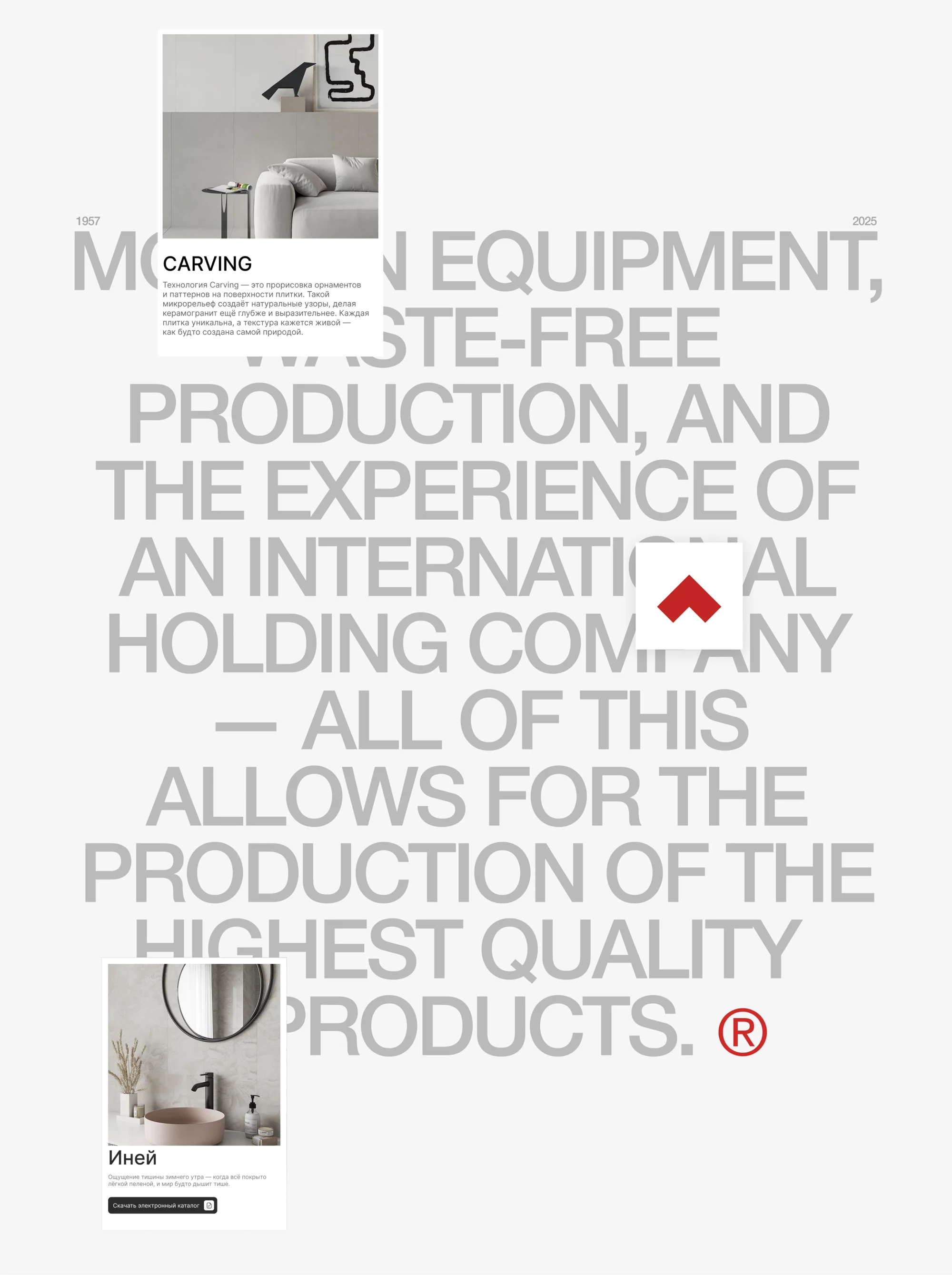
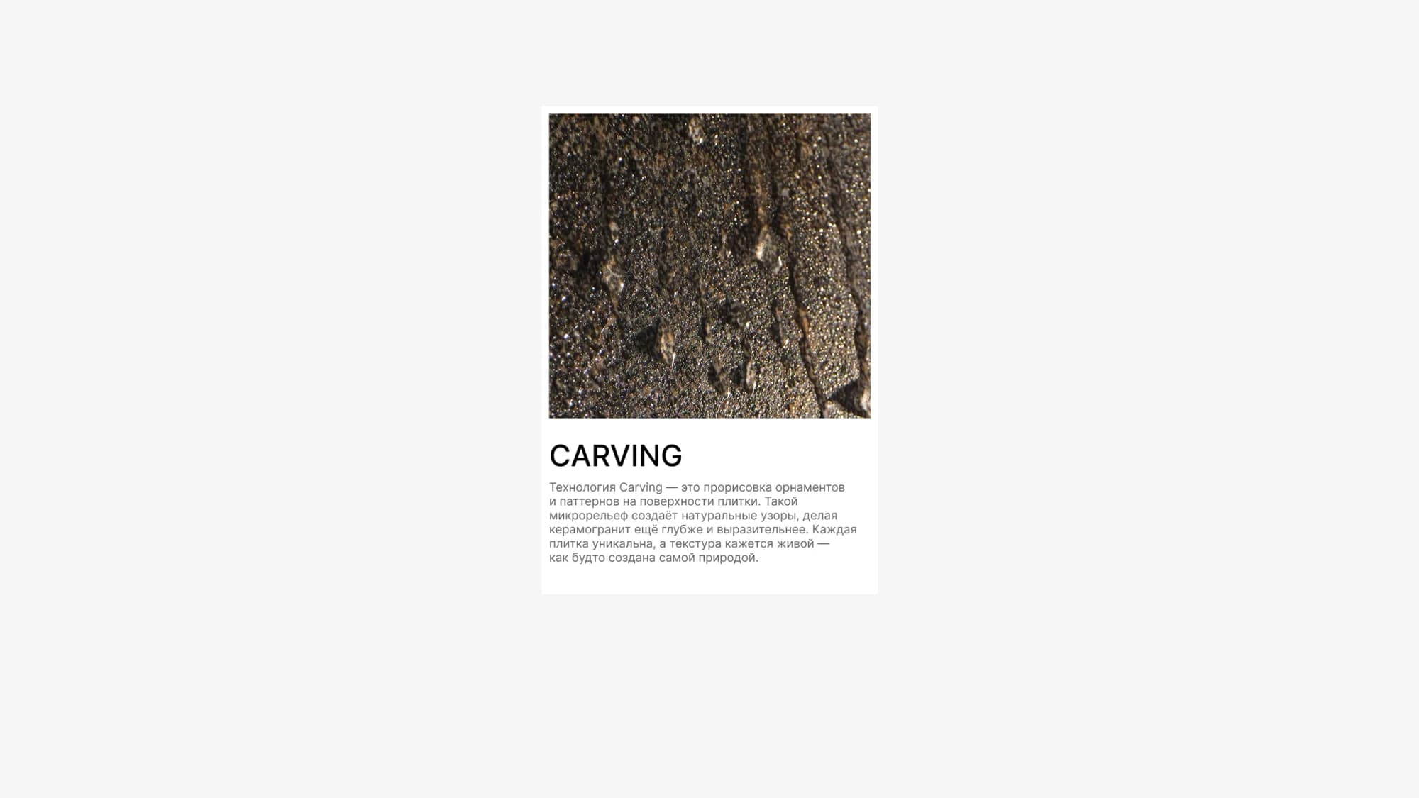
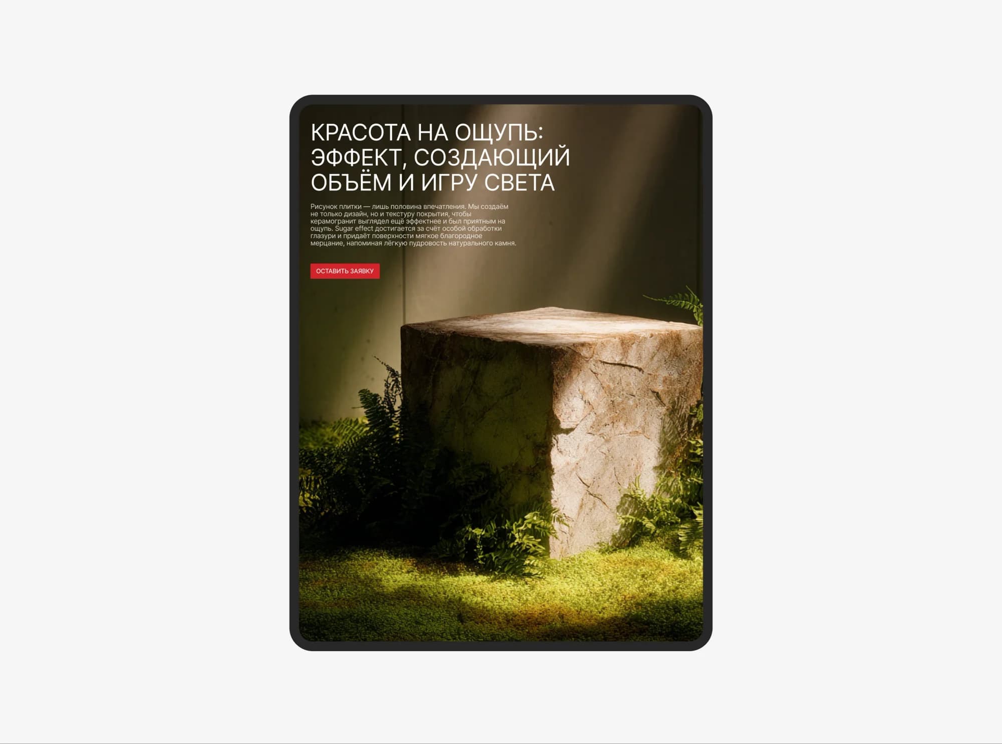
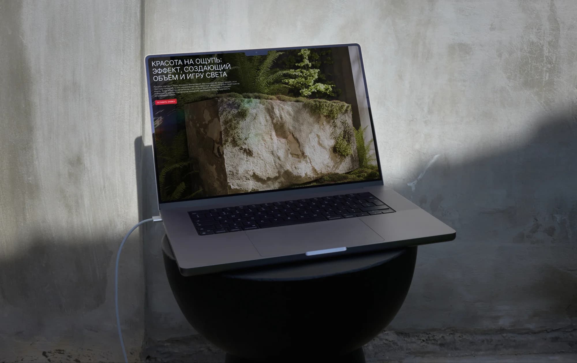
One device of its own is tactility. The technologies get spreads of their own: Carving, the drawing of ornament and pattern into the surface of the tile, and the Sugar effect under the heading about beauty you can feel — an effect that creates volume and a play of light. For a product people touch in a showroom, we took that to be the best way to carry texture through a screen.
What we did
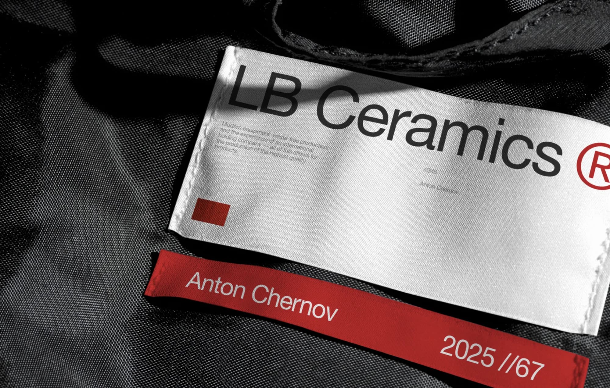
Design system. The brand red kept, the typography, grid and accent system renewed. The presentation is universal: web, marketplaces, print.
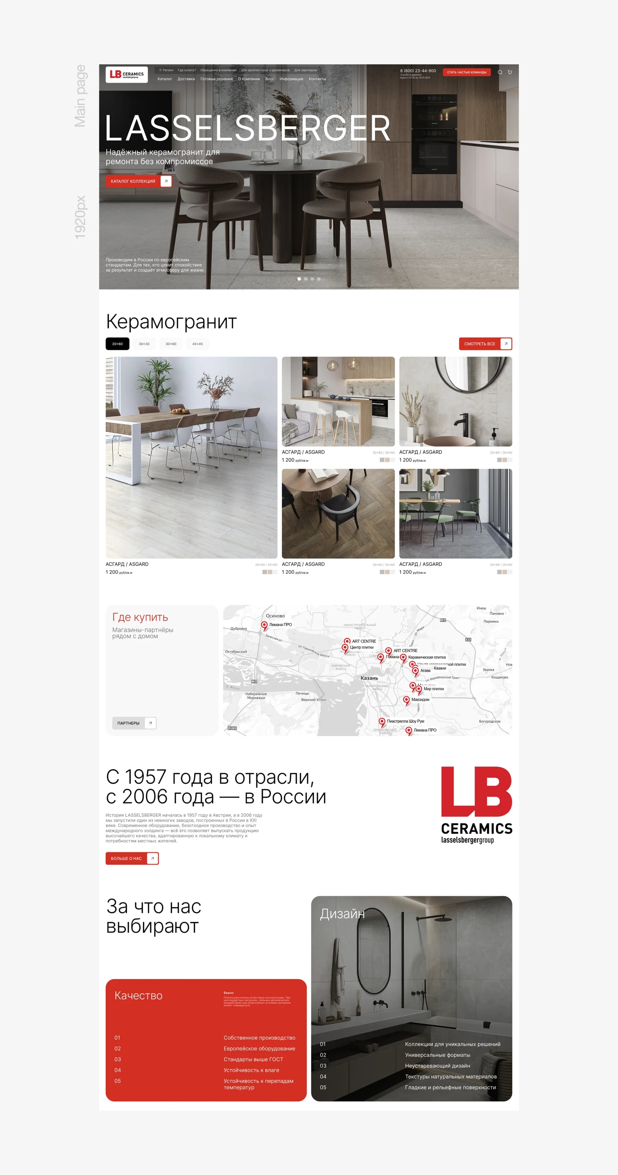
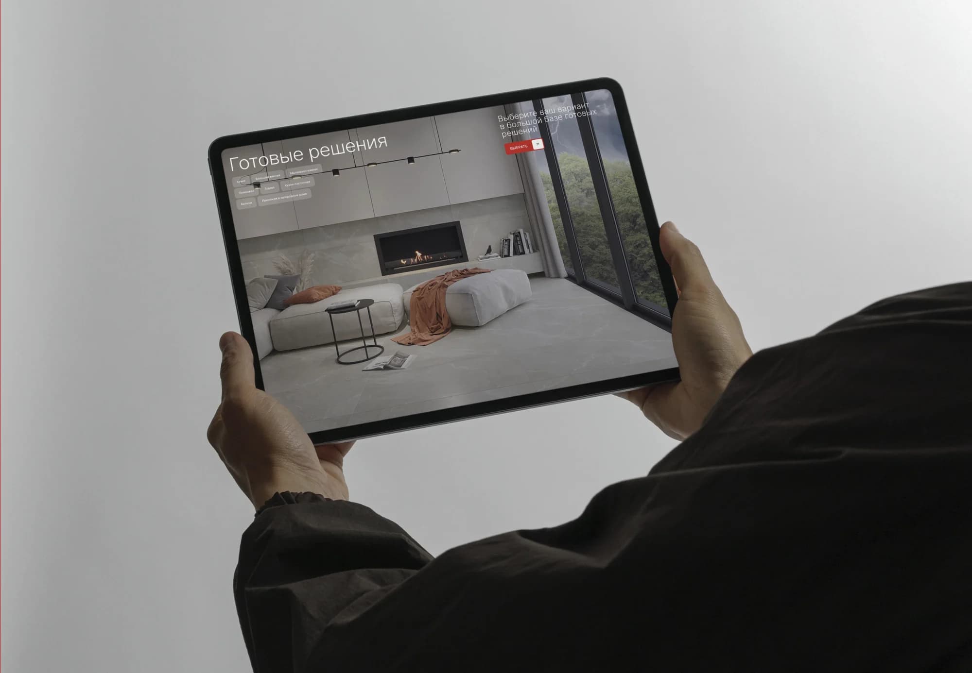
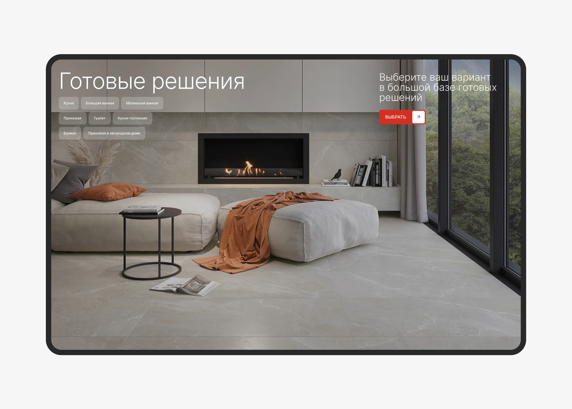
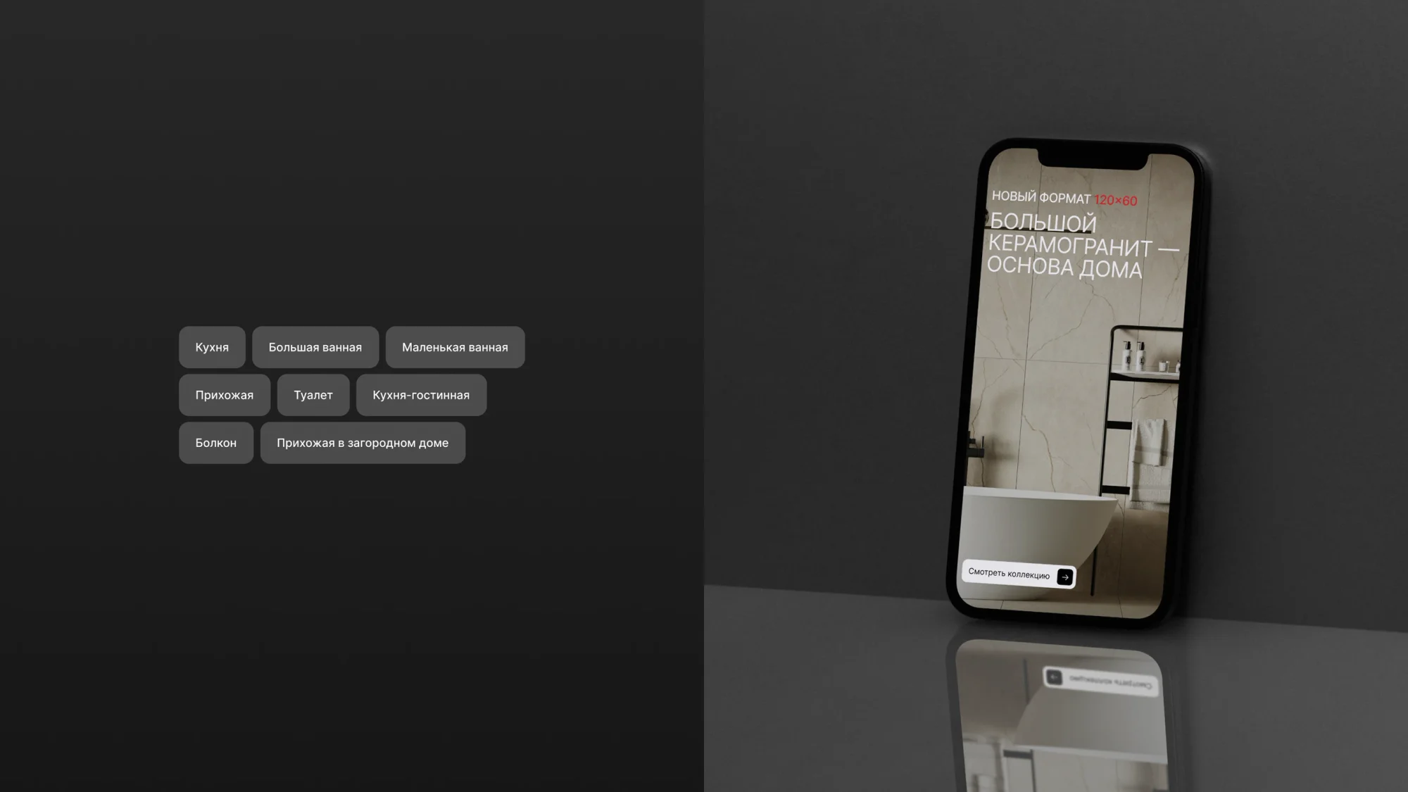
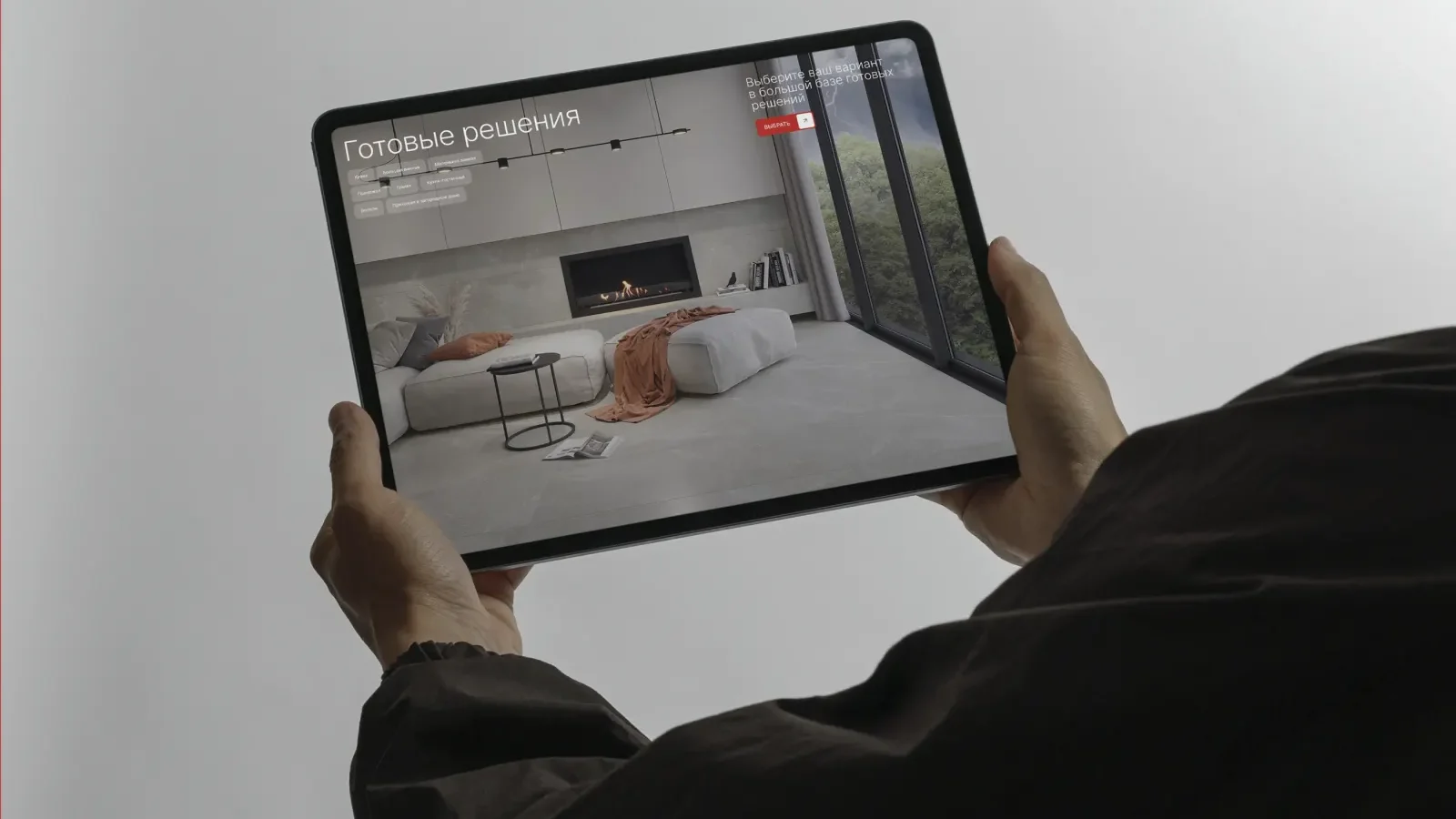
Home page and catalogue. A reworked home page, the structure of the electronic catalogue and the collection pages: porcelain stoneware cards with prices, popular collections, and ready-made solutions by room — kitchen, bathroom, hallway, toilet, kitchen-living room, balcony.
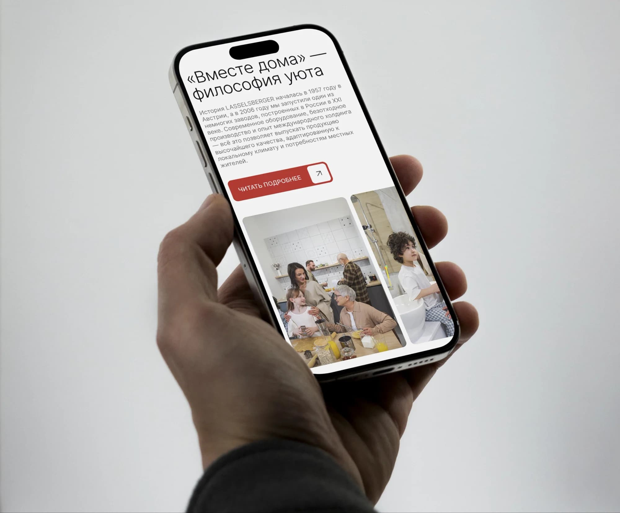
"Together at home". A section on the philosophy of comfort, and the brand's mission — creating a comfortable space that brings people together, making every corner a place of warmth, comfort and unity.
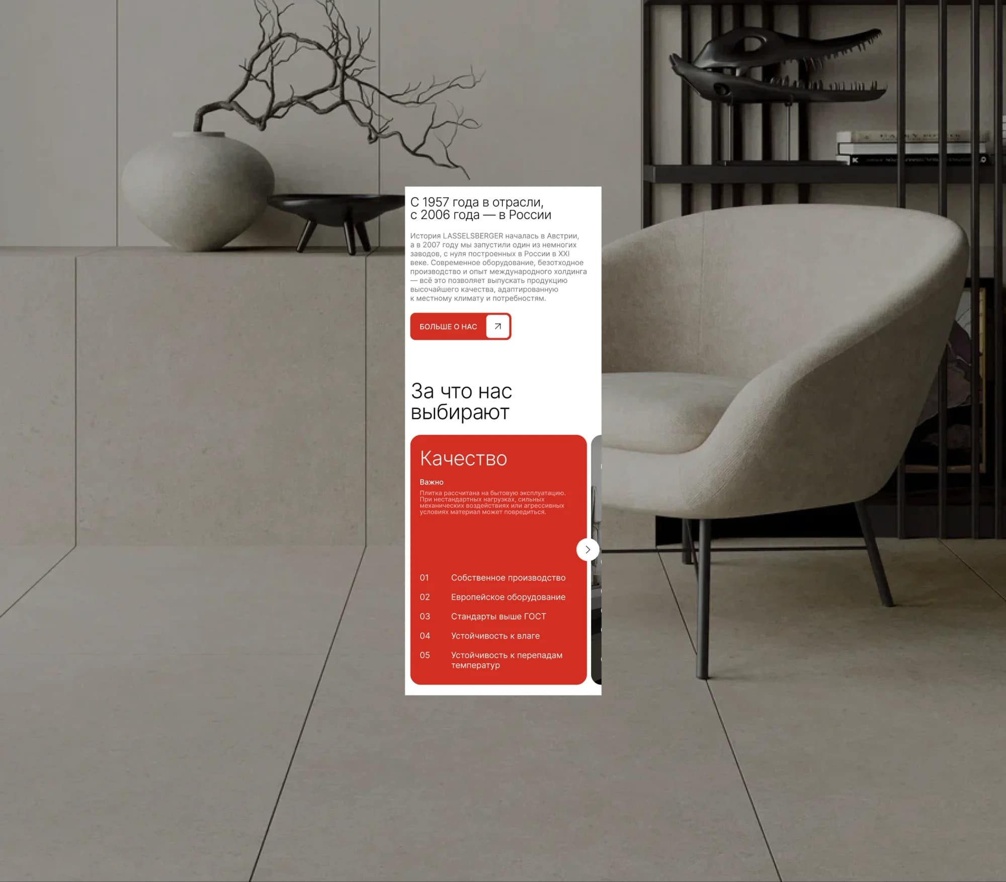
"Why we are chosen". A block in two halves. Quality: own production, European equipment, standards above the national norm, resistance to moisture and to temperature swings. Design: collections for one-off solutions, universal formats, a design that does not date, the textures of natural materials, smooth and relief surfaces.
"Where to buy". An interactive map of points of sale, and the brand store in Ufa.
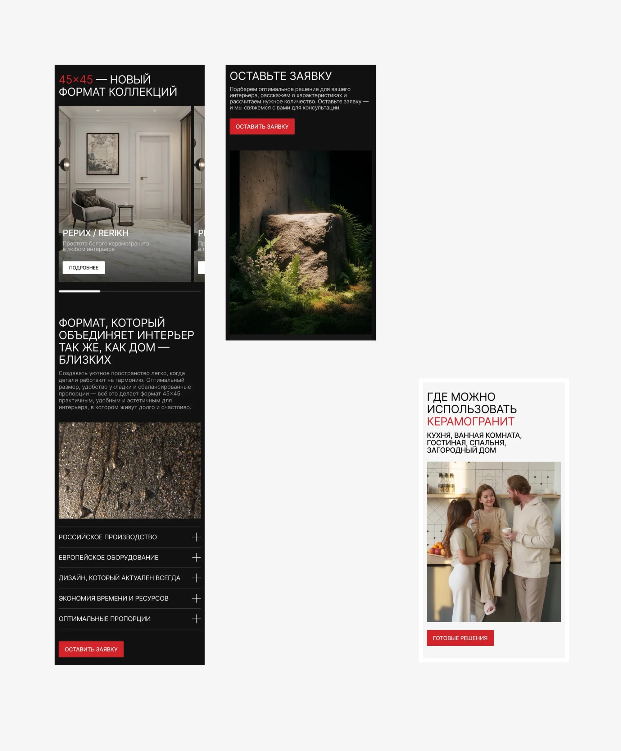
Format landings. Separate pages for the 45×45 and 120×60 tile formats. Advertising together with the 45×45 landing tripled traffic to the page.
Cards on Ozon. 60+ listings in one presentation: a shopper sees one brand's catalogue rather than an assortment of templates.
Partner conference. The event identity, held at the plant.
Mobile and tablet. The catalogue and the collections on a phone and a tablet.
The result
The brand got a contemporary visual language that did not have to be explained to existing partners: the red, the mark and the overall logic stayed where they were; the presentation changed.
The system works the same in web, on the marketplace, in print and at an offline event — covering both the B2B and the B2C segment the redesign was for.
The site is live at lb-ceramics.ru.
The full breakdown is published on Behance and Dprofile — links below.