The task
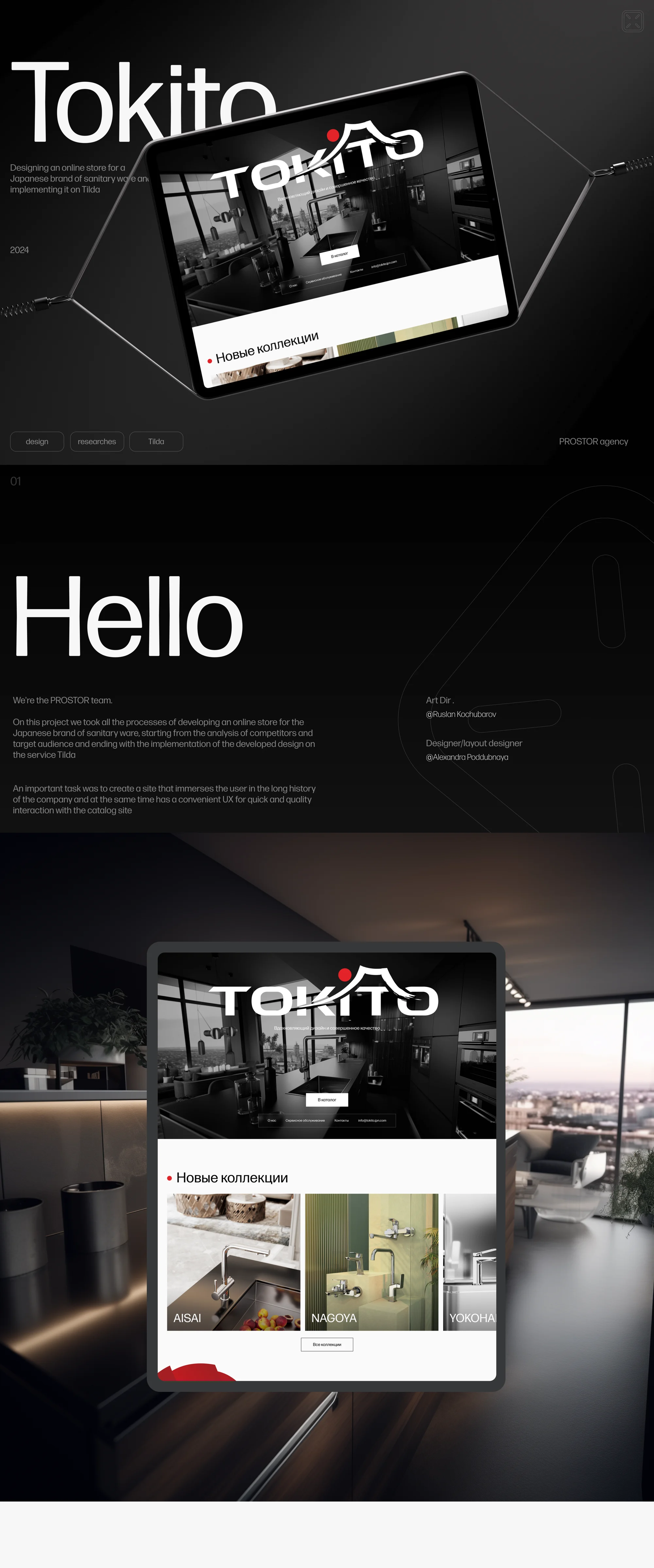
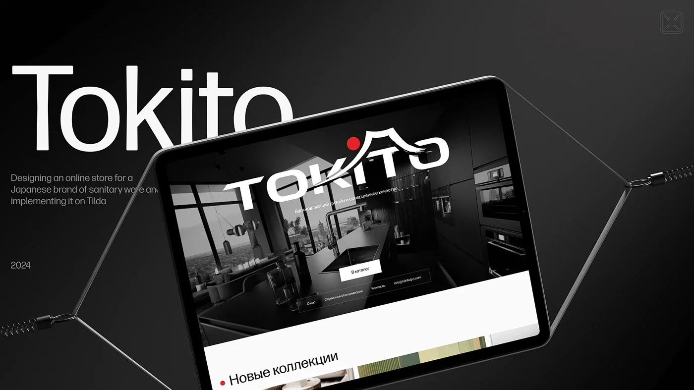
A client approached us with a request to develop a website for the Japanese sanitary ware brand Tokito. They needed clear navigation through a multilevel catalogue and a filter by collection and product type. The target audience is distributors who sell sanitary ware in retail stores.
At the same time it mattered to the client to immerse the visitor in the manufacturer's unusual history and show its values. That is where the tension sits, and it is what the work was about: a catalogue calls for speed, a brand history running back to 1949 calls for time and attention. The site had to hold both without turning into either a dry parts list or a presentation in which no tap can be found.
The solution
We took on the whole cycle: competitor and audience analysis, then the design concept and the build on Tilda.
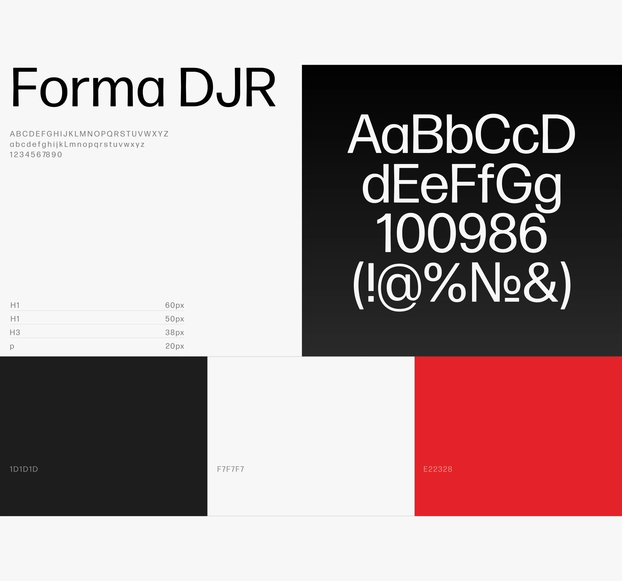
The visual language is black-and-white and technical with a single red accent: #1D1D1D, #F7F7F7 and #E22328. The typeface is Forma DJR on a fixed scale — 60 px for H1, 50 for H2, 38 for H3 and 20 for body text. Red works as a marker rather than as decoration: it lights the dot over the "i" in the logotype, the controls and the warranty block.
The tension between history and speed was resolved by separating them. The catalogue lives in the light part of the site and is built like a catalogue. History and manufacturing are moved into the dark and red screens — they read as a chapter of their own instead of getting in the way of navigation.
What we did
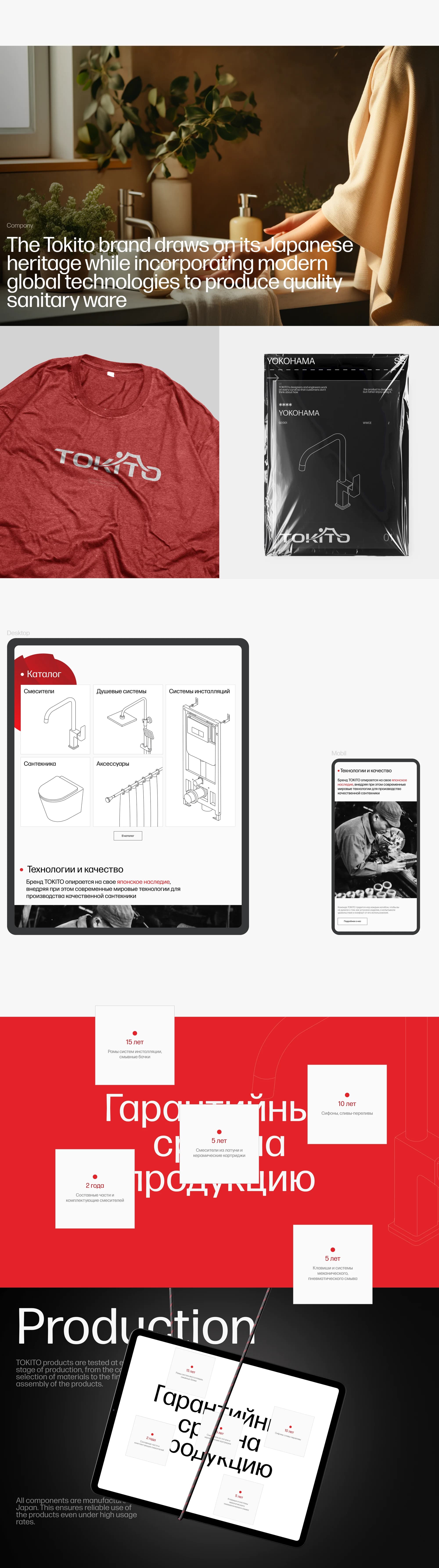
Catalogue. Five sections: mixers, shower systems, installation systems, sanitary ware, accessories. A filter by collection and product type — navigation shaped around a distributor's task.
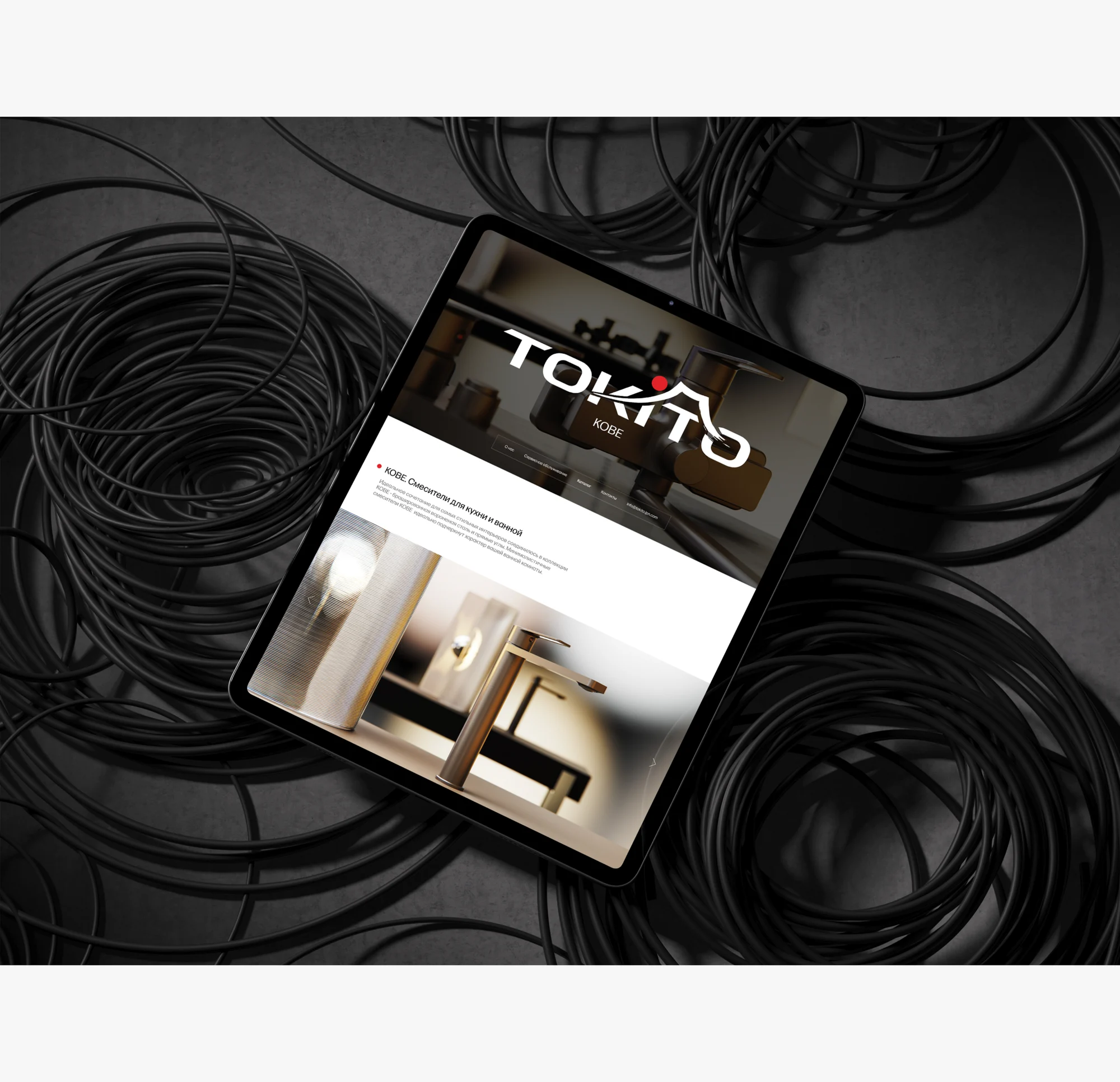
Collections. A showcase with names of their own: AISAI, NAGOYA, YOKOHAMA. Each gets its own block of cards and a route into the catalogue.
Warranty terms. A screen of its own, with the terms broken out by product type: 15 years on installation frames and cisterns, 10 years on traps and overflows, 5 years on brass mixers and ceramic cartridges, 5 years on flush plates and mechanical or pneumatic flush systems, 2 years on mixer components. The terms get a screen of their own rather than a footnote.
Production. A Production block: the products are tested at every stage, from the selection of materials to final assembly, and all components are manufactured in Japan.
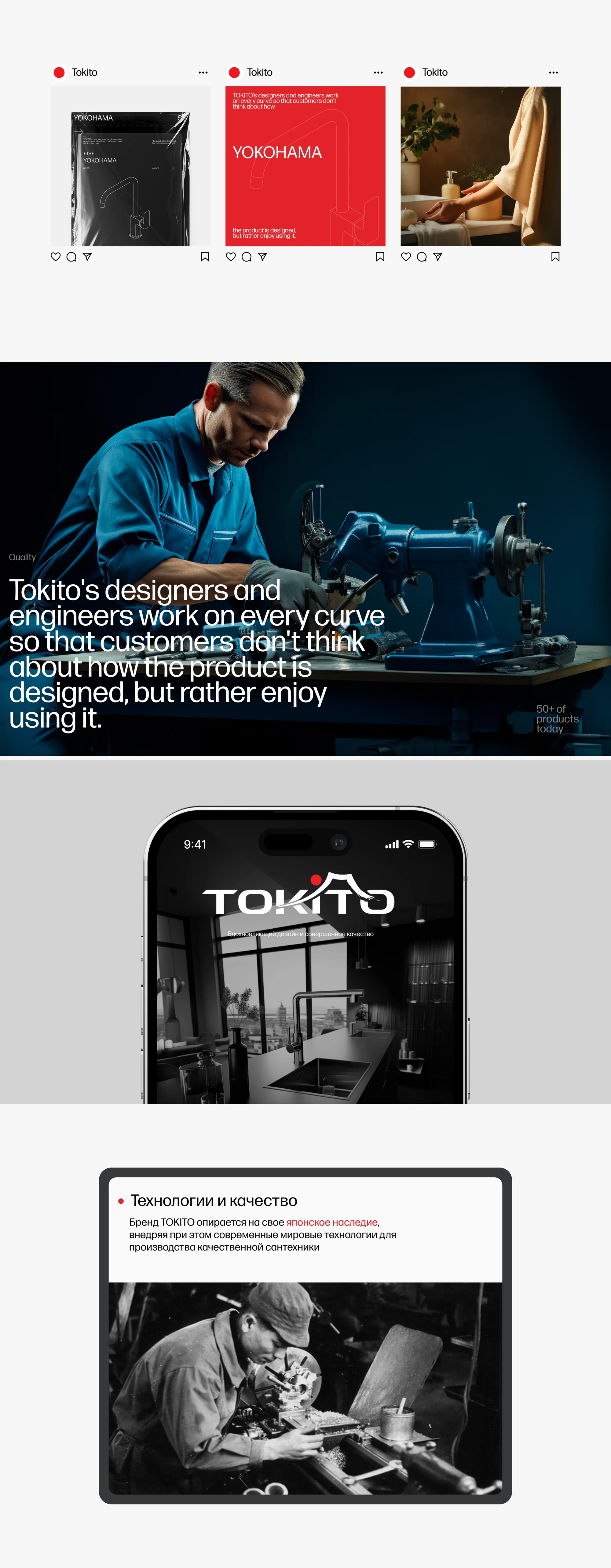
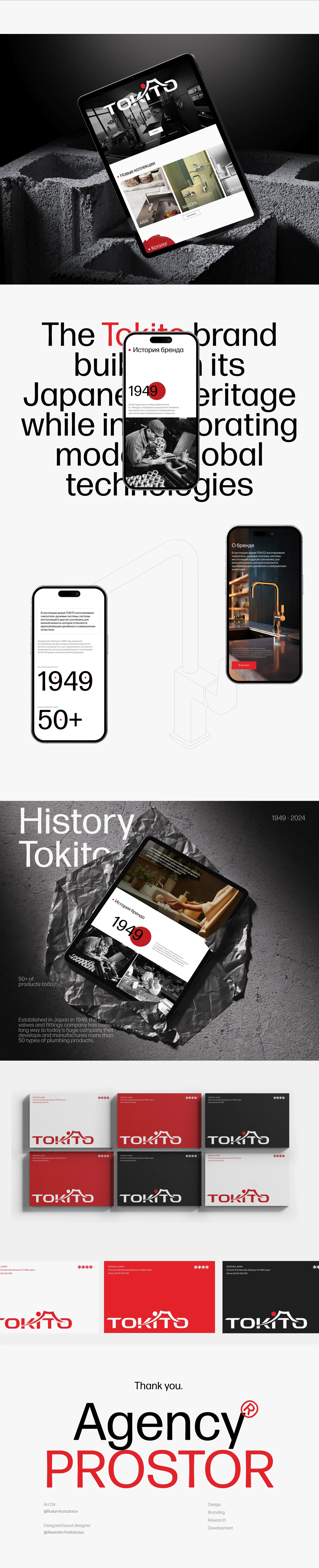
Technology and quality. The brand draws on its Japanese heritage while incorporating modern global technologies. A separate frame is given to the engineers: they work on every curve so that customers don't think about how the product is designed, but rather enjoy using it.
History. A timeline running from 1949, and today's figure — more than 50 products in the range.
Social and merchandise. Post layouts for the YOKOHAMA collection, a t-shirt and packaging carrying the logo.
Mobile. Catalogue, filter and cards on a phone, with the same navigation as on desktop.
The result
A catalogue site where a distributor reaches the article they need and its warranty term in a couple of clicks, and where the manufacturer's history does not get in the way, because it lives on screens of its own.
The site was built and launched on Tilda and runs at tokito.jpn.com. Art director Ruslan Kochubarov, designer Alexandra Poddubnaya.
The full breakdown is published on Behance and Dprofile — links below.