The task
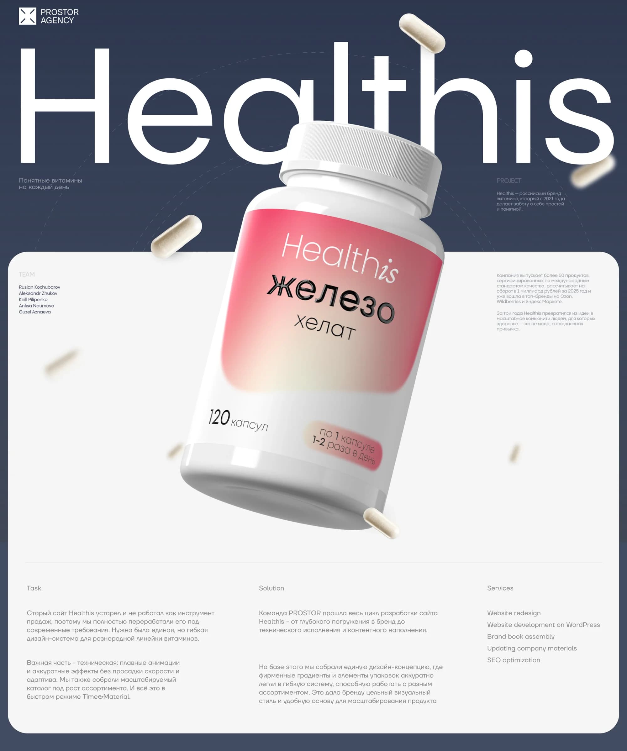
Healthis is a contemporary Russian brand of vitamins and supplements that in three years grew into a strong community and reached the top of the Ozon, Wildberries and Yandex Market marketplaces.
The Healthis team came to us with the task of creating a site that would become a continuation of their communication with people. The old site had aged and no longer worked as a sales instrument, so we reworked it completely to current requirements. What was needed was a flexible design system for an extensive range: the company makes more than 50 products.
An important part of the task was technical: smooth animation and careful effects without any loss of speed or responsiveness, plus a scalable catalogue built for a growing range.
The solution
The Prostor team went through the whole cycle of building the site — from a deep immersion in the brand to the technical execution and the content — in four months.
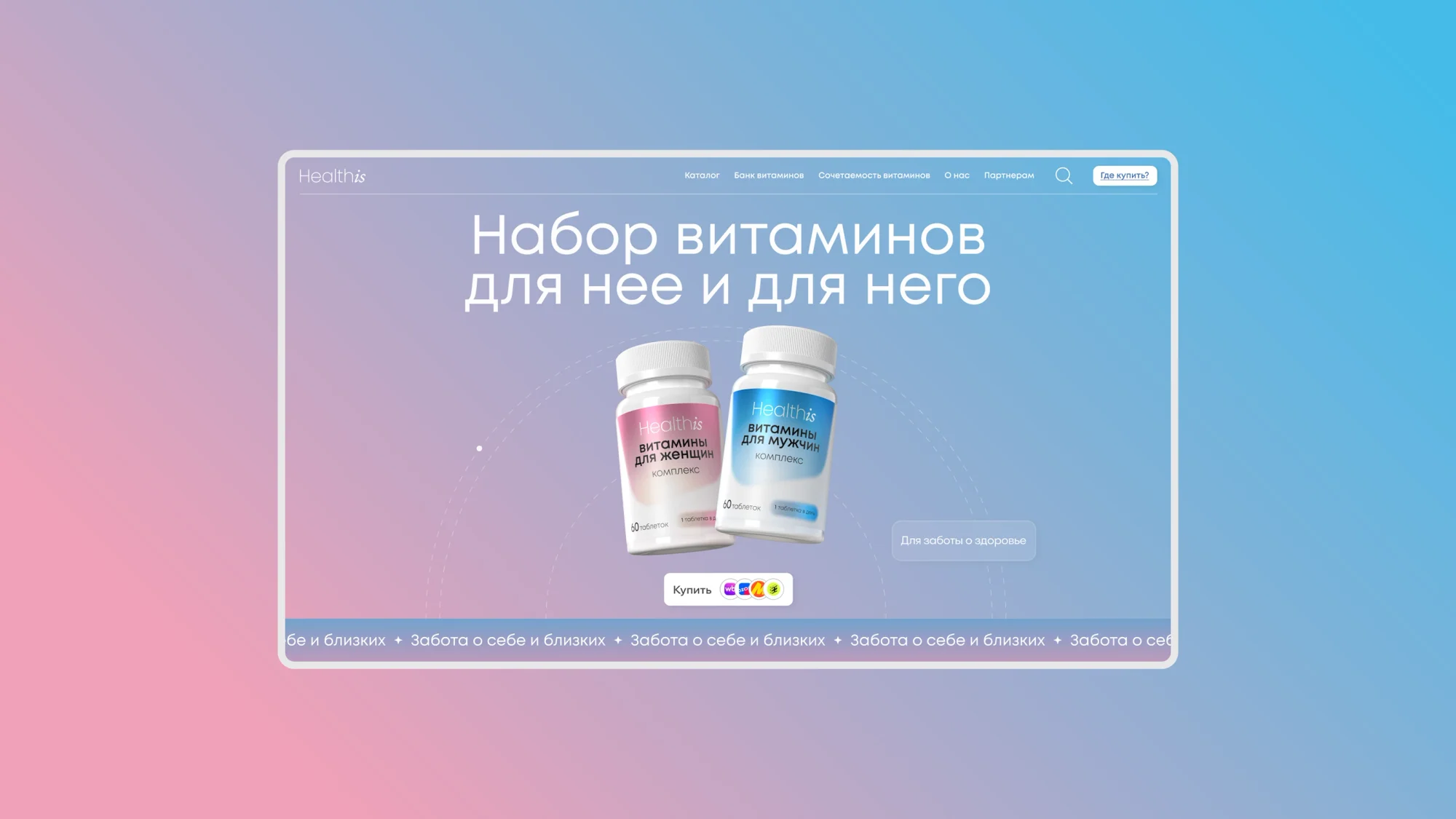
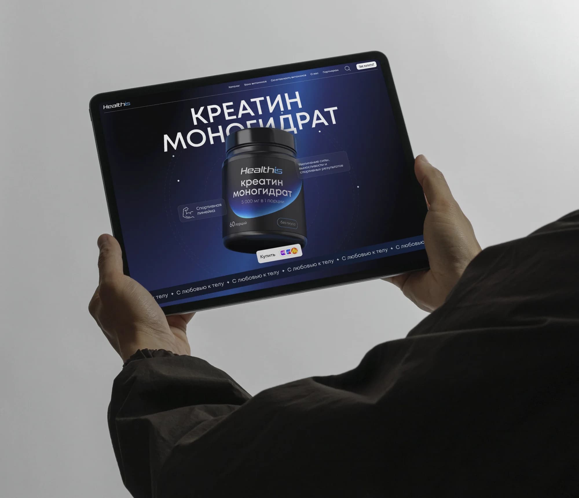
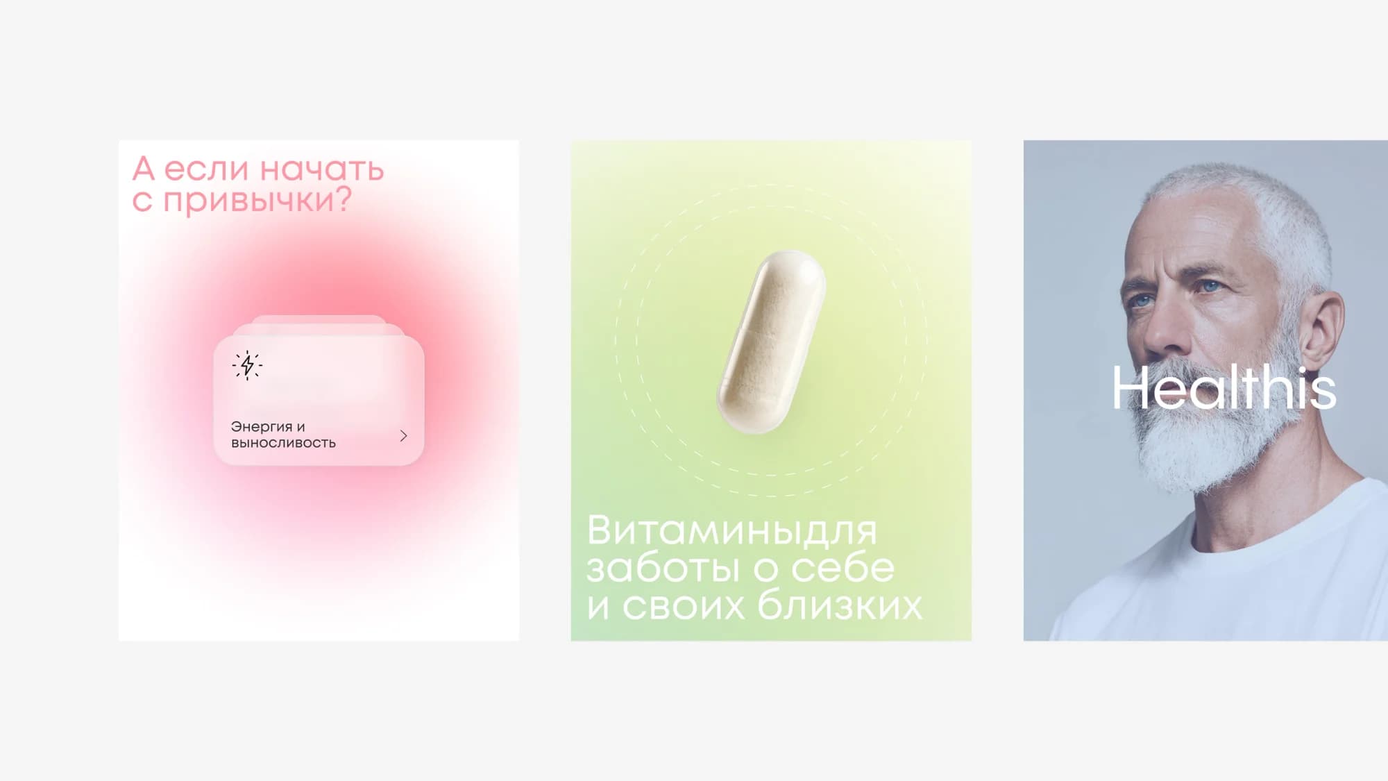
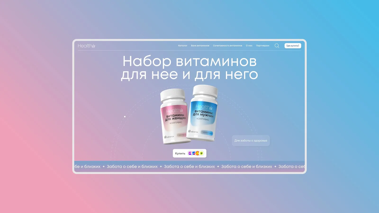
On that basis we assembled a single design concept in which the brand's gradients and packaging elements sit neatly inside a flexible system able to work across a varied range. That gave the brand a coherent, careful style and a convenient foundation for scaling its products.
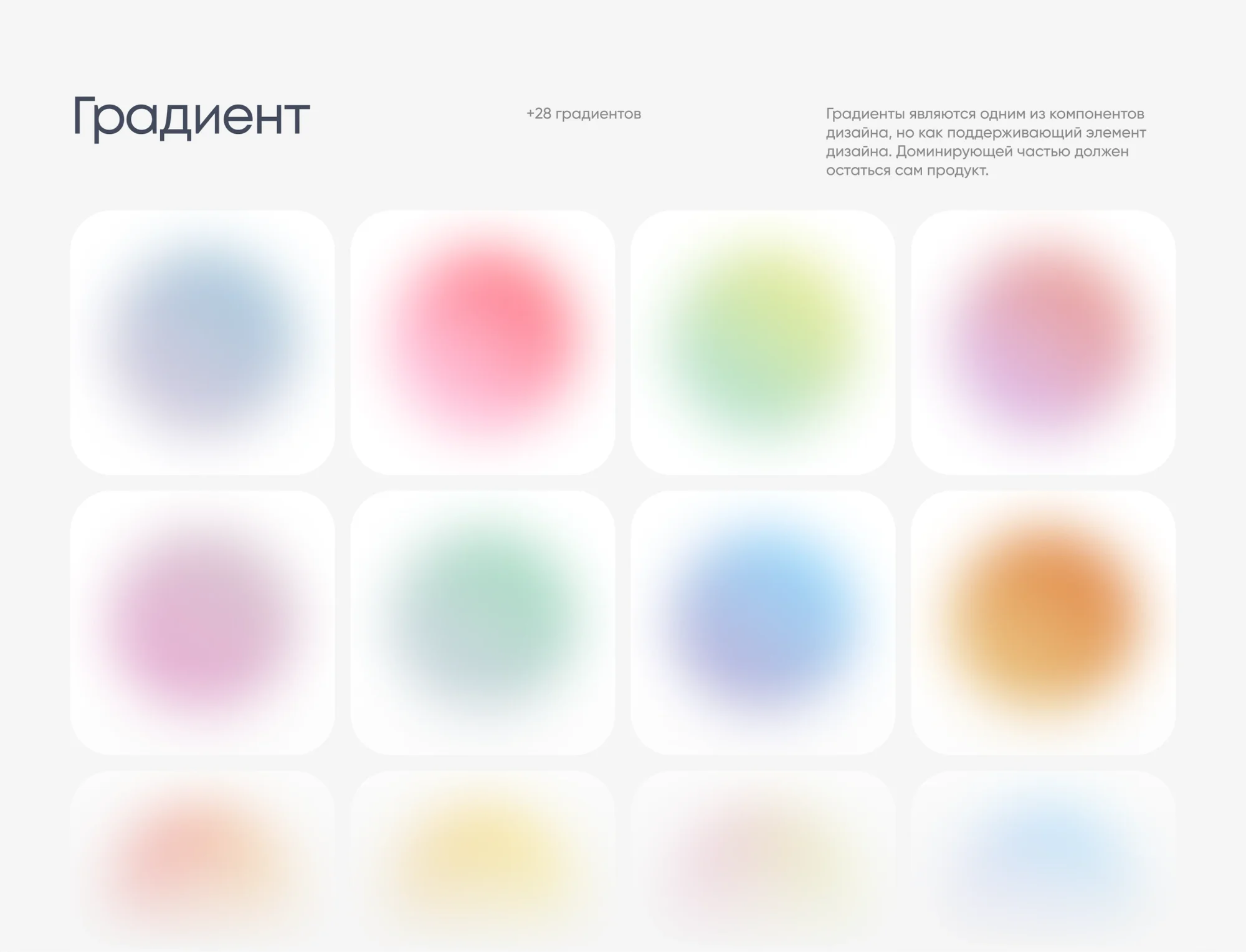
The system holds 28 gradients, and we set the rule for using them plainly: gradients are one component of the design, but as a supporting element — the product itself has to remain dominant. So colour does not cover the jar; it works as the ground beneath it.
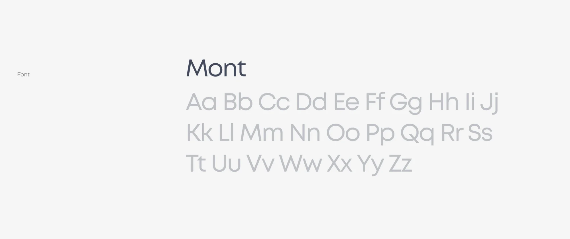
The typeface is Mont, a rounded sans — to our mind the one that sits best across 28 different grounds.
What we did
Design system. A unified visual language for a product line of 50+ SKUs: 28 gradients, packaging elements, catalogue components and product cards.
Redesign and development. The full cycle: a site redesign and development on WordPress.
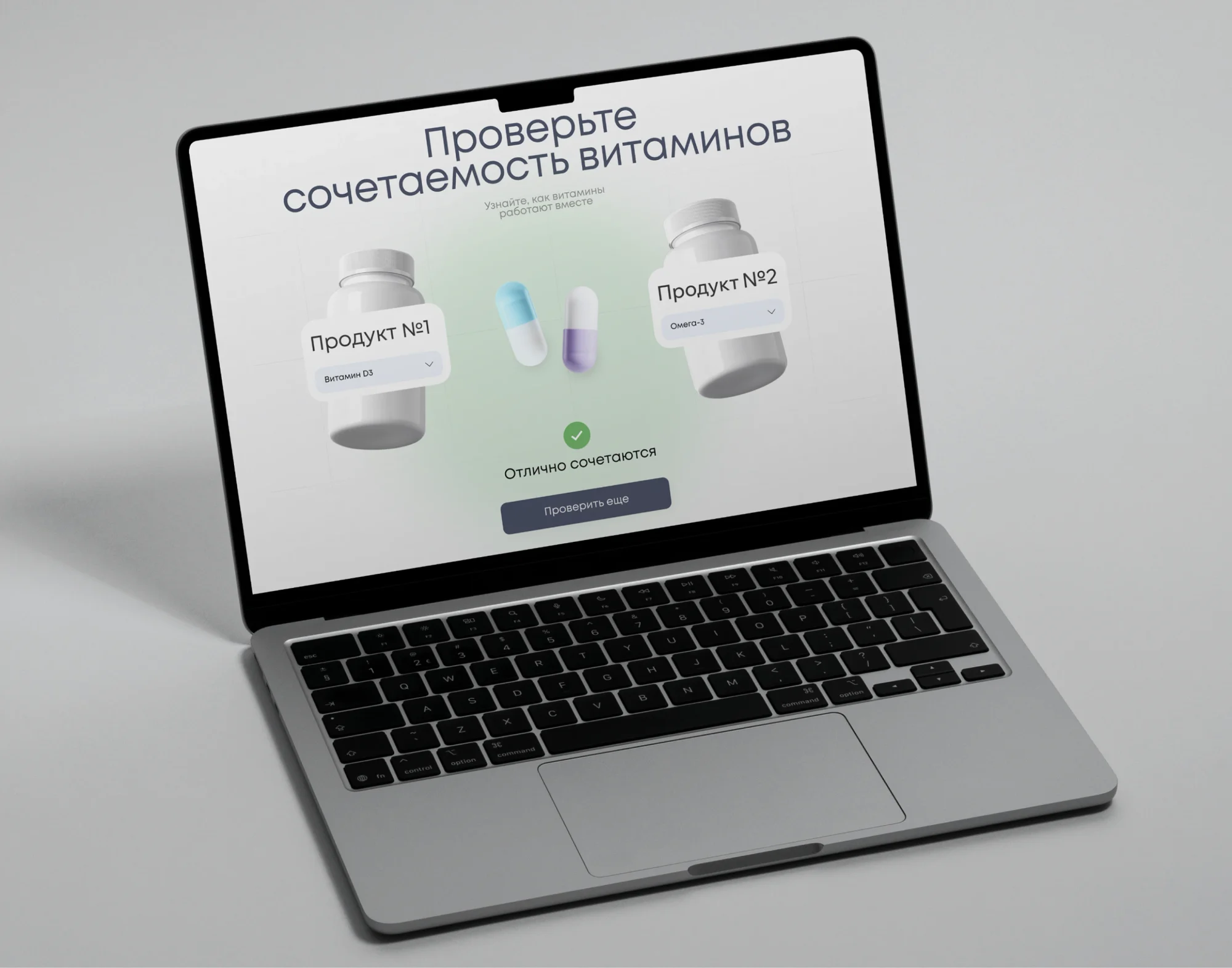
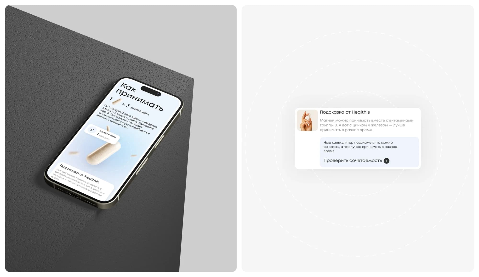
Compatibility calculator. The visitor picks two products and immediately sees whether they go together, with a prompt and the option to check the next pair.
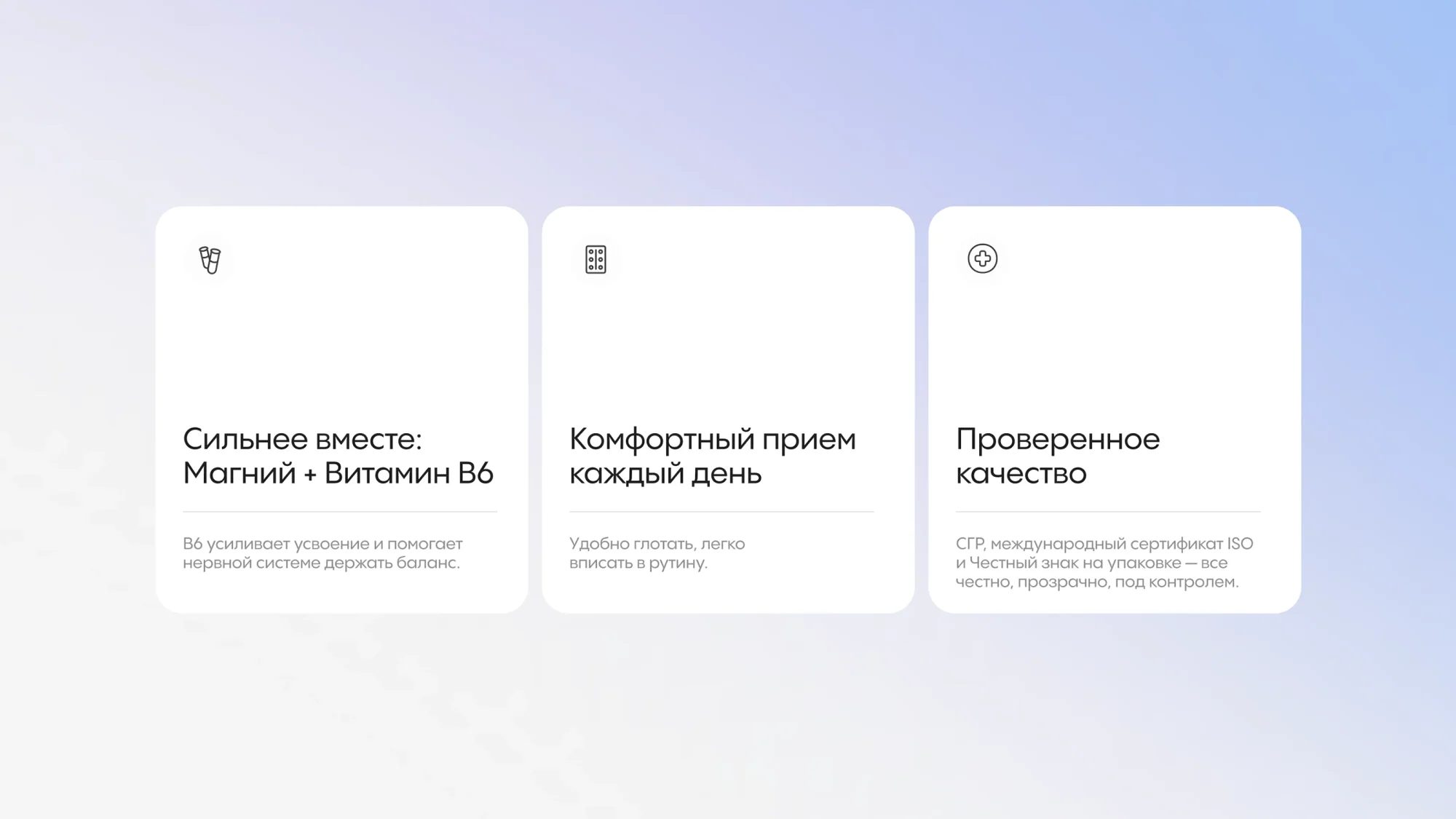
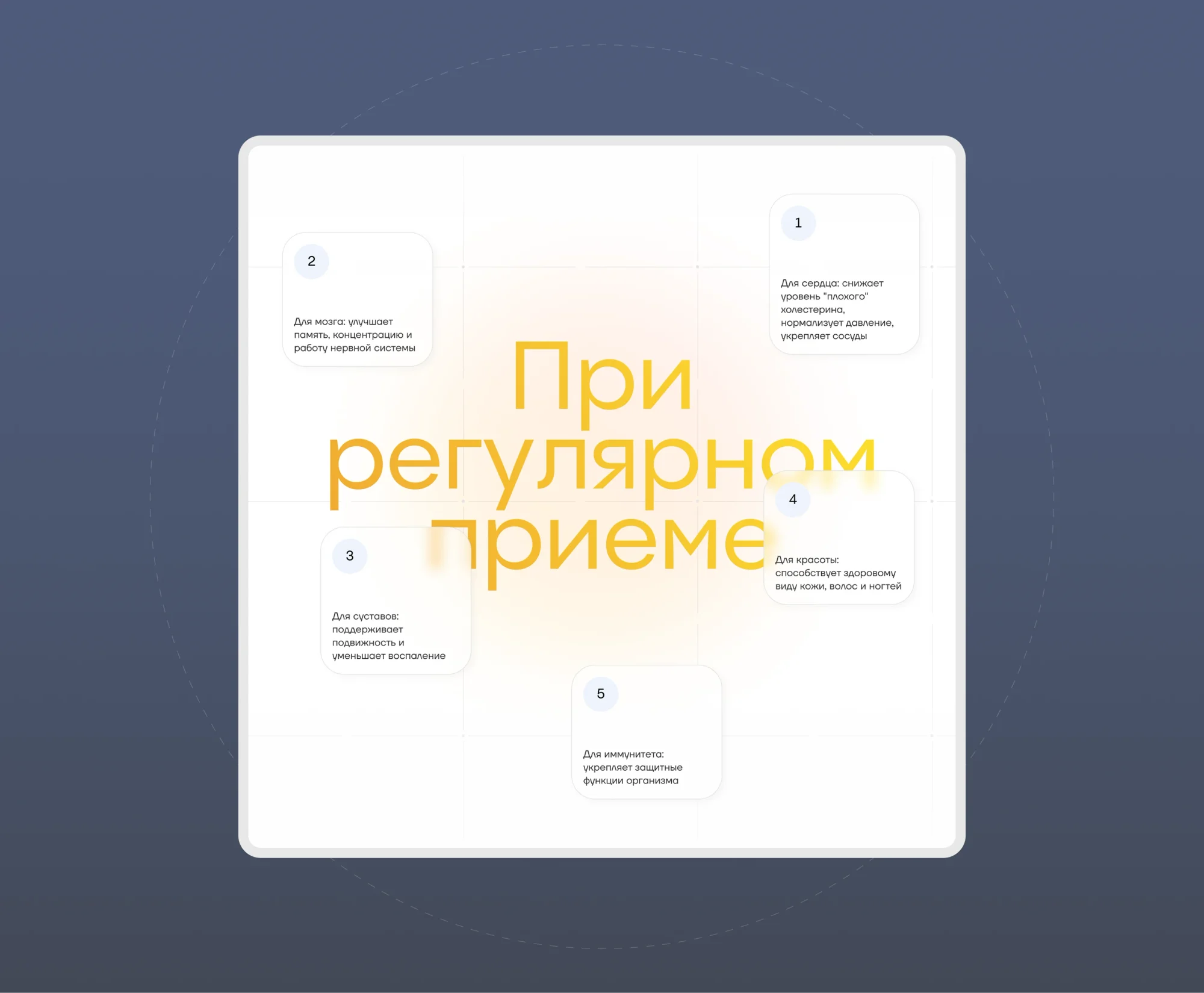
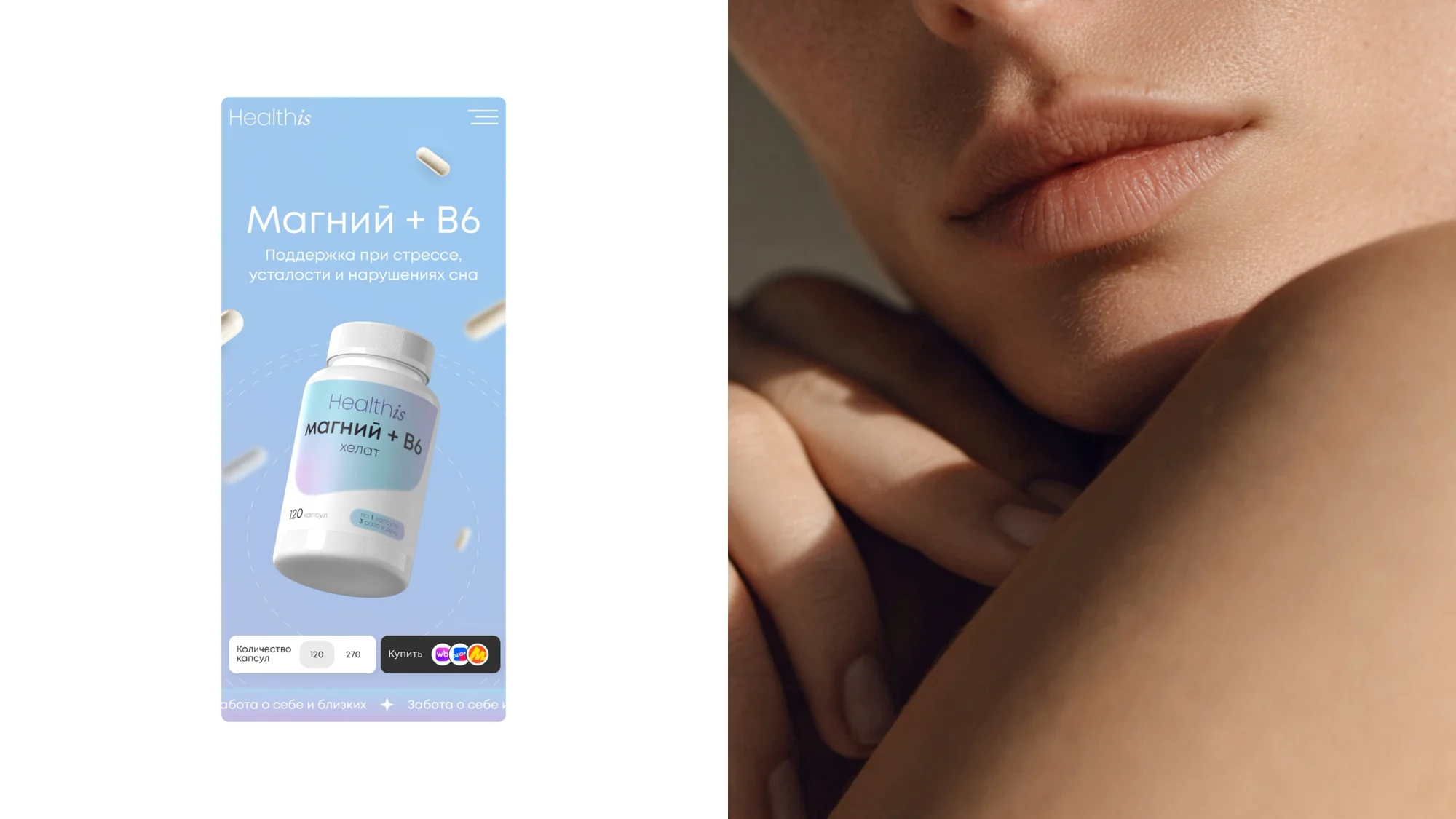
Product page. A "with regular use" block of five numbered effects — heart, brain, joints, beauty and immunity — a "stronger together" block on combinations such as magnesium with vitamin B6, a block on comfortable daily use, and one on verified quality carrying the state registration, an international ISO certificate and the Chestny Znak mark.
Sets. Ready-made selections — a vitamin set for her and for him among them.
Content. Clear product explanations, infographics, AI-generated videos and educational content that help users navigate the catalogue.
SEO. Updating the company's materials and SEO optimisation.
Brandbook. A brandbook assembled within the same project.
Mobile. Catalogue, product page and calculator on a phone, including a "how to take it" screen and prompts from Healthis.
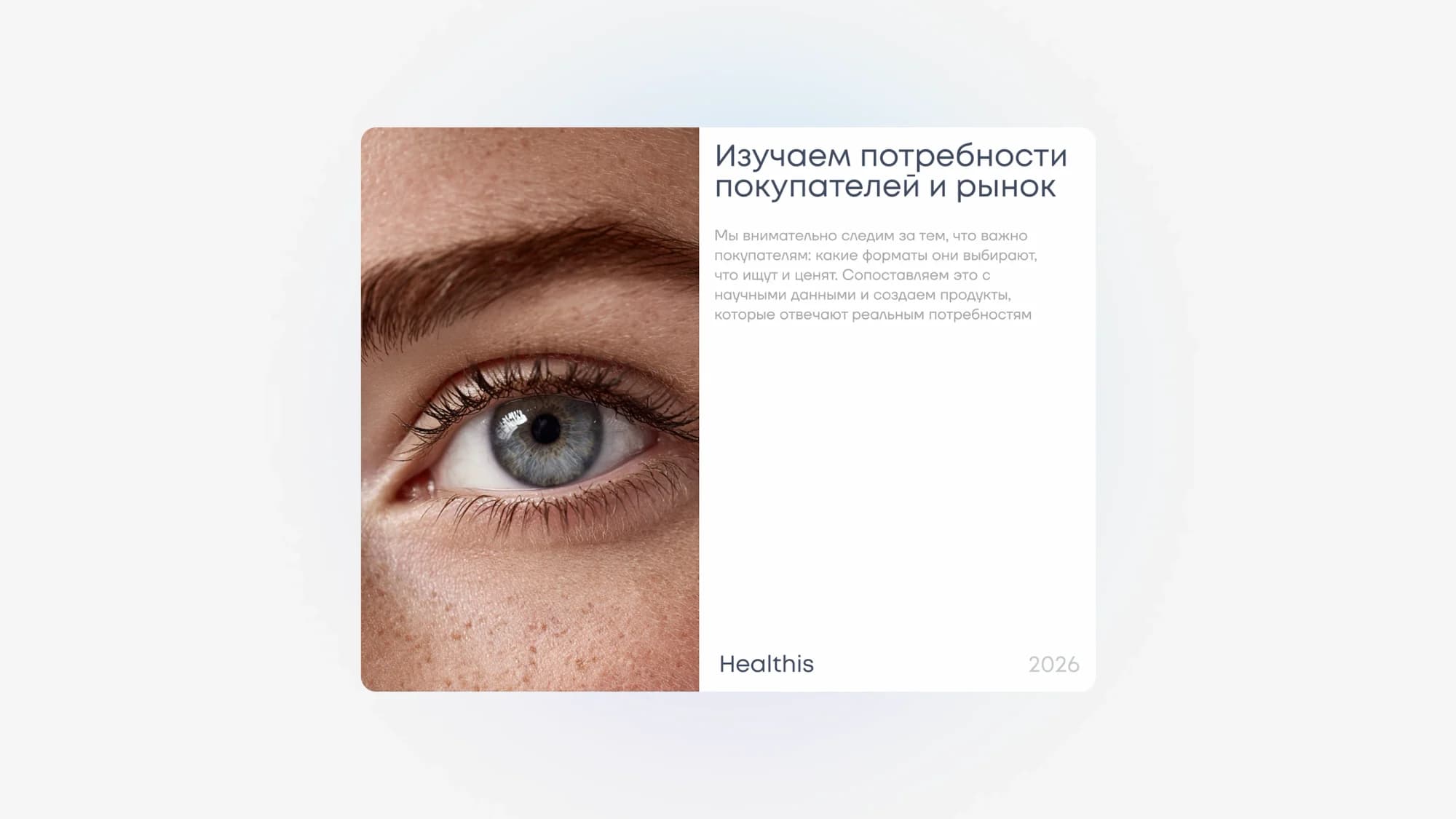
Research. A dedicated block on studying customer needs and the market.
The result
The site stopped being a shopfront and became a platform where sales, content and community meet — a single centre for the brand's whole ecosystem.
The design system carries growth: a new product gets its gradient and enters the catalogue without any layout being redone.
The site is live at healthis.ru.
The full breakdown is published on Behance and on Dprofile, where it carries the Recommended badge. Links below.