The task
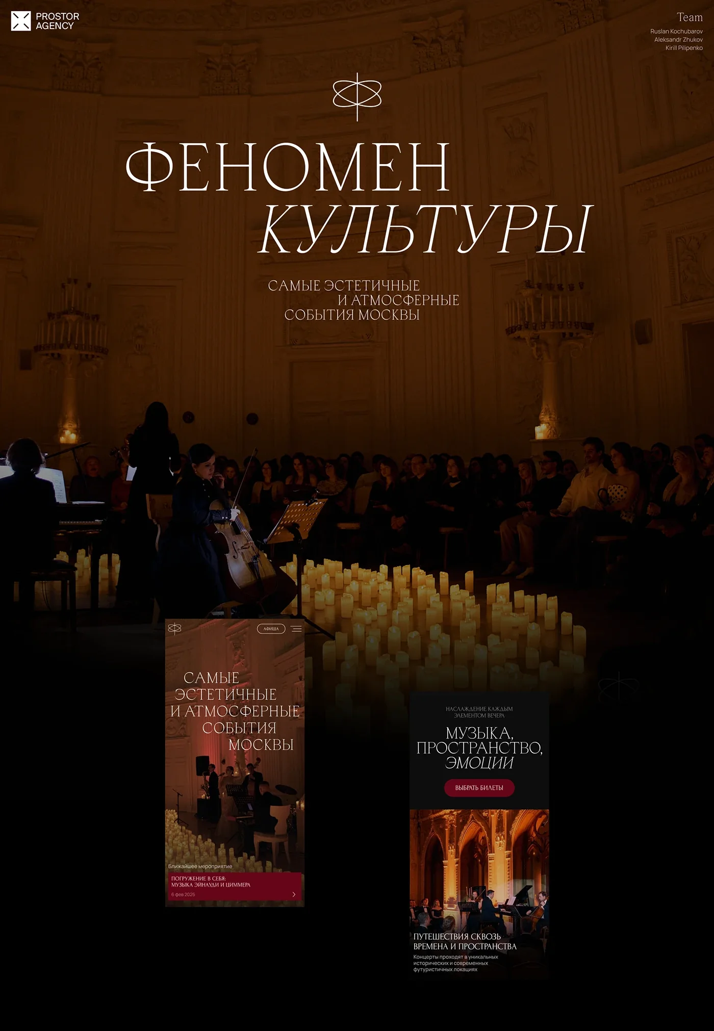
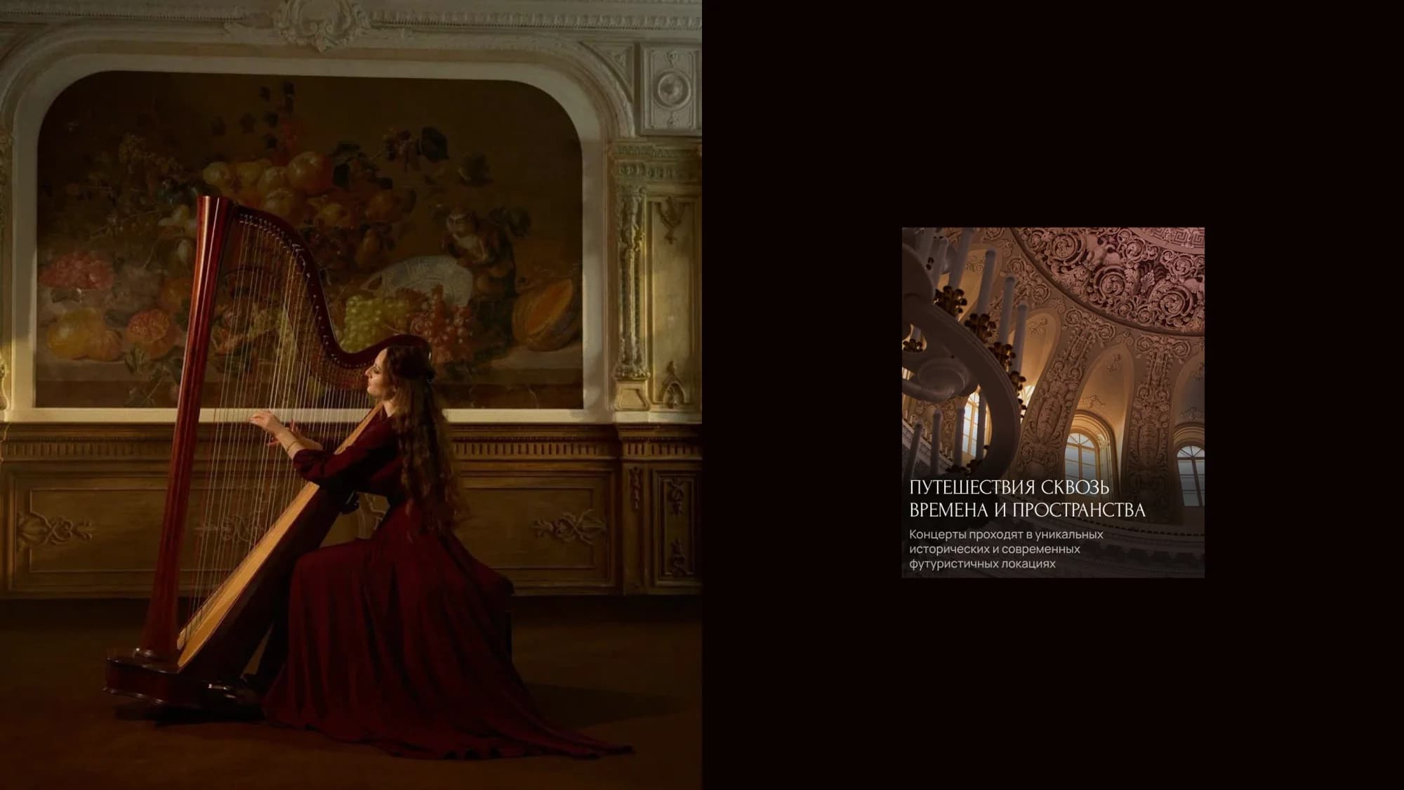
Fenomen Kultury runs premium chamber concerts in distinctive Moscow venues — historic ones and modern, futuristic ones alike. Music by candlelight, a small hall, aesthetics in everything.
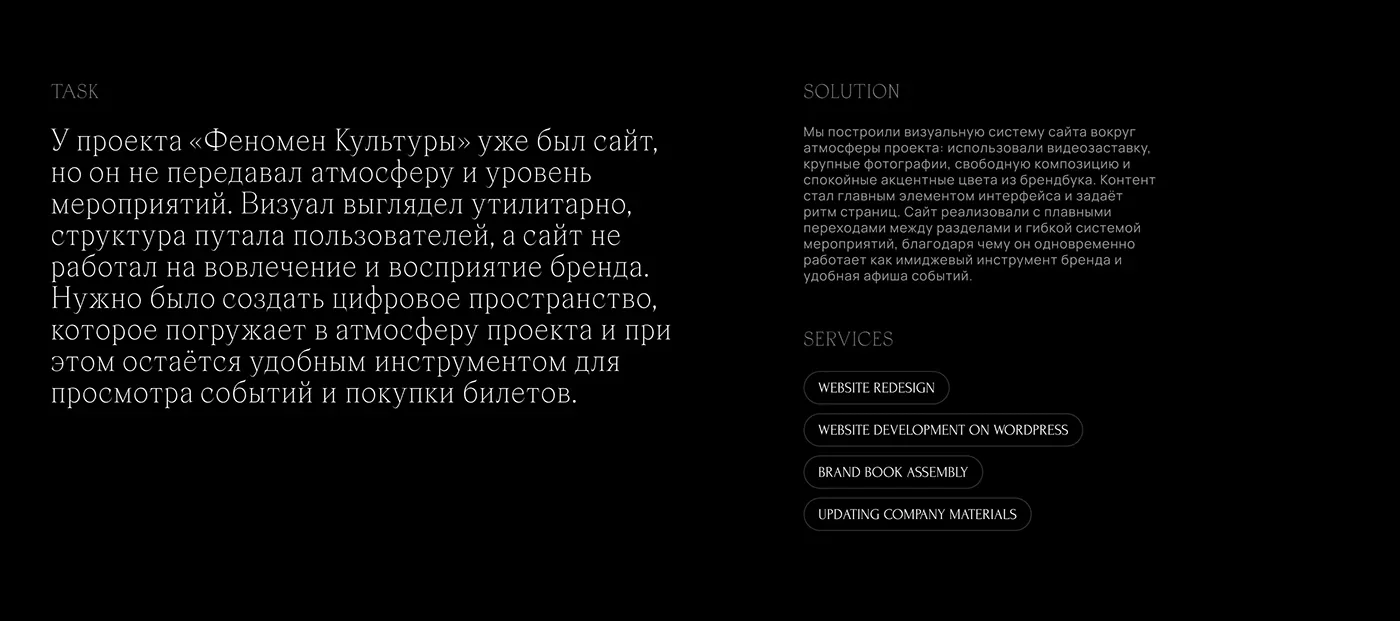
The project already had a website, and it did not do the one thing that mattered: it carried neither the atmosphere nor the level of the events. The visuals looked utilitarian, the structure confused people, and the site worked for neither engagement nor the brand.
This is a harder problem than it looks. A listing is by nature a table: dates, halls, prices, a button. The more usable it becomes, the more it reads like a train timetable. But the product sells on feeling, and if the site does not deliver that feeling, the buyer cannot see why the ticket costs what it costs. What was needed was a space that immerses and still works as a tool for browsing and buying.
The solution
We split the site into two zones, one for the impression and one for the action, and kept them out of each other's way.
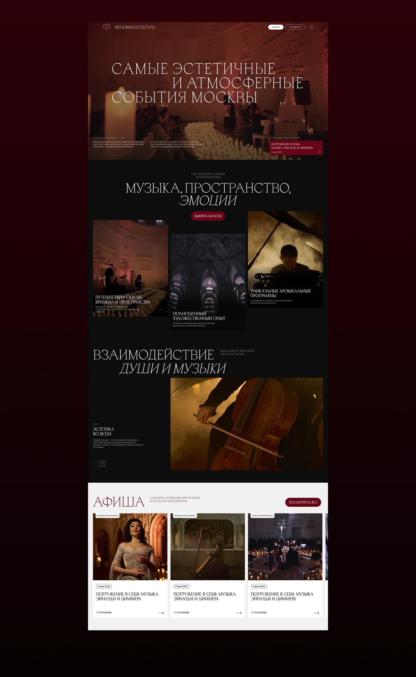
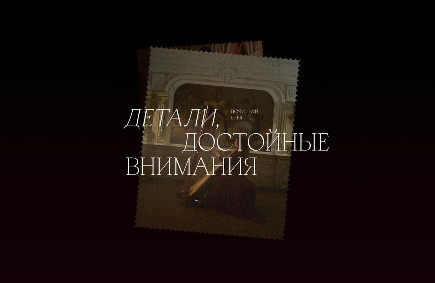
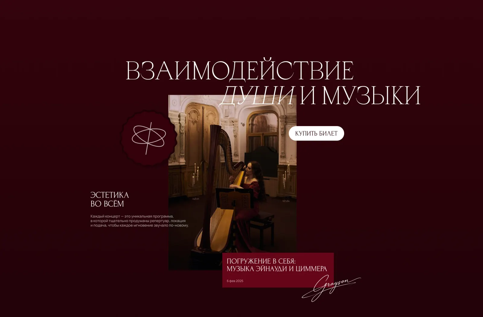
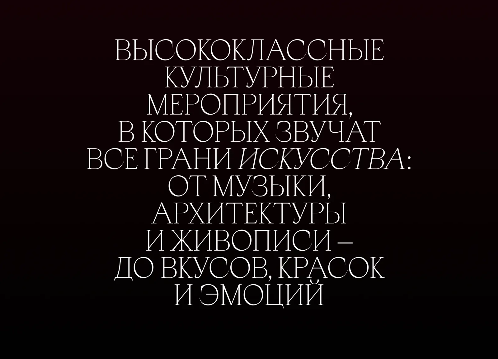
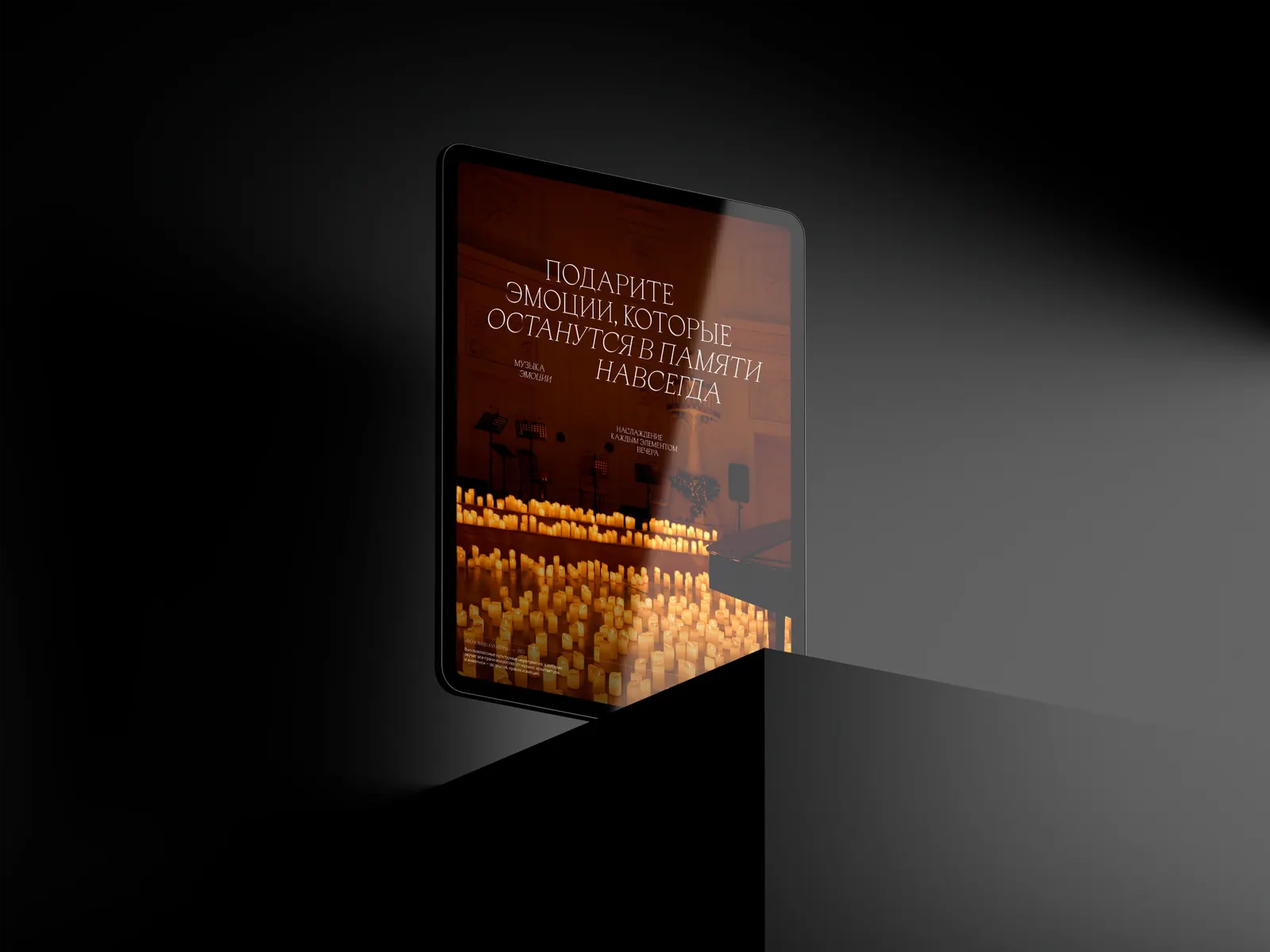
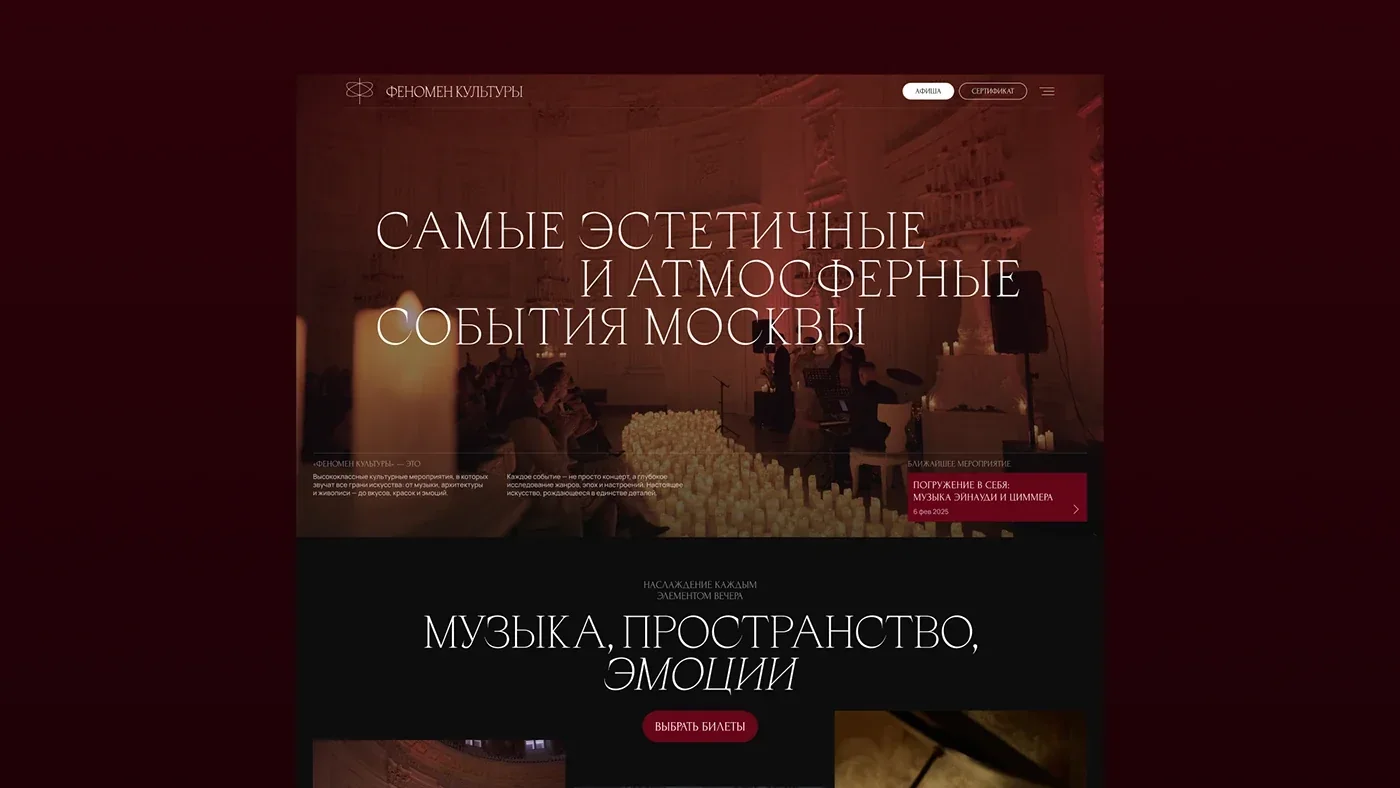
In the image half the main interface element is the content itself. A video opener, a large photograph of a candlelit hall, loose composition, plenty of air and almost no chrome. The palette comes from the evenings themselves: deep burgundy, black, warm cream. Headlines are set in a serif with italic emphasis — the interaction of soul and music, details worth attention, impressions finding a voice. The italic carries intonation; it is not decoration.
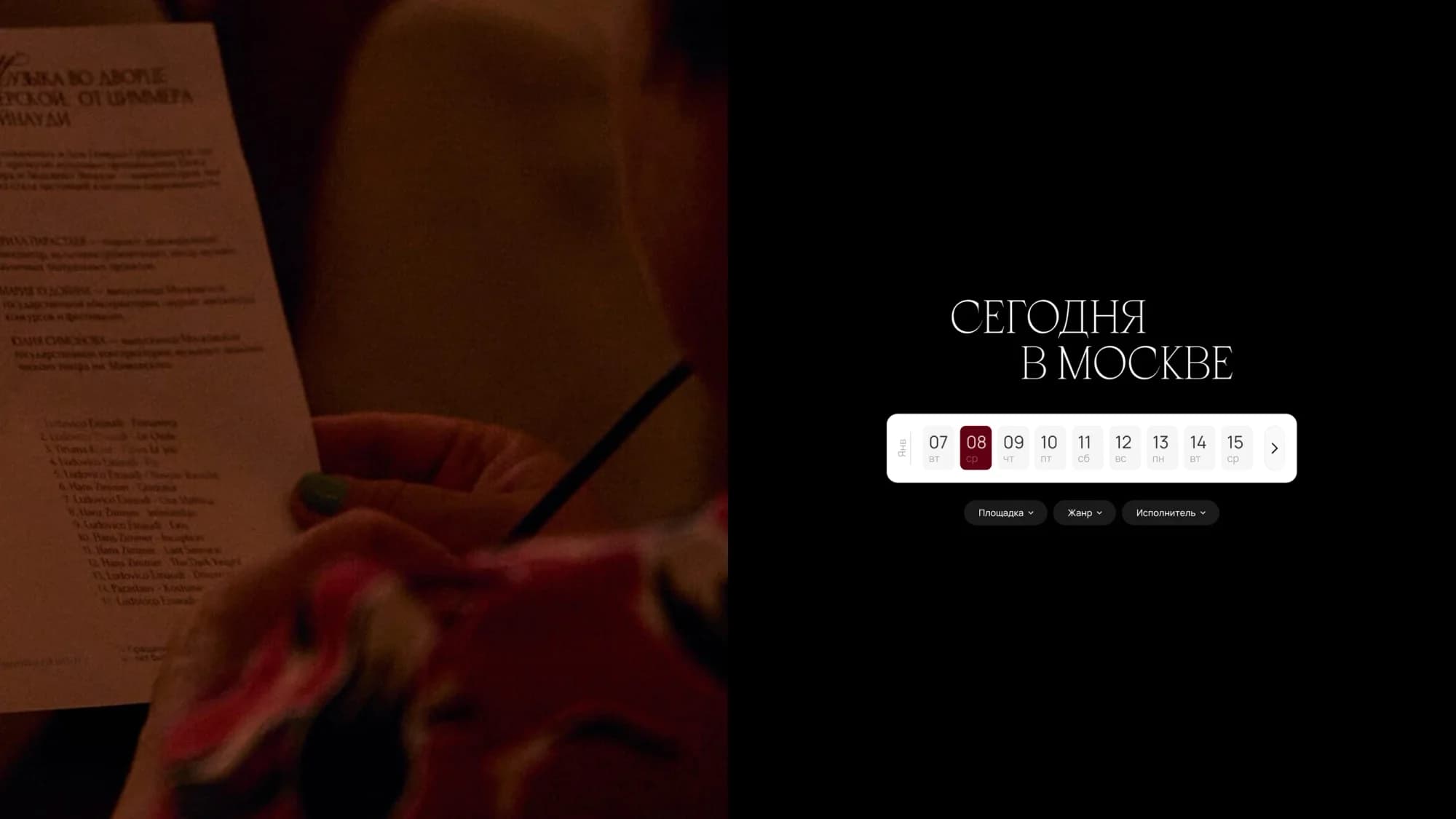
The functional half is deliberately ordinary and clear: a listing with a calendar, a Today in Moscow block with date selection, event cards, and an event page with the description and the ticket. Transitions between sections are smooth and do not reload the page, so the sense of the evening is not broken on every click.
What we did
Website redesign. Image blocks and the listing in one system, from the opening line — the most beautiful and atmospheric events in Moscow — down to the card of a specific concert.
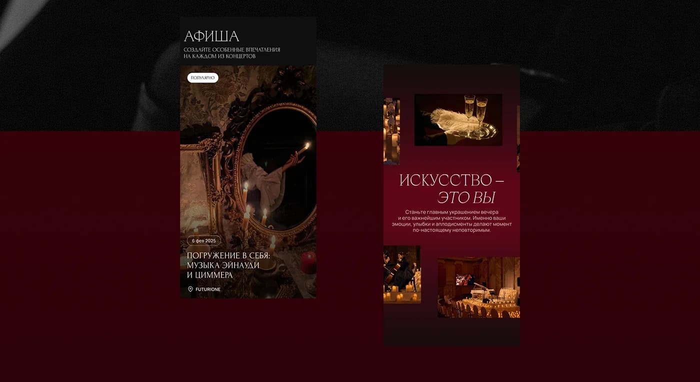
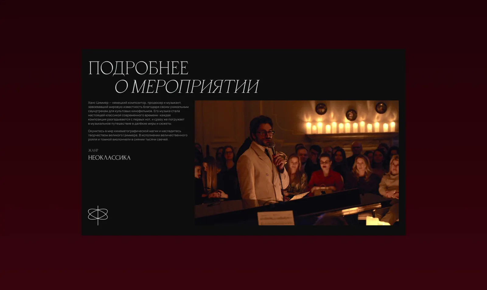
Listing and calendar. Today in Moscow with date selection, a grid of events, filters. The event page carries the description, the genre, photographs and the purchase.
Development on WordPress. With a flexible event management system and an API integration.
A custom admin panel. The client's own team adds events and edits descriptions and material without going to developers. For a listing that lives by a schedule, that is what independence rests on.
Brand book and materials. We assembled the brand book and updated the company's materials, so the site stopped being the only place where the brand looks its level.
Mobile. The same rhythm and the same density as on desktop.
The result
The site works as an image tool for the brand and as a listing people buy tickets from. The atmosphere rests on content and typography rather than decoration, so it never gets in the way of finding a date and paying.
The client runs the listing themselves, and the brand book and materials now sit in one system.
The site is live at f-k.art.
The full breakdown is published on Dprofile and Behance — links below.