The task
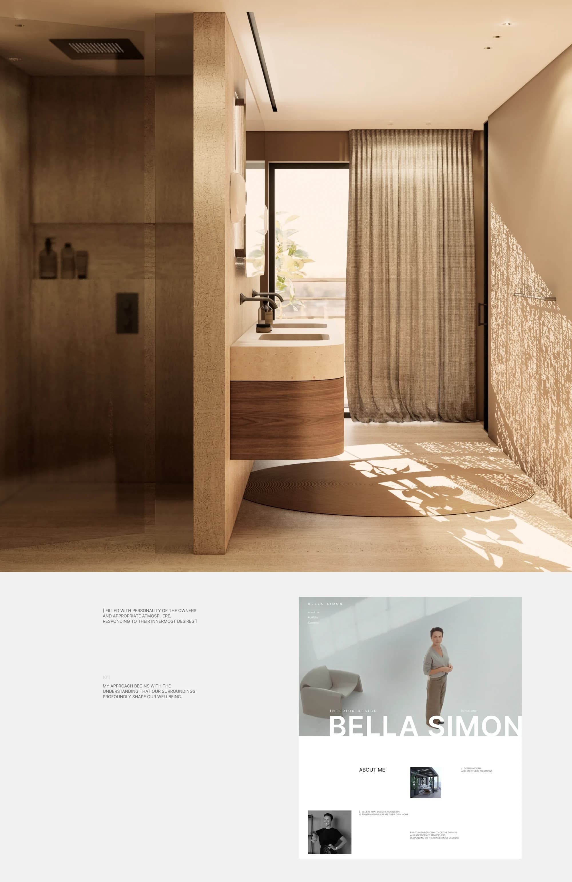
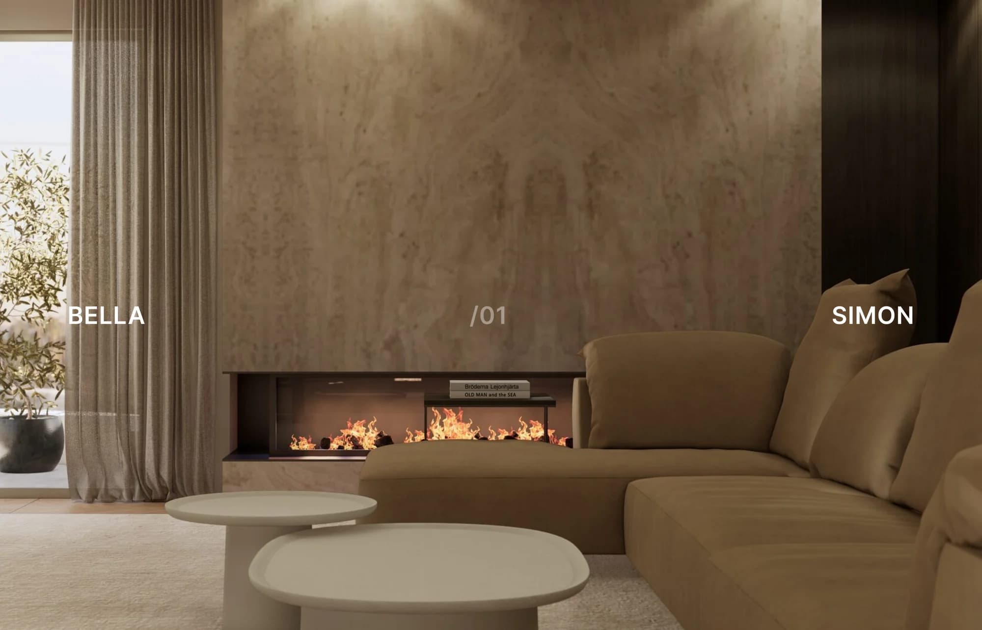
Bella Simon, an interior designer and the owner of a studio in Tel Aviv, came to Prostor with a clear brief: update the website so it would present the studio's projects across different directions — residential, commercial and public spaces.
This is how we approached it. Interior designers are chosen by eye: a client scrolls the work and decides whether the taste matches. Which means everything that is not an image gets in the way on a site like this — and a grid of identical tiles gets in the way too, because it levels a penthouse and a bathroom, and with the size it levels the impression.
The solution
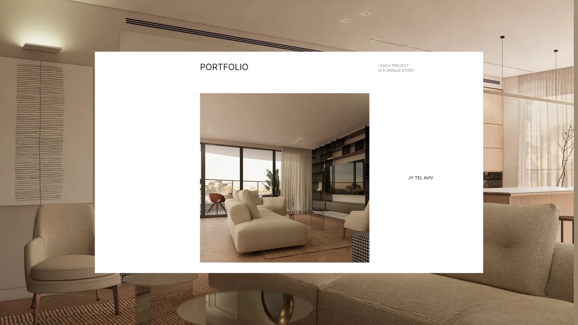
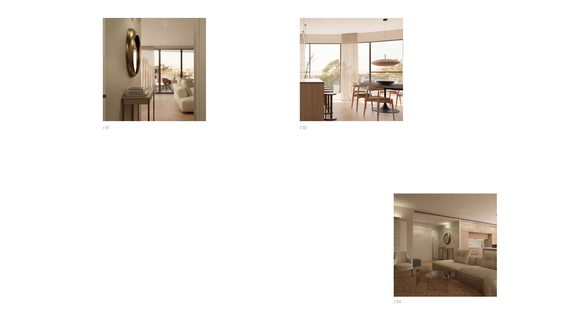
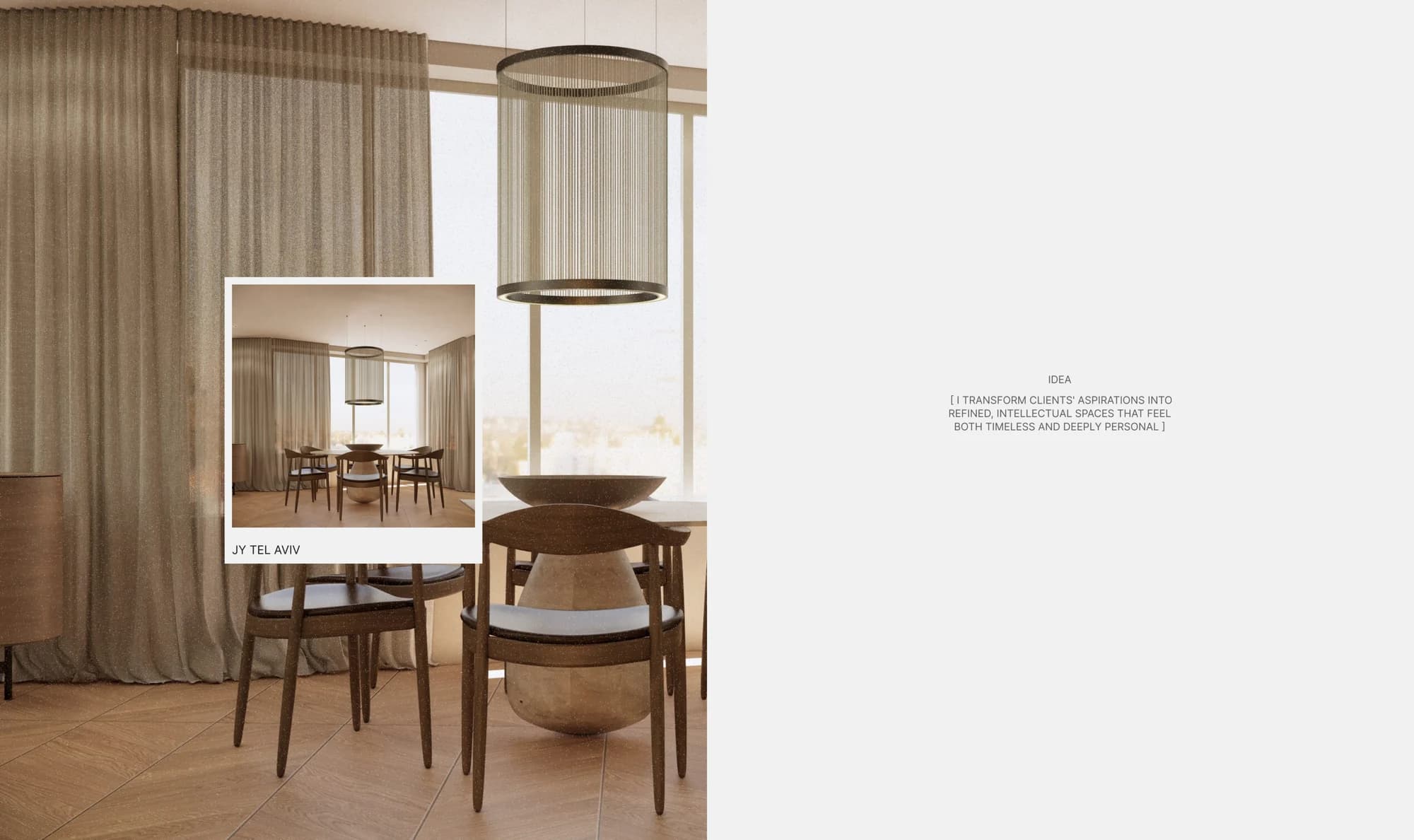
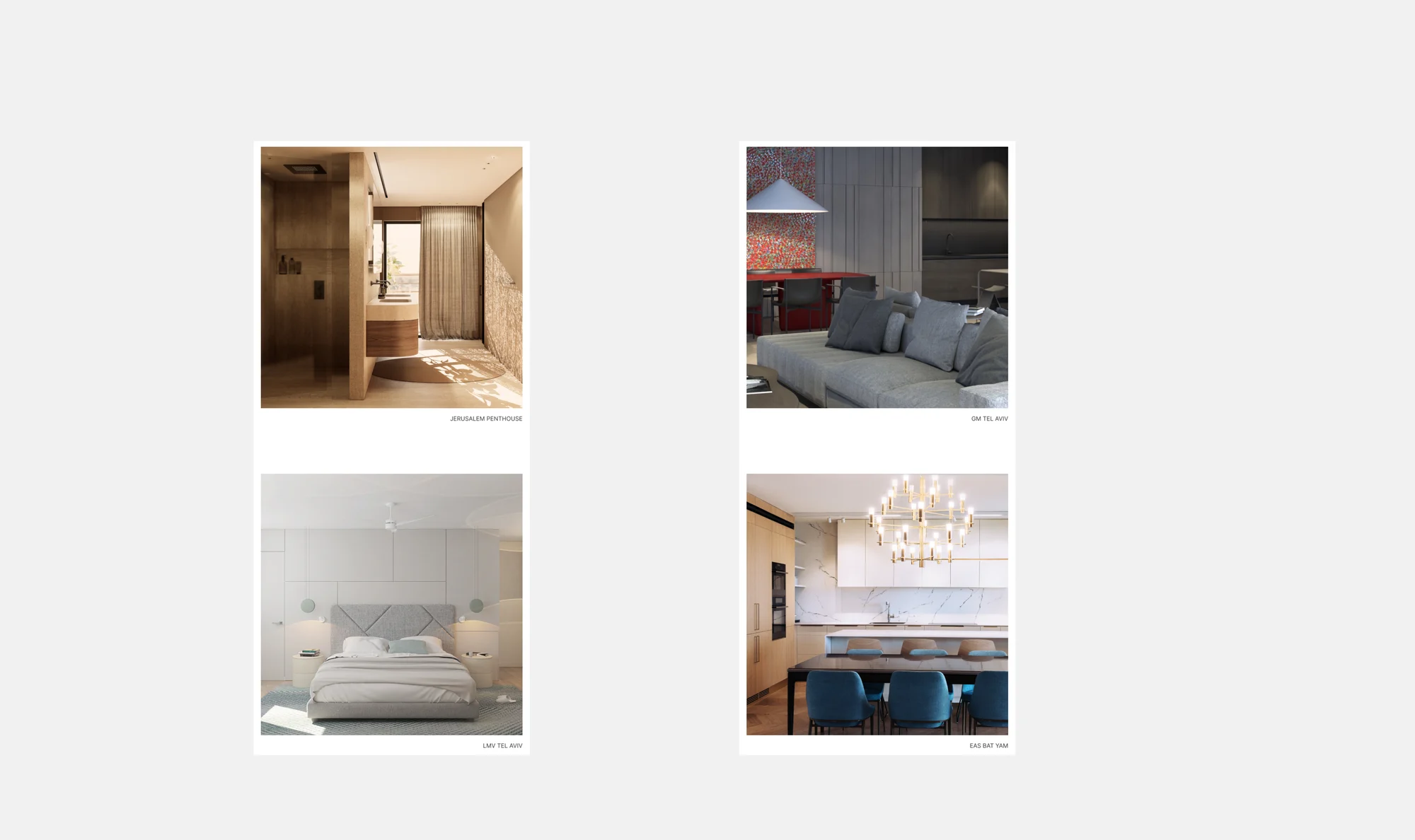
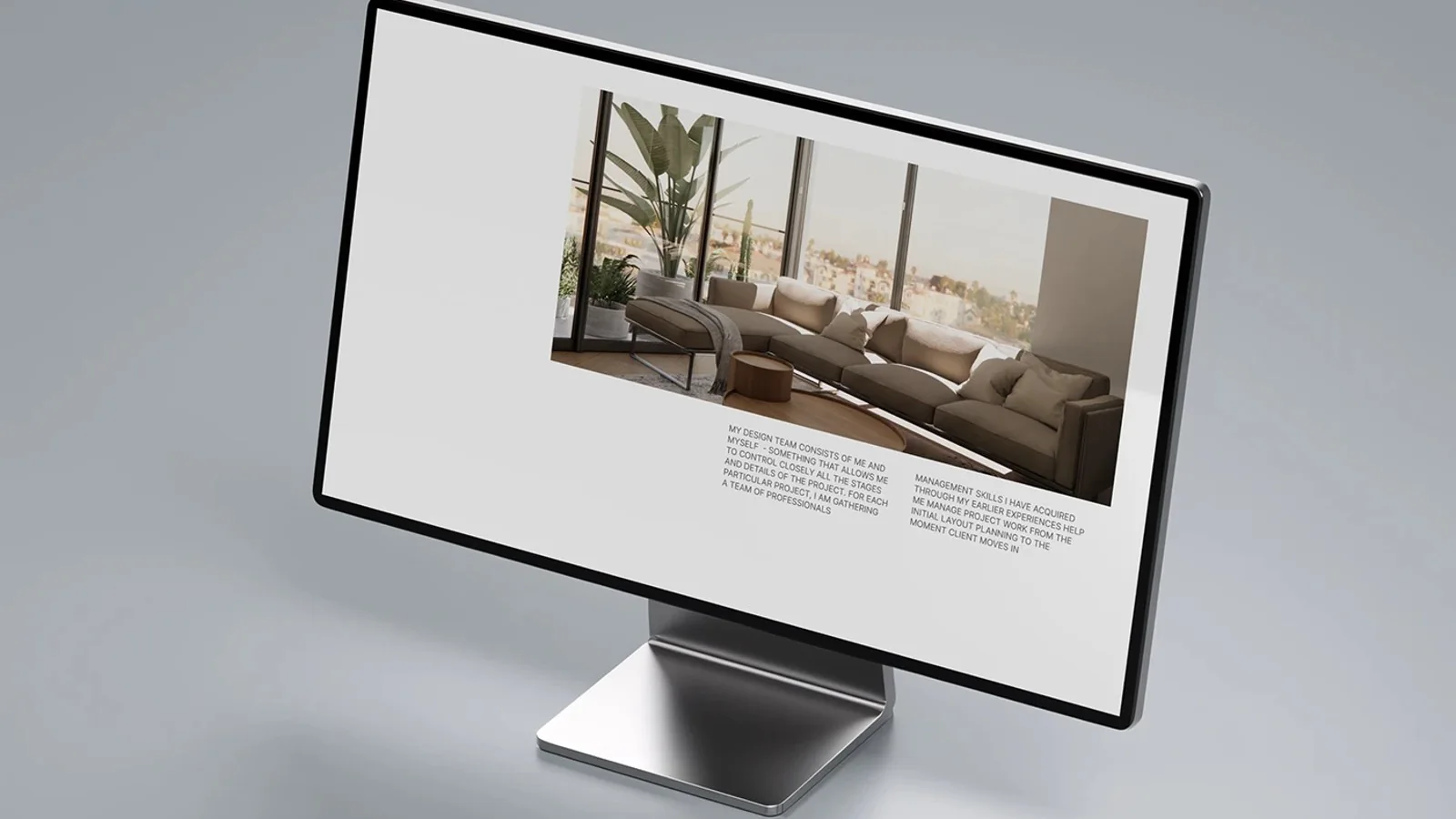
We gave the portfolio the role of the main visual element and built it on an asymmetric grid. Images vary in size and position: one takes half the screen, another sits as a small card to the side. The rhythm comes from the selection itself rather than from a template.
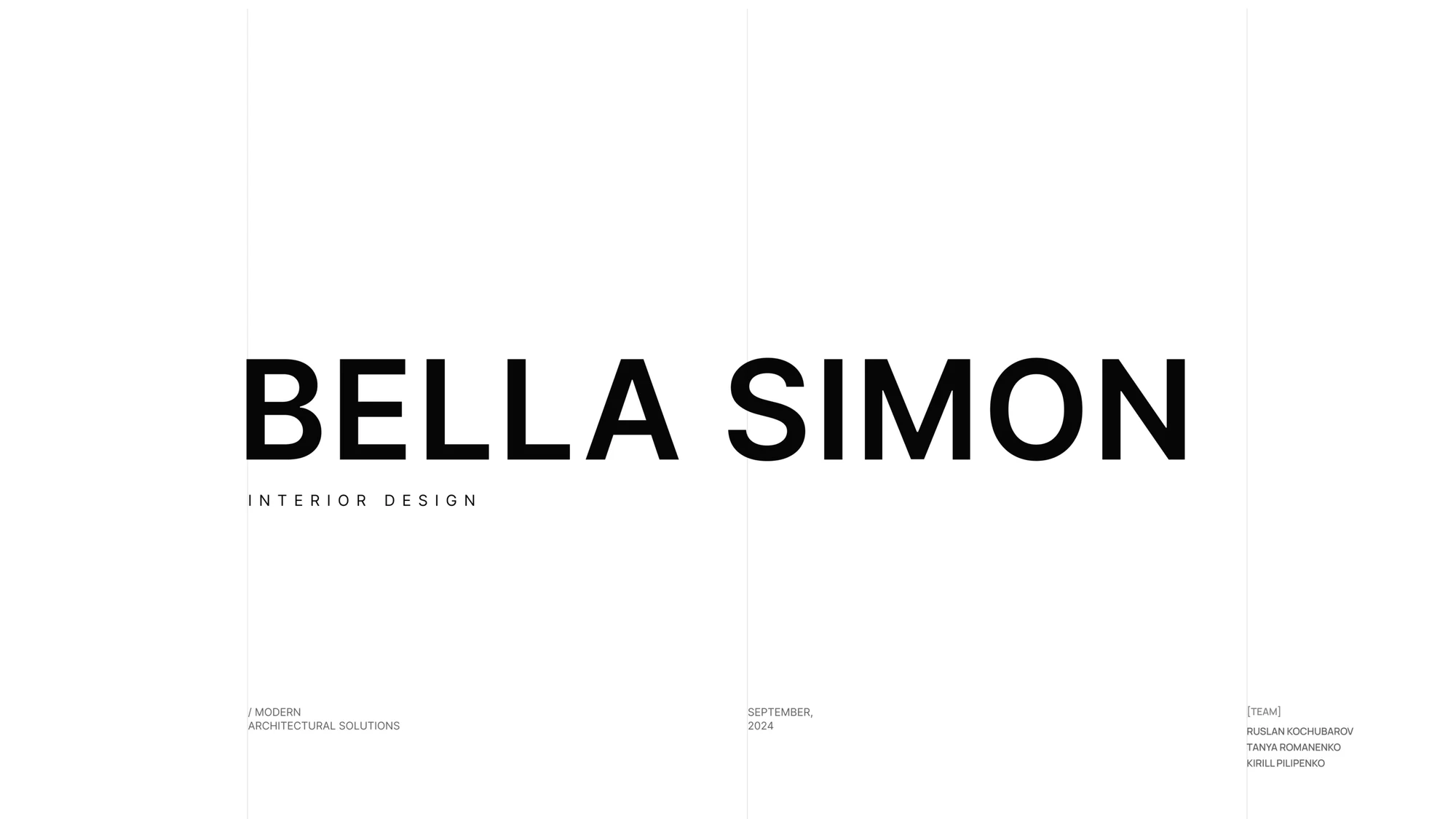
Around the images, air. A white ground, a fine sans in wide tracking, minimal captions — the project code and the city. Everything that is not the work steps back, because the first impression here is made by the interior, not the interface.
Projects are captioned by place: Jerusalem Penthouse, Tel Aviv and other cities in Israel, which shows both the studio's geography and its range, from an apartment to a public space.
What we did
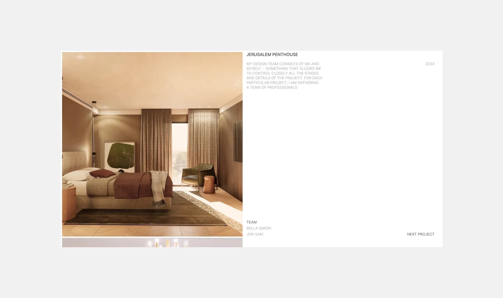
Portfolio. An asymmetric grid built on large interior visuals. Properties are captioned by code and city — Jerusalem Penthouse, Tel Aviv, Bat Yam — and inside a project the series is numbered.
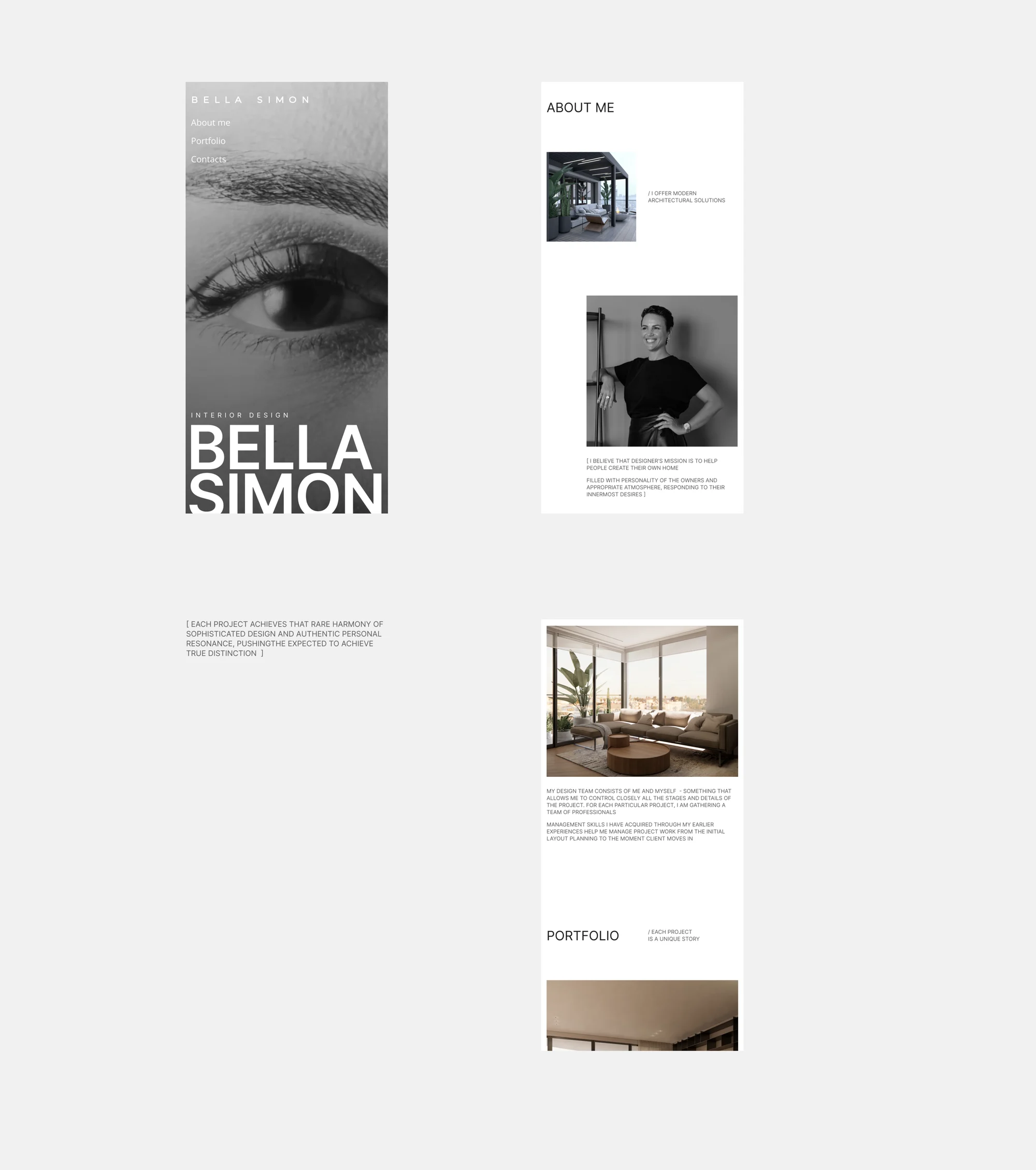
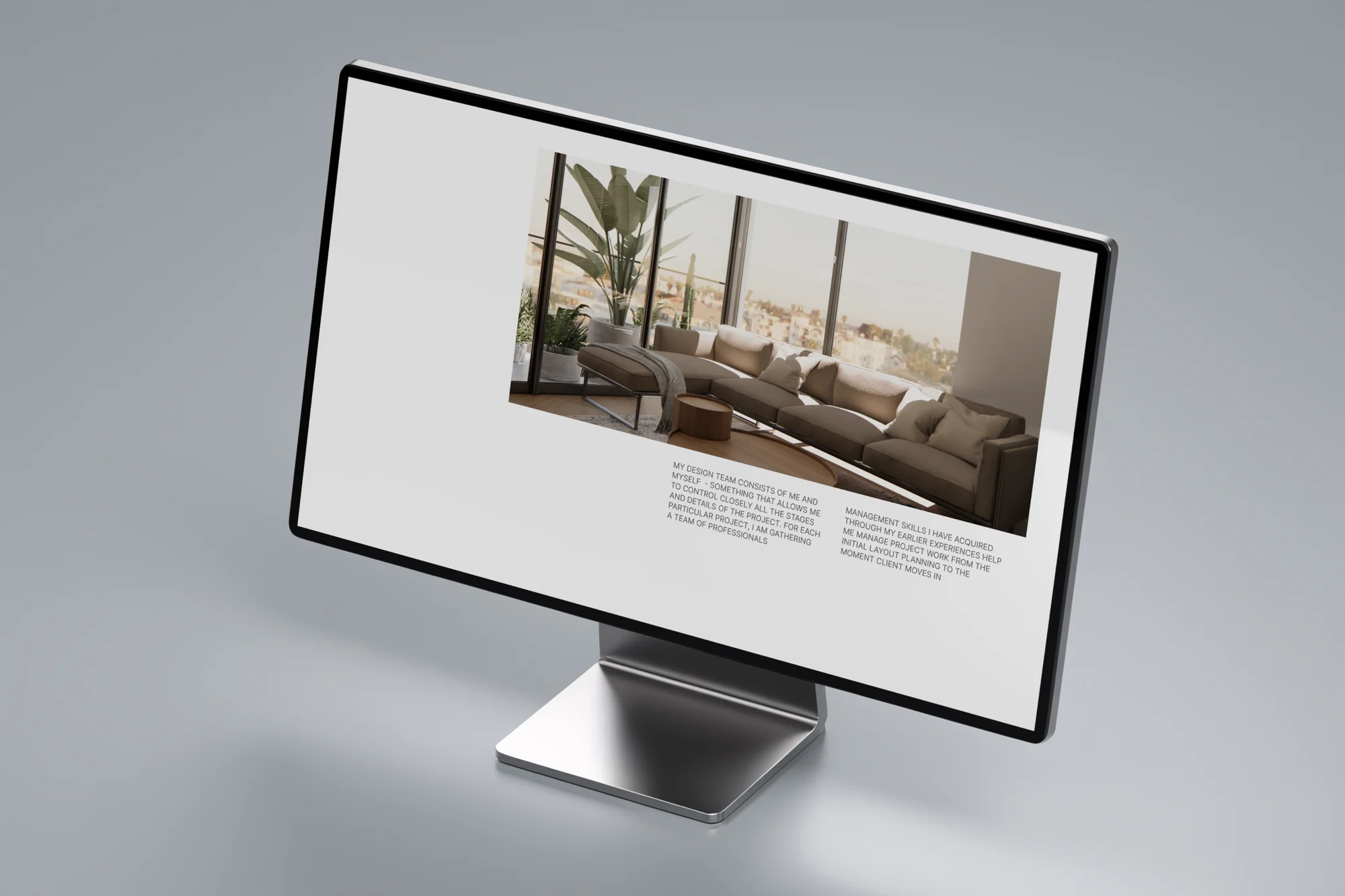
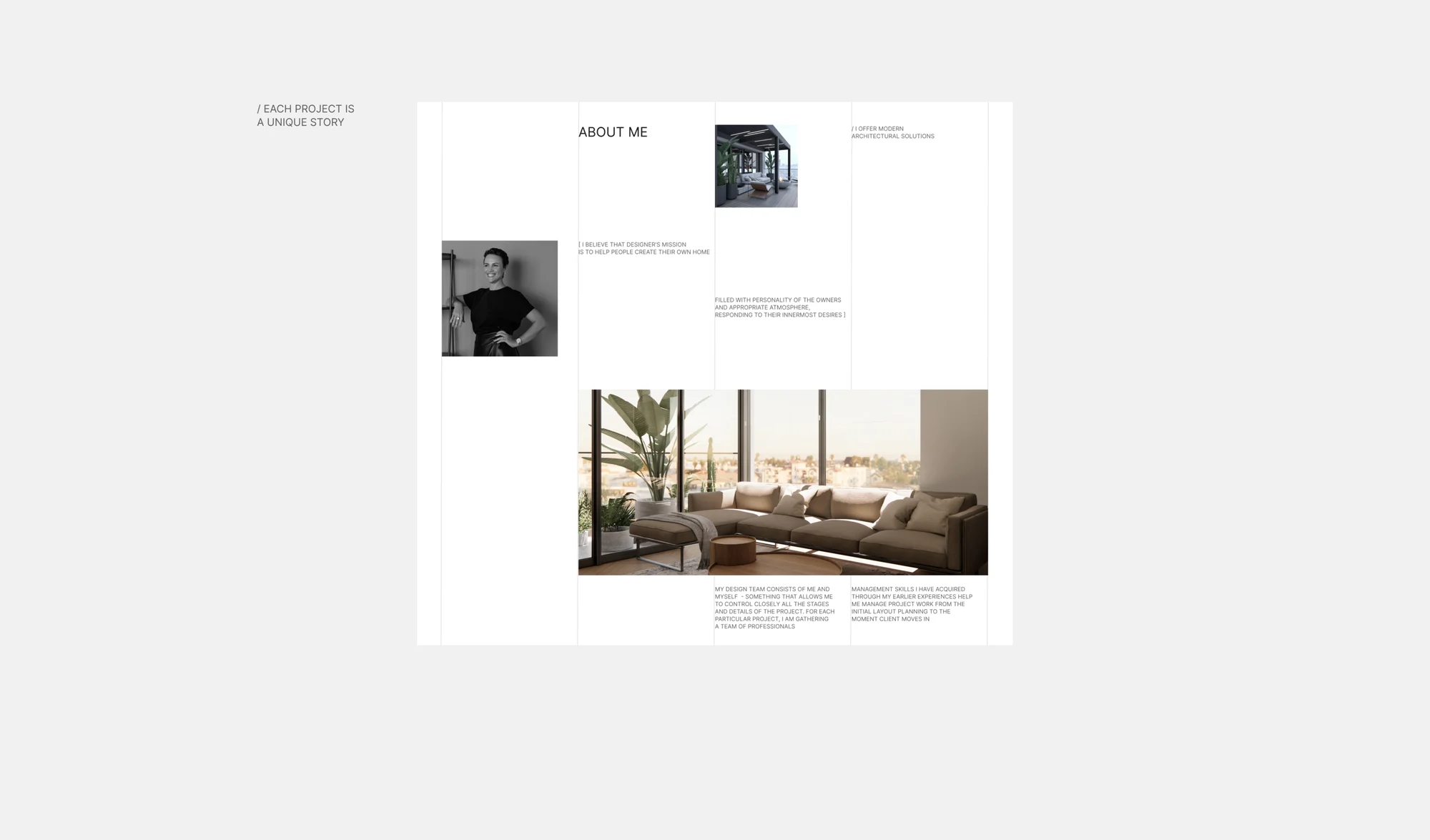
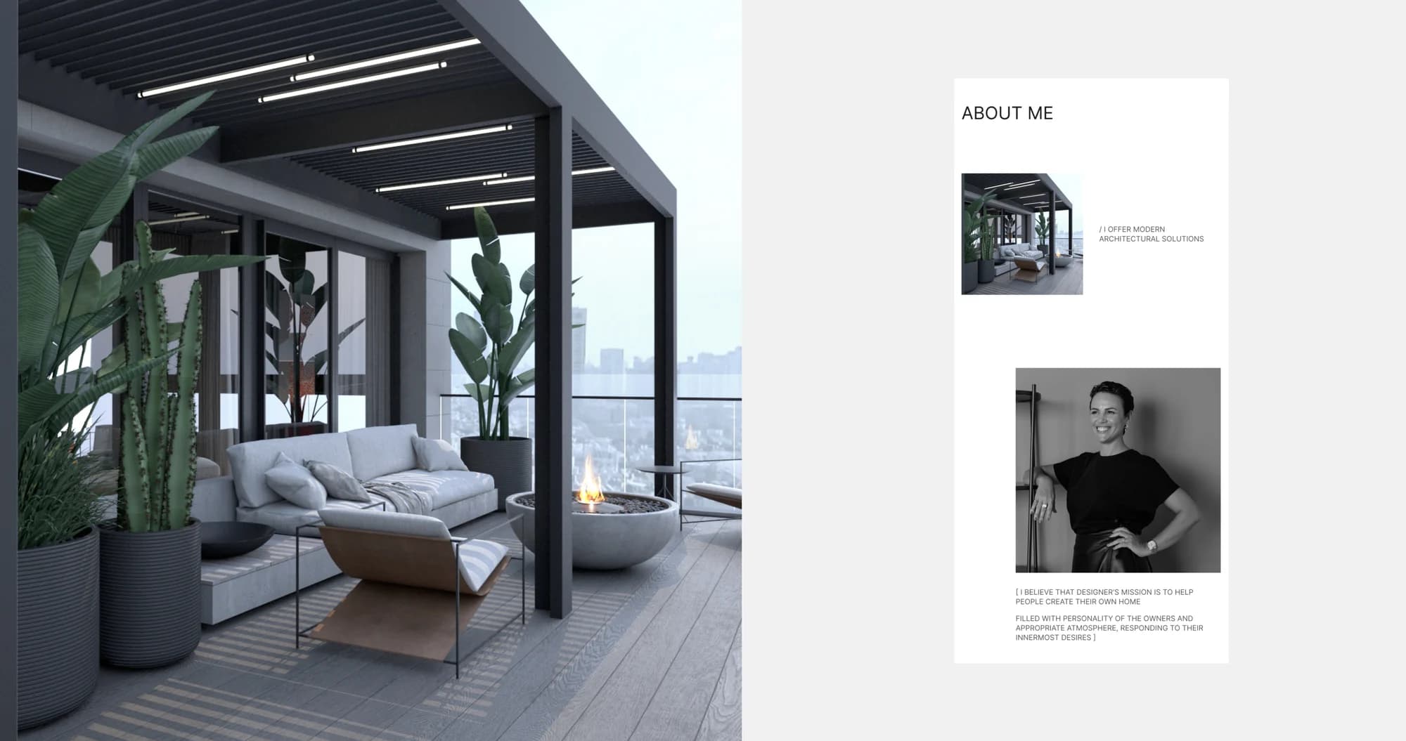
About me. Bella's story and her approach to working with clients, with a portrait and text in the first person. For a studio chosen on personal taste, that is not a formality — it is part of the argument.
Navigation. Simple and predictable despite the unconventional grid: portfolio, about and contacts, with a clear path from the list of projects to a specific property and back.
Typography and layout. Tracked headings, short captions, plenty of air. The styling does not compete with the photography and does not try to be noticed.
Responsive version. The same principle on mobile: the rhythm survives the drop to a single column and the captions stay compact.
The result
A site where the portfolio is the centrepiece rather than a list of links: the projects are shown the way they are actually judged — by eye and large. The About section adds the person standing behind the work.
The site is live at bellasimondesign.com.
The full breakdown is published on Behance and Dprofile, where it carries the Recommended badge. Links below.