The task
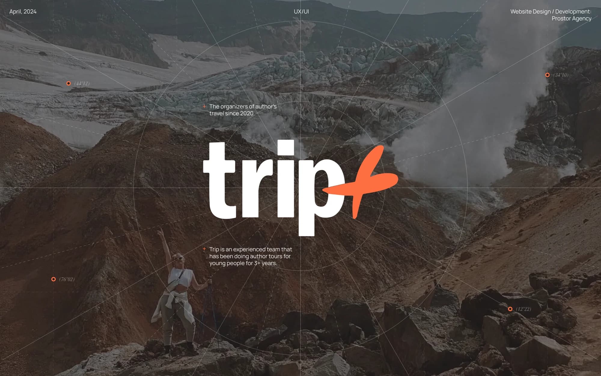
TRIP+ has been running curated trips for a young audience since 2020 and, by its own description, continues the Trip For Students project, which ranks among the top three curated-travel companies in Russia.
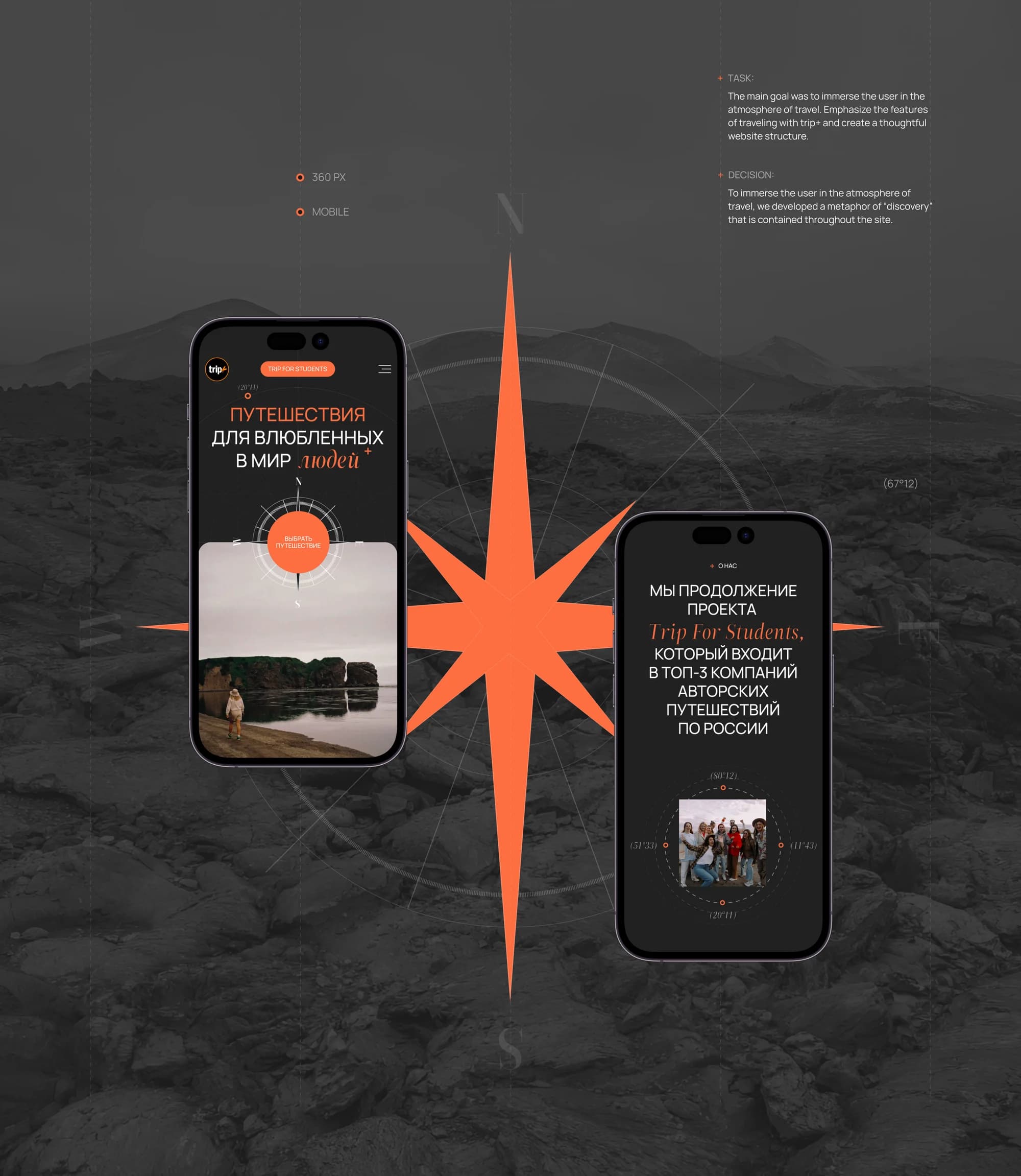
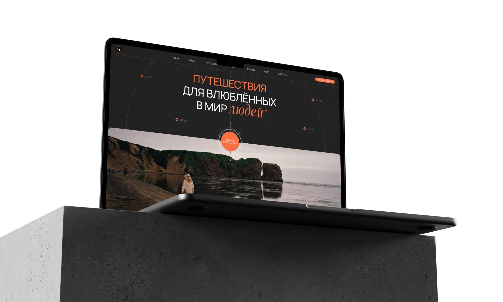
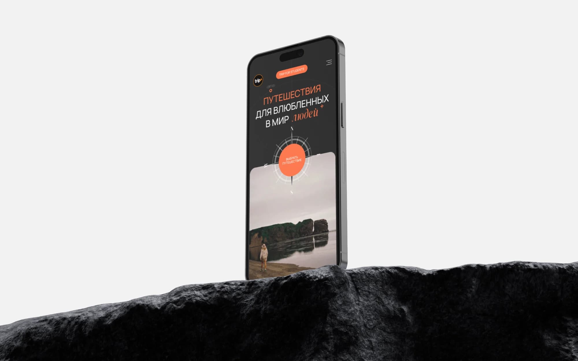
The club's line reads: travel for people in love with the world. In the layout the last word is set in the accent serif and marked with a raised plus, so the phrase can be read two ways at once — and that ambiguity is built into the typography deliberately.
The client put the brief in three parts: immerse the visitor in the atmosphere of a trip, show what travelling with TRIP+ is actually like, and build a considered structure — from a first look at the club through to the card for a specific tour.
The solution
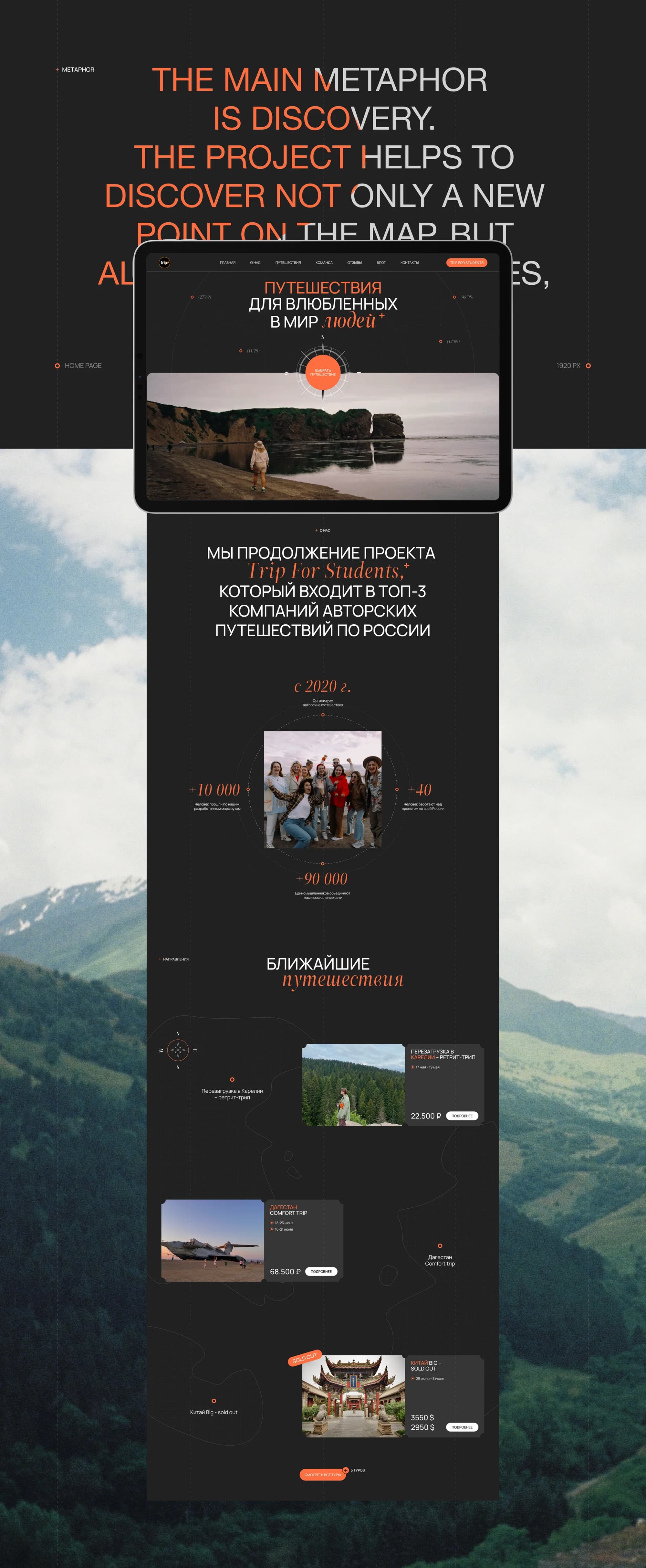
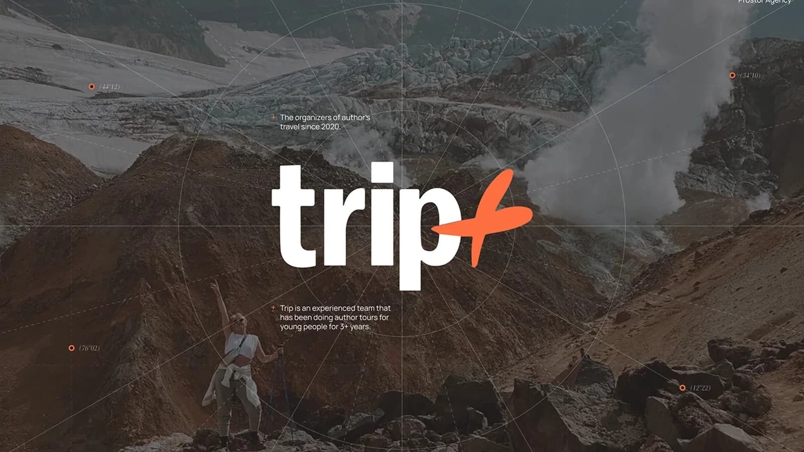
The project's central metaphor is stated outright in the layouts: the main metaphor is discovery. The mark carries it literally — the plus in the logotype is opened out into a four-pointed star, a compass rose. The same element recurs across the pages as a graphic accent.
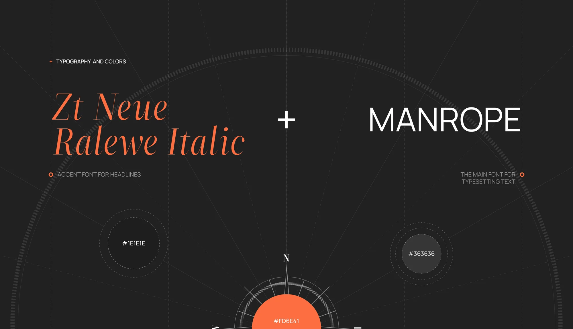
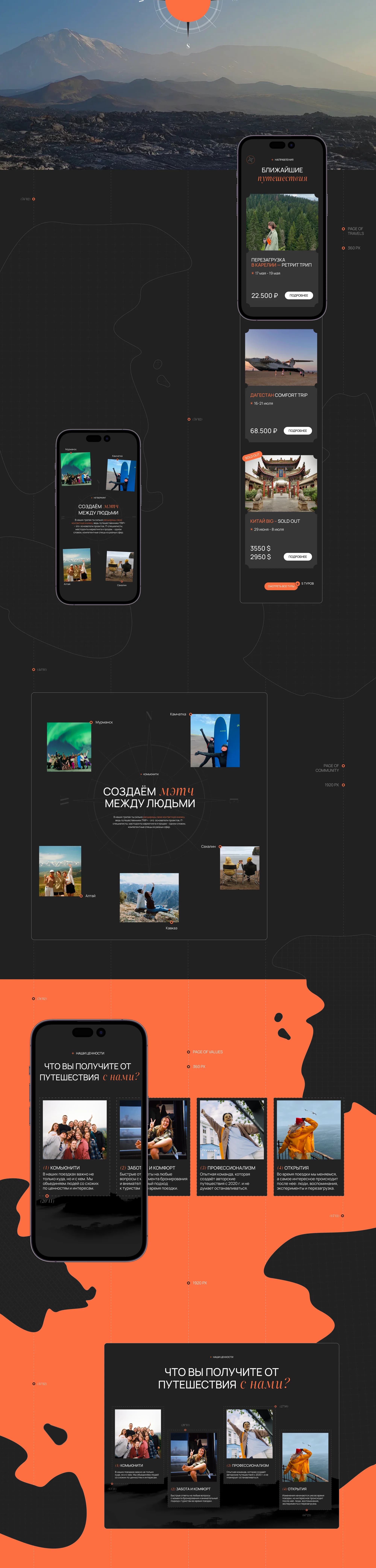
The palette is dark — #1E1E1E and #363636 — and the orange #FD6E41 is the only bright colour in it. It works as a pointer: it lights up buttons, prices and dates, everything the visitor came for. Large reportage photography fills the top of the screens, with captions naming the routes: Murmansk, Kamchatka, Altai, Sakhalin, the Caucasus.
The type is a pair — Zt Neue Ralewe Italic as the accent face for headlines, Manrope for the main setting. The italic serif carries the register; the sans keeps things legible where dates and terms begin.
What we did
Home page. A first screen with the club's line and a large frame, a block on the continuation of Trip For Students, the company's numbers, the club's four values — community, care and comfort, professionalism, discovery — and a feed of upcoming trips.
Trip catalogue. Cards carrying the destination, the dates, the price and the availability status, sold-out states included. What has already filled up and what is still open reads at a glance.
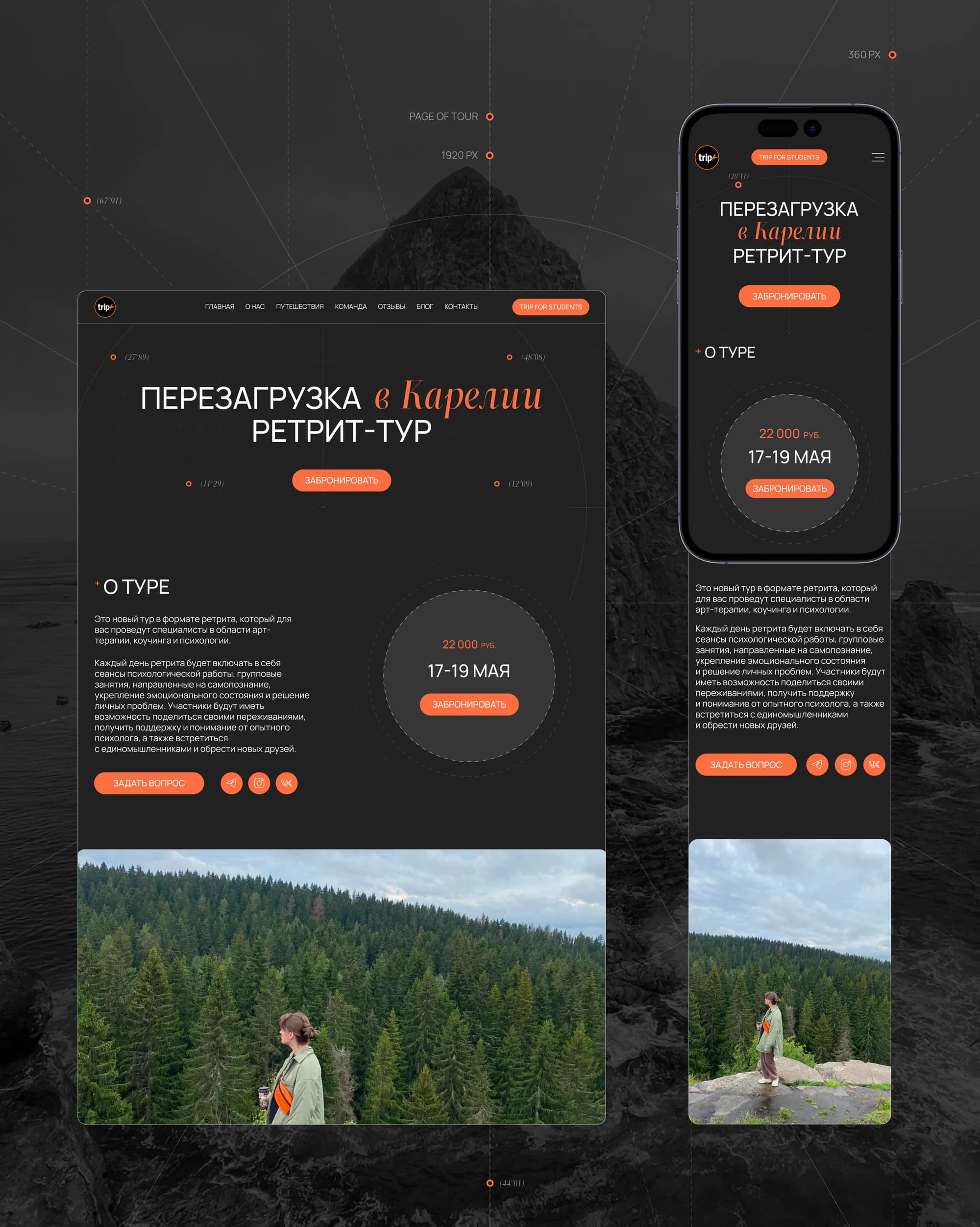
Tour page. A page of its own for the Karelia retreat: an "about the tour" block, dates, price, a booking button and photographs from the route.
Community. A section on who travels alongside you and the connections that outlast the trip.
Navigation. Home, about, trips, team, reviews, blog, contacts, plus a separate button through to Trip for students — the path from first look to booking runs without forks.
Mobile. The second breakpoint is 360 px: the tour card there is as complete as on the 1920 desktop.
The result
A platform site with a catalogue where every tour carries its own dates, price and status, and with sections that explain how a trip with TRIP+ differs from buying a package.
The discovery metaphor holds the whole system together — from the mark in the logotype to the orange pointer on the booking button.
The site runs at tripplusclub.com. The full breakdown is published on Behance and on Dprofile, where it carries the Recommended badge. Links below.