The task
IMG — Illuminati Media Group — is a Russian music media holding with six lines inside it: production, a record label, distribution, management, booking and consulting. The company takes an artist from the recording through to shows and brand integrations.
The client framed the job as reworking the structure: the holding has a lot of services and the site should show how many. We read that more broadly. A list of services does not read as scale on its own — six lines in a list look like anyone else's six lines. Scale becomes visible when you can see that the lines connect into a single path.
Hence two halves of the work: rebuild the structure, and change the visual register — the old presentation was neutral.
The solution
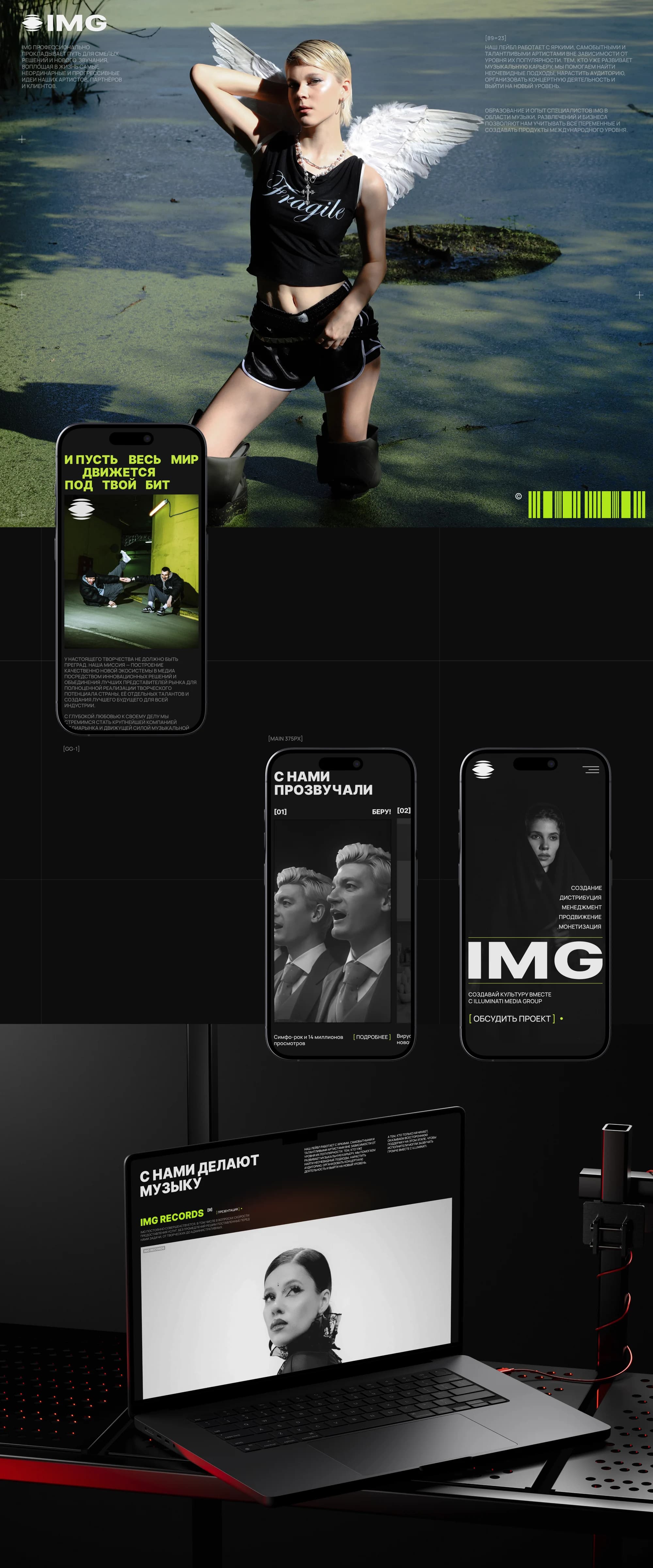
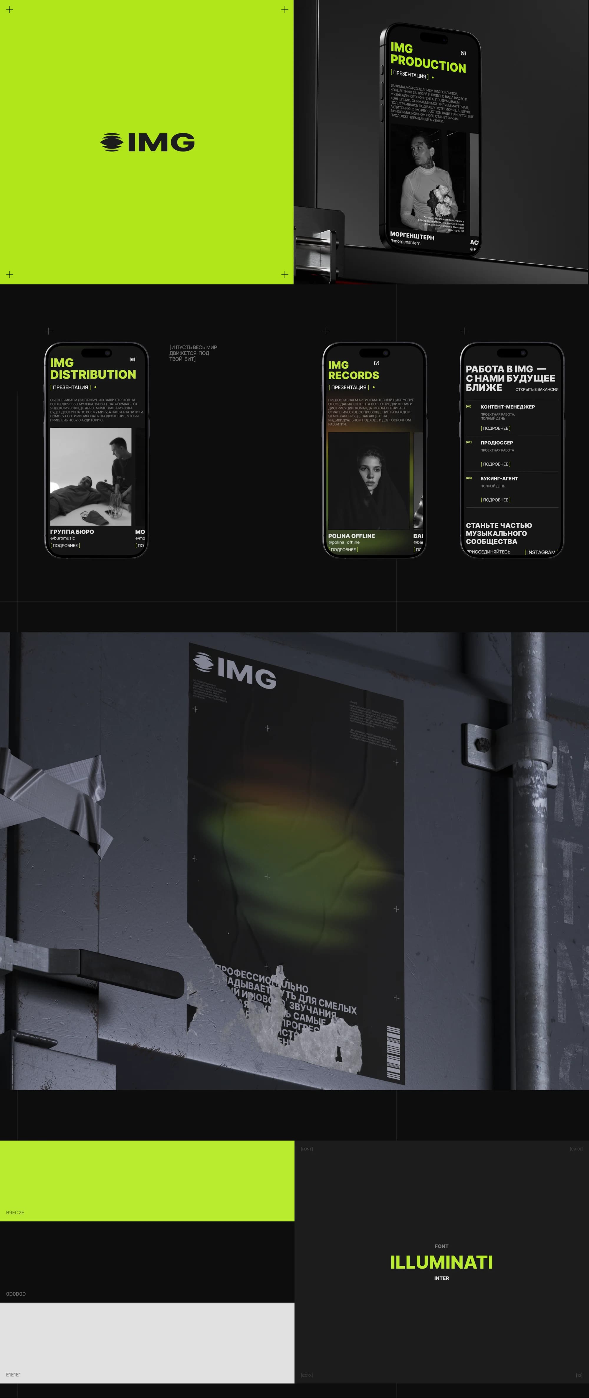
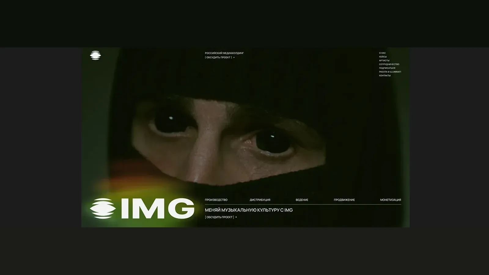
We built the presentation on contrast: a #0D0D0D ground, a #B9EC2E acid accent, #E1E1E1 text and oversized type running the full width, set in Inter. A site like that looks like a record sleeve rather than a company page — and our reading was that for the music industry this is the right register.
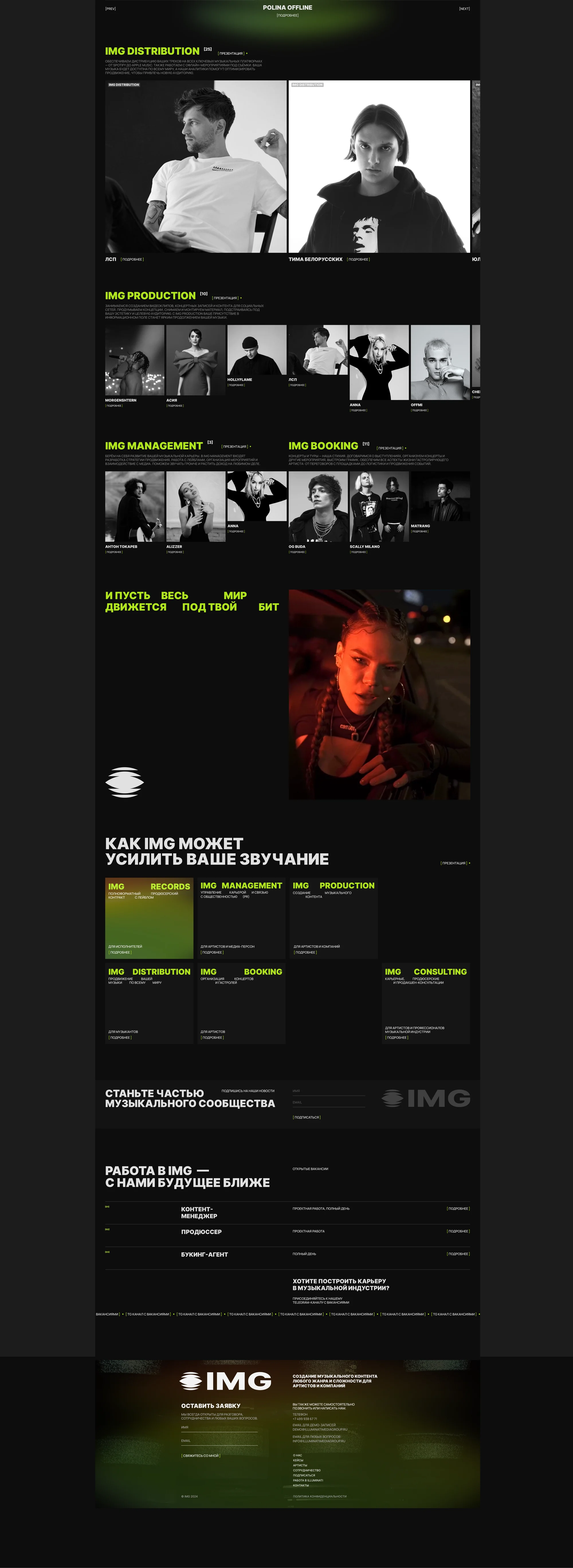
The structure was rebuilt so the six lines read as one system instead of a list. The home page unfolds as a sequence: who we are, who has already sounded with us, what we do, how we can amplify you, how to join the community, how to come and work here. Each block answers the question the previous one raises.
What we did
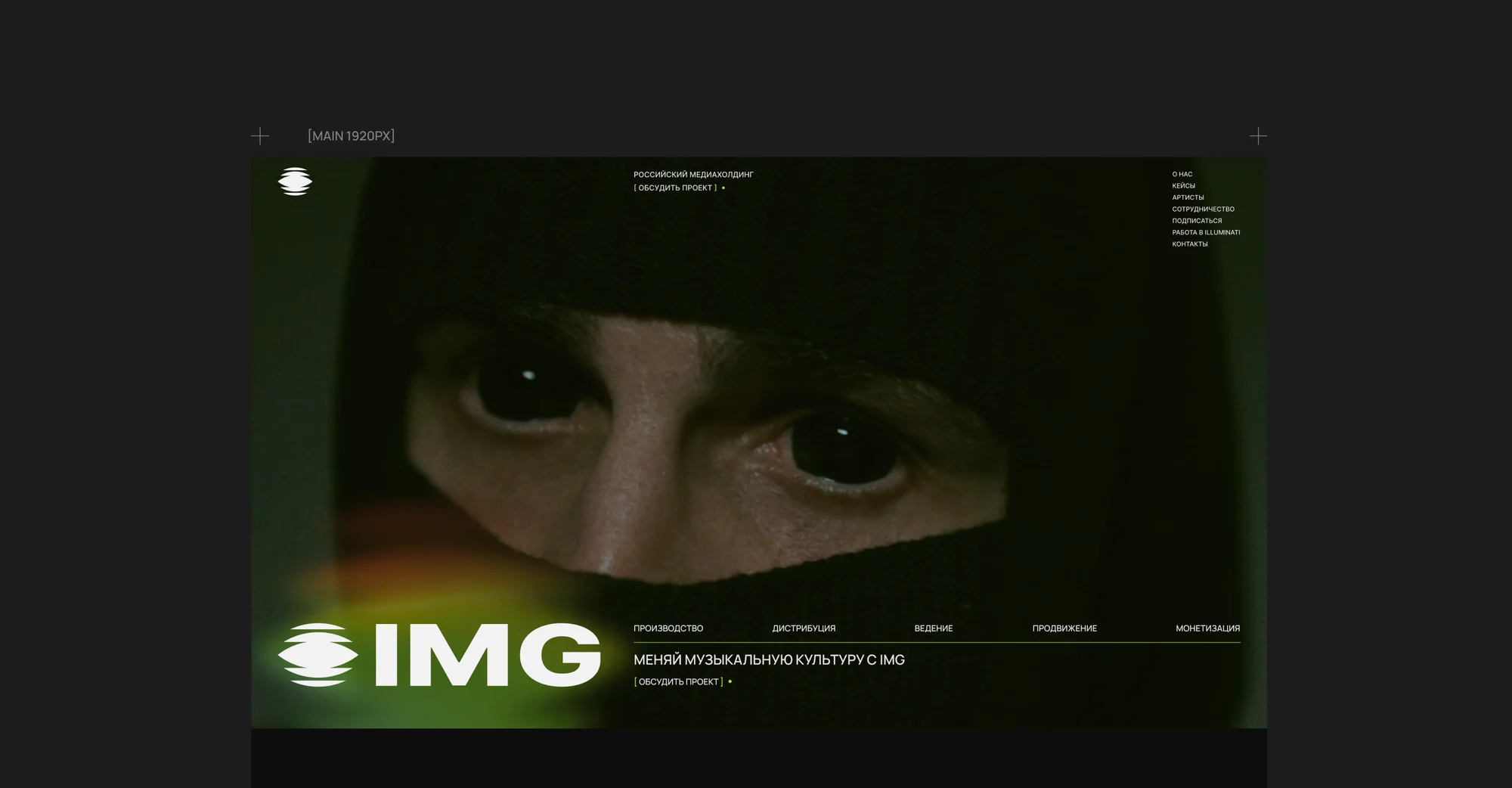
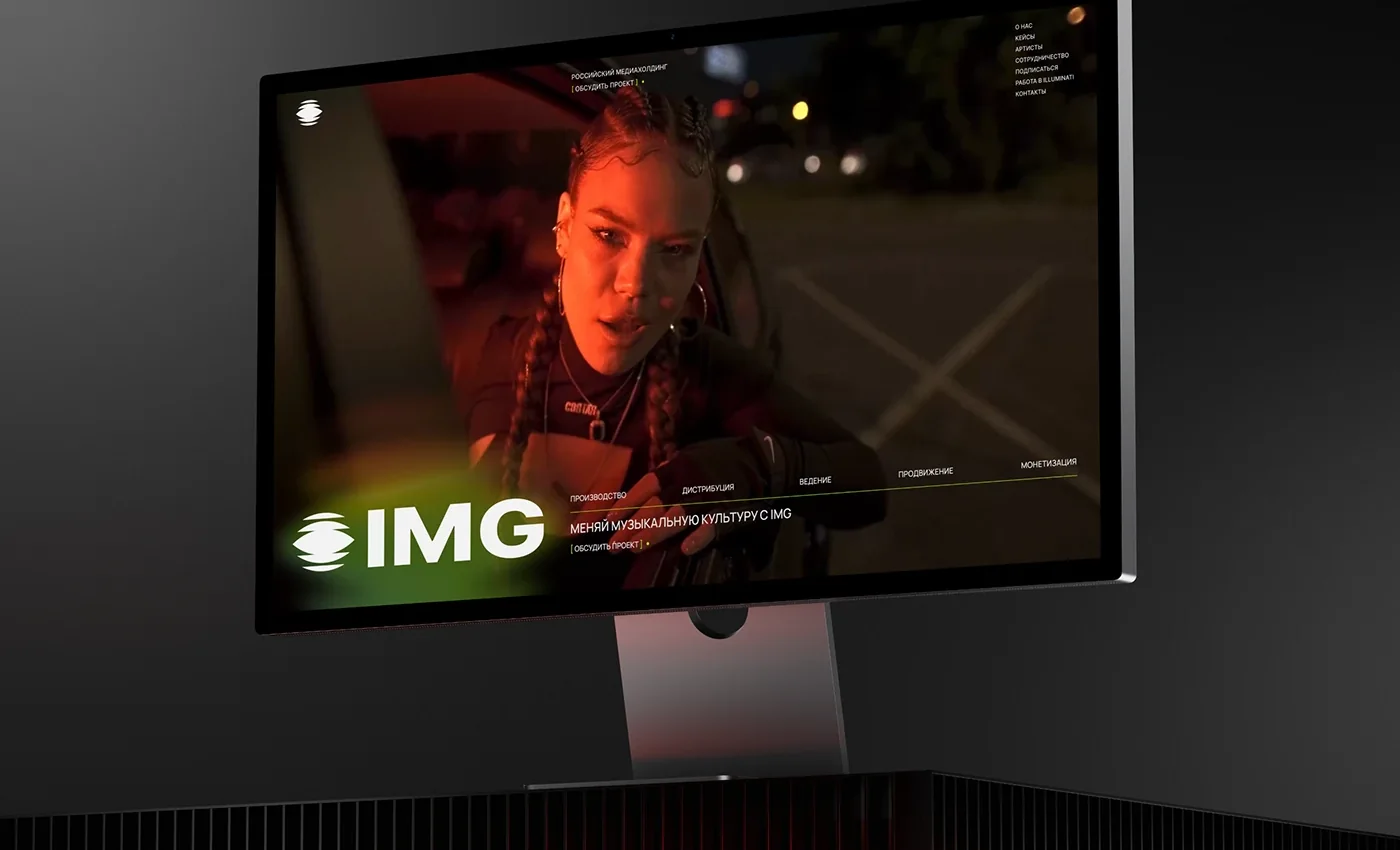
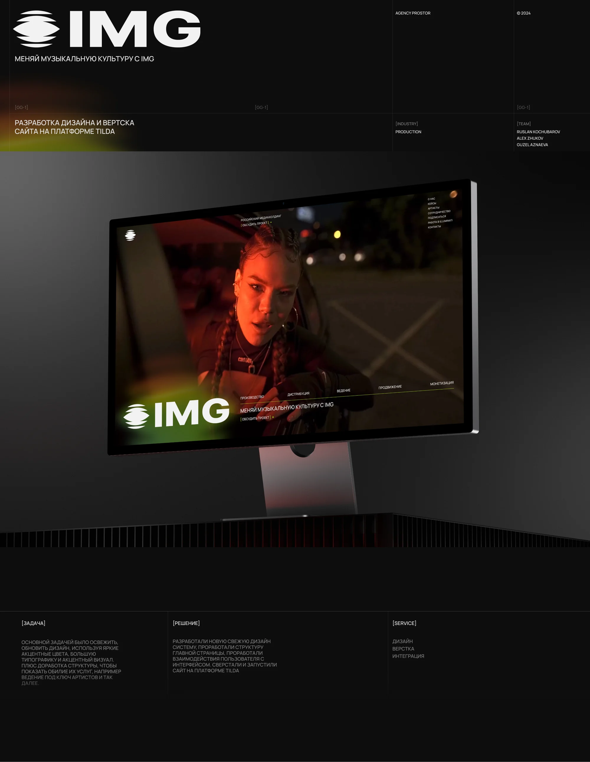
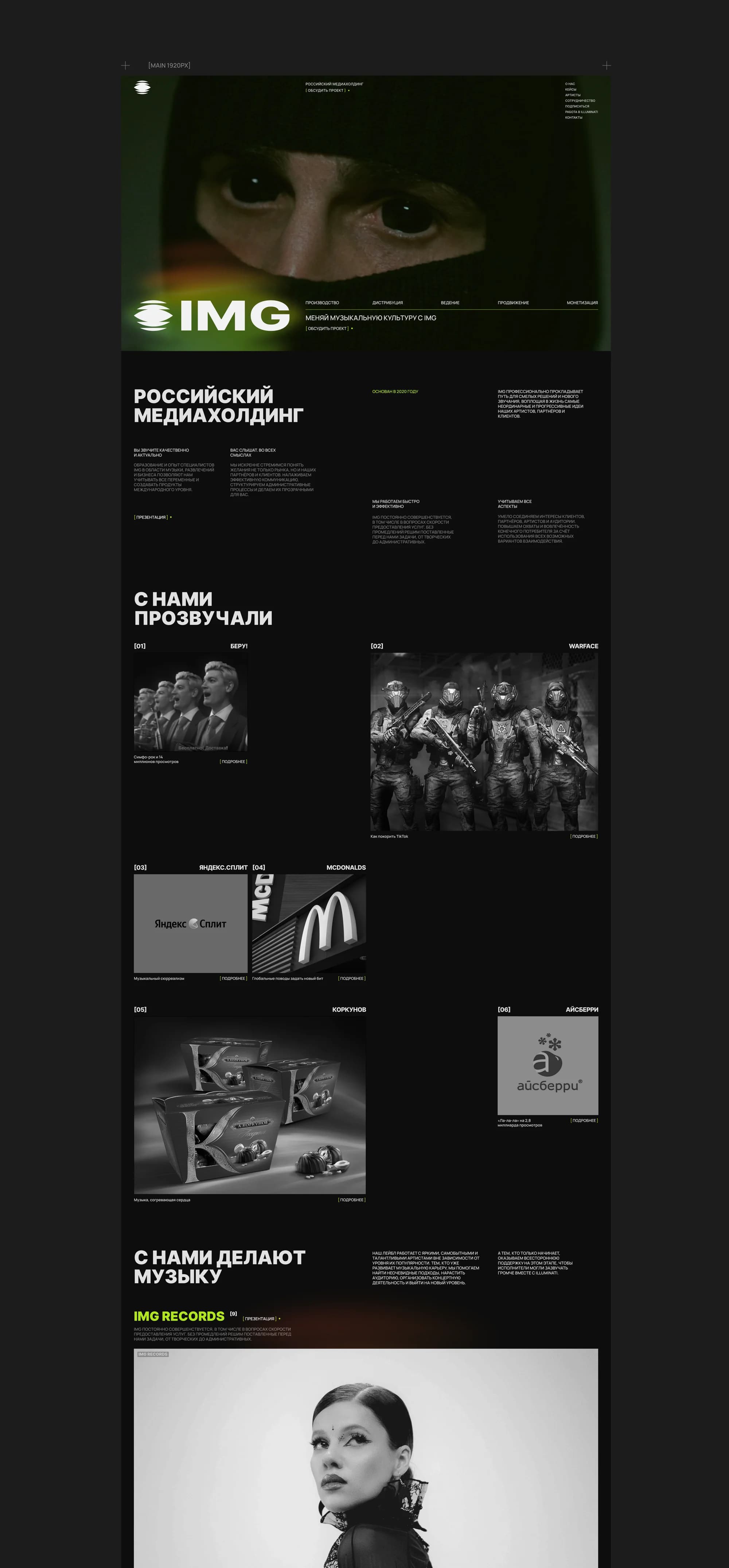
The first screen. An eyebrow reading "Russian media holding", a large frame and the line about changing music culture with IMG. To the right of the oversized logotype, on the same band, runs a row of stages: production, distribution, management, promotion, monetisation. That is a second cut through the same system — by the stages of an artist's path rather than by the names of the business lines.
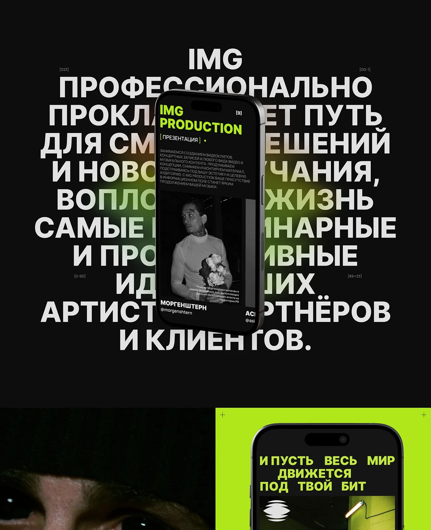
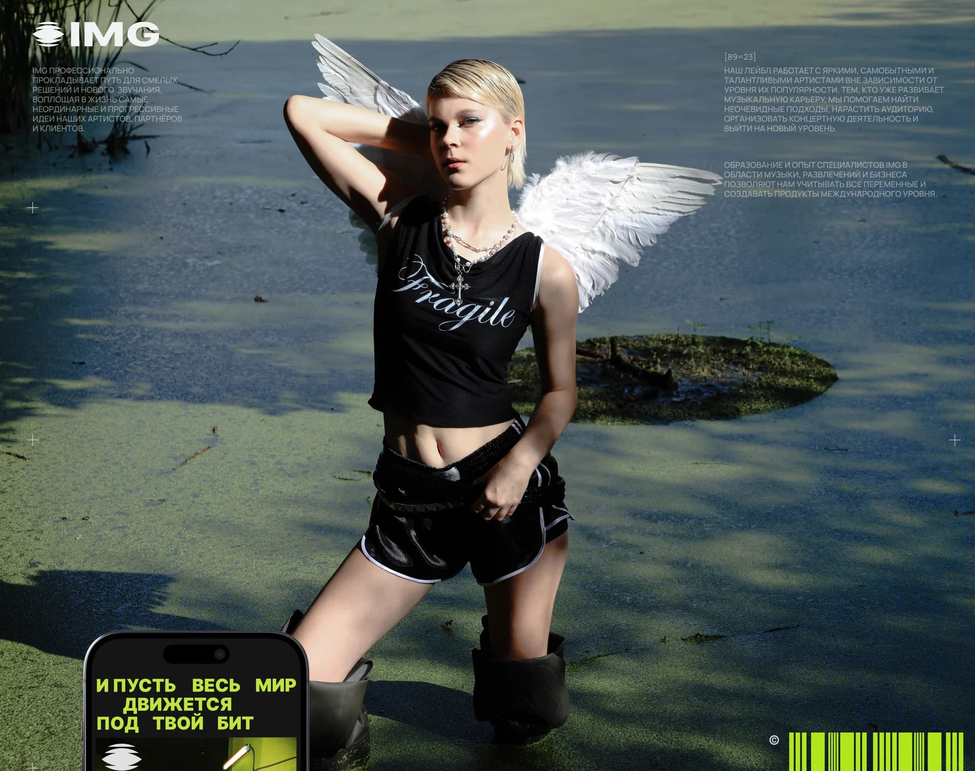
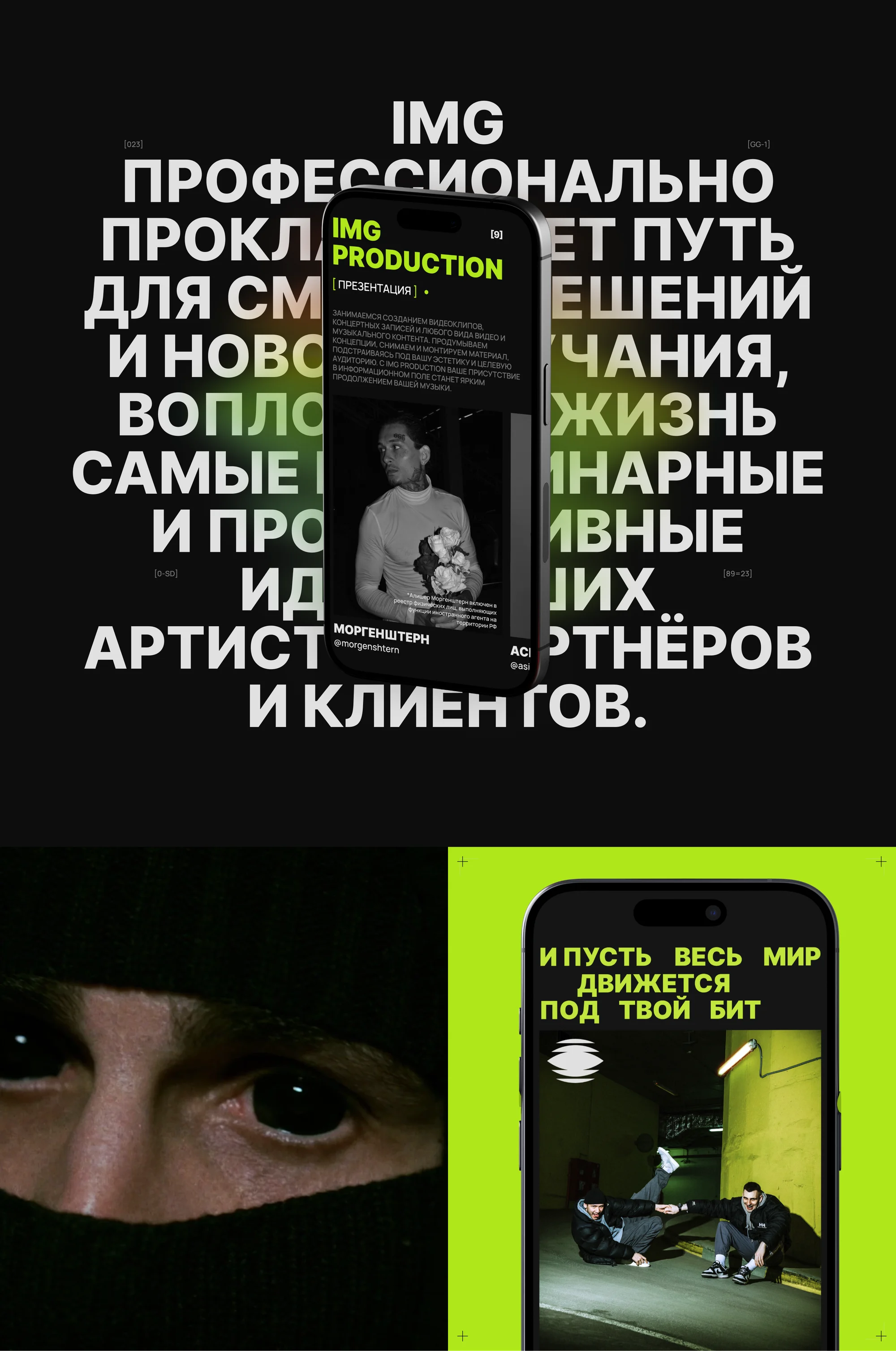
Type across the full width. Between the artists block and the business lines, set in acid green: let the whole world move to your beat. The rhythm of the typography carries the subject literally.
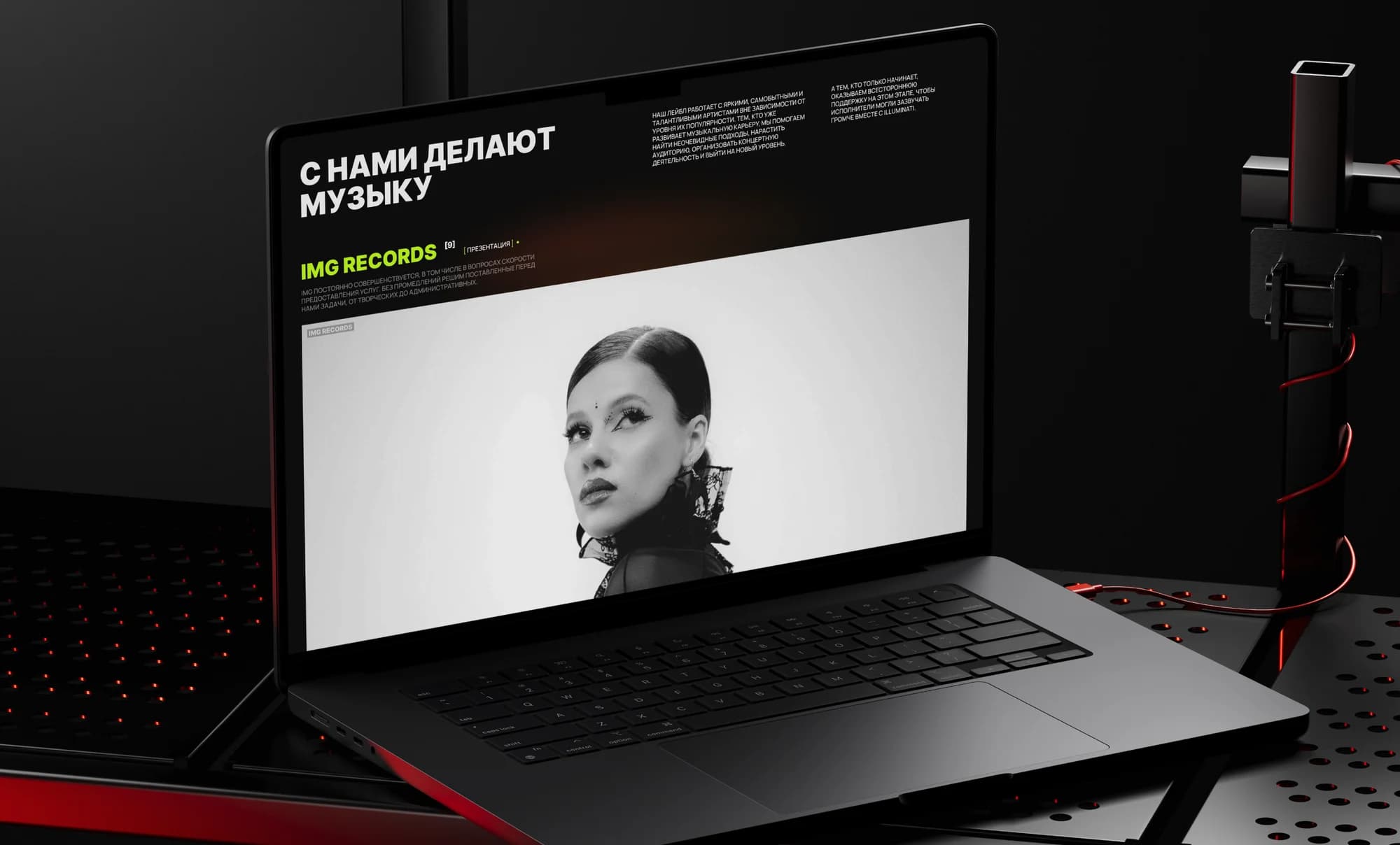
The lines. IMG Records, IMG Management, IMG Production, IMG Distribution, IMG Booking and IMG Consulting — six cards in the "How IMG can amplify your sound" block, each captioned with who it is for: performers, artists and media figures, artists and companies, musicians, artists, artists and music-industry professionals.
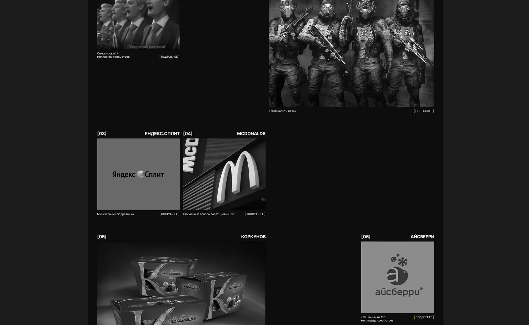
"They sounded with us" and "They make music with us". The proof: artists, and the logos of the partners integrations were made with — Beru!, Warface, Yandex.Split, McDonald's, Korkunov, Aisberry.
Community and careers. Sections inviting people into the music community and into the company. A holding grows through people, so their entrance is as visible as the client's.
Navigation. The header carries about, cases, artists, partnerships, subscribe, careers at Illuminati, contacts.
Mobile. The same contrast and the same oversized type: that version is not the cut-down one.
Built on Tilda. Design, build and integration on the platform.
The result
The site now looks like the thing the company does: loud, and part of the industry rather than a description of it from outside.
Six business lines sit in one readable structure, and it makes the main point visible — IMG covers an artist's whole path, not a slice of it.
The full breakdown is published on Behance and Dprofile — links below.