The task
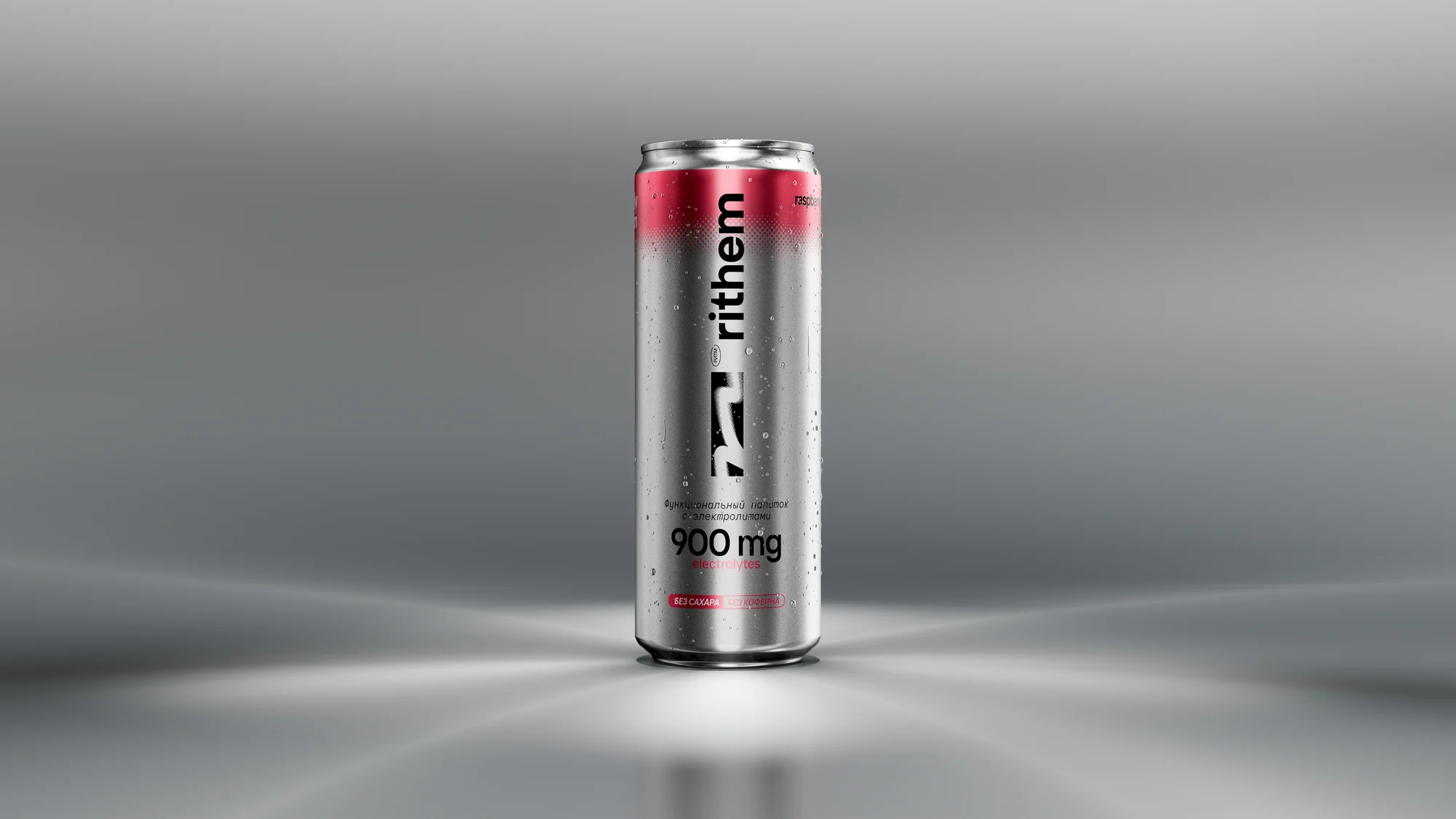
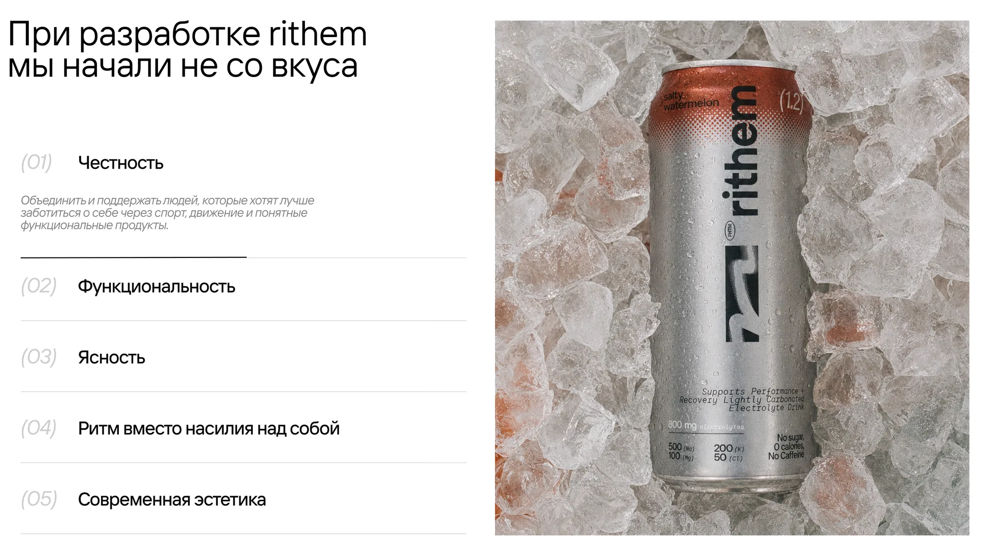
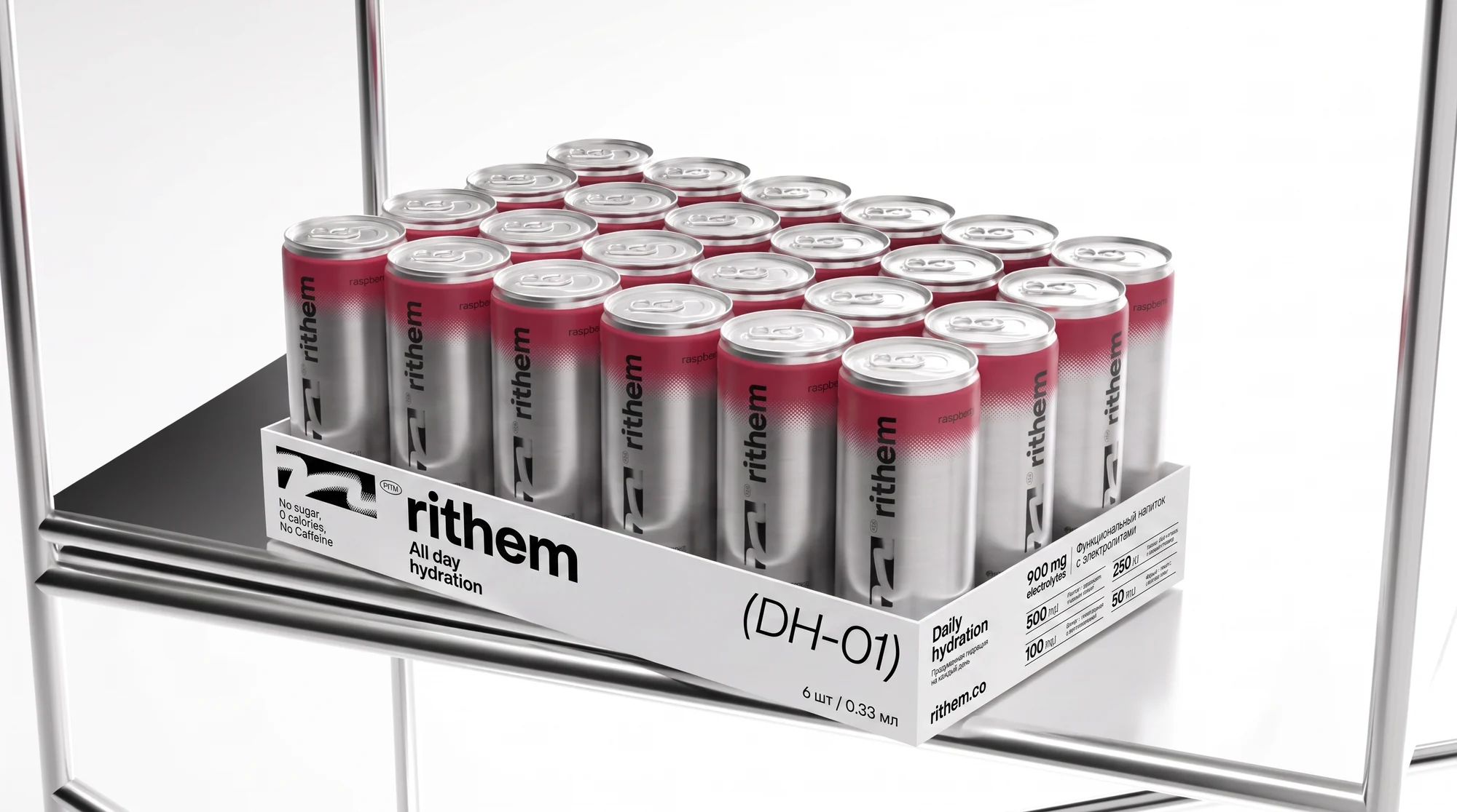
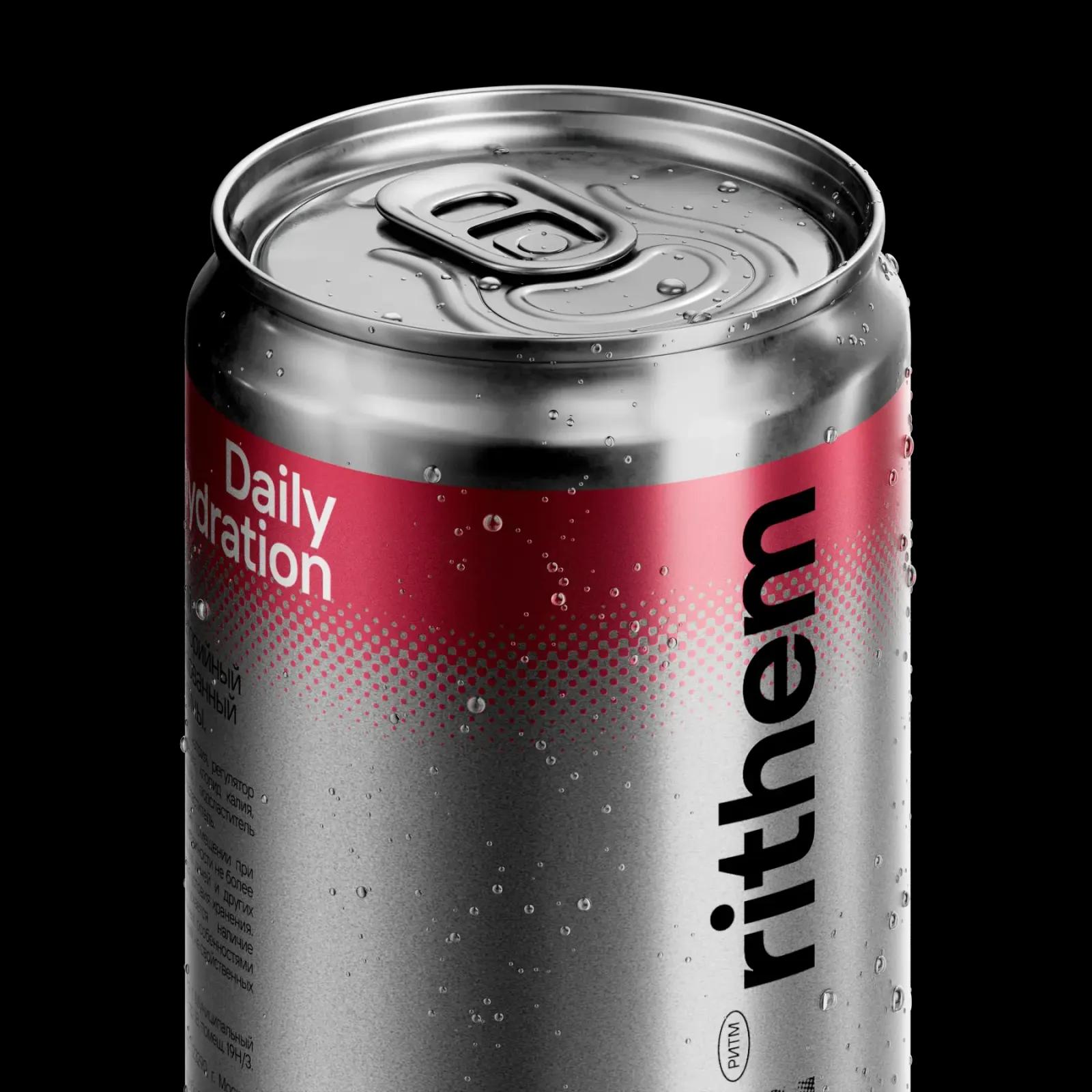
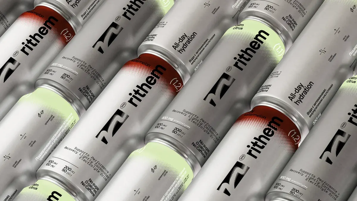
Rithem makes electrolyte drinks for everyday hydration — no sugar, no caffeine, no artificial additives. It sold on marketplaces, like almost everything in the category. That model has two ceilings: the platform's commission eats the margin, and the customer belongs to the marketplace, not the brand. No customer base, no repeat sales.
The brand identity is not ours — it came ready. Our part is the site concept, the visual design and the build.
The idea
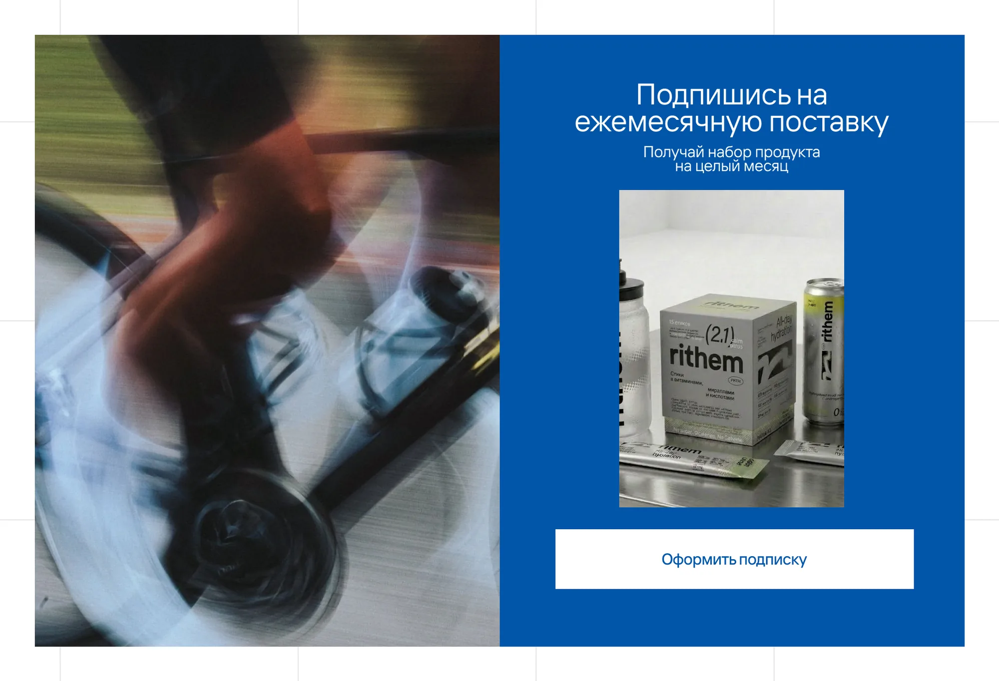
The core scenario here is regularity. The drink is bought every month, not once, so the centre of the site is a subscription rather than a cart: pick the mix and the interval, and delivery arrives on its own.
The second decision was not to wait for a finished site. The brand had a drop in August, so the launch is split into three waves, each estimated and shipped on its own: a holding page for the August drop, the basic shop in autumn, the advanced layer after that.
What we did
Structure and prototype. A page map and block wireframes for every page, so both the design and the build could be estimated before anything was drawn.
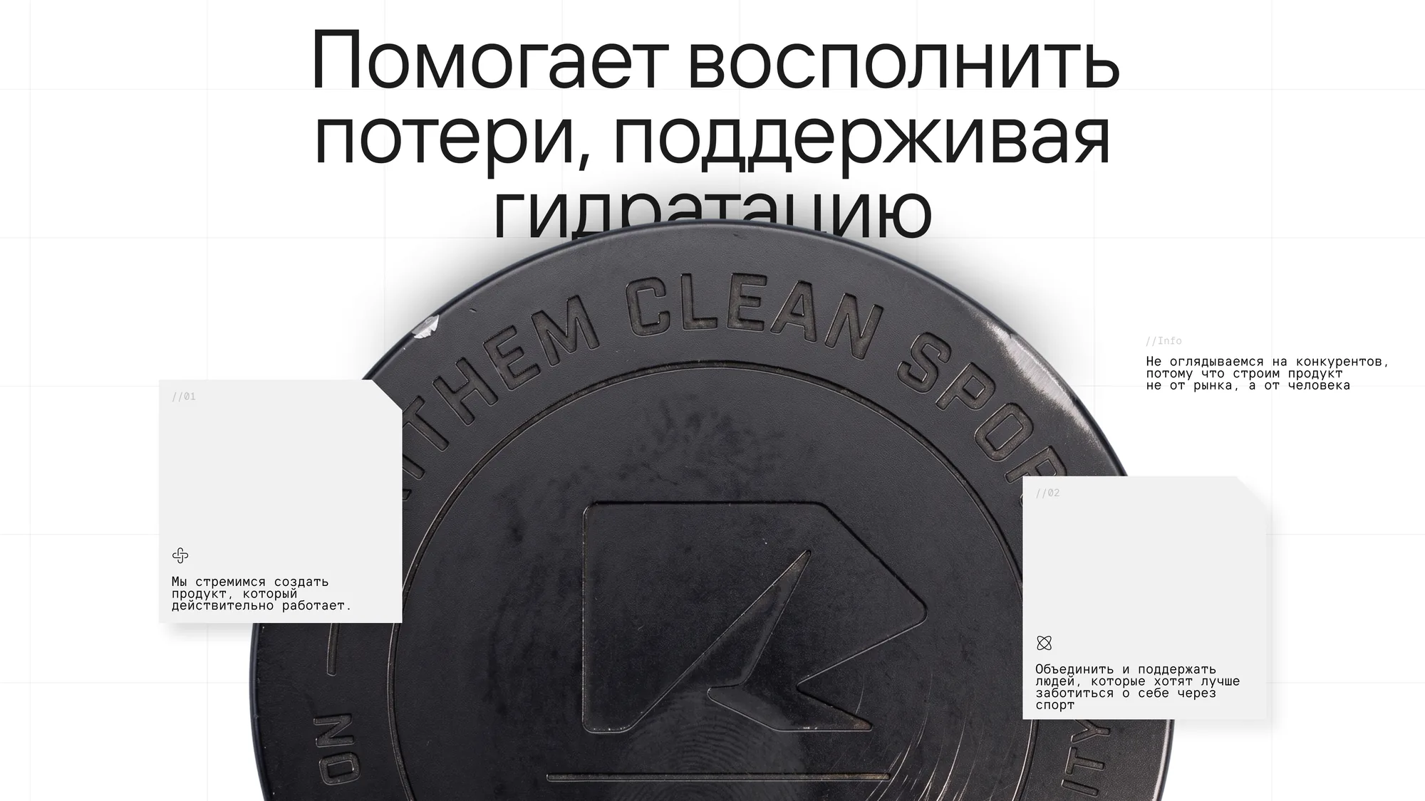
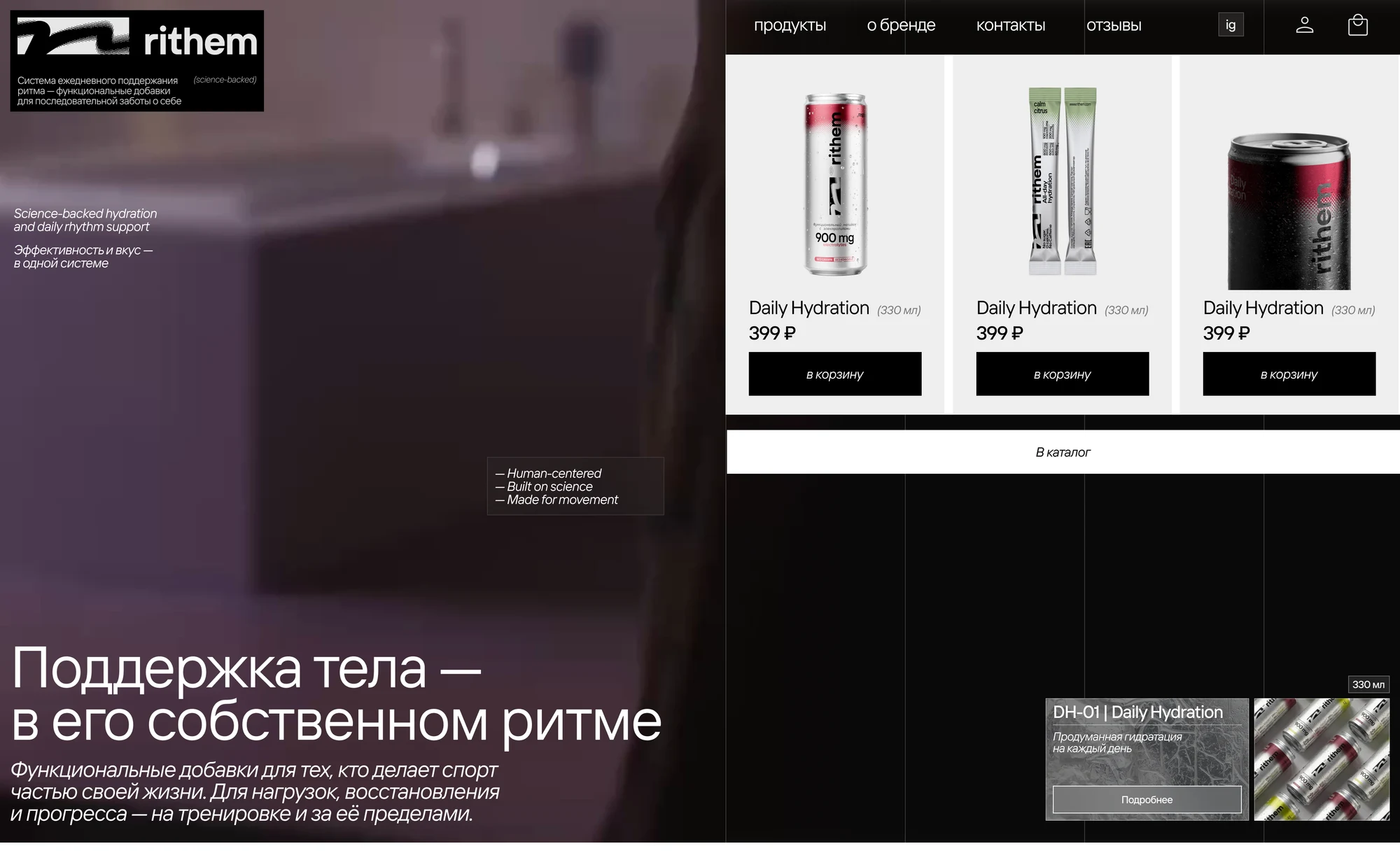
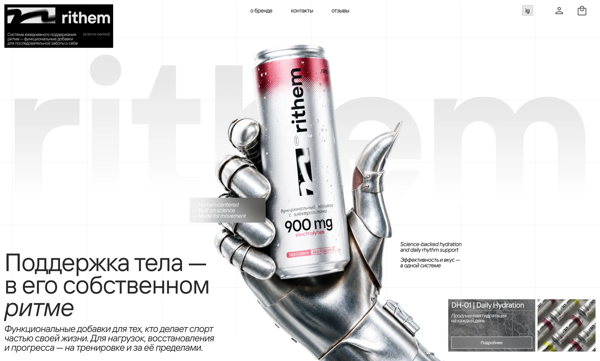
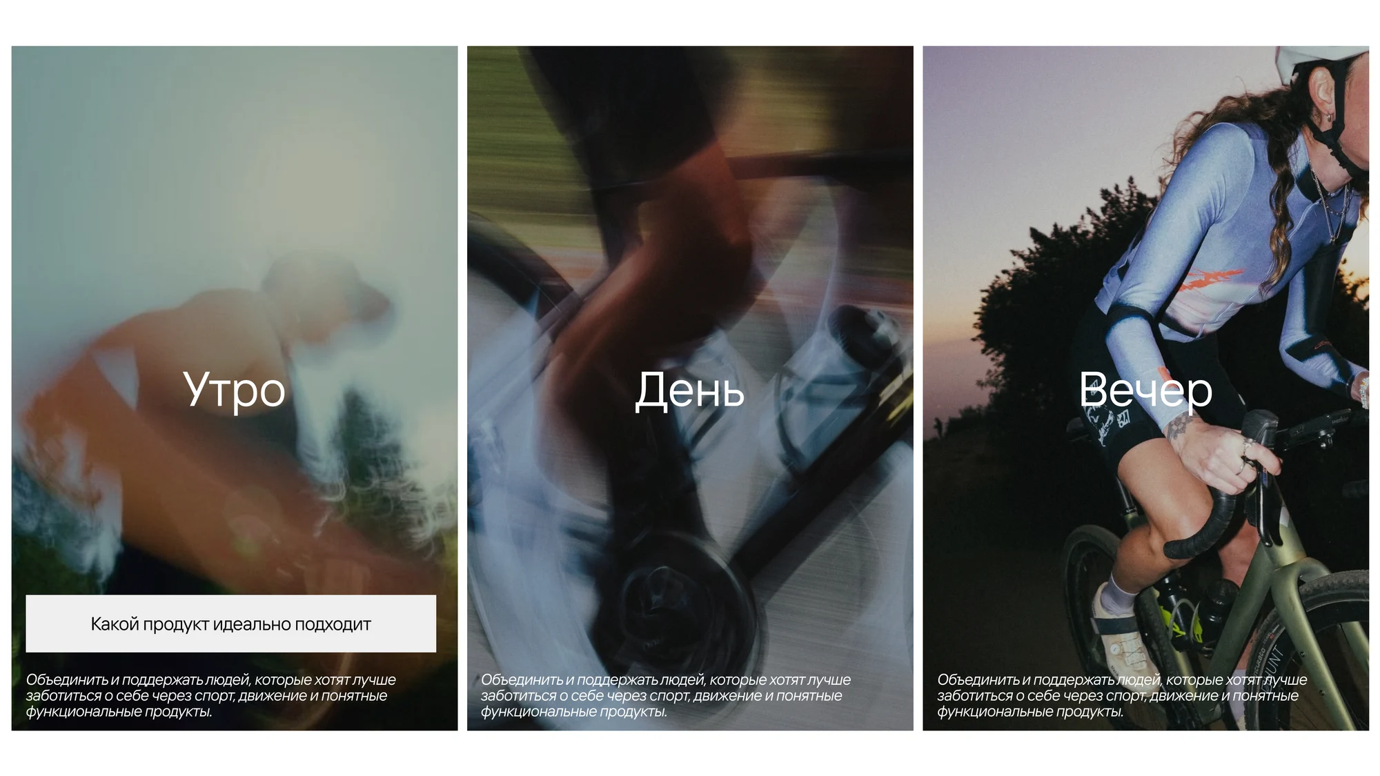
Design concept. The visual language of the site, built on the brand's existing identity.
Subscription. Choice of mix and frequency, plans, subscriber benefits. Merch and accessories for members only — the model Red Bull runs on.
Account area. Details and delivery addresses, order history and statuses, subscription control: pause, cancel, change the date or the contents — without writing to support.
A WordPress build. With an admin the brand uses to add products itself, and integrations for payments, delivery and stock.
What it gives the brand
- the brand owns its customer base instead of renting it from a platform
- the subscription turns one-off purchases into regular ones
- sales start with the first wave instead of waiting for the whole site
The project is in progress.