The task
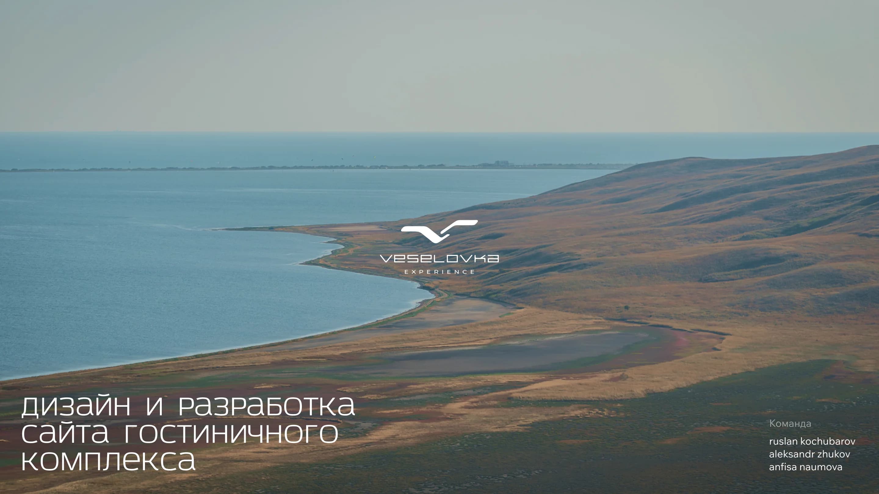
Veselovka Experience is a hotel complex on the Black Sea coast, set among vineyards and steppe landscape. The brief was put like this: design a website building on the complex's identity, its architecture and its location, and build and launch it on the Tilda platform.
The booking mechanics were a difficulty of their own. The complex has several ways to stay, and they do not reduce to a list of rooms: there are connecting rooms, different views, different bed configurations.
The solution
The complex's identity was adapted and carried into the web, built on its contrasting red and a light but memorable typeface.
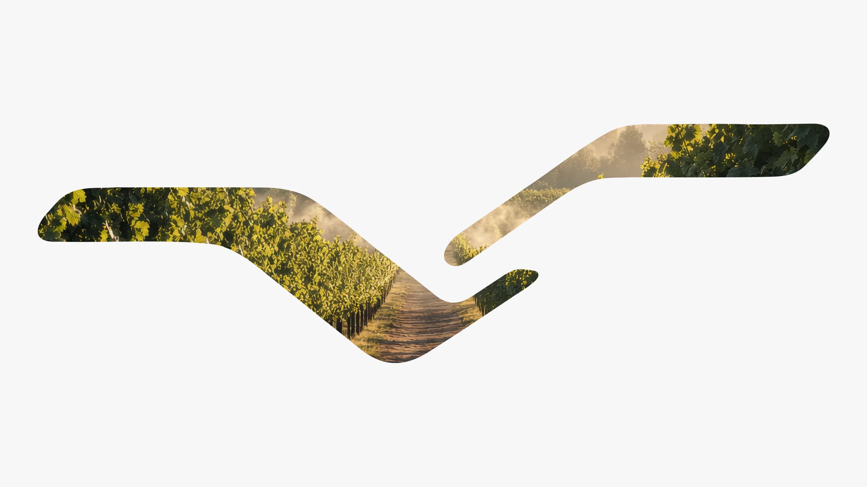
The main device is the mark. The brand shape — close to the silhouette of a gull in flight — works not as a logo in the corner but as a mask: a photograph of the vineyard is poured into it, so the mark fills each time with the very place the site is talking about.
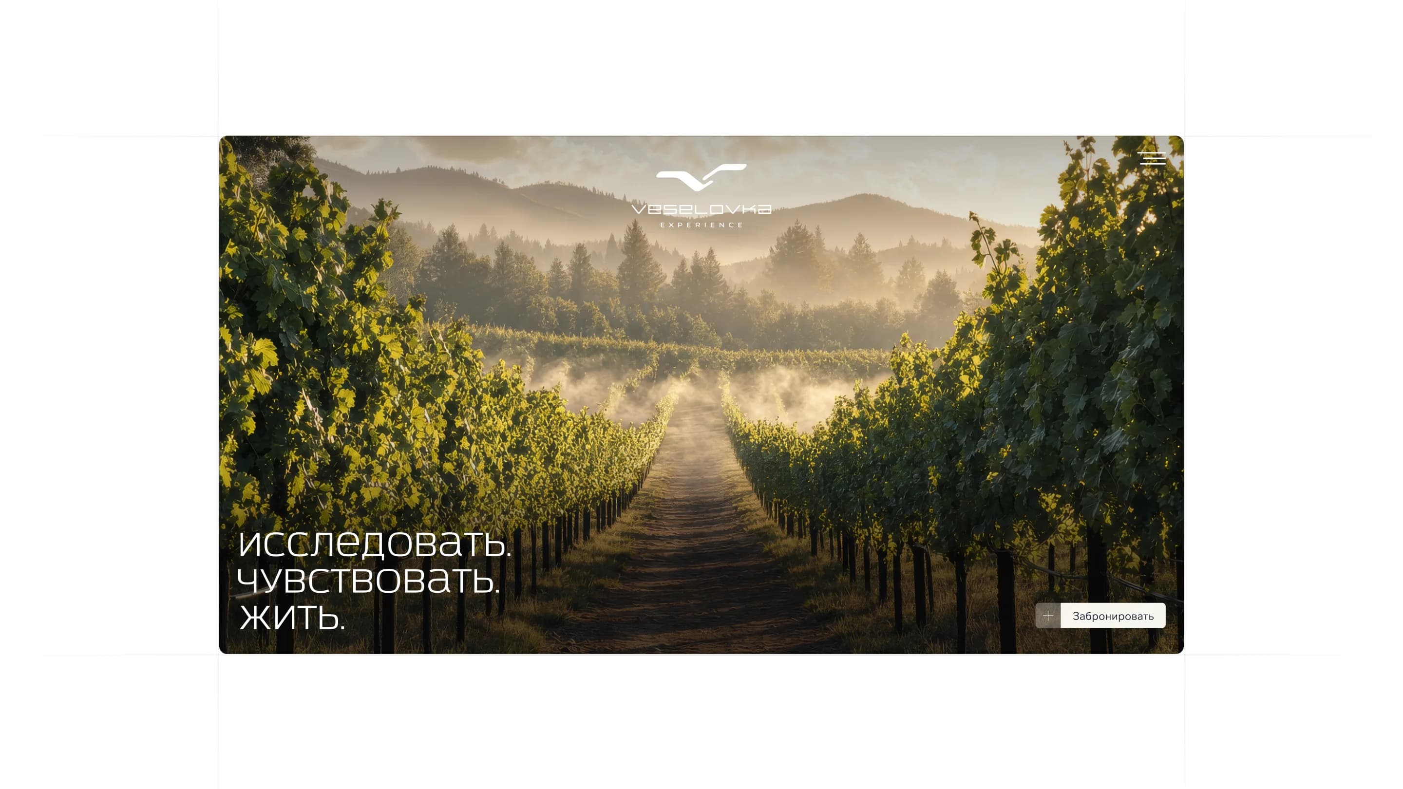
The first screen speaks in three verbs: explore, feel, live. Below them, a track between rows of vines in the morning mist, and a single button to book.
What we did
First screen. A large frame of the grounds, the three-verb line and a direct route into booking.
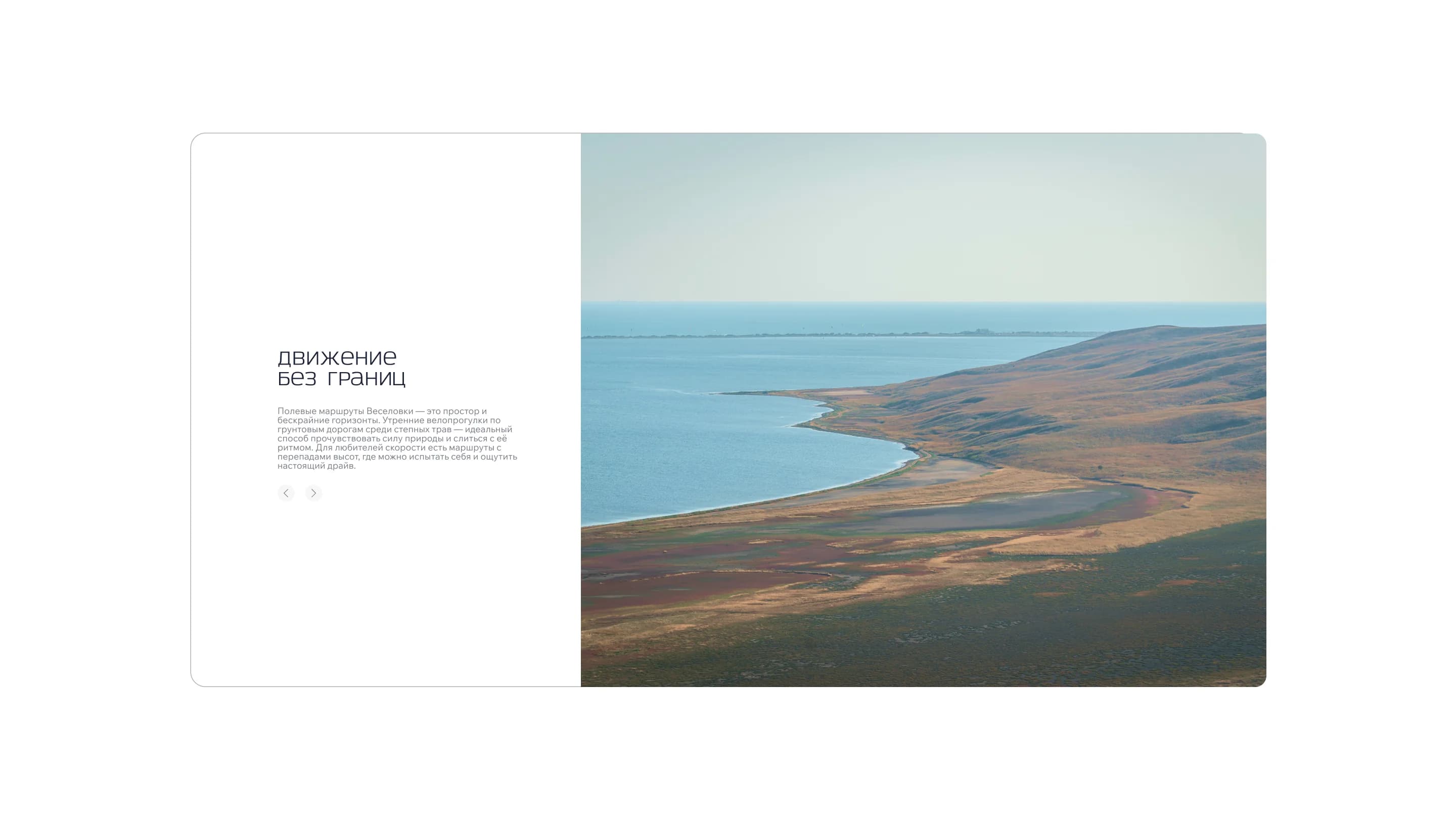
"Movement without borders". A section on the field routes: morning rides along dirt tracks through steppe grasses, and routes with elevation changes for anyone riding for speed. Built as a slider rather than a wall of text.
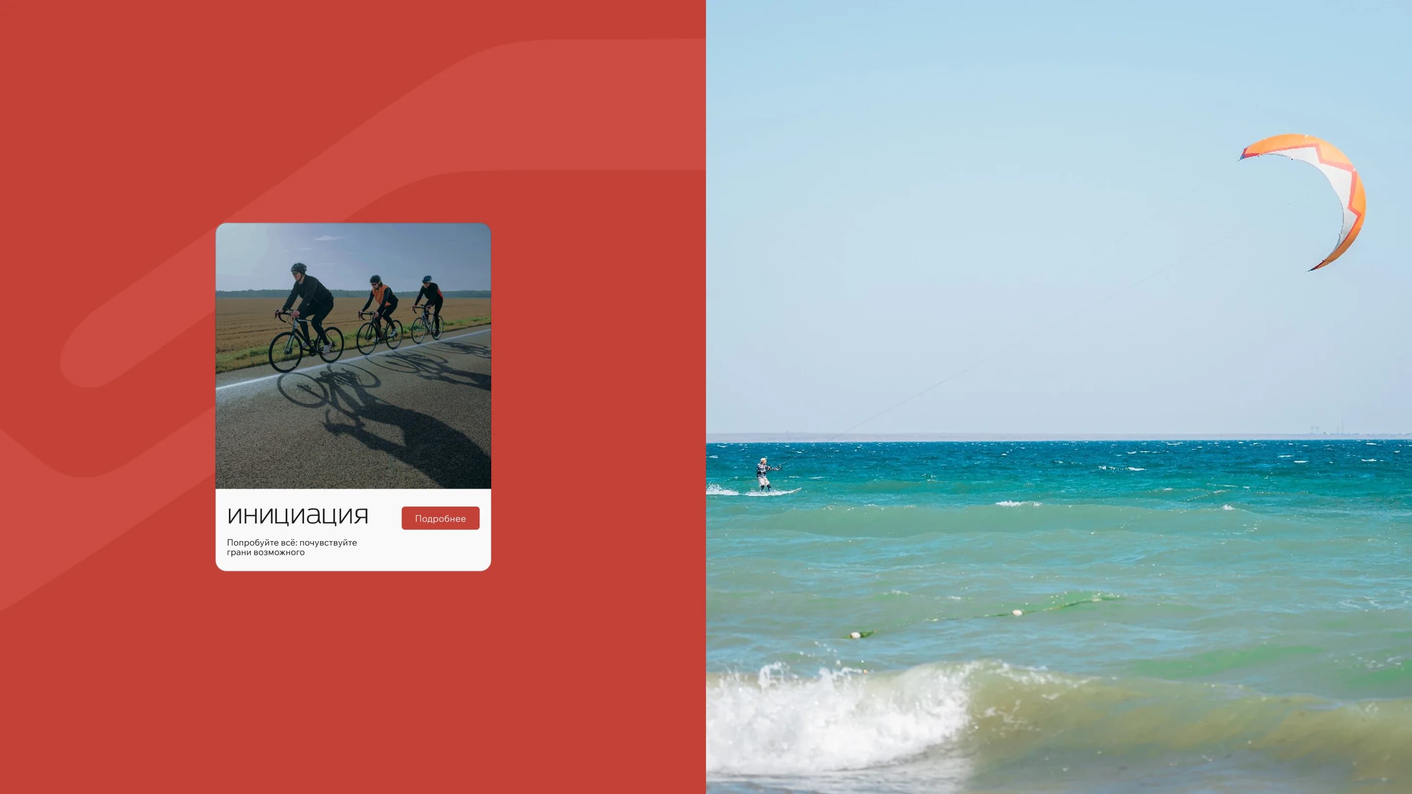
Activities. Cards for what happens on the grounds — for instance "Initiation", captioned "try everything: feel the edge of what's possible", with a route into the detail. Kitesurfing, cycling and the coastline are shown as frames, not icons.
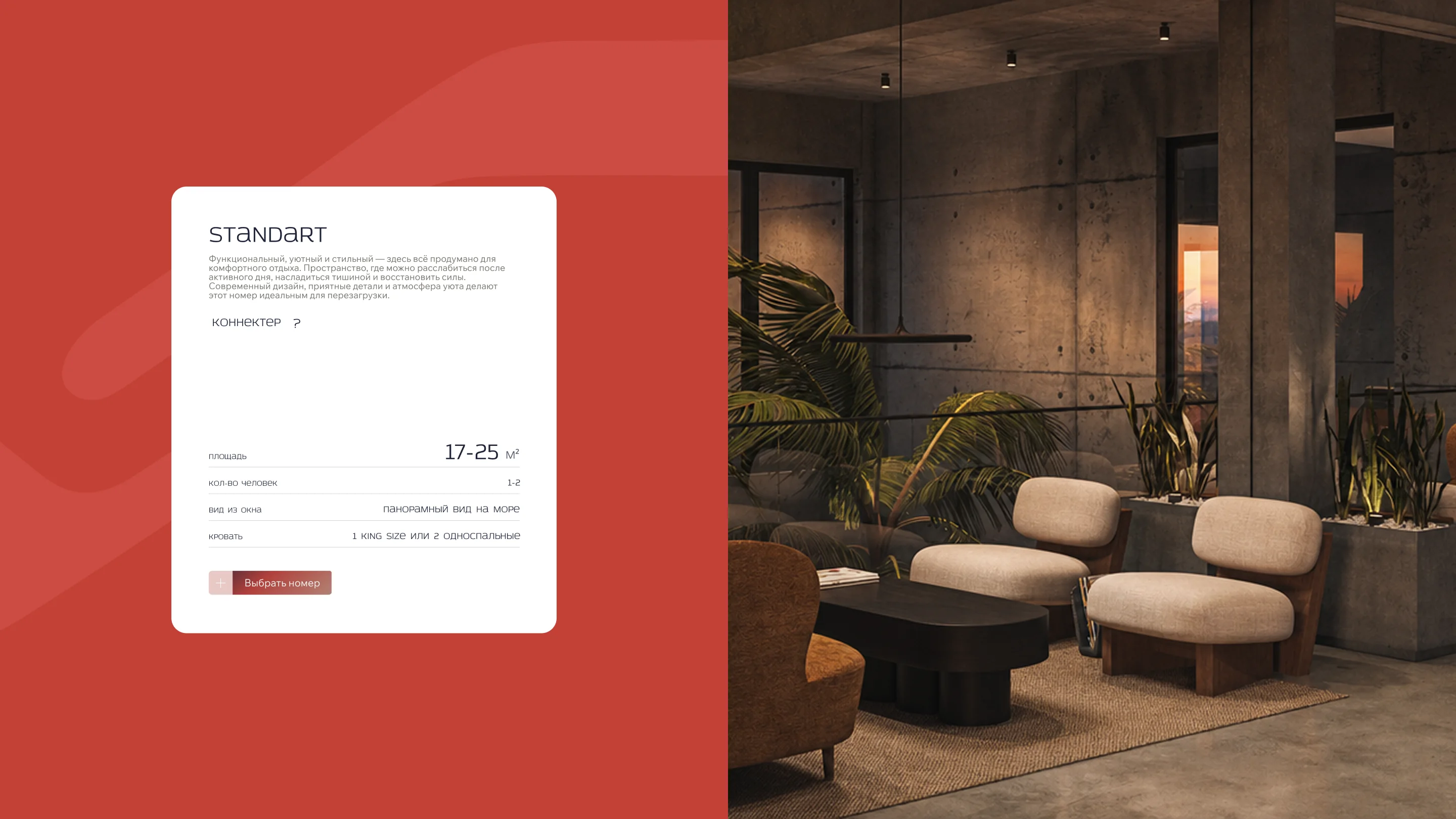
Room cards. The Standart category carries an area of 17–25 m², a capacity of 1–2, a panoramic sea view and the bed configuration — one king size or two singles. Alongside it, a connecting-room toggle and a "choose a room" control.
Booking mechanics. Complex booking with several options was worked through and surfaced so that choosing a configuration does not fall out into a separate form.
Interactive blocks. Built to increase how deep visitors browse the site: sliders, cards that open, toggles inside the sections.
Launched on Tilda. Design, build and launch on the platform.
The result
The site presents the complex through its place — vineyards, coastline, steppe, routes — and only then through its rooms.
The room card still does its job: area, capacity, view and bed type read at a glance, and a connecting room is chosen with a toggle inside the card.
The site is live on Tilda. The full breakdown is published on Dprofile — link below.
The site is live at ve-hotel.com.