The task
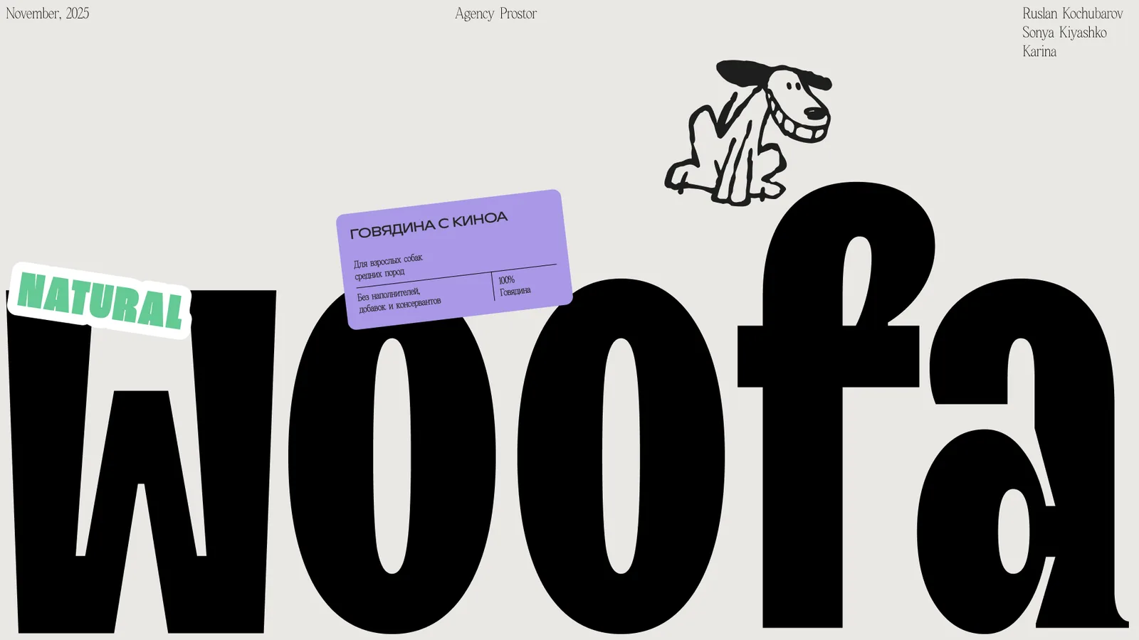
Woofa is a Georgian eco dog food brand. The pet store shelf splits into two camps: clinically dull "veterinary" packs and shouting mass market with cartoon dogs. An eco food needed a third way — warm and playful yet grown-up, so the pack earns the same trust as the ingredients list.
The approach
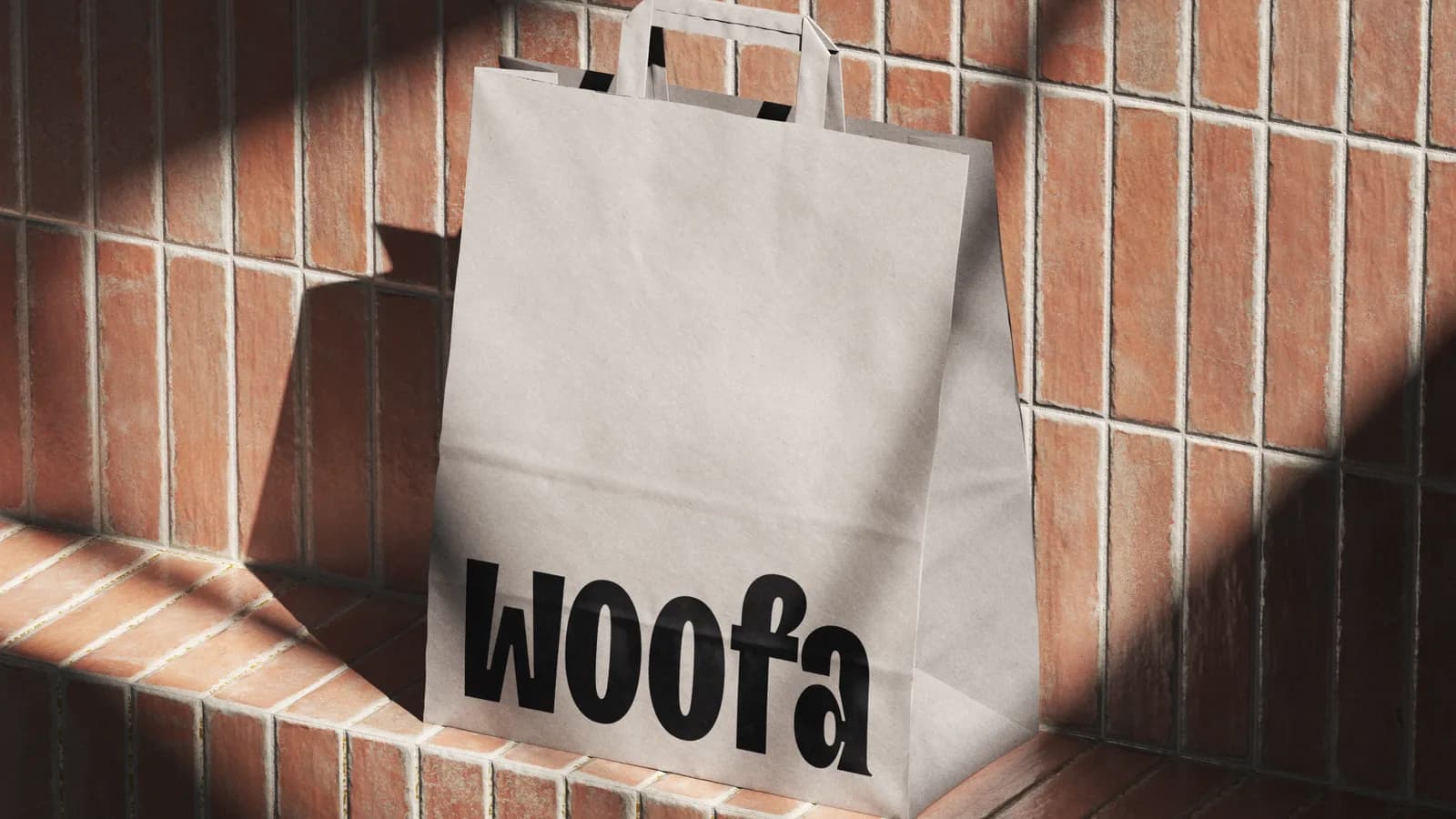
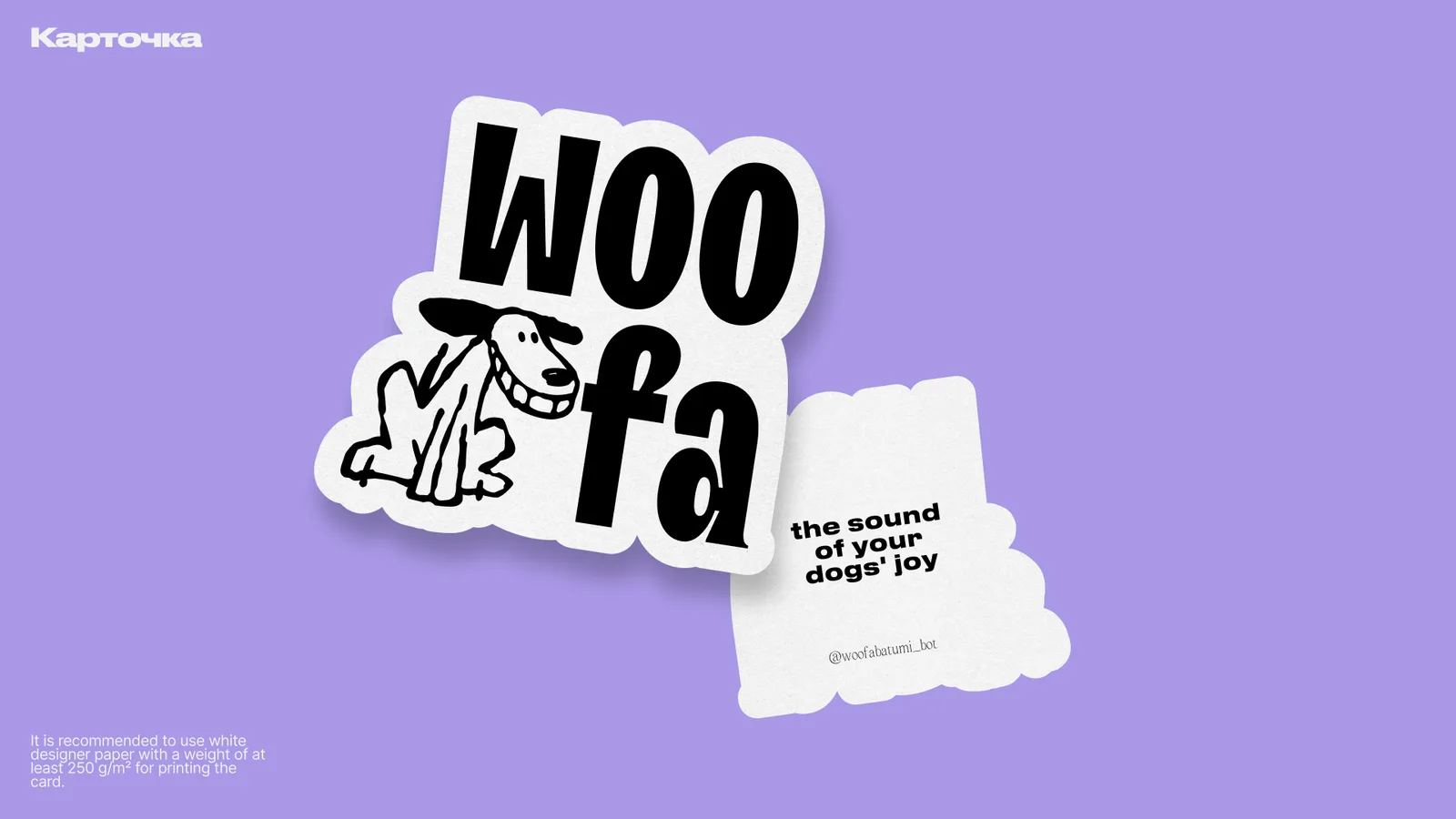
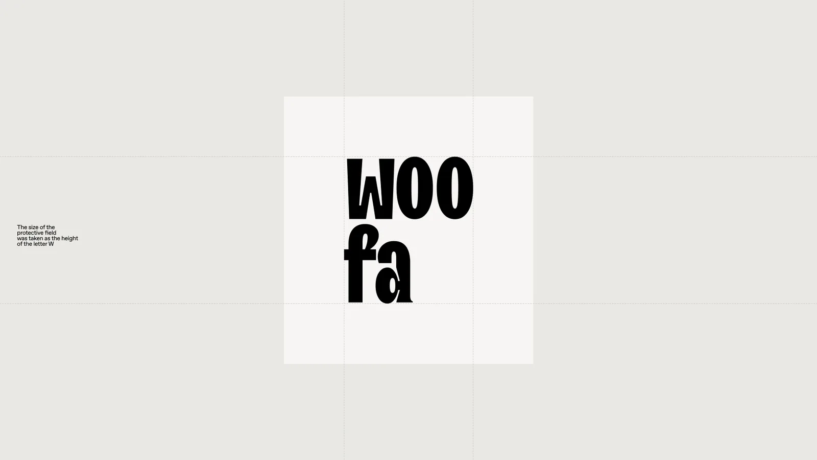
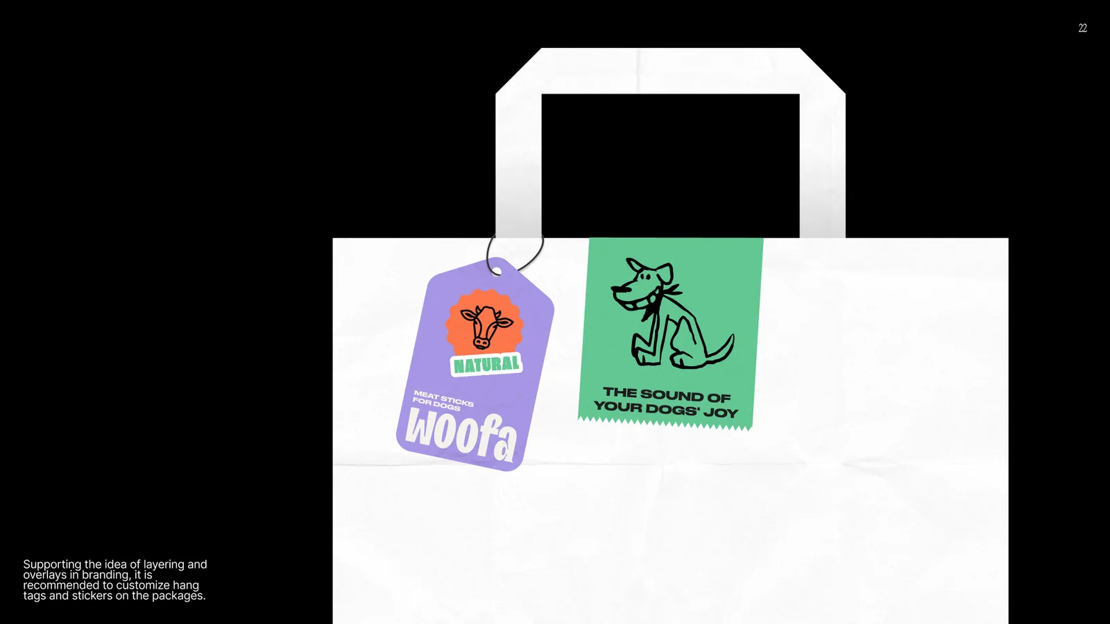
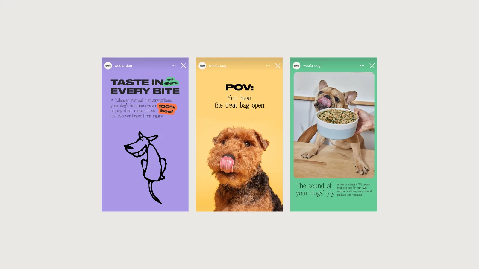
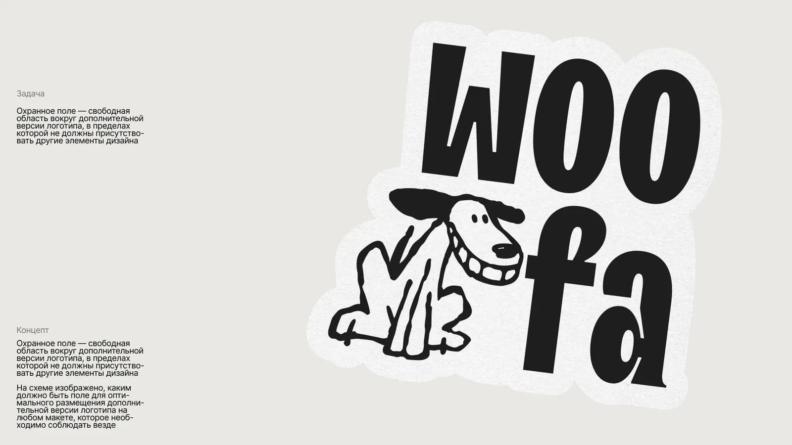
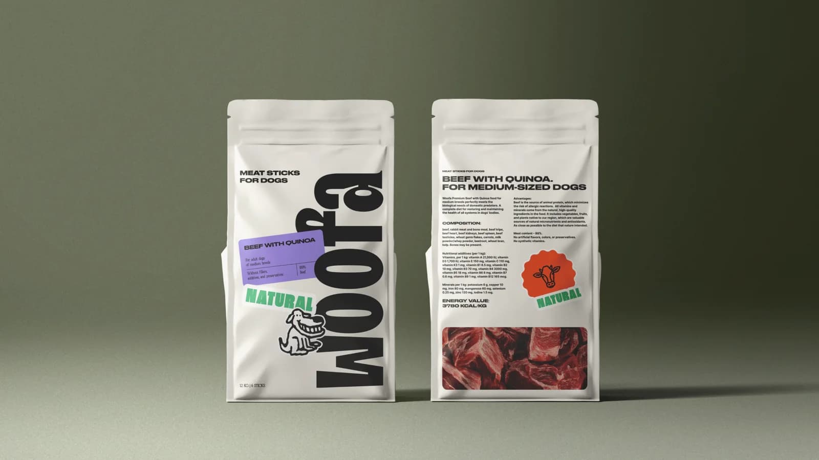
We built the brand's character on the mood between an owner and their dog, not on stock-photo "premium" or "natural". The logo is made as a sticker: alive, friendly, and it travels easily from the pack to social media and merch. The playful language is held by a system — fun without turning the food into a toy.
What we did
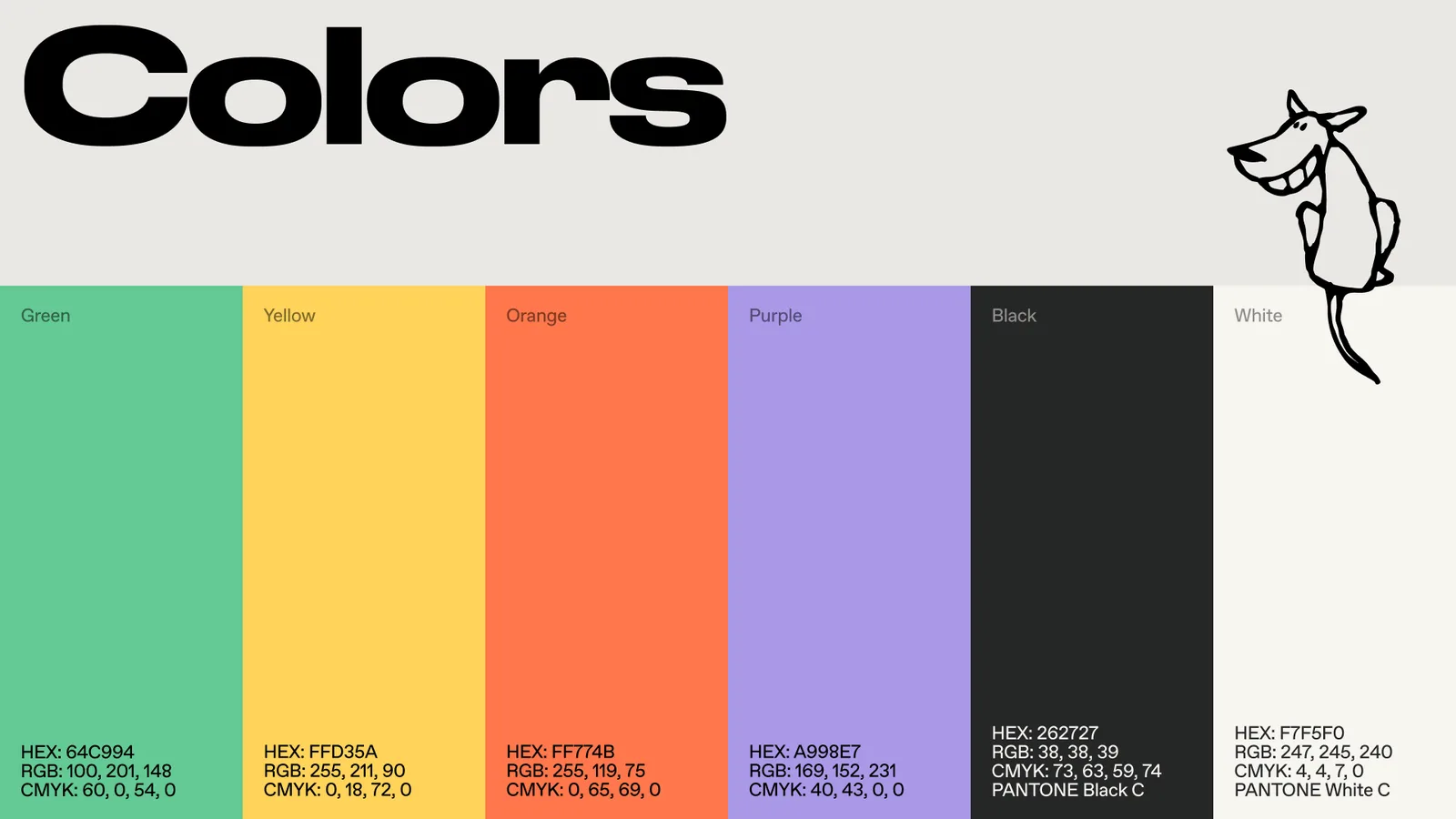
Identity. The sticker-style logo, palette, typography and the brand's graphic elements.
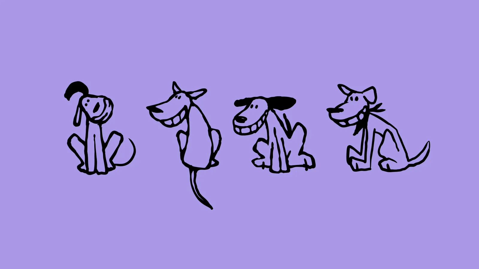
Visual language. A playful system of illustration and composition, recognisable on the shelf and in the feed.
Packaging range. A series of packs: flavours and formats differ at a distance while the brand reads unmistakably.
The result
- a character you cannot confuse with the shelf neighbours
- the sticker logo lives on packs, socials and merch
- the range grows inside a ready system