The task
A private residence in historic central Moscow does not compete on floor area or finishes; the neighbours have plenty of both. It competes on image. The brief for the concept: find a metaphor that separates the project from its glossy neighbours and grows out of the place itself instead of being glued on top.
The idea
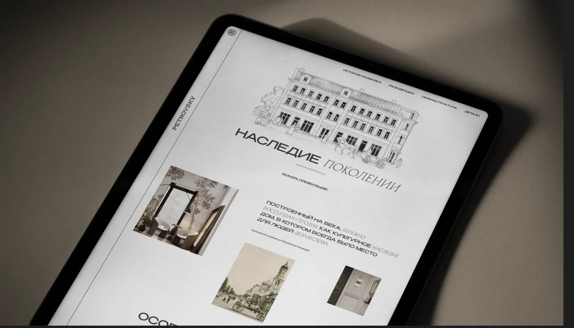
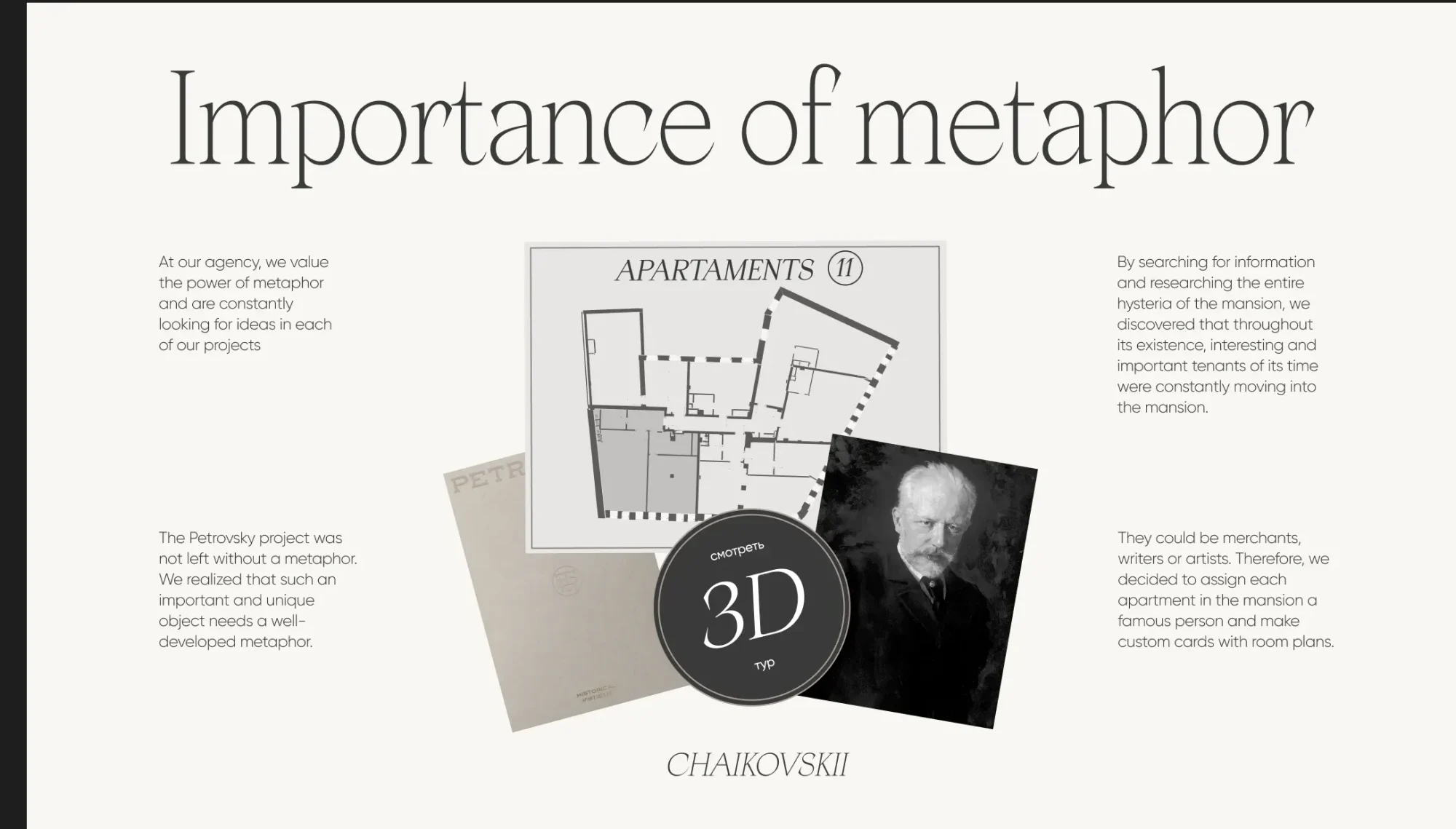
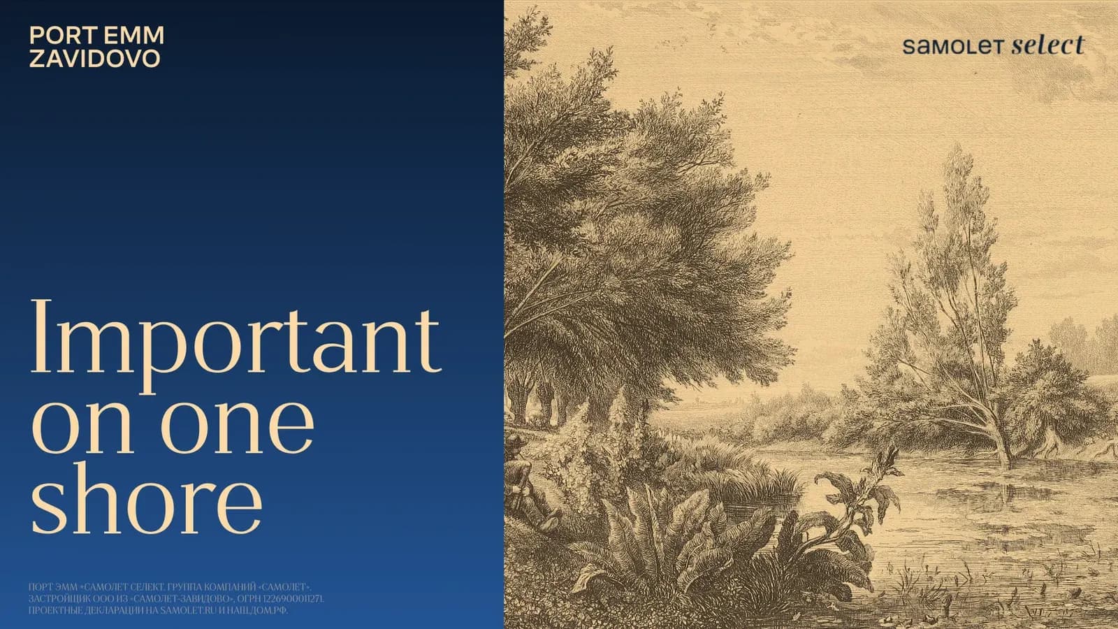
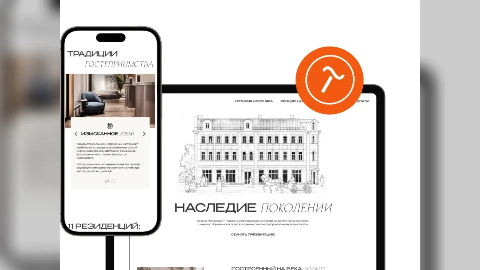
We went into the history of the district and found the anchor in Moscow's merchant era: solidity, wealth without noise, things made to last. The metaphor runs through everything: a type pairing with the character of pre-revolutionary print, a restrained palette, copy with the voice of a confident owner, and a viewing scenario that moves from the history of the place to the house and the apartment.
What we did
Research. The history of the quarter, archive materials, the tone of the era.
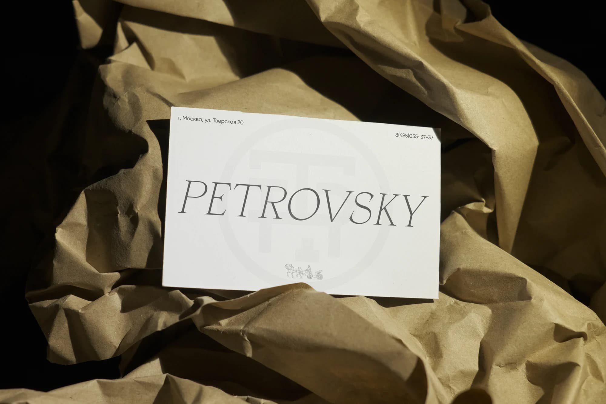
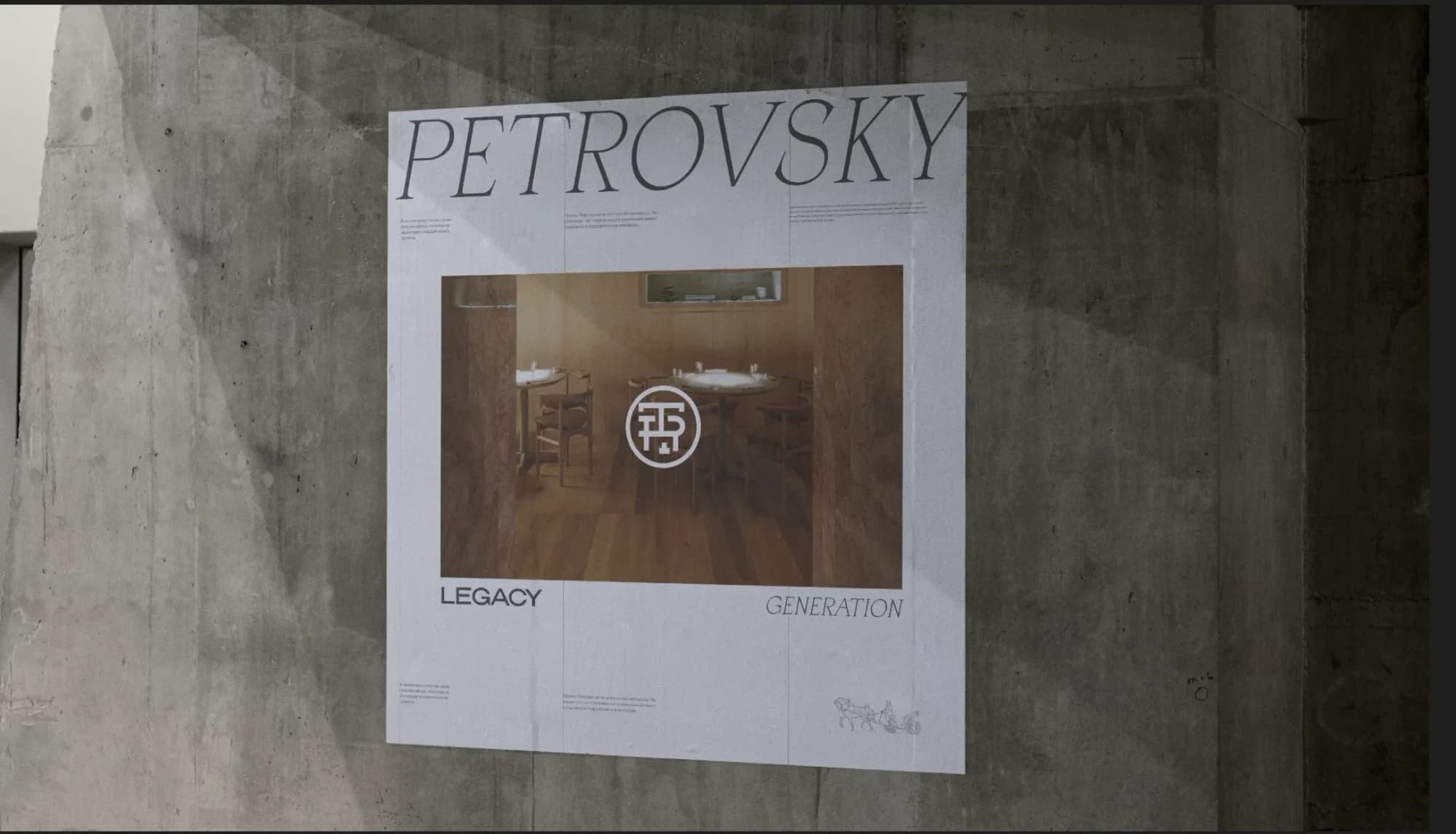
Visual language. Typography, palette and graphic devices: the merchant era without costume-drama styling.
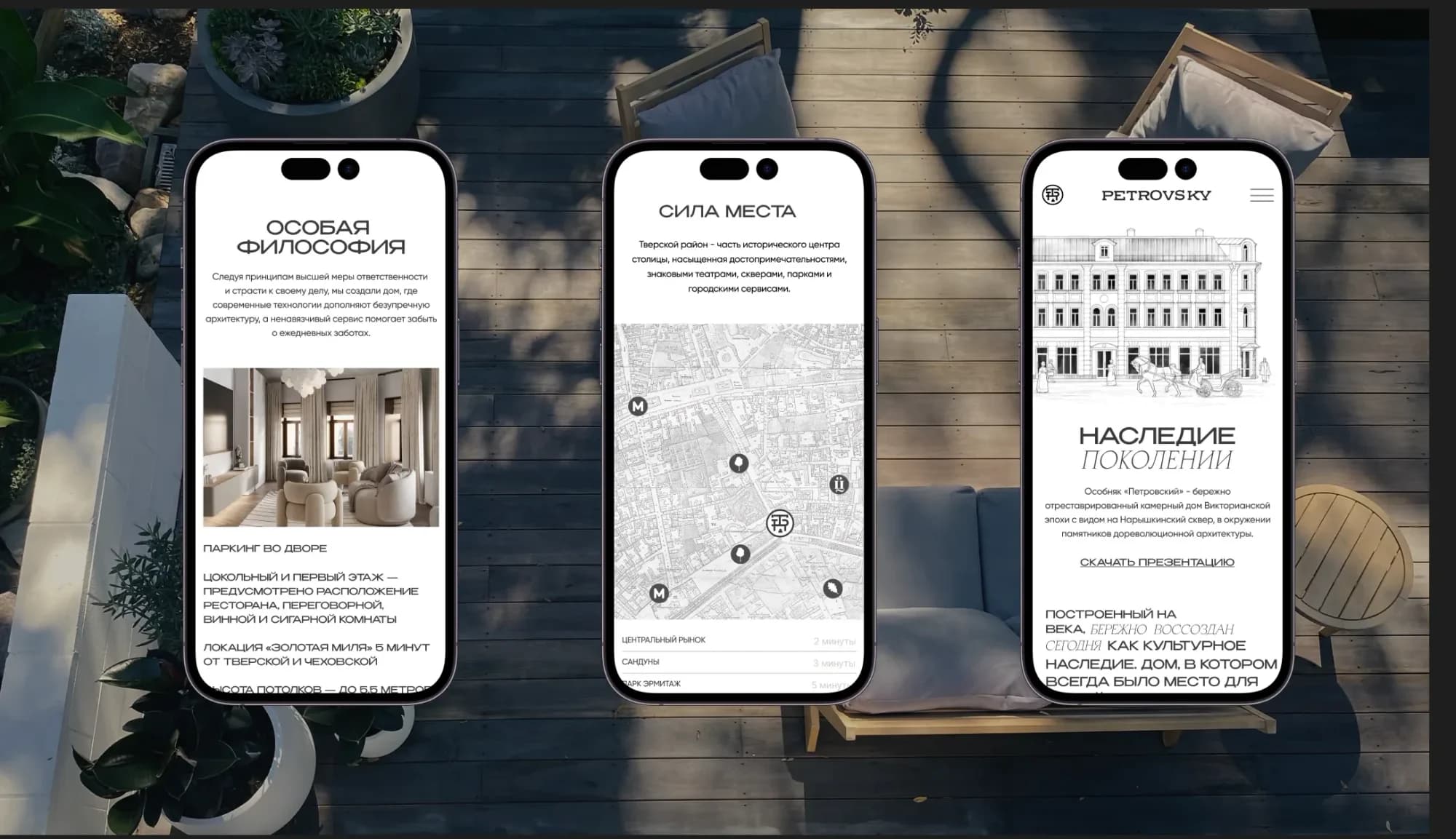
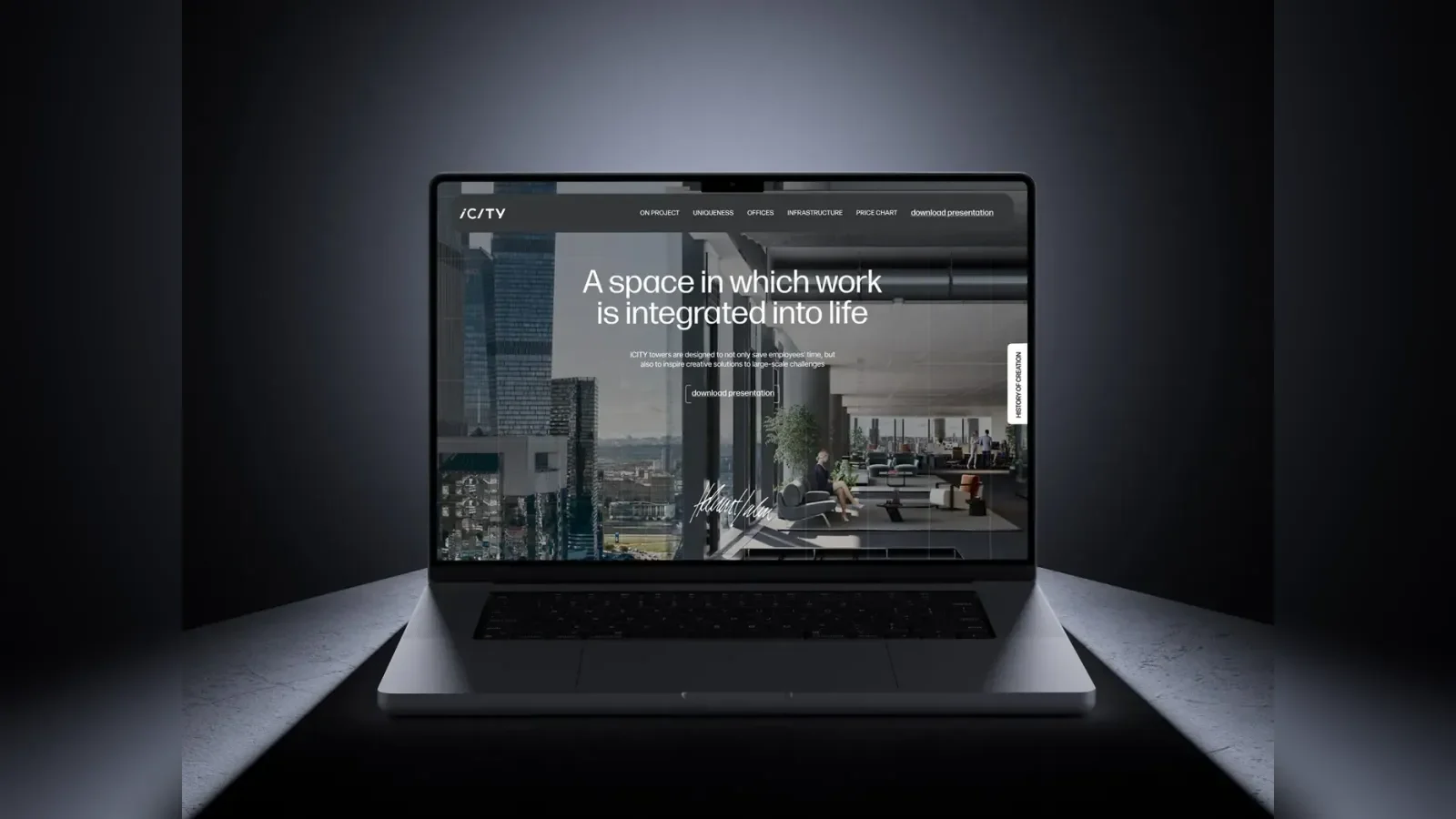
Scenario. The first screen sets the image; then the house, floor plans, finishes and the district.
Copy. Written in the same voice as the visuals: calm, weighty, no superlatives.
Results
- a coherent concept the sales team can retell in words
- an image impossible to confuse with the neighbouring projects
The site is live at petrovsky.moscow.