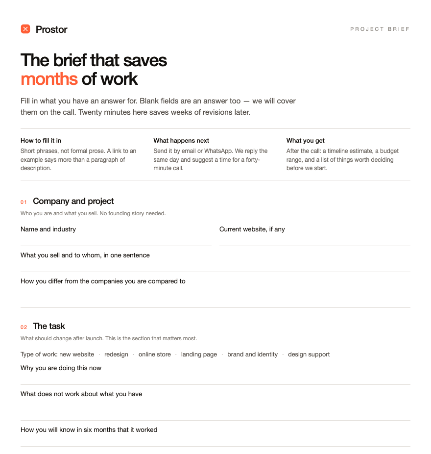
Most redesigns that go over budget do not fail on execution. They fail on a guess made in week one that nobody checked: who the site is actually for, what the competitor down the road already owns, what the homepage has to prove before anyone scrolls. A discovery phase exists to catch that guess before it gets built into wireframes, components and copy that all have to be redone once it turns out to be wrong.
Here is what that phase concretely produces, and what it does not.
Audience interviews or a survey
Not a focus group and not a client's opinion about their own customers. A handful of structured conversations, or a short survey when the audience is large or hard to reach, with the people who actually buy, browse or evaluate. The goal is narrow: what do they compare before they decide, what makes them trust or distrust a site in the first ten seconds, what question does the homepage need to answer that it currently does not. Five to eight good interviews surface most of the recurring patterns; the marginal value of a ninth one drops fast.
A competitive teardown
A short, structured look at three to five sites the client's audience actually compares against, not an admired but irrelevant reference. For each one: what claim it leads with, what it proves and what it skips, where its structure is strong and where it is generic. The output is not a list of things to copy. It is a map of what is already taken, so the new site does not spend its homepage repeating a message three competitors already own.
A positioning statement
One paragraph, written down, that says who the site is for, what it promises over the alternative, and why that promise is credible. This is the part teams most often skip because it feels like homework before the "real" work of design. It is also the single document that prevents the most expensive kind of rework: a homepage built around one idea of who the client is, discovered in review three, to be wrong.
A content and information architecture outline
The list of pages the site needs, in what order, and what each one has to prove to move a visitor forward. Not wireframes, not layout, just structure: does this site need a pricing page or does pricing belong inline, does it need a resources section or is that scope creep, where does the case study prove the claim the homepage makes. Getting this wrong is expensive in a specific way — it usually surfaces only after design has already committed to a page count and a navigation, and fixing it then touches sitemap, IA and layout at once.
What discovery does not produce
It does not produce a finished visual direction. Positioning and IA narrow the design brief; they do not choose typefaces or write the hero headline. It does not produce a guaranteed conversion number. Nobody honest promises that a research phase will lift a specific metric by a specific amount, because the site's execution, the offer and the traffic quality all move that number too. What discovery buys is a lower chance of building the wrong thing, not a guarantee about how well the right thing performs.
Why skipping it costs more later
Skipping discovery does not remove these questions, it just changes where they get answered. Instead of a paragraph of positioning getting argued over in a document, the argument happens across three rounds of homepage revisions, because nobody agreed in writing who the site was for before the first mockup existed. Instead of a competitive teardown flagging that a claim is already crowded, the client finds out after launch, when a competitor's near-identical headline shows up in the same search results. The cost is the same either way; discovery just pays it while it is still cheap to fix — a document, not a rebuilt section.
If a project is heading into a redesign or a new build and the positioning, audience and competitive picture have not been written down anywhere, that is worth fixing before design starts, not after. Read more about how we run this as research.